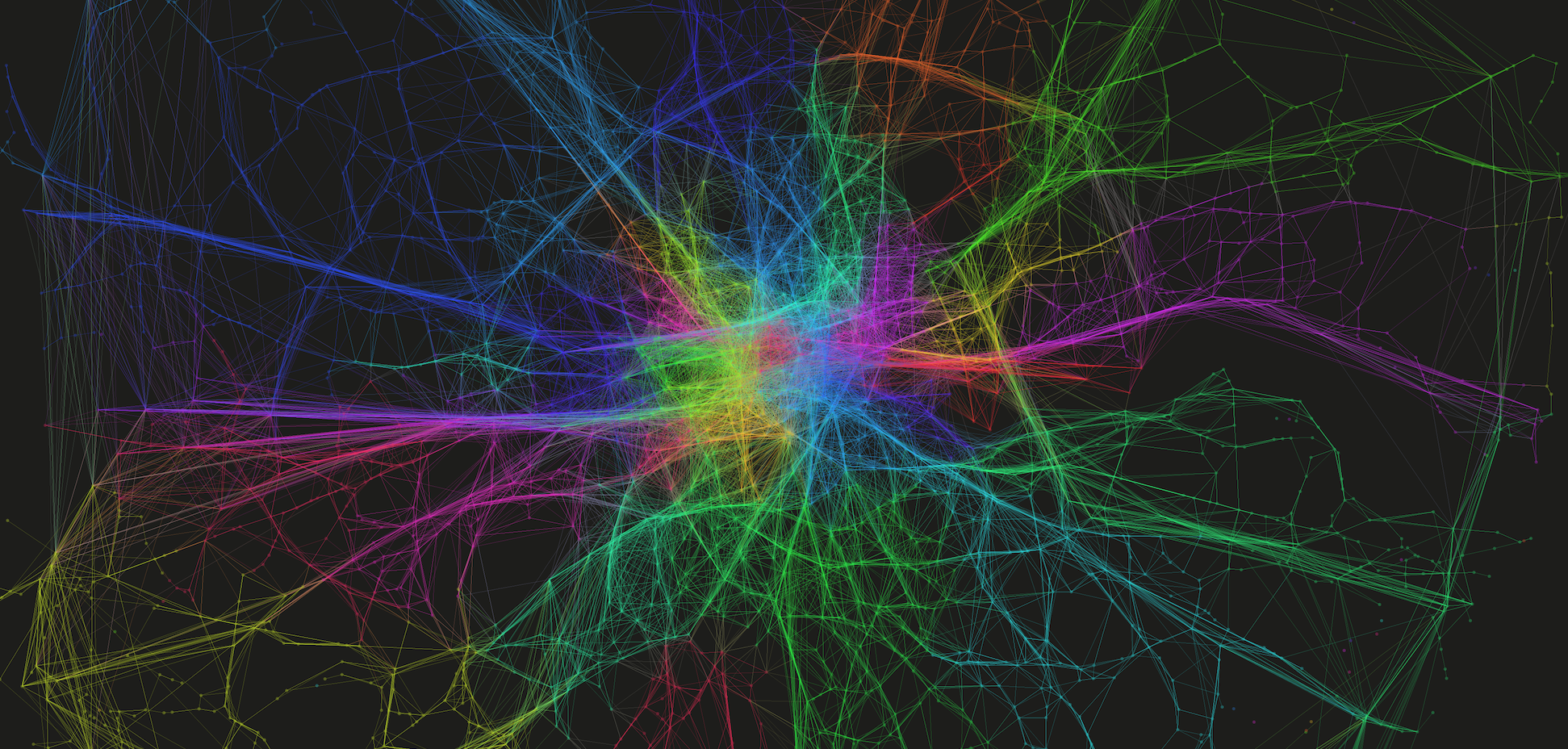
I’ve been spending a bit of time with Twitter data of late – perhaps not a healthy activity – but it is amazing what a rich data source of social and spatial behaviour it is.
Someone asked to me today whether it was possible to identify when and where Twitter gets angry. Well, here is my answer to the first part – the when.
The graph below shows the variation, across the day, in the prevalence of swearing in the ‘Twittersphere’. The data used represents tweets during two weeks in March 2012 covering London only – so maybe this is just when London gets angry…
In the graph we have the percentage of all tweets containing ALL types of swearing in blue, in red we have the prevalence of the f-word (by far the most common swear word), then finally the percent appearance of the s-word is shown in green. Time is along the bottom.
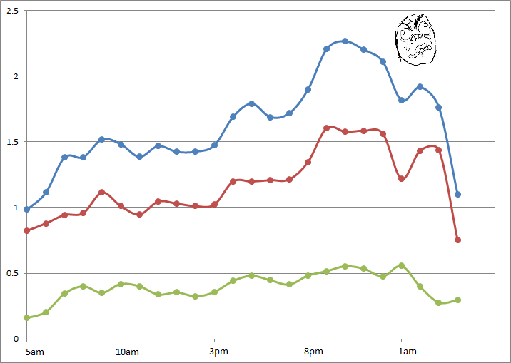
Putting the slightly frivolous nature of this work aside for a second, the data does demonstrate some interesting trends. There is a clear upward trend in ‘anger’ as the day goes on, reaching a peak at around 10pm. But why is this? Why do we swear more in the evening, when we should be relaxed and enjoying our precious free time? Are we (we being Twitter users only, of course) swearing at the TV? Arguing with our friends over Twitter? Or are enough of us getting drunk and losing our inhibitions?
We also see a smaller peak at around 5pm – now this is more easily explained. The ‘thank f**k work is over’ tweet one might surmise. An even smaller peak at around 9am suggests the opposite effect.
But I think this simple analysis gives us some insight into the way we use social media throughout the day. During the day we think about work. We tweet and communicate about work. Yet in the evening, Twitter becomes a different place. We let our guard down, and once we’re outside of the constraints of work, perhaps we begin to use Twitter in a different way. Places like Twitter allow us the space to exclaim and let off our true feelings, whatever they may be, that might otherwise be constrained in other environments.
Twitter gets a lot of stick for its high volume of frivolous content – probably with good reason – but at a higher level some subtle but interesting social trends can start to be observed.