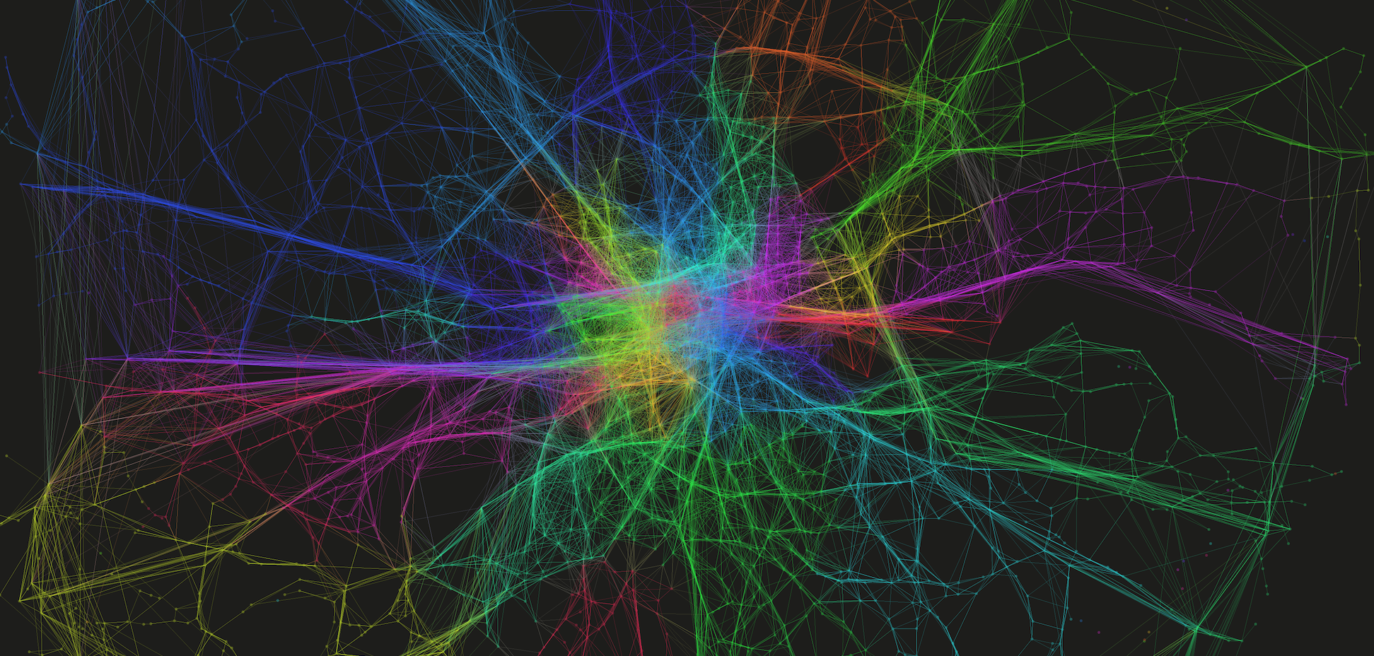
I’ve been collecting Twitter data for a little while now, and have managed to identify some interesting (if slightly frivolous) trends. But, when considering the wider applications of such a dataset, one question that has continued to bug me is – Why do we tweet when we tweet?
I won’t attempt to answer that question here (yet), but one clear reason is when we want to communicate our involvement in an event or activity. You can see it quite clearly in the data – gigs at the O2, football matches at the Emirates – all of these events show up as clusters of tweet points. So, with the Diamond Jubilee celebrations occurring in London last weekend, I thought this would be a nice opportunity to demonstrate how these crowd patterns form and disappear over space and time. The images below – I hope you will agree – are quite pretty, but I think the analysis presents some more interesting implications with regard to the use of this type of dataset and the nature of visualisation, aspects I’ll address at the end.
Tweeting the Diamond Jubilee
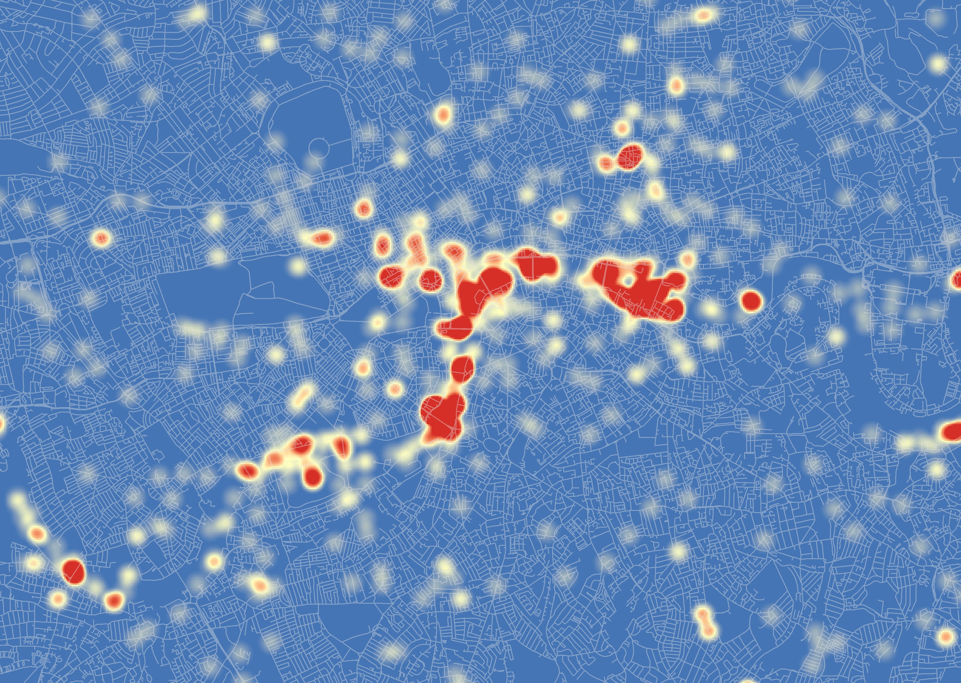
What I’ve done here is look at all tweets mentioning ‘Jubilee’ occurring in London on the 3rd and 4th June 2012. As you good patriots will recall, these were the dates of the Thames flotilla and Jubilee concert outside Buckingham Palace. For you more technically-minded people, I’ve taken the tweet point locations and applied a Kernel Density Estimation on them, to provide a sense of where the highest density of tweets were occurring on each day.
The colour scheme – in the colours of the flag, of course – shows the shift from high density areas of Jubilee-related tweets (in red) to areas where not many such tweets are detected (in blue).
Flotilla Day
On the day of the flotilla, you can clearly see a strong distribution of tweeting monarchists along the course of the flotilla on the River Thames. It can be noted that this distribution is not spatially uniform, however, indicating perhaps the locations of the best, or most popular, viewing areas. You can see other clusters around London too, which may indicate where other gatherings were taking place.
We can also look at this data in 3D too, allowing us to better explore where the absolute highest densities of tweets were occurring within those big clusters of red…

Interestingly, this map helps to better draw out where the exact hotspots lie. Revealing that the highest densities are at each the bridges along the route, with Vauxhall and London bridges seeing the greatest activity.
Concert Day
The day of the concert – taking place on the evening of the 4th June – indicates clearly a completely different pattern of behaviour.
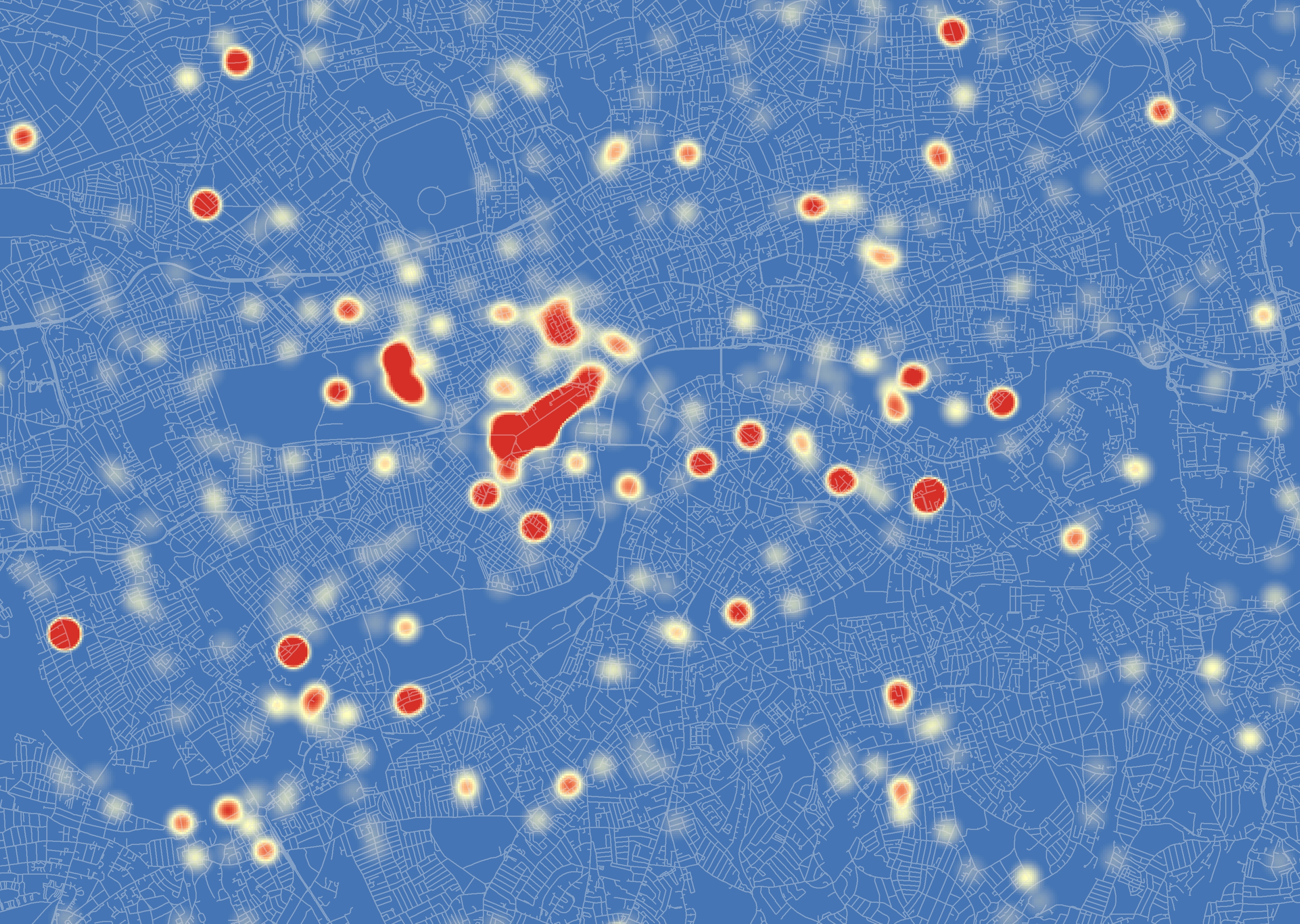
Here the biggest activity is along the Mall and towards the Jubilee concert outside Buckingham Palace. One can also identify big clusters of tweets in Hyde Park and around Soho, again with lots of other clusters dotted around the city. Overall, there appears to be a lesser concentration of tweets than seen on the day of the flotilla, something that appears to follow that reported in the press.
Again, consulting the 3D representation of the data, shows us more exactly where the largest clusters of tweets are located…
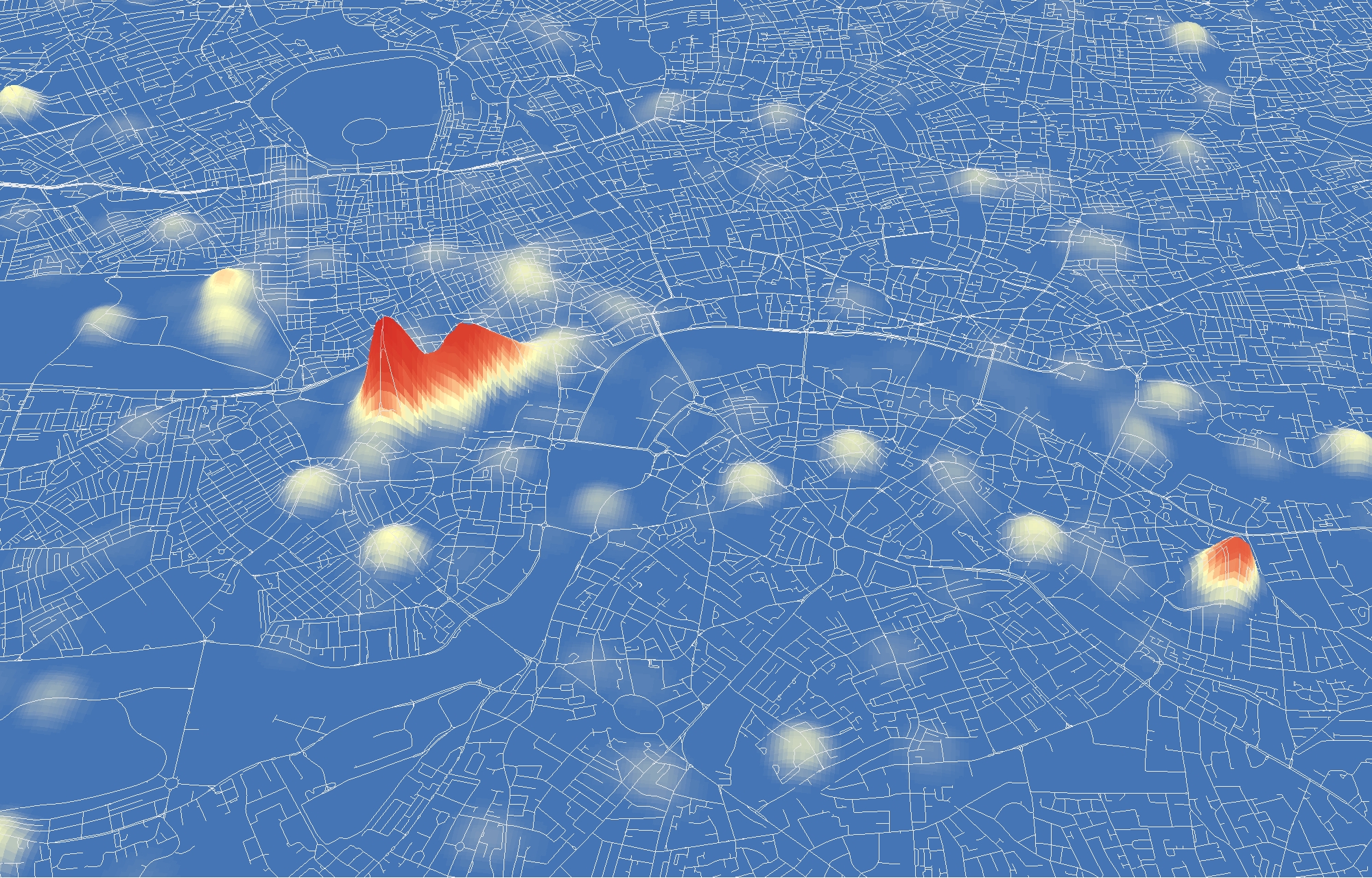
This image again demonstrates the importance of an alternative perspective. In this case, we can see that the most important cluster is found along the Mall at the concert itself, with the other activity highlighted in the 2D perspective seemingly of much lesser significance.
What does all this actually mean?
OK, OK, so you may be thinking at this point ‘Yes, very nice pictures and everything, but isn’t this all fairly obvious?’. Well in some ways yes, we know from the television pictures that there were a lot of people along the Thames on the 3rd June watching the flotilla. What we have a lesser grasp on is the exact volume and spatial distribution of these people, and how they moved throughout the day.
My feeling is that, although biased in many respects, this dataset provides us with a unique opportunity to measure the spatial distribution of crowds at events. It may well only be a proxy for activity, but rather than relying on a few, subjective viewpoints, we are able to get a better overall indication of the true patterns of crowds in space and time. Such analysis may also help us to identify emerging, organic events, outside of our current viewpoint, that require our attention.
In regard to these images in particular, I hope that the Kernel Density approach has been of interest to some of you of a less geographic mindset. They do quite effectively highlight the locations of tweet hotspots. The differences between the 2D and 3D images do demonstrate, however, how the visualisation of data can become misleading. What appear to be large events in one representation are much less significant when viewed from an alternative perspective. This is a facet of data visualisation that we all should be conscious of.
As ever, your thoughts on anything I’ve presented here are very welcome.
Edit (11-06-12)
You can now find video animations of the 3D results here and here.