Understanding Cities through Individual-Level Data – Opportunities and Challenges

As it’s been a while since I last posted, I thought I’d put up something I prepared for a Royal Society Smart Cities and Transportation workshop next week. I’ve focussed on data collected at the individual-level, and the opportunities the data present for better understanding cities, and the challenges the maximisation of these resources face. There are no doubt alternative perspectives, arguments that go deeper beyond this very short piece, and methodological issues too to contend with. Feel free to add your thoughts in the comments at the end.


As the creation, capture and accumulation of granular datasets becomes increasingly engrained within the urban environment, the potential for analysing urban processes in finer and finer detail increases. New forms of data are being generated at spatial, temporal and individual-level scales that surpass all that have gone before. These data transcend the boundaries that previously imposed on analyses of cities – traffic flow can be captured on a second-by-second basis road-by-road, crime incidents are habitually recorded with a longitude and latitude, and commuting patterns can be captured live through the movements of mobile phones. Through the development of a wealth of new methods, machine learning approaches are able to derive deeper insight from these data, revealing new patterns and understanding of cities than have been available before. It is, however, increasing granularity individual behaviours that offers the greatest promise, and poses the biggest challenges for future urban data analysis.

Data derived insights around the individual offer a chance to better understand the behavioural heterogeneity within the population across a range of domains, as well as revealing the complex interconnectivity of urban systems. Capturing these details at finer level could allow us to better measure and model cities, allowing us to improve our current conceptions on how we understand, manage and organise our cities.

The opportunities presented by individual-level analyses are plentiful. Longitudinal data allow us to learn how individuals adjust behaviour over different periods of time and under different conditions, and how they adapt to longer-term changes to the city. Within domains such as transportation, conventional models lack strong behavioural insights, failing to capture behavioural heterogeneity or measure how individual experiences and perceptions influence behaviour. The new lessons we can potentially learn from these data can not only aid our longer term models of urban futures, but contribute towards our management of cities on a day-to-day basis.

The individual-oriented nature of these analyses are able to transcend disciplinary boundaries through which cities have previously been understood and managed. At present, we lack a deep knowledge around the integration of different urban systems, and the influence of the urban realm upon these connections. We might, for example, be interested in the influence of travel on shopping behaviour, or on health, or crime patterns, but the potential interconnections extend far and wide. While conventional surveys provide good localised insight into these behaviours and systems, only through large scale data collection can these interconnectivities be observed across the whole population and entire urban area. The improved understanding of the people and systems that make up the urban realm offers considerable potential for those operating and optimising cities.

Despite the promise, there are considerable challenges to capitalising on these opportunities – underlined primarily by the fact that many of the datasets that could advance our understanding of cities already exist. At the individual scale, longitudinal travel behaviour can be captured by smart card transactions, many retail transactions are captured via loyalty cards, and mobile phones tracked from cell tower to cell tower. There is, however, little opportunity for joined up thinking, as many of these datasets exist within silos, accessible to interested parties only in exchange for a considerable fee. The potential for asking new questions, discovering new insights, and crossing urban systems and disciplines is restricted by commercial confidentiality. Crossing these boundaries requires leadership and openness from business and government, where too often, siloed within their own priorities, perspectives and worldview, a wider vision or motivation for an improved city is lacking.

Beyond structural challenges, however, there are questions of morality, and how far data collection and analysis should be deployed for the purpose of urban development. When one starts to generate data at the individual level, the risk of de-anonymising individuals becomes very real. Data analysts have already proven this in various contexts, using datasets cleared for public release – from the identification of individuals from the movements of their mobile phones, to the identification Netflix users from their viewing habits, to establishing whether celebrities tipped their taxi driver or not. These analyses may have been conducted for benign reasons, but they illustrate the point that the opportunities for revealing identities from data traces sharply increase as data collection reaches individual-level granularity. The questions therefore become how far should these analyses extend, what constraints (if any) should be placed on data collection and analysis to ensure anonymity, and how should methods and results be communicated to the public. At present, there is little guidance from government and seemingly little leadership beyond. Without due consideration given to the treatment of these issues, there is a risk that public trust in data collectors and analysts will be eroded, risking the imposition of limiting constraints on how these data are exploited in future.

Mapping Connected Places on London’s Public Transport Network

I haven’t written much on this blog about the work I’m currently doing at UCL CASA.  As a Research Associate working on the Mechanicity with Mike Batty, I’m tasked with drawing meaning out of a massive dataset of Oyster Card tap ins and tap outs across London’s public transport network.  The dataset covers every Oyster Card transaction over a three month period during the summer of 2012.  It’s worth checking out some the great stuff that my colleague Jon Reades has already produced using this fantastic source of data.

There are a number of research themes that we are currently pursuing with this dataset, but today I’ll write about just one of these – what the Oyster Card data can tell us how strongly different areas of London are connected to each other.

Most Popular Destinations

For this initial exploration I just want to keep it simple, and use quite a basic metric for assessing how associated two places are.  What we do here is look at the most popular destination station for each origin location.  So, using the big dataset of Oyster Card transactions (here is the Oyster contact number for support), we pull out the most likely end point for any traveller beginning their journey at any given station on London’s public transport network.

We are focussing here on only Underground, Overground and rail travel in London, obviously by Oyster Card alone.  Bus trips are unfortunately not covered because of the way the Oyster Card works.  Yes that mean you will need to pay for those Bus Tours to New York from Halifax outright. Within this dataset I have extracted only the most popular destinations for each origin between 7am and 10am on weekday mornings.  The dataset covers a total of 48.9 million journeys over 49 weekdays, so averaging at around 1 million morning peak trips per day.  In focussing only on the morning commuter influx into London, we exclude any ambiguity that might come with including bidirectional flows of travellers.

The map below shows the connections formed between all London stations and their most popular destinations.  A link has been drawn between the two places, and the link and points coloured according to the destination.  Each destination is given a unique colour.  If you click on the image below you’ll get a full screen version, and be able to switch to an annotated version of the map.

Map showing the most popular destinations by origin, derived from a large dataset of morning peak Oyster Card trips

Map showing the most popular destinations by origin, derived from a large dataset of morning peak Oyster Card tripsThe map itself is made using Gephi – an open-source network analysis package with some excellent visualisation capabilities – and is supported with a bit of good old data crunching to get at these popular destination figures.

What Does The Map Show?

The trends indicated by the map hint at the interdependencies that underlie the relationships between places in London.  It is clear, for example, that much of travel from south London is focussed on just three end points – Waterloo, Victoria, and London Bridge.  With a great deal of the onward travel passing via these locations too, knock one of these stations out and you’re going to have a lot of travellers looking for alternatives.

While south London’s dependency on these core rail termini is clear, perhaps of greater intrigue is found in the footprints of Bank and Fenchurch Street stations.  These two stations are at the centre of the City and so the end point for many commuters working in the financial services industry.  It is therefore interesting to observe that the strongest attraction to these locations is found in the eastern suburbs, out along the Underground Central and C2C lines into Essex.  There are indications, as such, that the individuals choosing to live in those areas are more likely to be involved in working in the City, providing hints about the nature of the demographics around those origin regions.

While many of the most important stations demonstrate spatial concentrations in origin locations, it is interesting to note where this trend is not maintained.  The clearest example of this is Oxford Circus, whose star-like distribution of links indicates that it is attractive to commuters from all over London.  Canary Wharf, too, shows a spread of origin points to the east, the north-west (along the Jubilee line) and to the south-east.  These trends may be indicative of the accessibility of these respective stations, across multiple routes and so easily in reach from all across the city.

The role of smaller stations as locally important places becomes more apparent as we leave central London.  Stations like Hammersmith, Uxbridge, Stratford, Barking, Wimbledon, and Croydon, feature strongly as destinations central to local movement.  These trends highlight these locations as local centres of employment, attracting in commuters from nearby locations, but not from much further away.

Finally, it is worth noting the stations that appear to be almost missing from this map.  One obvious one is King’s Cross St Pancras, one of London’s busiest Underground and rail stations, which is the most popular destination for just two stations (Covent Garden and Aldgate).  The reason for this is that this may not be where people end their trips.  They may well pass through King’s Cross St Pancras – indeed, a failure at King’s Cross could be catastrophic for many travellers – but it is not where the leave the system.  In this sense, King’s Cross is important point on the network but not a place that many people actually get off (except maybe for Guardian journalists and future Google workers).


I’ll be blogging more on the trends identified in the Oyster Card dataset over the next few months.  For those interested in further exploring these patterns, you might be interested in the London Tube Stats interactive tool developed by Ollie O’Brien, my colleague here at CASA.  Ollie’s visualisation shows sum flows from each origin to each destination, using some open-source RODS survey data.


Post-Crash UK Housing Market Resilience

I think many of us are familiar with the 2007 UK housing market crash.  Over the course of a few months at the end of 2007, the bottom dropped out of the market, with the number of transactions plummeting from 127491 nationwide  in August 2007 to just 49462 a year later.  Even now, in 2014, while the average house price may be increasing, the market has yet to recover to the same volumes of transactions seen in 2006.

While the impact of the crash still casts a shadow over the nationwide market, I thought it might be quite interesting to examine the spatial variation within the general trends of housing transactions.  Identifying the areas that actually returned to pre-crash transaction volumes quickly after the crash, and those which appear to be the slowest to respond.  It is hoped that this line of research, only in its initial stages here, will help us to explore and explain regional differences in the resilience in housing markets during times of crisis.


Data and Method

This analysis is supported by a superb granular dataset, provided by the Land Registry and pulled together by my talented colleague Camilo Vargas-Ruiz, that lists every single house transaction in England and Wales between 1995 and 2012.  This dataset allows us to get really deep into the spatial and temporal patterns of housing transactions over the last 17 years.

The method of analysis is quite simple – for each postal district, we just take the total number of transactions in 2006 (pre-crash), and total number of transactions in 2012 (the latest post-crash data we hold), and see what the percentage differences are.  Postal districts are the most granular part of the postcode (e.g. M14, NG31, SE4), and usually refer to a single town or part of a town.  I’ve completely removed transactions involving new builds, reducing any direct impact bought about by the building of new housing.


The National Picture

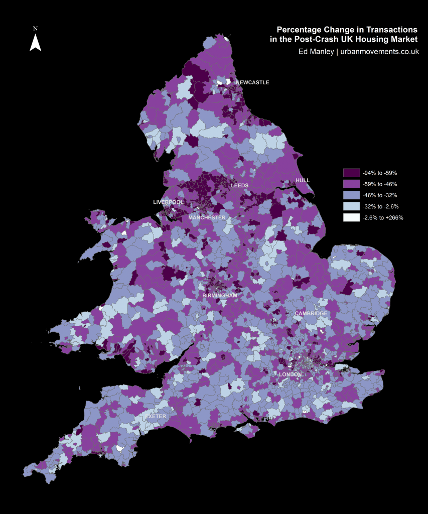
Mapping the percentage change in housing transactions between 2006 and 2012 by district provides us with an initial indication of the nationwide trends in post-crash market response.

Looking at the map below, one can begin to see some regionalisation in trends, indicative of certain parts of the country responding more or less quickly to the impact of the crash.  Of particular note are the regions north of Manchester and around Newcastle, both of which indicate relatively widespread negative trends.  However, the map broadly indicates a mixed picture nationwide.

Percentage Change in Transactions in Post-Crash UK Housing Market

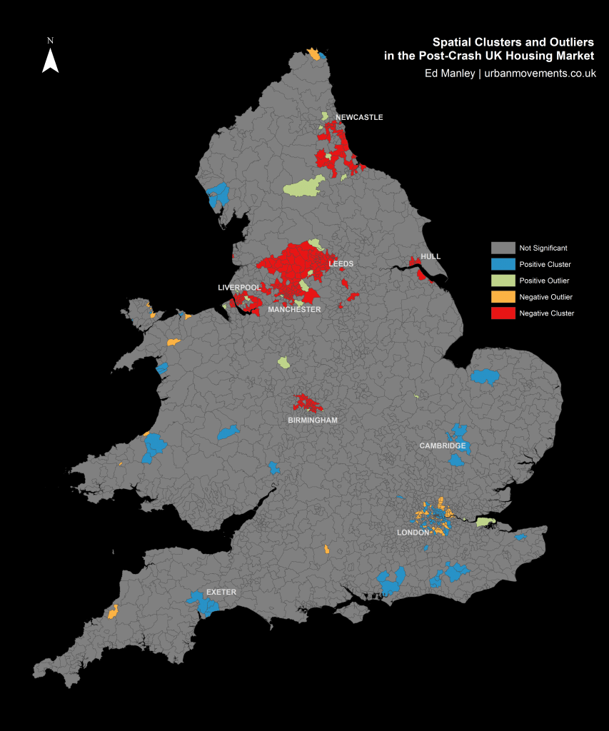
A better understanding of the regions responding well or poorly post-crash can be obtained by applying a spatial clustering methodology.  The method I’ve used here – Ancelin’s Local Moran’s I – is a form of hotspot analysis based on localised patterns in post-crash response.  This approach allows us to identify  spatial clusters of districts that have higher than average local similarity or dissimilarity.  The method allows us to extract those clusters of districts with widespread positive post-crash response, clusters with negative post-crash response, as well as any outliers (i.e. districts with positive change within wider negative regions, and districts with negative change within positive regions) that might crop up too.

Spatial Clusters and Outliers in the Post-Crash UK Housing Market

The results from the spatial clustering approach are more conclusive.  Here we can immediately see some clear regionalisation of positive and negative post-crash response, that extend the trends identified within the earlier map.  Interestingly, many of the northern cities are badly effected, with large negative clusters – indicative of widespread patterns of a slow post-crash response – around Manchester, Liverpool, Birmingham, Leeds, Hull and Newcastle.

Relative to these cities, London demonstrates a remarkable response, with positive clustering demonstrating that 2012 transaction levels are much closer to 2006 levels than average.  Likewise, a number of towns – including Exeter, Cambridge and Chichester – demonstrate positive responses, as do rural areas in Wales, East Sussex and the Lake District.

It is revealing too to examine the outliers identified through this approach.  Around the poorly performing regions between Liverpool and Leeds, a few smaller towns, including Otley, Guiseley, Bredbury and Marple, perform above and beyond local trends.  Likewise, within some of these cities certain areas perform well, particular within Liverpool and Manchester city centres and suburbs (L16, L34 and M17).

Likewise, one can identify outliers with negative local performance, surrounded by wider positive trends.  This pattern is most apparent around London, where despite positive spatial clustering in central and north London (around Islington, Hackney, Southwark and Greenwich), the outer suburbs do not reflect these trends.  It is noticeable that relative to the wider positive patterns in London, the markets around Tottenham and Enfield in the north, Croydon in the south, Southall in the west, Barking in the east, and Bromley in the south-east, do not reflect similar trends.

These analyses provide us with some insight into the regional trends in the housing market, the next stages will examine the specific locations that have performed best and worst between the pre- and post-crash period.


Which Areas Have Fared Best?

As you might have gleaned from the map above, of the 2299 districts used within the study, very few saw an increase in transactions between 2006 and 2012.  In fact, only one district saw a positive change, – that being the EC1V region in London, the area of Finsbury, between Old Street and Angel in central London, which saw a 5.47% increase.  More widely, the picture was very much different, with the mean percentage change in transactions between the two years being -48.13%, with a mode percentage change of -50%.  As such, in assessing the areas which performed well across the period, we shift our perspective to looking at which areas performed least badly.

The table below presents the top 20 districts with the lowest percentage reductions in transaction volumes between 2006 and 2012.  At this stage, to control for small numbers, only those regions with 25 or more transactions in either 2006 or 2012 are considered.

Postal districts with best maintenance of transaction volume between 2006 and 2012
Postal districts with best maintenance of transaction volumes between 2006 and 2012

The list represents an interesting mix of urban and rural locations.  On one hand, areas of London, Cambridge, Bristol, Milton Keynes, and Exeter are indicative of a market remaining relatively buoyant within certain areas towns and cities.  Yet, the majority of locations within the top 20 are found in the agricultural lands of Wales, the Peak District, North Yorkshire, and the South.  Wales demonstrates surprising resilience during the period, with 6 of the 20 best performing regions found in here.


Which Areas Have Fared Worst?

Like that above, we can look at the other end of the scale.  This table shows the 20 lowest ranking locations based on the changes in the local market between 2006 and 2012.

Postal districts with worst maintenance of transaction volume between 2006 and 2012
Postal districts with worst maintenance of transaction volumes between 2006 and 2012

These results reflect the patterns observed from the spatial clustering earlier, with poorly performing areas demonstrably more concentrated in urban areas in the north of England.  Particularly badly affected appear to be the large cities of Leeds, Manchester, Newcastle and Liverpool, although smaller northern towns – including Middlesborough, Burnley, Darwen, and Hartlepool – feature too.  In some cases, around Hull and Burnley in particular, the transaction count dropped dramatically between 2006 and 2012.

These results offer further indication that some urban areas saw a larger, sharper turn down in housing market activity after the crash than that experienced in other regions.


What Does All Of This Mean?

In conducting this kind of analysis, it is very difficult to track down the absolute causation behind any correlation.  Intrinsic to the housing transaction market are a range of external elements relating to housing supply, changing demographics and wider economic influences.  In, furthermore, taking only a time slice between two years, we limit our ability to identify the rate of change across different areas of the country.

Nevertheless, this relatively simple methodology has provided some insight into the spatial variation with which the housing market is returning to pre-crash levels.  It is clear that some areas are still a long way from the levels of activity experienced prior to the crash, while others are now beginning to return to the activity observed back in 2006.  The worst affected are the urban areas near to many of England’s major cities, many of which are vastly less active relative to pre-crash levels.  In direct contrast are the more positive bounce backs indicated in city centre regions, most widely observed across London, but in parts of Liverpool and Manchester too.

The impact on towns is another interesting findings that can be drawn from this analysis.  While some relatively isolated towns – including Cambridge, Exeter and Chichester – are some of the best performing locations, those towns near to larger urban centres – such as Burnley, Hartlepool and some outer London suburbs – are some of the worst affected areas.  There is an indication of the dependent nature of locations on larger urban hubs, and so too the fragility of these regions in times of crisis.  In contrast, a quicker return to pre-crash activity is observed in towns that appear to possess a more established local economy, being less dependent on regional hubs.

It is interesting to contrast the negative performance around urban areas with those demonstrated in more rural regions.  Some of the regions performing closest to their 2006 levels are found in rural areas of Wales, the Peak District and North Yorkshire.  While the levels of transactions may not be spectacular compared to urban areas, there is a suggestion that, like isolated towns, perhaps given the nature of employment and the economy in these regions, they are better insulated from the downturn observed in the wider economy.

This work represents the first exploratory steps in examining patterns of spatial variation in the housing market transactions.  Any comments or thoughts on this work are welcome.