
I think many of us are familiar with the 2007 UK housing market crash. Over the course of a few months at the end of 2007, the bottom dropped out of the market, with the number of transactions plummeting from 127491 nationwide in August 2007 to just 49462 a year later. Even now, in 2014, while the average house price may be increasing, the market has yet to recover to the same volumes of transactions seen in 2006.
While the impact of the crash still casts a shadow over the nationwide market, I thought it might be quite interesting to examine the spatial variation within the general trends of housing transactions. Identifying the areas that actually returned to pre-crash transaction volumes quickly after the crash, and those which appear to be the slowest to respond. It is hoped that this line of research, only in its initial stages here, will help us to explore and explain regional differences in the resilience in housing markets during times of crisis.
Data and Method
This analysis is supported by a superb granular dataset, provided by the Land Registry and pulled together by my talented colleague Camilo Vargas-Ruiz, that lists every single house transaction in England and Wales between 1995 and 2012. This dataset allows us to get really deep into the spatial and temporal patterns of housing transactions over the last 17 years.
The method of analysis is quite simple – for each postal district, we just take the total number of transactions in 2006 (pre-crash), and total number of transactions in 2012 (the latest post-crash data we hold), and see what the percentage differences are. Postal districts are the most granular part of the postcode (e.g. M14, NG31, SE4), and usually refer to a single town or part of a town. I’ve completely removed transactions involving new builds, reducing any direct impact bought about by the building of new housing.
The National Picture
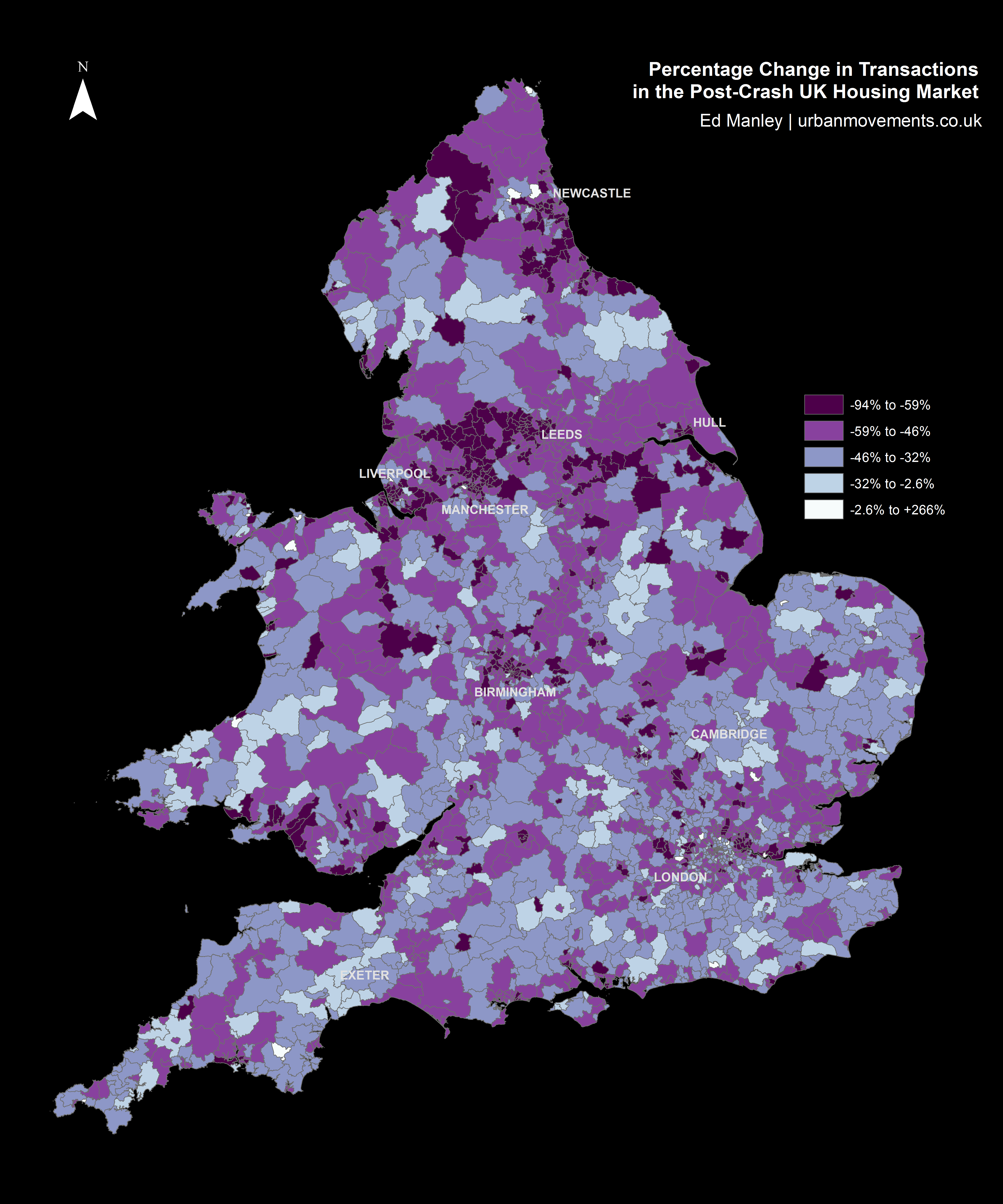
Mapping the percentage change in housing transactions between 2006 and 2012 by district provides us with an initial indication of the nationwide trends in post-crash market response.
Looking at the map below, one can begin to see some regionalisation in trends, indicative of certain parts of the country responding more or less quickly to the impact of the crash. Of particular note are the regions north of Manchester and around Newcastle, both of which indicate relatively widespread negative trends. However, the map broadly indicates a mixed picture nationwide.
A better understanding of the regions responding well or poorly post-crash can be obtained by applying a spatial clustering methodology. The method I’ve used here – Ancelin’s Local Moran’s I – is a form of hotspot analysis based on localised patterns in post-crash response. This approach allows us to identify spatial clusters of districts that have higher than average local similarity or dissimilarity. The method allows us to extract those clusters of districts with widespread positive post-crash response, clusters with negative post-crash response, as well as any outliers (i.e. districts with positive change within wider negative regions, and districts with negative change within positive regions) that might crop up too.
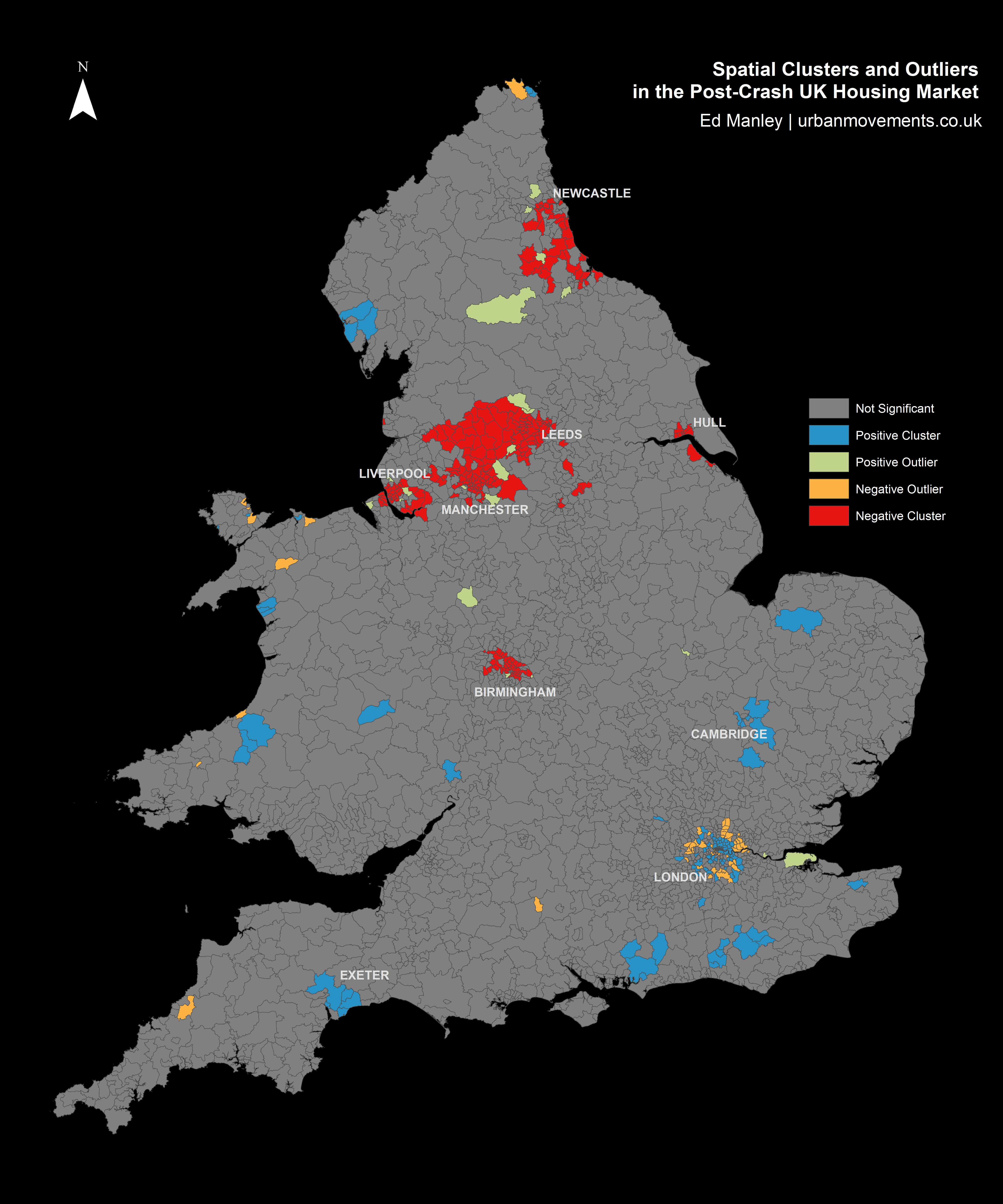
The results from the spatial clustering approach are more conclusive. Here we can immediately see some clear regionalisation of positive and negative post-crash response, that extend the trends identified within the earlier map. Interestingly, many of the northern cities are badly effected, with large negative clusters – indicative of widespread patterns of a slow post-crash response – around Manchester, Liverpool, Birmingham, Leeds, Hull and Newcastle.
Relative to these cities, London demonstrates a remarkable response, with positive clustering demonstrating that 2012 transaction levels are much closer to 2006 levels than average. Likewise, a number of towns – including Exeter, Cambridge and Chichester – demonstrate positive responses, as do rural areas in Wales, East Sussex and the Lake District.
It is revealing too to examine the outliers identified through this approach. Around the poorly performing regions between Liverpool and Leeds, a few smaller towns, including Otley, Guiseley, Bredbury and Marple, perform above and beyond local trends. Likewise, within some of these cities certain areas perform well, particular within Liverpool and Manchester city centres and suburbs (L16, L34 and M17).
Likewise, one can identify outliers with negative local performance, surrounded by wider positive trends. This pattern is most apparent around London, where despite positive spatial clustering in central and north London (around Islington, Hackney, Southwark and Greenwich), the outer suburbs do not reflect these trends. It is noticeable that relative to the wider positive patterns in London, the markets around Tottenham and Enfield in the north, Croydon in the south, Southall in the west, Barking in the east, and Bromley in the south-east, do not reflect similar trends.
These analyses provide us with some insight into the regional trends in the housing market, the next stages will examine the specific locations that have performed best and worst between the pre- and post-crash period.
Which Areas Have Fared Best?
As you might have gleaned from the map above, of the 2299 districts used within the study, very few saw an increase in transactions between 2006 and 2012. In fact, only one district saw a positive change, – that being the EC1V region in London, the area of Finsbury, between Old Street and Angel in central London, which saw a 5.47% increase. More widely, the picture was very much different, with the mean percentage change in transactions between the two years being -48.13%, with a mode percentage change of -50%. As such, in assessing the areas which performed well across the period, we shift our perspective to looking at which areas performed least badly.
The table below presents the top 20 districts with the lowest percentage reductions in transaction volumes between 2006 and 2012. At this stage, to control for small numbers, only those regions with 25 or more transactions in either 2006 or 2012 are considered.
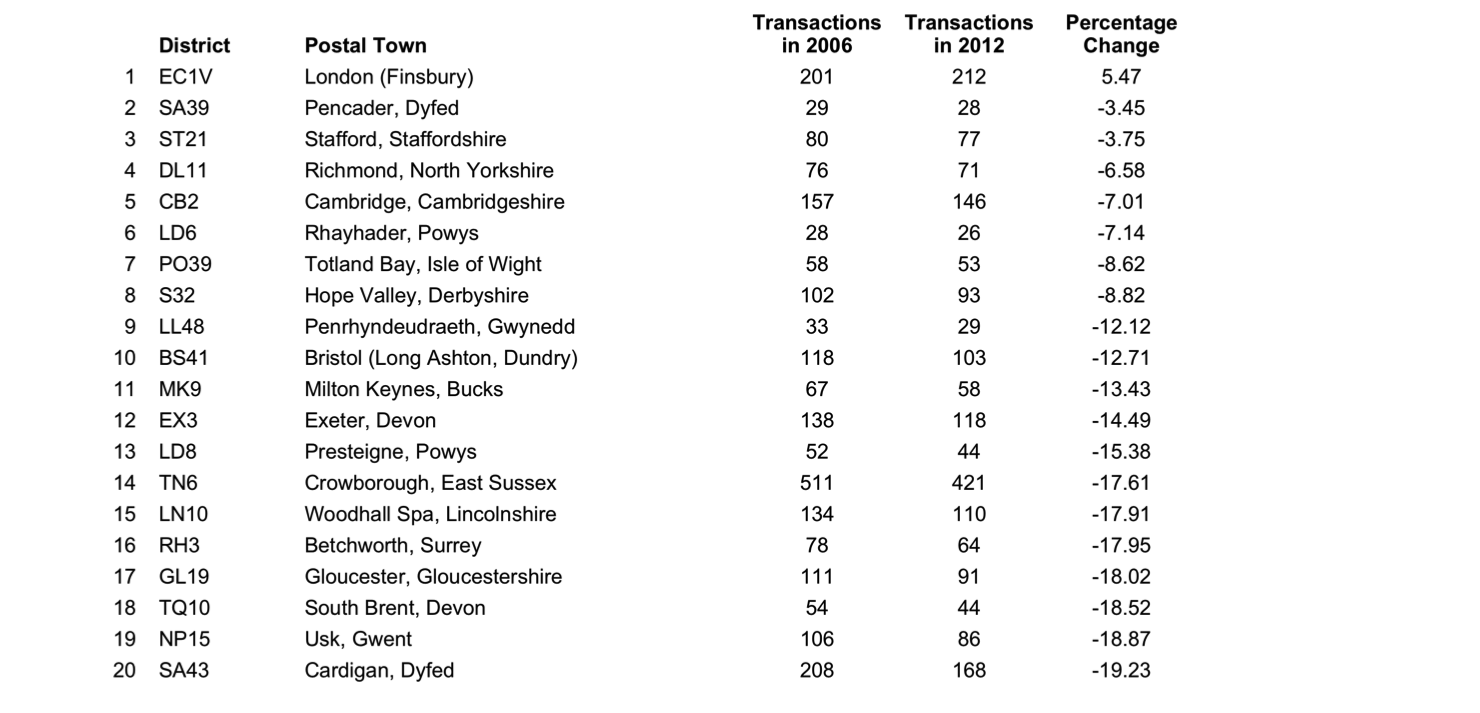
The list represents an interesting mix of urban and rural locations. On one hand, areas of London, Cambridge, Bristol, Milton Keynes, and Exeter are indicative of a market remaining relatively buoyant within certain areas towns and cities. Yet, the majority of locations within the top 20 are found in the agricultural lands of Wales, the Peak District, North Yorkshire, and the South. Wales demonstrates surprising resilience during the period, with 6 of the 20 best performing regions found in here.
Which Areas Have Fared Worst?
Like that above, we can look at the other end of the scale. This table shows the 20 lowest ranking locations based on the changes in the local market between 2006 and 2012.
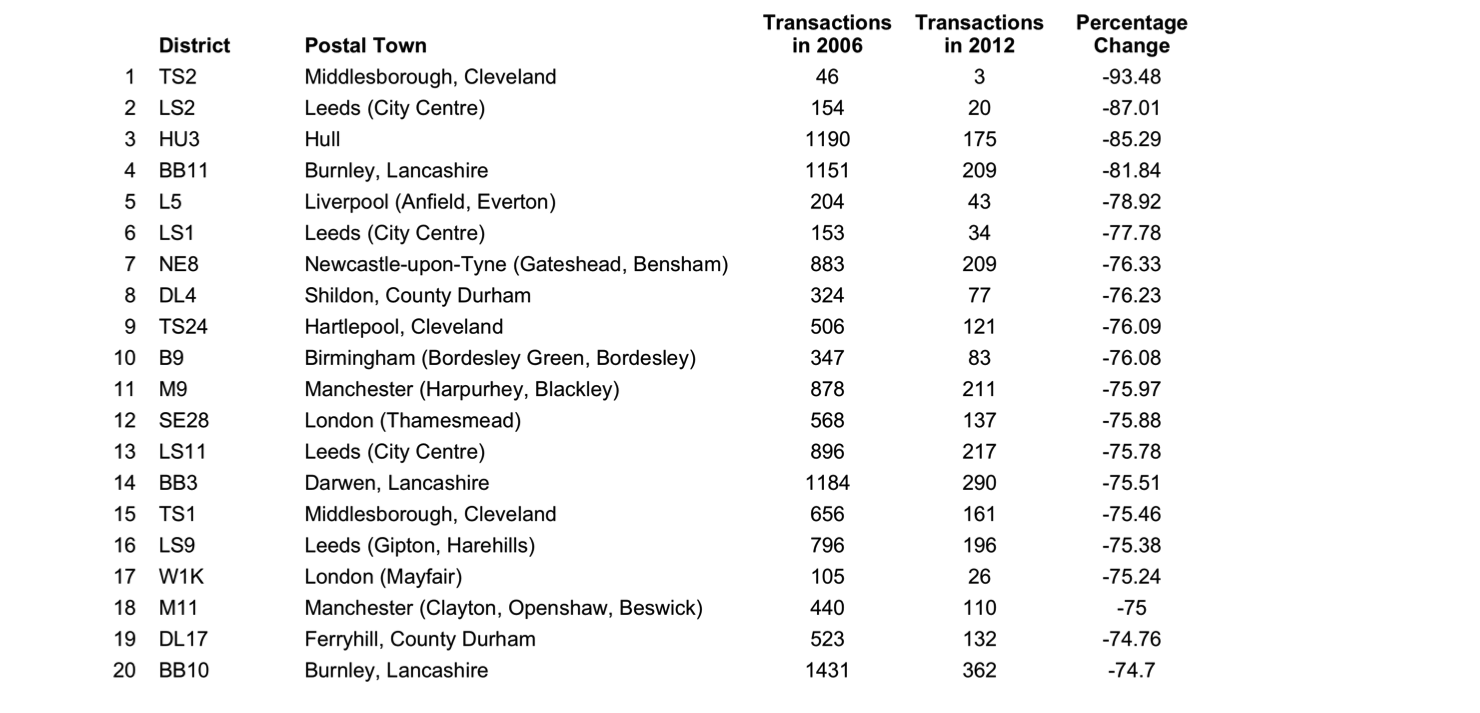
These results reflect the patterns observed from the spatial clustering earlier, with poorly performing areas demonstrably more concentrated in urban areas in the north of England. Particularly badly affected appear to be the large cities of Leeds, Manchester, Newcastle and Liverpool, although smaller northern towns – including Middlesborough, Burnley, Darwen, and Hartlepool – feature too. In some cases, around Hull and Burnley in particular, the transaction count dropped dramatically between 2006 and 2012.
These results offer further indication that some urban areas saw a larger, sharper turn down in housing market activity after the crash than that experienced in other regions.
What Does All Of This Mean?
In conducting this kind of analysis, it is very difficult to track down the absolute causation behind any correlation. Intrinsic to the housing transaction market are a range of external elements relating to housing supply, changing demographics and wider economic influences. In, furthermore, taking only a time slice between two years, we limit our ability to identify the rate of change across different areas of the country.
Nevertheless, this relatively simple methodology has provided some insight into the spatial variation with which the housing market is returning to pre-crash levels. It is clear that some areas are still a long way from the levels of activity experienced prior to the crash, while others are now beginning to return to the activity observed back in 2006. The worst affected are the urban areas near to many of England’s major cities, many of which are vastly less active relative to pre-crash levels. In direct contrast are the more positive bounce backs indicated in city centre regions, most widely observed across London, but in parts of Liverpool and Manchester too.
The impact on towns is another interesting findings that can be drawn from this analysis. While some relatively isolated towns – including Cambridge, Exeter and Chichester – are some of the best performing locations, those towns near to larger urban centres – such as Burnley, Hartlepool and some outer London suburbs – are some of the worst affected areas. There is an indication of the dependent nature of locations on larger urban hubs, and so too the fragility of these regions in times of crisis. In contrast, a quicker return to pre-crash activity is observed in towns that appear to possess a more established local economy, being less dependent on regional hubs.
It is interesting to contrast the negative performance around urban areas with those demonstrated in more rural regions. Some of the regions performing closest to their 2006 levels are found in rural areas of Wales, the Peak District and North Yorkshire. While the levels of transactions may not be spectacular compared to urban areas, there is a suggestion that, like isolated towns, perhaps given the nature of employment and the economy in these regions, they are better insulated from the downturn observed in the wider economy.
This work represents the first exploratory steps in examining patterns of spatial variation in the housing market transactions. Any comments or thoughts on this work are welcome.
A very insightful post with some thorough research. It’s quite shocking when you look at it. Although, hasn’t the northern part of the country always come out worse with the property market? It may be too general to say. I think to say that the correlations will always differ slightly as the housing market is always changing. I think demographic is a huge contributing factor. How long will it take for the housing market to revert back to its pre-crash self? The next step will be deciding what action to take based on the findings.