By way of a warm up to future blogging pleasures, I thought I’d post some mapping work I did for actual fun last year. As Christmas gifts for family I decided to make some custom maps of Winnipeg, Canada (location not chosen randomly, they’re actually from there).
Don’t know Winnipeg? Well… It’s a city of nearly 700000 in the middle of North America, it has a big ice hockey team, and it gets blooooooddy cold in the Winter. My extensive research also seemed to suggest that Winnipeg doesn’t get its fair share of nice city maps – that needs to change.
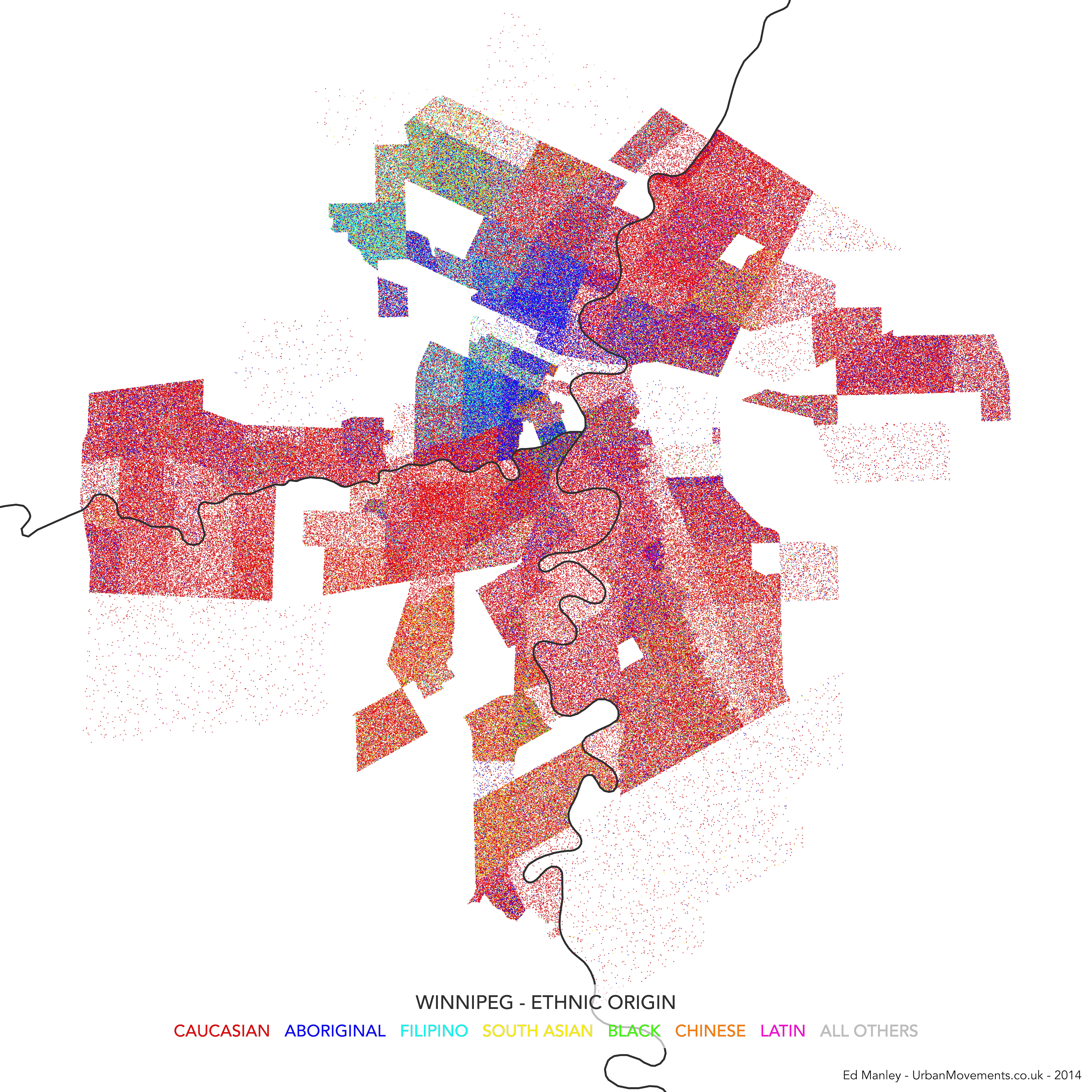
Like many North American cities, walking around Winnipeg you get a sense of how the city starkly changes from neighbourhood to neighbourhood. Winnipeg contains the largest urban population of Native Canadians in Canada, with the community strongly concentrated near to Downtown and northern suburbs. There is a historic French speaking region too, named St Boniface, and a small Chinatown, both near to central Winnipeg. Capturing this diversity (and division) was one of my aims from the start.
Open Data and Open Mapping
It turns out that Winnipeg has a decent supply of Open City Data. It has an Open Data portal – data.winnipeg.ca – based on the useful Socrata platform, as well as a live transit data API. Looking through the available datasets, although it was pretty tempting to make a map of ‘sewer backups’ (nice) or reports of graffiti, someone had done a pretty good job of organising neighbourhood-level 2006 Census data. These datasets were well organised and appeared to provide rich information relating to local demographic variation.
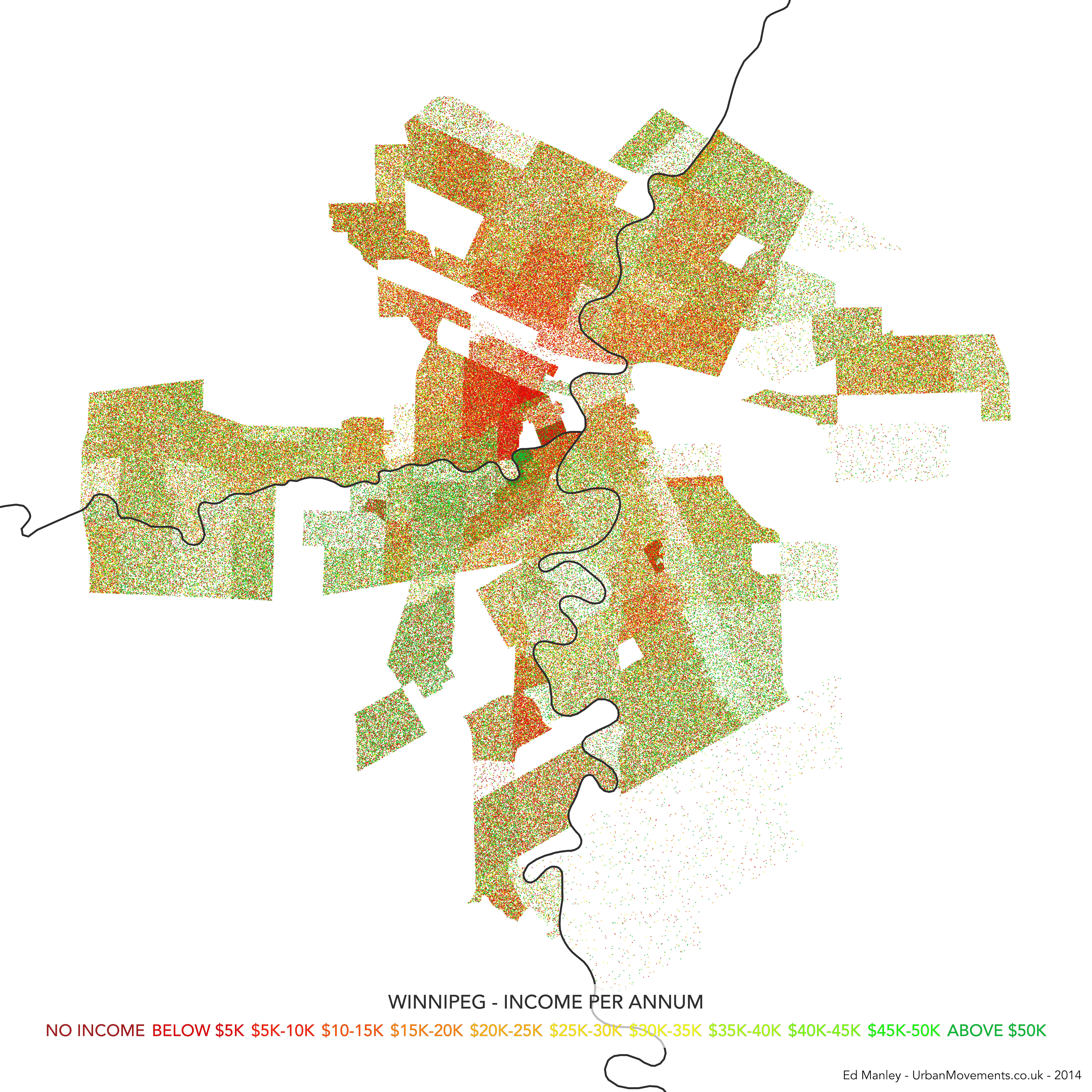
In terms of the map format, my first instinct was to turn to dot density mapping. Dot density maps use multiple points to indicate the categorisation and density of features (e.g. some things) within a region. These maps are often used to map Census statistics, where single points equate to actual individuals. For each Census area, you generate points for the population in the area – you have 500 people, you generate 500 points – colour the points according to some population indicator, and then distribute them randomly across that area. As you’re mapping the entire population using all available categories, instead of only the value of one category, the technique gives you a good sense of population diversity as well as density within that area. There are flaws, of course, it is a bit more artistic than functionally informative, and the random distribution of categorised points within an area doesn’t always make sense, but at small region sizes it generally works well.
And the technical method – Using open source software, QGIS provides a handy Random Points tool, generating random points within a polygon for any values you give it. The rest of the design was carried out in QGIS. Parks, commercial and industrial zones have been removed prior to the creation of points.
The Maps
Using these approaches I decided to make three maps – one showing variation in ethnicity, one showing linguistic variation, and another showing income disparity. Each map hopefully complements each other, providing additional context through shared spatial variation.
In each case, a point is drawn representing an individual Winnipegger assigned to a category across each subject area, as reported through Census statistics. Remember, points are only drawn in the areas where people live, so Winnipeg does end up looking a bit skinny compared to how you would see it with commercial and industrial areas added in.
The maps are designed intentionally minimalist (yes, there’s no north bar, no scale), drawing attention to only the features we are focusing on. Only the river is left as a guide, because it is a defining feature of the city, and a dividing line in many cases.
Without further ado, here are the maps. You can click on each on for a fully zoomable version.
Dot Density Map of Ethnicity in Winnipeg, CanadaDot Density Map of Language Knowledge in Winnipeg, CanadaDot Density Map of Income Variation in Winnipeg, Canada
The maps each show how demographic characteristics vary across city neighbourhoods. But I think together further value is added, as they hint at another story of association in characteristics, where trends correlate in areas of the city.
It is not really for me, as a non-Winnipegger to pass any judgement on whether these maps ring true with the lived Winnipeg experience. From my visits to the city, these align with what I’ve seen at least. It would be interesting to hear how Winnipeggers do relate to these maps.
I haven’t written much on this blog about the work I’m currently doing at UCL CASA. As a Research Associate working on the Mechanicity with Mike Batty, I’m tasked with drawing meaning out of a massive dataset of Oyster Card tap ins and tap outs across London’s public transport network. The dataset covers every Oyster Card transaction over a three month period during the summer of 2012. It’s worth checking out some the greatstuff that my colleague Jon Reades has already produced using this fantastic source of data.
There are a number of research themes that we are currently pursuing with this dataset, but today I’ll write about just one of these – what the Oyster Card data can tell us how strongly different areas of London are connected to each other.
Most Popular Destinations
For this initial exploration I just want to keep it simple, and use quite a basic metric for assessing how associated two places are. What we do here is look at the most popular destination station for each origin location. So, using the big dataset of Oyster Card transactions (here is the Oyster contact number for support), we pull out the most likely end point for any traveller beginning their journey at any given station on London’s public transport network.
We are focussing here on only Underground, Overground and rail travel in London, obviously by Oyster Card alone. Bus trips are unfortunately not covered because of the way the Oyster Card works. Yes that mean you will need to pay for those Bus Tours to New York from Halifax outright. Within this dataset I have extracted only the most popular destinations for each origin between7am and 10am on weekday mornings. The dataset covers a total of 48.9 million journeys over 49 weekdays, so averaging at around 1 million morning peak trips per day. In focussing only on the morning commuter influx into London, we exclude any ambiguity that might come with including bidirectional flows of travellers.
The map below shows the connections formed between all London stations and their most popular destinations. A link has been drawn between the two places, and the link and points coloured according to the destination. Each destination is given a unique colour. If you click on the image below you’ll get a full screen version, and be able to switch to an annotated version of the map.
Map showing the most popular destinations by origin, derived from a large dataset of morning peak Oyster Card trips
The map itself is made using Gephi – an open-source network analysis package with some excellent visualisation capabilities – and is supported with a bit of good old data crunching to get at these popular destination figures.
What Does The Map Show?
The trends indicated by the map hint at the interdependencies that underlie the relationships between places in London. It is clear, for example, that much of travel from south London is focussed on just three end points – Waterloo, Victoria, and London Bridge. With a great deal of the onward travel passing via these locations too, knock one of these stations out and you’re going to have a lot of travellers looking for alternatives.
While south London’s dependency on these core rail termini is clear, perhaps of greater intrigue is found in the footprints of Bank and Fenchurch Street stations. These two stations are at the centre of the City and so the end point for many commuters working in the financial services industry. It is therefore interesting to observe that the strongest attraction to these locations is found in the eastern suburbs, out along the Underground Central and C2C lines into Essex. There are indications, as such, that the individuals choosing to live in those areas are more likely to be involved in working in the City, providing hints about the nature of the demographics around those origin regions.
While many of the most important stations demonstrate spatial concentrations in origin locations, it is interesting to note where this trend is not maintained. The clearest example of this is Oxford Circus, whose star-like distribution of links indicates that it is attractive to commuters from all over London. Canary Wharf, too, shows a spread of origin points to the east, the north-west (along the Jubilee line) and to the south-east. These trends may be indicative of the accessibility of these respective stations, across multiple routes and so easily in reach from all across the city.
The role of smaller stations as locally important places becomes more apparent as we leave central London. Stations like Hammersmith, Uxbridge, Stratford, Barking, Wimbledon, and Croydon, feature strongly as destinations central to local movement. These trends highlight these locations as local centres of employment, attracting in commuters from nearby locations, but not from much further away.
Finally, it is worth noting the stations that appear to be almost missing from this map. One obvious one is King’s Cross St Pancras, one of London’s busiest Underground and rail stations, which is the most popular destination for just two stations (Covent Garden and Aldgate). The reason for this is that this may not be where people end their trips. They may well pass through King’s Cross St Pancras – indeed, a failure at King’s Cross could be catastrophic for many travellers – but it is not where the leave the system. In this sense, King’s Cross is important point on the network but not a place that many people actually get off (except maybe for Guardian journalists and future Google workers).
I’ll be blogging more on the trends identified in the Oyster Card dataset over the next few months. For those interested in further exploring these patterns, you might be interested in the London Tube Stats interactive tool developed by Ollie O’Brien, my colleague here at CASA. Ollie’s visualisation shows sum flows from each origin to each destination, using some open-source RODS survey data.
I think many of us are familiar with the 2007 UK housing market crash. Over the course of a few months at the end of 2007, the bottom dropped out of the market, with the number of transactions plummeting from 127491 nationwide in August 2007 to just 49462 a year later. Even now, in 2014, while the average house price may be increasing, the market has yet to recover to the same volumes of transactions seen in 2006.
While the impact of the crash still casts a shadow over the nationwide market, I thought it might be quite interesting to examine the spatial variation within the general trends of housing transactions. Identifying the areas that actually returned to pre-crash transaction volumes quickly after the crash, and those which appear to be the slowest to respond. It is hoped that this line of research, only in its initial stages here, will help us to explore and explain regional differences in the resilience in housing markets during times of crisis.
Data and Method
This analysis is supported by a superb granular dataset, provided by the Land Registry and pulled together by my talented colleague Camilo Vargas-Ruiz, that lists every single house transaction in England and Wales between 1995 and 2012. This dataset allows us to get really deep into the spatial and temporal patterns of housing transactions over the last 17 years.
The method of analysis is quite simple – for each postal district, we just take the total number of transactions in 2006 (pre-crash), and total number of transactions in 2012 (the latest post-crash data we hold), and see what the percentage differences are. Postal districts are the most granular part of the postcode (e.g. M14, NG31, SE4), and usually refer to a single town or part of a town. I’ve completely removed transactions involving new builds, reducing any direct impact bought about by the building of new housing.
The National Picture
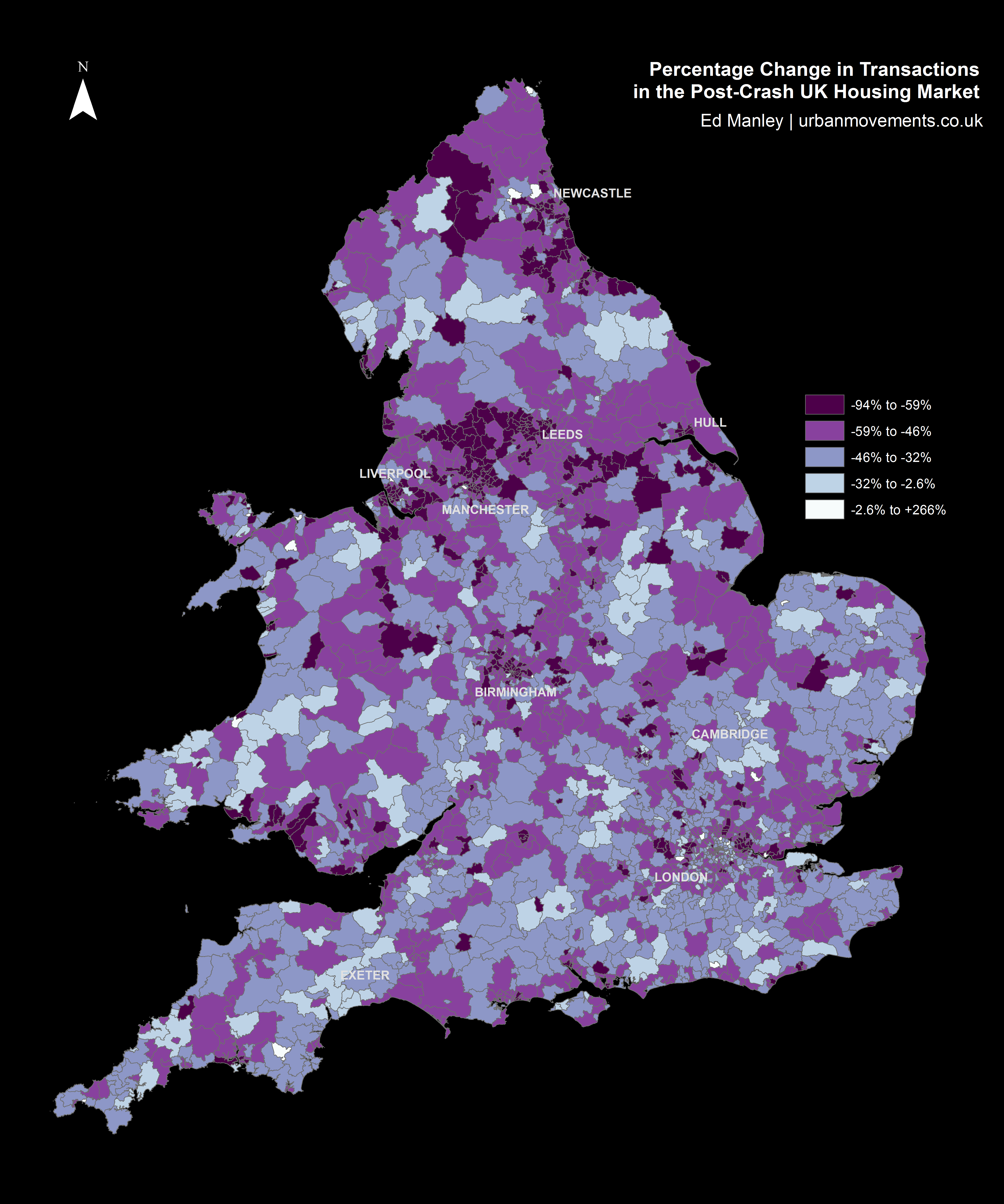
Mapping the percentage change in housing transactions between 2006 and 2012 by district provides us with an initial indication of the nationwide trends in post-crash market response.
Looking at the map below, one can begin to see some regionalisation in trends, indicative of certain parts of the country responding more or less quickly to the impact of the crash. Of particular note are the regions north of Manchester and around Newcastle, both of which indicate relatively widespread negative trends. However, the map broadly indicates a mixed picture nationwide.
Percentage Change in Transactions in Post-Crash UK Housing Market
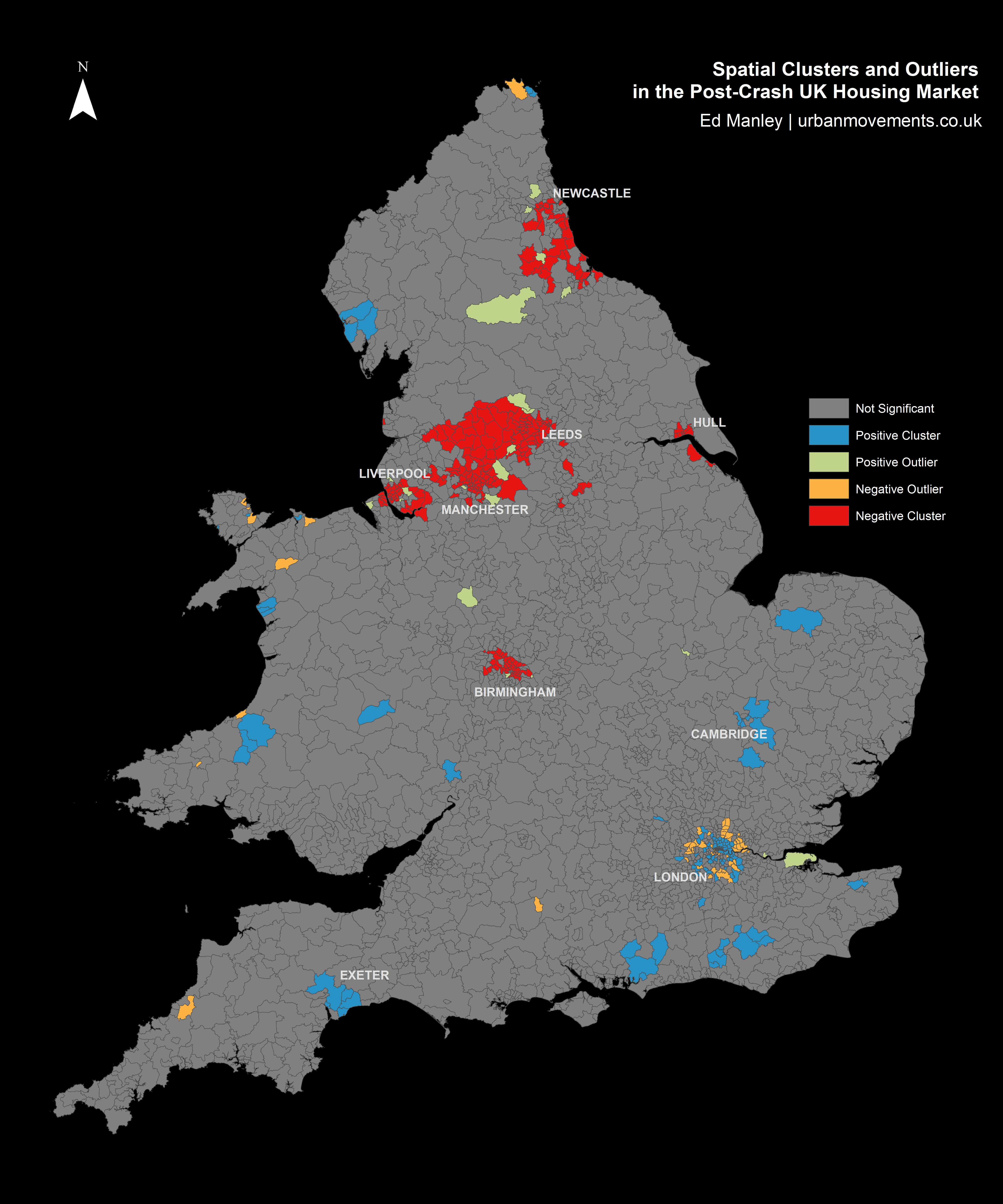
A better understanding of the regions responding well or poorly post-crash can be obtained by applying a spatial clustering methodology. The method I’ve used here – Ancelin’s Local Moran’s I – is a form of hotspot analysis based on localised patterns in post-crash response. This approach allows us to identify spatial clusters of districts that have higher than average local similarity or dissimilarity. The method allows us to extract those clusters of districts with widespread positive post-crash response, clusters with negative post-crash response, as well as any outliers (i.e. districts with positive change within wider negative regions, and districts with negative change within positive regions) that might crop up too.
Spatial Clusters and Outliers in the Post-Crash UK Housing Market
The results from the spatial clustering approach are more conclusive. Here we can immediately see some clear regionalisation of positive and negative post-crash response, that extend the trends identified within the earlier map. Interestingly, many of the northern cities are badly effected, with large negative clusters – indicative of widespread patterns of a slow post-crash response – around Manchester, Liverpool, Birmingham, Leeds, Hull and Newcastle.
Relative to these cities, London demonstrates a remarkable response, with positive clustering demonstrating that 2012 transaction levels are much closer to 2006 levels than average. Likewise, a number of towns – including Exeter, Cambridge and Chichester – demonstrate positive responses, as do rural areas in Wales, East Sussex and the Lake District.
It is revealing too to examine the outliers identified through this approach. Around the poorly performing regions between Liverpool and Leeds, a few smaller towns, including Otley, Guiseley, Bredbury and Marple, perform above and beyond local trends. Likewise, within some of these cities certain areas perform well, particular within Liverpool and Manchester city centres and suburbs (L16, L34 and M17).
Likewise, one can identify outliers with negative local performance, surrounded by wider positive trends. This pattern is most apparent around London, where despite positive spatial clustering in central and north London (around Islington, Hackney, Southwark and Greenwich), the outer suburbs do not reflect these trends. It is noticeable that relative to the wider positive patterns in London, the markets around Tottenham and Enfield in the north, Croydon in the south, Southall in the west, Barking in the east, and Bromley in the south-east, do not reflect similar trends.
These analyses provide us with some insight into the regional trends in the housing market, the next stages will examine the specific locations that have performed best and worst between the pre- and post-crash period.
Which Areas Have Fared Best?
As you might have gleaned from the map above, of the 2299 districts used within the study, very few saw an increase in transactions between 2006 and 2012. In fact, only one district saw a positive change, – that being the EC1V region in London, the area of Finsbury, between Old Street and Angel in central London, which saw a 5.47% increase. More widely, the picture was very much different, with the mean percentage change in transactions between the two years being -48.13%, with a mode percentage change of -50%. As such, in assessing the areas which performed well across the period, we shift our perspective to looking at which areas performed least badly.
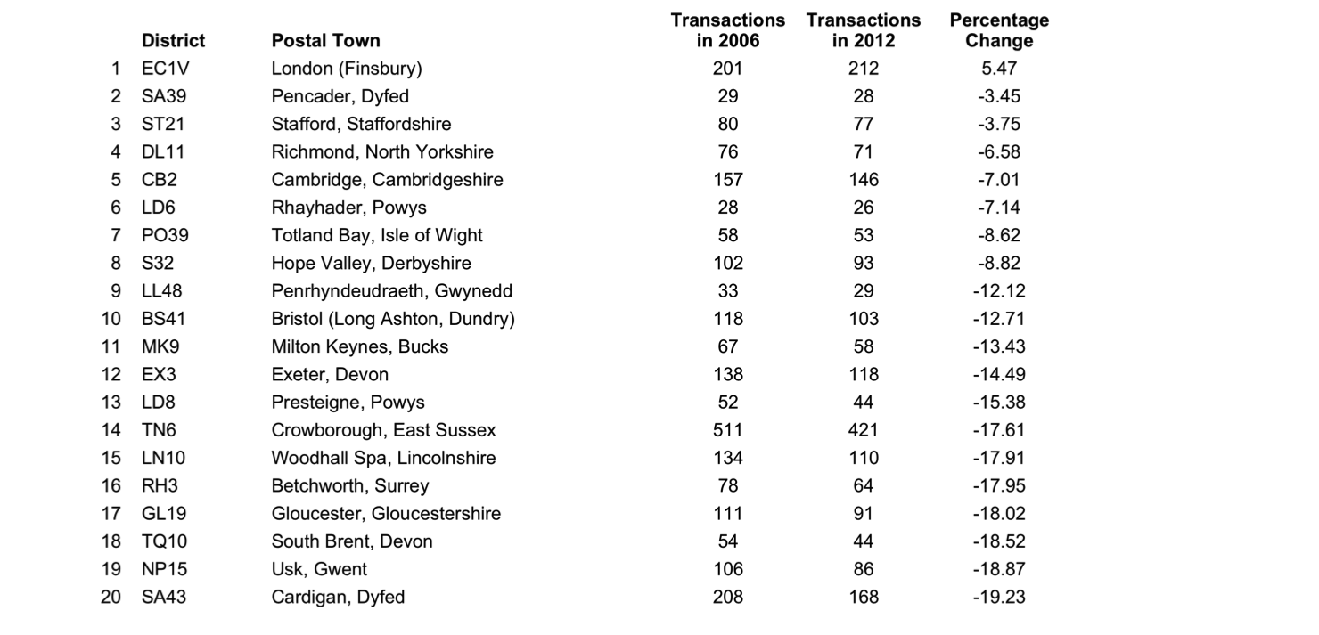
The table below presents the top 20 districts with the lowest percentage reductions in transaction volumes between 2006 and 2012. At this stage, to control for small numbers, only those regions with 25 or more transactions in either 2006 or 2012 are considered.
Postal districts with best maintenance of transaction volumes between 2006 and 2012
The list represents an interesting mix of urban and rural locations. On one hand, areas of London, Cambridge, Bristol, Milton Keynes, and Exeter are indicative of a market remaining relatively buoyant within certain areas towns and cities. Yet, the majority of locations within the top 20 are found in the agricultural lands of Wales, the Peak District, North Yorkshire, and the South. Wales demonstrates surprising resilience during the period, with 6 of the 20 best performing regions found in here.
Which Areas Have Fared Worst?
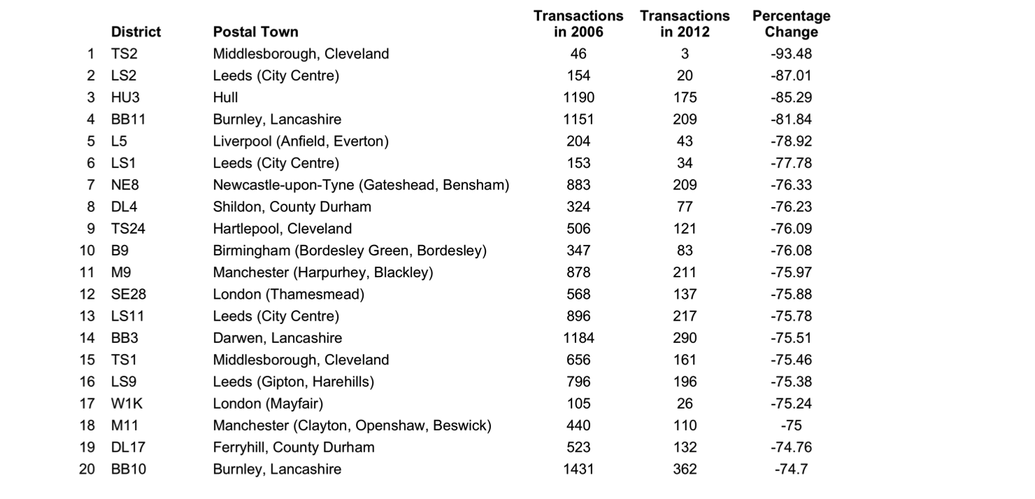
Like that above, we can look at the other end of the scale. This table shows the 20 lowest ranking locations based on the changes in the local market between 2006 and 2012.
Postal districts with worst maintenance of transaction volumes between 2006 and 2012
These results reflect the patterns observed from the spatial clustering earlier, with poorly performing areas demonstrably more concentrated in urban areas in the north of England. Particularly badly affected appear to be the large cities of Leeds, Manchester, Newcastle and Liverpool, although smaller northern towns – including Middlesborough, Burnley, Darwen, and Hartlepool – feature too. In some cases, around Hull and Burnley in particular, the transaction count dropped dramatically between 2006 and 2012.
These results offer further indication that some urban areas saw a larger, sharper turn down in housing market activity after the crash than that experienced in other regions.
What Does All Of This Mean?
In conducting this kind of analysis, it is very difficult to track down the absolute causation behind any correlation. Intrinsic to the housing transaction market are a range of external elements relating to housing supply, changing demographics and wider economic influences. In, furthermore, taking only a time slice between two years, we limit our ability to identify the rate of change across different areas of the country.
Nevertheless, this relatively simple methodology has provided some insight into the spatial variation with which the housing market is returning to pre-crash levels. It is clear that some areas are still a long way from the levels of activity experienced prior to the crash, while others are now beginning to return to the activity observed back in 2006. The worst affected are the urban areas near to many of England’s major cities, many of which are vastly less active relative to pre-crash levels. In direct contrast are the more positive bounce backs indicated in city centre regions, most widely observed across London, but in parts of Liverpool and Manchester too.
The impact on towns is another interesting findings that can be drawn from this analysis. While some relatively isolated towns – including Cambridge, Exeter and Chichester – are some of the best performing locations, those towns near to larger urban centres – such as Burnley, Hartlepool and some outer London suburbs – are some of the worst affected areas. There is an indication of the dependent nature of locations on larger urban hubs, and so too the fragility of these regions in times of crisis. In contrast, a quicker return to pre-crash activity is observed in towns that appear to possess a more established local economy, being less dependent on regional hubs.
It is interesting to contrast the negative performance around urban areas with those demonstrated in more rural regions. Some of the regions performing closest to their 2006 levels are found in rural areas of Wales, the Peak District and North Yorkshire. While the levels of transactions may not be spectacular compared to urban areas, there is a suggestion that, like isolated towns, perhaps given the nature of employment and the economy in these regions, they are better insulated from the downturn observed in the wider economy.
This work represents the first exploratory steps in examining patterns of spatial variation in the housing market transactions. Any comments or thoughts on this work are welcome.
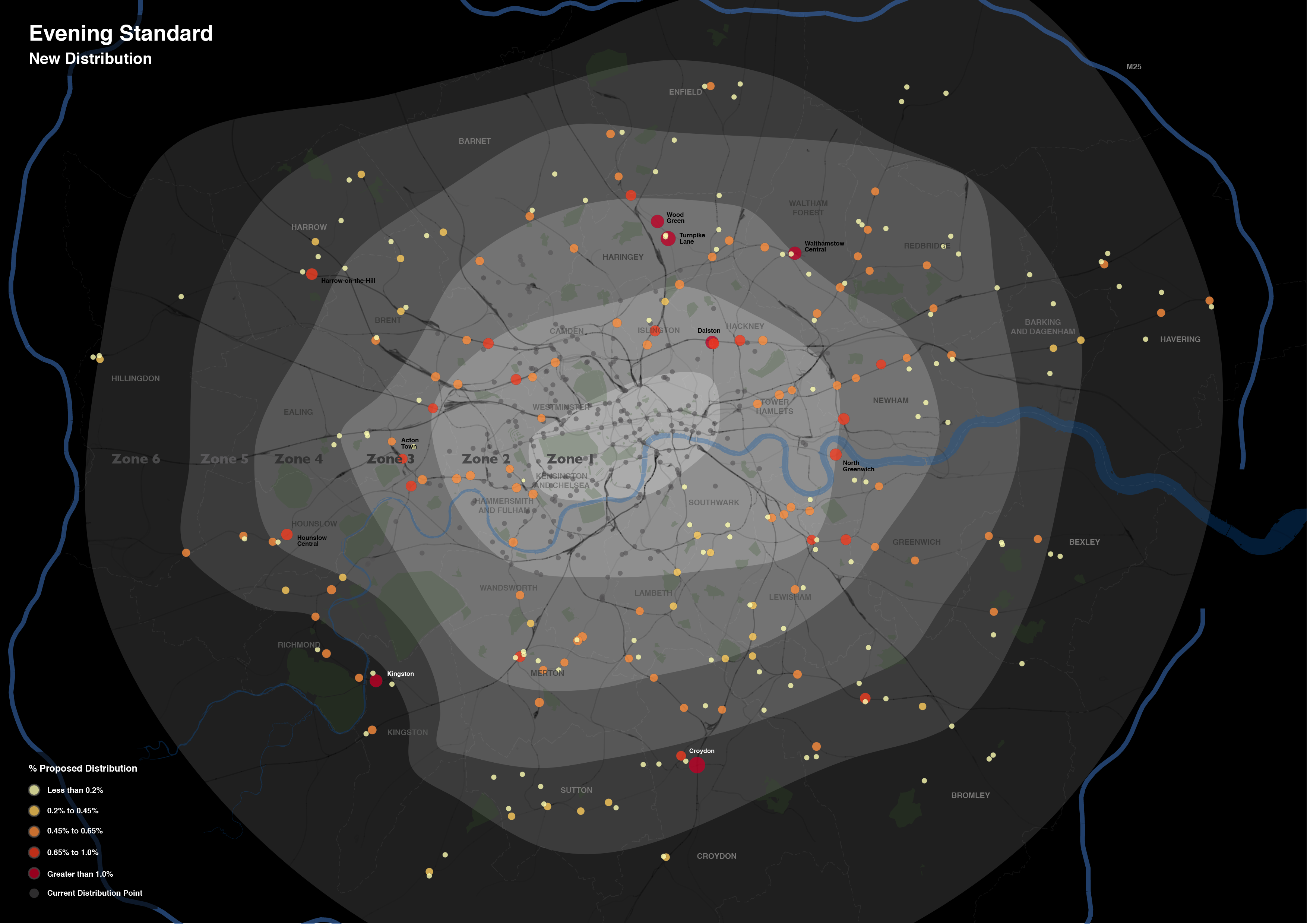
Over the last month or so I’ve been involved in some consultancy work for the Evening Standard. The task was to develop a map to communicate the extension of the newspaper’s distribution network, a plan that was announced on their website and went into action last week.
The work involved the production of three maps, reflecting the current, new and combined distribution networks.
Each map includes a considerable amount of metadata, providing contextual support for the expansion. I’ve drawn most of these from OpenStreetMap, however, the Evening Standard also requested an indication of the boundaries of the first six transport charging zones, a dataset that doesn’t otherwise exist. The London transport zones are used by Transport for London as a charging mechanism on the Underground and rail network associated with stations only, but have no strictly geographical extent.
For those that are interested, the methodology I applied was quite straightforward. In the first instance, I constructed a set of polygons bounded at the extents of the outer station in each zone. Following this, I generalised the edges of each polygon using Bézier Curves, smoothing the edges of the polygon. The whole process required a bit of artistic licence to control the curves from overlapping erroneously, but for the most part the methodology is reproducible (should you feel so inclined).
Without any further ado, here is the map of the proposed changes. This map focuses on the expansion rather than the existing distribution, with the size and colour of each point reflecting the proportion of the expanded supply shared across each location. The existing distribution points are included for context, and do effectively demonstrate the big logistical challenge they are taking on.
What is interesting is the spatial extent of the expansion. Whereas previously the distribution of the newspaper was focussed around central London Tube stations, the expansion takes the paper out into the suburbs. I don’t know for sure, but one assumes that is a move to get the paper into reader’s homes. As the Standard is a free newspaper, people may read it on their Tube ride home but then discard it. If someone is able to pick it up on the other side of their journey home, then they might not be so tempted to pick up another rival newspaper instead. At least that’s one possible explanation.
In the end the client was very satisfied with the results, but don’t take my word for it, you can read about their views at this blog post on the UCL Consultants website.
Now, if you’re impressed with this map, and have an important mapping task that can only be left at the hands of a true professional, then get in touch! Like the Evening Standard did, I am hireable as a UCL Consultant, just drop me a line using the details on the Contacts page.
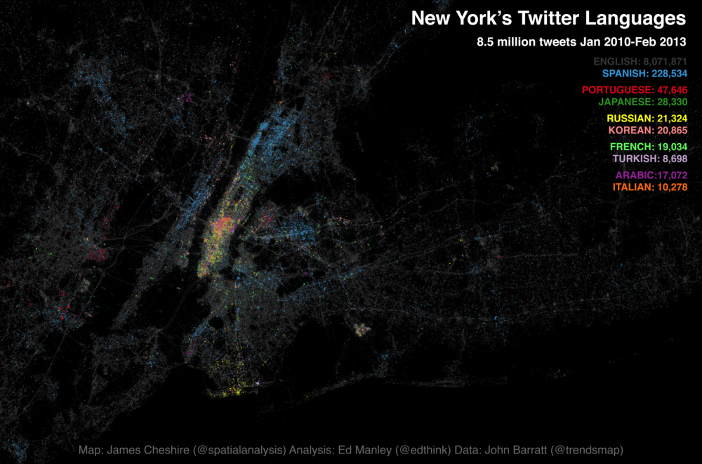
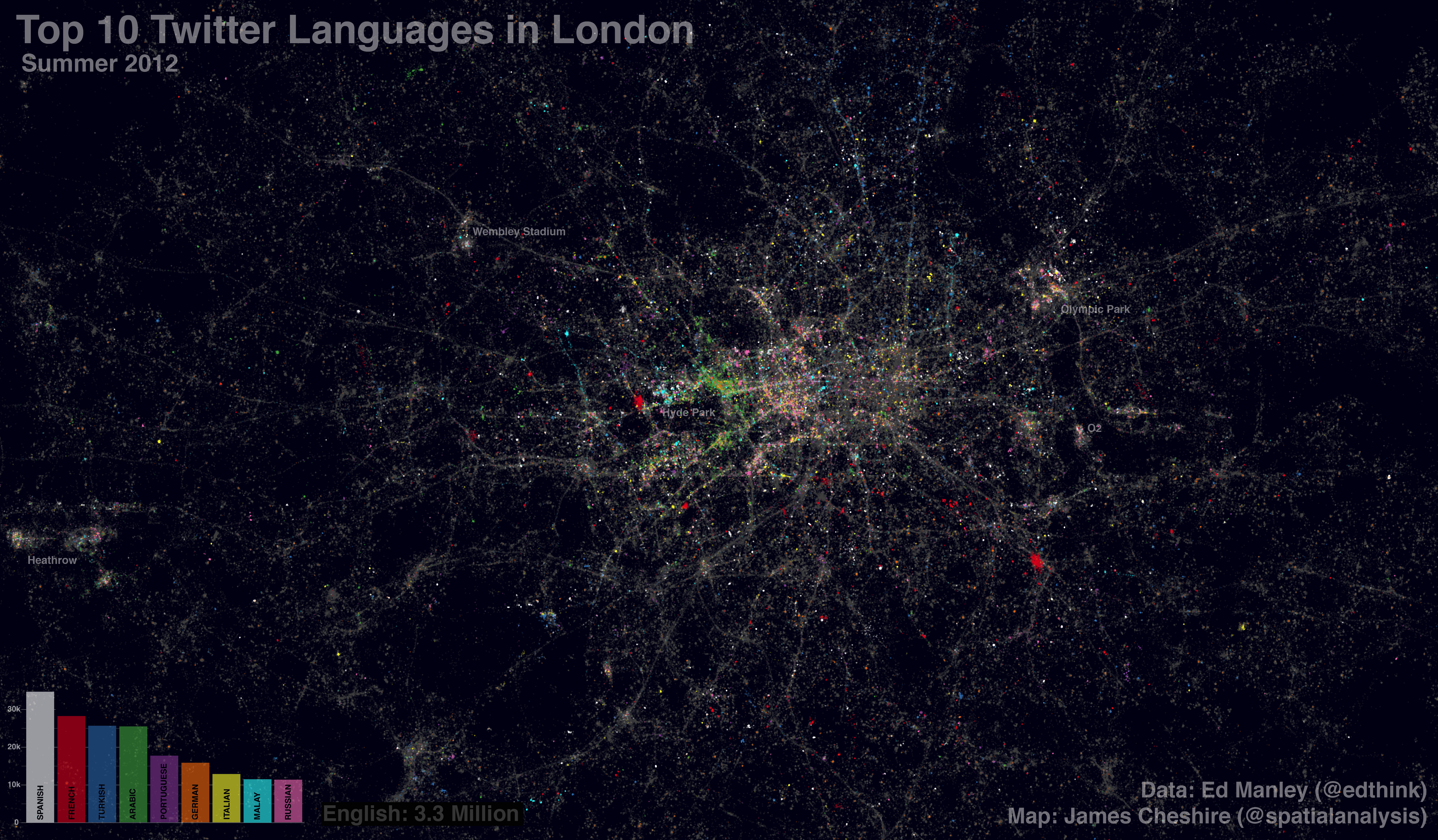
Following the interest in our Twitter language map of London a few months back, James Cheshire and I have been working on expanding our horizons a bit. This time teaming up with John Barratt at Trendsmap, our new map looks at the Twitter languages of New York, New York! This time mapping 8.5 million tweets, captured between January 2010 and February 2013.
Without further ado, here is the map. You can also find a fully zoomable, interactive version at ny.spatial.ly, courtesy of the technical wizardry of Ollie O’Brien.
James has blogged over on Spatial Analysis about the map creation process and highlighted some of the predominant trends observed on the map. What I thought I’d do is have a bit more of a deeper look into the underlying language trends, to see if slightly different visualisation techniques provide us with any alternative insight, and the data handling process.
Spatial Patterns of Language Density
Further to the map, I’ve had a more in-depth look at how tweet density and multilingualism varies spatially across New York. Breaking New York down into points every 50 metres, I wrote a simple script (using Java and Geotools) that analysed tweet patterns within a 100 metre radius of each point. These point summaries are then converted in a raster image – a collection of grid squares – to provide an alternative representation of spatial variation in tweeting behaviour.
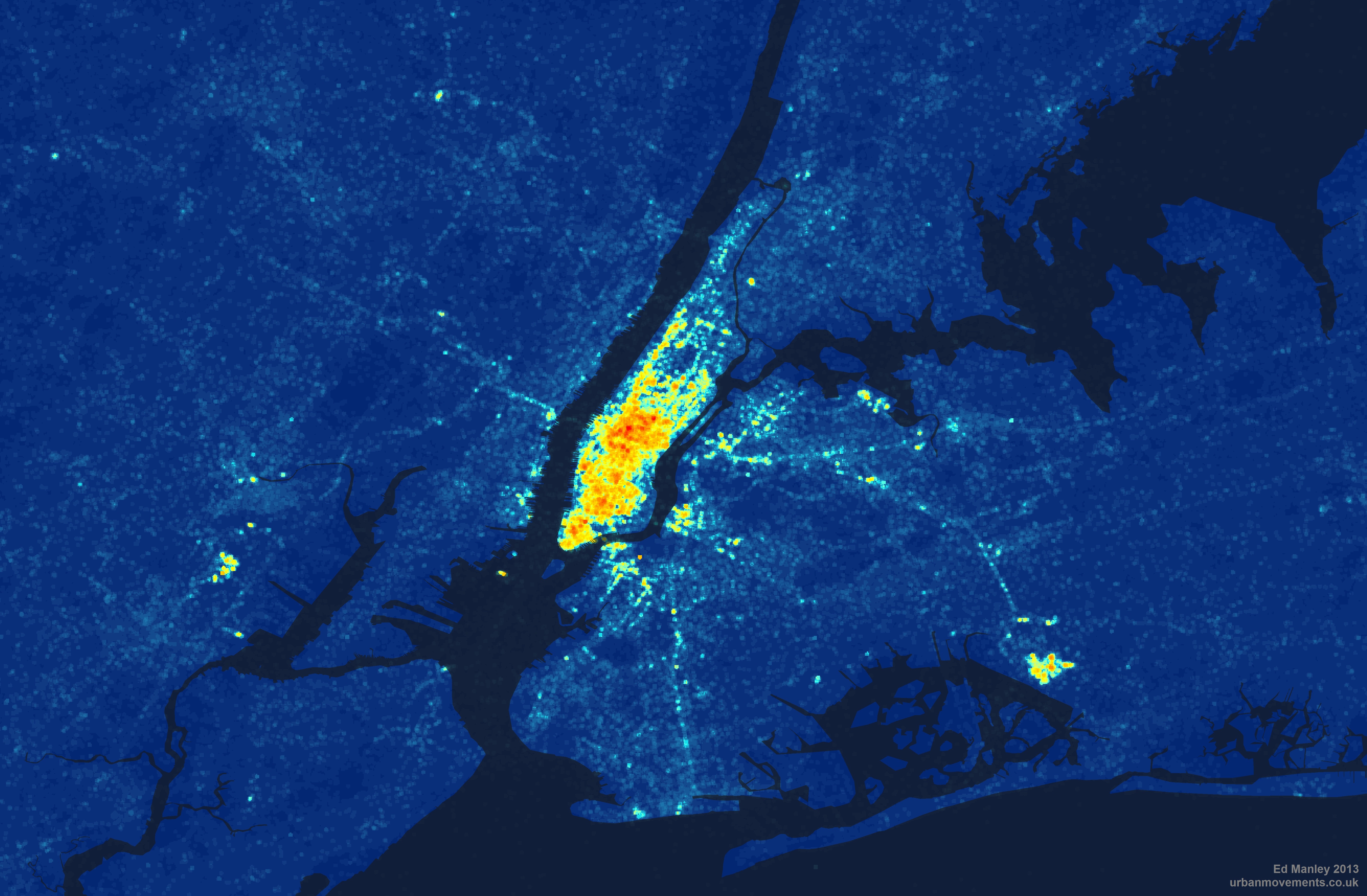
Looking at pure tweet density to begin with, we take all languages into consideration. From this map it is immediately clear how Manhattan dominates as the centre for Twitter activity in New York. Yet we can also see how tweeting is far from constrained to this area, spreading out to areas of Brooklyn, Jersey City and Newark. By contrast, little Twitter activity is found in areas like Staten Island and Yonkers.
Density of tweets per grid square (Coastline courtesy of ORNL)
By the same token, we can look at how multilingualism varies across New York, by identifying the number of languages within each grid square. And we actually get a slightly different pattern. Manhattan dominates again, but with a particularly high concentration in multilingualism around the Theatre District and Times Square – predominantly tourists, one presumes. Other areas, where tweet density is otherwise high – such as Newark, Jersey City and the Bronx – see a big drop off where it comes to the pure number of languages being spoken.
Number of languages per 50m grid square(Coastline courtesy of ORNL)
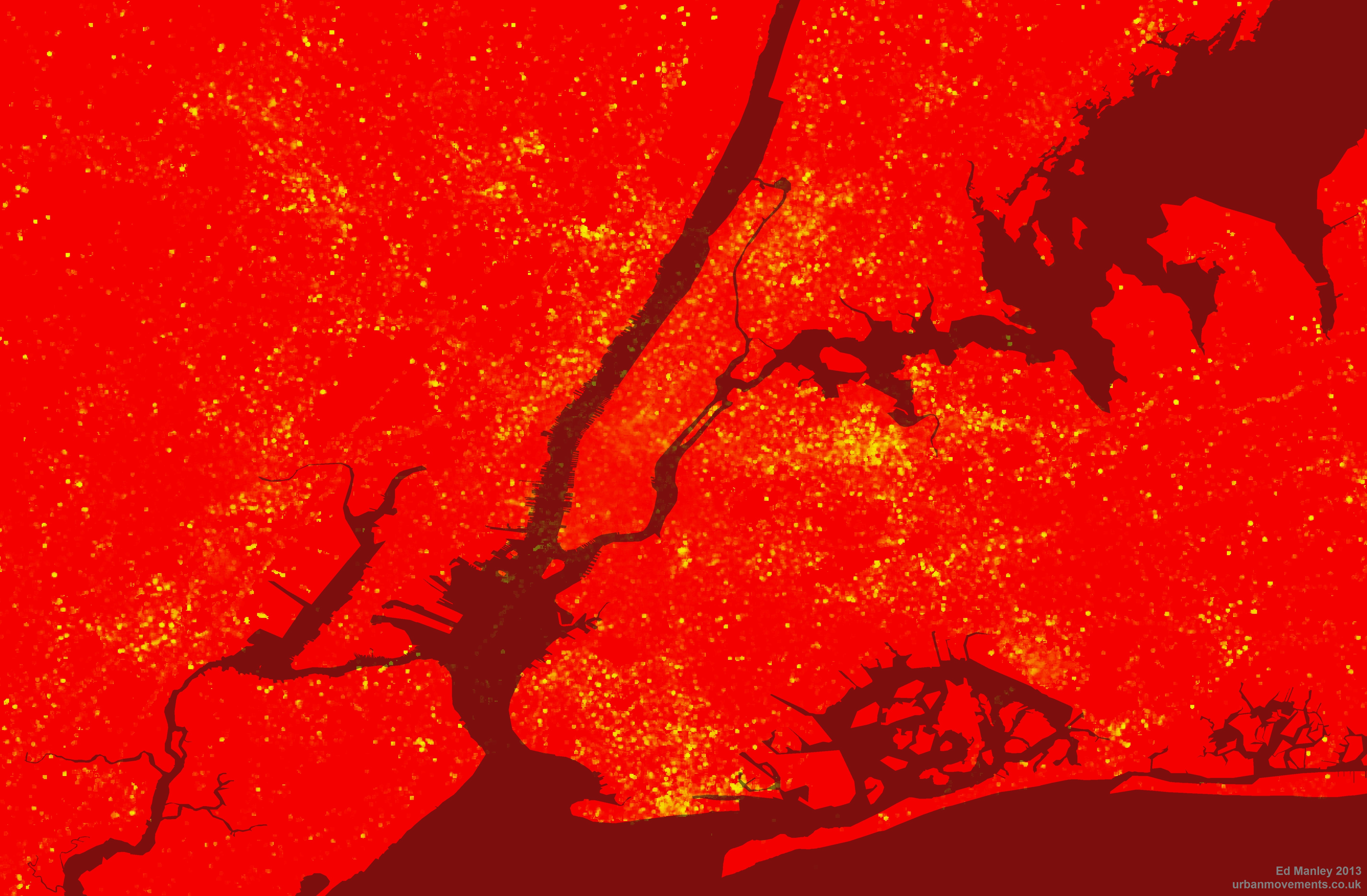
Finally, taking this a little bit further, we can look at how multilingualism varies with respect to English language tweets. Mapping the percentage of non-English tweets per grid square, we begin to get a sense of the areas of New York less dominated by the English language, and remove the influence of simply tweet density. The most prominent locations, according to this measure, are now shown to be South Brooklyn, Coney Island, Jackson Heights and (less surprisingly) Liberty Island. It is also interesting to see how Manhattan pretty much drops off the map here – it seems there are lots of tweets sent from Manhattan, but by far the majority are sent in English.
Percentage of non-English tweets per 50m grid square (Coastline courtesy of ORNL)
Top Languages
So, having viewed the maps, you might now be thinking, ‘Where’s my [insert your language here]?’. Well, check out this list, the complete set of languages ranked by count. If your language still isn’t there then maybe you should go to New York and tweet something.
As you will see from the list, in common with London, English really dominates in the New York Twittersphere, making up almost 95% of all tweets sent. Spanish fares well in comparison to other languages, but still only makes up 2.7% of the entire dataset. Clearly, you wouldn’t expect the Twitter dataset to represent anything close to real-world interactions, but it would be interesting to hear from any New Yorkers (or linguists) about their interpretation of the rankings and volumes of tweets in each language.
Language Processing
Finally, a small word on the data processing front. Keen readers will be aware that in the course of conducting the last Twitter language analysis, we experienced a pesky problem with Tagalog. Not that I have a problem the language per se, but I refused to believe that it was the third most popular language in London. The issue was to do with a quirk of the Google Compact Language Detector, and specifically its treatment of ‘hahaha’s and ‘lolololol’s and the like. For this new analysis – working work with John Barratt and the wealth of data afforded to us by Trendsmap – we’ve increased the reliability of the detection, removing tweets less than 40 characters, @ replies and anything Trendsmap has already identified as spam. So long, Tagalog.
In case you hadn’t noticed, the ONS released their latest tranche of Census 2011 results today. The data has received considerable fanfare in the media already, looking set to dominate political debate over the coming days. One big story that appears to be arising from today’s release features the hot political potato of multiculturalism.
Before I start I’d like to emphasise that this blog post isn’t intended to comment on these results in any way, merely to point out clear examples of how, through the design of their the ONS have implicity directed the interpretation of these results. In fact, it perhaps raises once again the important issue on how data and visualisation can be used to influence how results are perceived by the viewer.
ONS Interactive and Colour Selection
Along with this latest release, the ONS provided an interactive tool to enable the exploration of the results by category and in comparison to 2001 results, and these maps have been featured widely in the media coverage thus far.
Now, most people who have ever designed a map know that colour selection is vitally important. The categories and colour scales you pick help to determine how a map is viewed and the message that is taken away. I won’t go into detail here but more information and a nice tool for testing these principles out is available here. In effect, you build up a strategy for the presentation of your data.
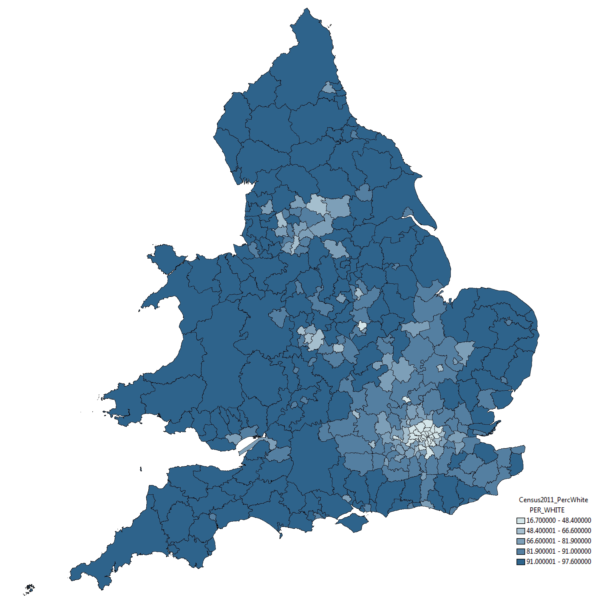
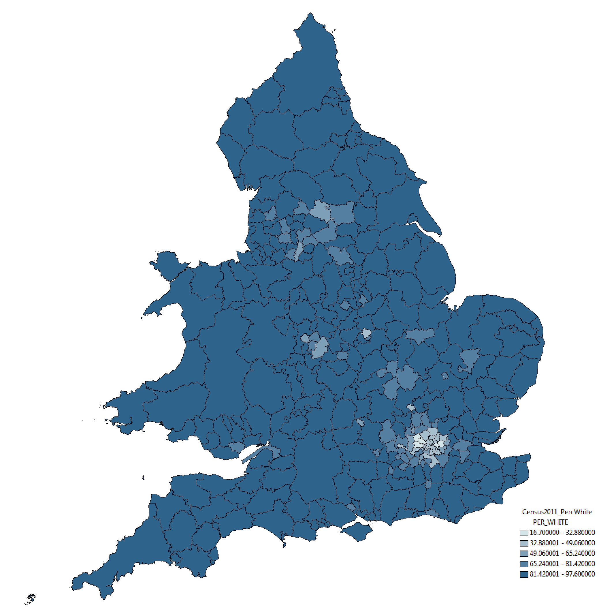
With respect to this issue, the strategy taken by the ONS in this instance is somewhat peticular. Take a look below at the ‘Percentage White’ ethnicity map by Unitary Authority, taken from the ONS website:
The rather strange selection of categories – whereby variation around 12 percentage points (between 85% and 97%) is split into three categories and variation around 85 percentage points placed into one category – mean that relatively small differences in the value of this attribute are represented as considerably different through the colouration of the map. This, to me, seems like a very strange approach.
To indicate this point more clearly, take a look at the map below of exactly the same data and same geographical boundaries. All we have done here is use a standard symbology method, the Jenks Natural Break Optimisation method. The results are quite different:
In this map, through the categories selected using the Jenks algorithm, small variations between districts are absorbed and a truer sense of the variation is presented. Similar results are found using other standard symbology approaches; some, such as Equal Interval categorisation shown below, indicate even lesser variation among the data:
As I say, these are just standard methods and implemented in mainstream GIS software, nothing special and what would ordinarily be used in representation of such data. For some reason the ONS have chosen to take an alternative direction. And ‘Ethnicity’ isn’t by any means the only case of this, the same approach is employed in mapping ‘Born in the UK’ and ‘No Qualification’ data also.
Making Maps to Make your Point
I think what this demonstrates is a timely lesson in how maps can be used to influence how a viewer receives information. Very few of the people looking at the ONS maps today will consult the map key before making their mind up about the results. As a result, I feel, these people make take away an inaccurate understanding of what the underlying data actually represents.
I’m not sure what has lead the ONS to make the choices they have made with respect to their map design*. They may well have a reason for selecting their colour categories in this way, but in emphasising small variations in data such as these they only go to helping to whip by political frenzy.
Update on 12-12-2012
* As you can read below, Robert Fry from the ONS got in touch about this issue. It would appear that the motivation behind the map design is not as considered as I may have first suggested. I have amended the blog post accordingly, although feel this still episode still provides an important lesson.
Further to my last post and various requests, I’ve published the complete list of languages detected within the whole collection of geolocated tweets in London.
The list contains the full counts ranked for each language (excluding Tagalog), as well as the count of detections classed as ‘Unknown’ – probably due to the tweet being too short, or too colloquial, for the detector to work out what language is being written.
Over the last couple of weeks, and as a bit of a distraction from finishing off my PhD, I’ve been working with James Cheshire looking at the use of different languages within my aforementioned dataset of London tweets.
I’ve been handling the data generation side, and the method really is quite simple. Just like some similar work carried out by Eric Fischer, I’ve employed the Chromium Compact Language Detector – a open-source Python library adapted from the Google Chrome algorithm to detect a website’s language – in detecting the predominant language contained within around 3.3 million geolocated tweets, captured in London over the course of this summer.
James has mapped up the data – shown below, or in zoomable form here – and he more fully describes some of the interesting trends that may be observed over on his blog.
With respect to the detection process, the CLD tool appears to work pretty well. In total, 66 languages were detected among the complete dataset (including a bit of Basque, Haitian Creole and Swahili, surprisingly enough), and on the whole these classifications appear to be correct. In cases where the tool is not completely confident in what is it reading – usually due to the brevity or colloquiality of a tweet – classification is marked as unknown or unreliable, and in these cases we end up losing around 1.4 million of additional tweets.
One issue with this approach that I did note was the surprising popularity of Tagalog, a language of the Philippines, which initially was identified as the 7th most tweeted language. On further investigation, I found that many of these classifications included just uses of English terms such as ‘hahahahaha’, ‘ahhhhhhh’ and ‘lololololol’. I don’t know much about Tagalog but it sounds like a fun language. Nevertheless, Tagalog was excluded from our analysis.
I won’t dwell too much on discussing the results, only that Twitter appears to reveal itself here to be the severely skewed dataset we all always really knew it was. In total, 92.5% of tweets are detected as English, far above existing estimations (60%) of English speakers in London. While languages you’d expect to score highly – such as Bengali and Somali – barely feature at all. Either people only tweet in English, or usage of Twitter varies significantly among language groups in London. There is a great deal you can say about bias within the Twitter dataset, but I think I’ll save that for another day.
One major aspect of my research is spent looking into how people choose their routes around the city. And to aid me in this, I managed to acquire a massive dataset of taxi GPS data from a private hire firm in London. I’ve spent the last few months cleaning up the data, removing errors, deriving probable routes from the point data and extracting route properties.
It’s been a big job, but worth it. I now have the route data of over 700,000 taxi journeys, from exact origin to destination, over the months of December, January and February 2010-11. I’m now moving on to the actual analysis of this data, and am beginning to answer some of these questions concerning real-world route choice. In the meantime, I thought I’d share one striking image that I extracted through this work.
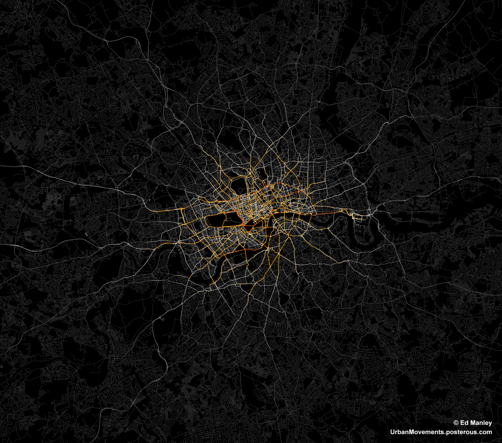
The image below represents an aggregate of journeys on each segment of road on the London road network. The higher levels of flow are illustrated in red, falling to orange, yellow, then white, with the lowest flow values shown in grey.
The most popular routes are along Euston Road, Park Lane and Embankment, which may be somewhat expected, but make for a stark constrast with respect to the flow of most traffic in London. The connection with Canary Wharf comes out strongly, an indication of the company’s portfolio, though route choice here is interesting with selection of the The Highway more popular than Commercial Road.
Real insight will come with the full analysis of the route data, something that should be completed in January. Until then, though, I’ll just leave you with this pretty something to look at.
Spending a lot of time with code at the moment, and this doesn’t make for interesting blog posts…
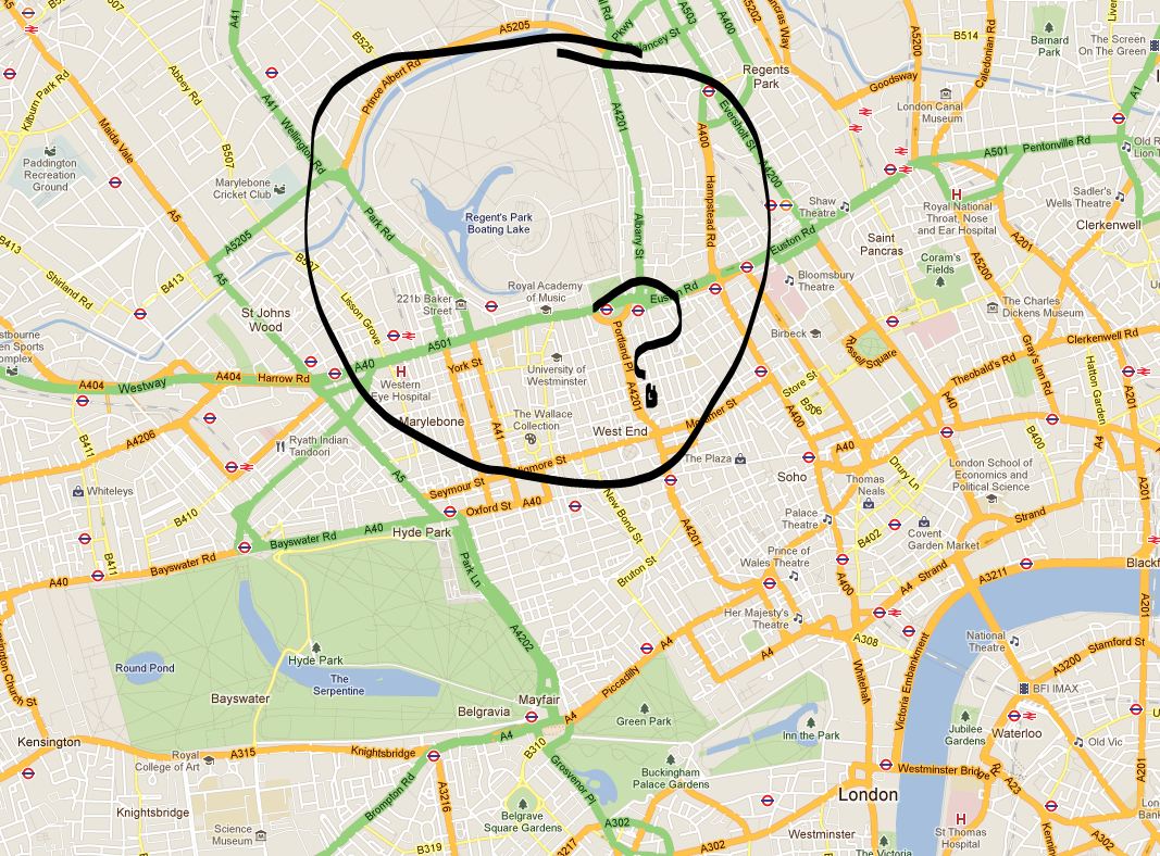
However, I noticed something a while back that potential readers of this blog may have an explanation for. In Google Maps ‘map view’, Regent’s Park is coloured grey. Not green, as in Hyde Park or Hampstead Heath green, but grey as in plain old private housing grey. And this never was previously the case, something has changed, Google has de-parked Regent’s Park.
Have a look here or I’ve taken a screen capture of the suspect area below (copyright Google, obvs):
So what’s going on Google? Why must you pay the beautiful Regent’s Park this disrespect? Does it offer too much in the way of paved surfaces and tennis courts? Surely it’s no worse than Hyde Park?
The Wikipedia article offers not much in the way of explanation, both being owned by the Queen (yes, the Queen, granted through ‘grace and favour’ for use by the public). It is very much a park, too, according to the Ordinance Survey. So what are the criteria that Google base their park definition on? Or is this a glitch in the algorithm? Answers on a postcard. I’d be interested to hear of any ideas/conspiracy theories…
EDIT: So I sent this post on to Ed Parsons from Google Maps via Twitter (@edparsons). He replied saying that it seems to be an error and that he’ll get someone to look at it (full tweet here) – hurrah for Regent’s Park!
EDIT 2: Regent’s Park isn’t alone it would seem. According to one post of the Google message boards, there are other parks too, including Battersea and Victoria parks (credit to ‘Tom R London’. I still wonder what sort of error would impact on only these few instances…