I’m very excited to report the publishing of our new book on Agent-based Modelling and Geographic Information Science in January 2019!
Co-authored with Andrew Crooks, Nick Malleson, and Alison Heppenstall, the book aims to provide a broad and practical overview of building spatial agent-based models. It includes a vast set of example models, written in NetLogo, as well as teaching and tutorial materials. All of these materials are provided open source along side the book at our accompanying website – abmgis.org.
We think the book covers a lot of ground, and should certainly provide a good primer for those starting off in spatial agent-based modelling. It also contains a brilliant foreword from Prof Mike Batty, which contextualises where we have come from and where we going with agent-based modelling.
It seems life and work is less than compatible with #content generation for this blog, so ‘why don’t I just’, I figure, ‘write a short piece about the research I have been doing in all this time’. I also figured this was a good idea, so here is the first in what I’m going to tentatively call a series of short descriptions of recent publications I have been involved with.
Disclaimer: I think transportation studies, at the risk of vastly overgeneralising matters, is a bit too interested with measuring ‘usual’ conditions. I can’t blame people who do that sort of research – we are still suffering with strained transportation systems, congested, crowded, and polluted, that are damaging to economies, to health, and wellbeing. But in focusing too much on ‘usual’ patterns, we miss the effect of disruption and rapid change, and once we start considering those, maybe there is no ‘usual’ after all.
This particular piece of research focused on the spatial and temporal appearance of ‘usual’ and ‘unusual’ travel behaviour on the London public transport system. Through a long-term collaboration with Transport for London we analysed around 1 billion Oyster Card transactions, and constructed patterns of ‘usual’ travel behaviour at the (anonymous) individual scale. These ‘usual’ patterns of behaviour are constructed through a simple DBSCAN clustering of data points over space and time, with these clusters indicative of regular activity. We make a simple assumption that if a person appears at this space and time on a regular basis (as defined by the clustering algorithm), then that is a ‘usual’ activity for that individual. Most importantly, perhaps, the classification of ‘usual’ activity at an individual scale, allows us to identify spatial and temporal occurrence of ‘unusual’ activity. This differentiation enables us to understand travel behaviour from a different point of view.
There are various findings from this work, and these can be better explored in the paper itself, but here are a few highlights.
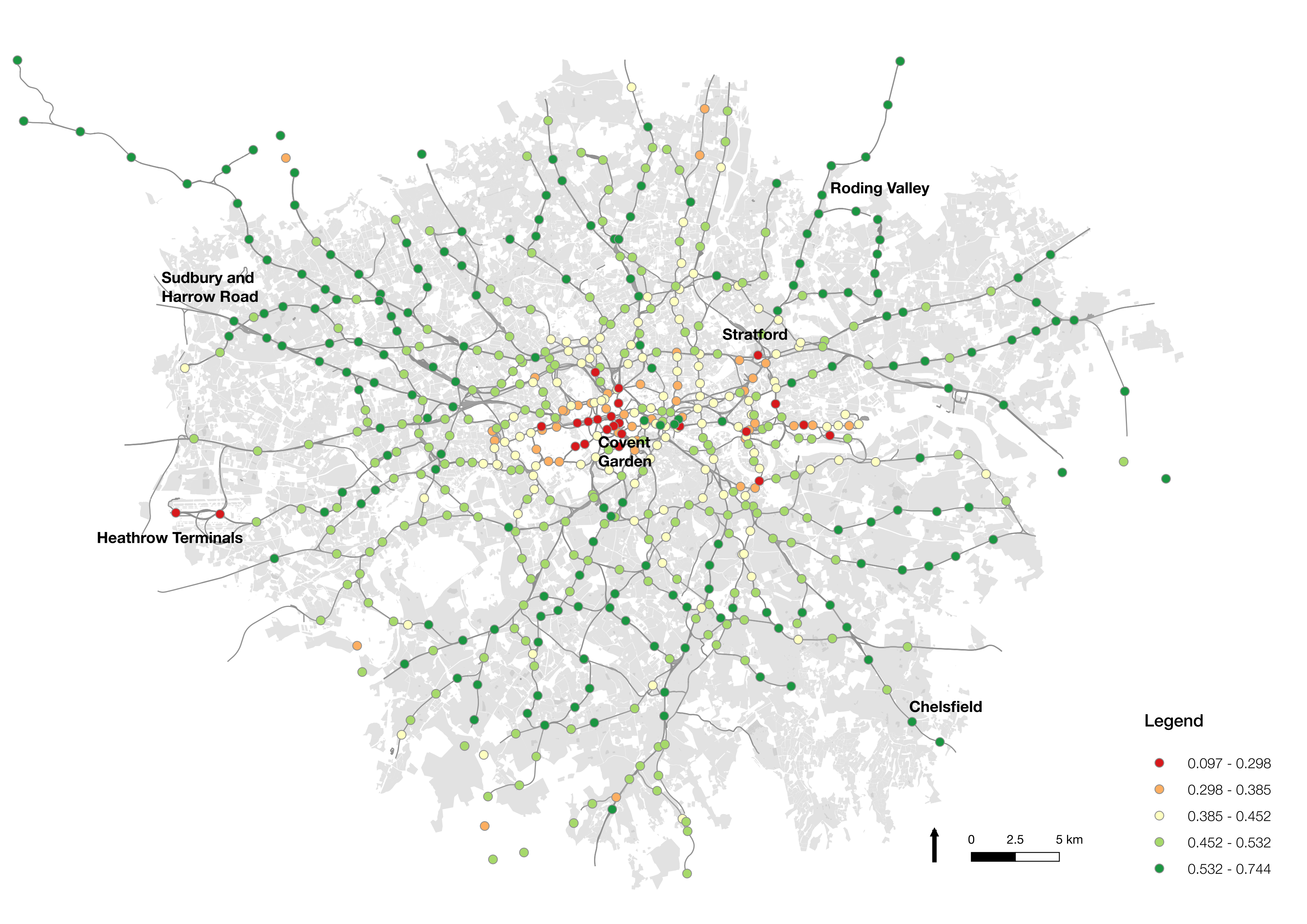
For me the most interesting snapshot is the spatial variation in ‘usual’ Underground journeys. The maps show us proportions of ‘usual’ journeys occurring in each Underground station, relative to ‘unusual’ journeys. And, in fact, we see quite a lot of variation in this behaviour. Commuter belt zones in outer London, such as Sudbury and Roding Valley, demonstrate high proportions (55% to 75%) of regular journeys. This suggests that people are more regularly undertaking journeys to work from these locations, as opposed to other activity, and perhaps work in industries with strong ties to defined working hours. These areas, I would expect, have fewer attractions that lead to ad hoc journeys to be conducted there. On the opposite end of the spectrum are placed like Covent Garden, which demonstrate low levels (below 30%) of regular activity. This is in part due to these areas being full of tourist attractions, restaurants, and other reasons for trips to be conducted there at a variety of times of day. Also ranking low at the airports, Heathrow and City. This is no surprise, relatively few people work regularly at this locations, but provides us with some validation of the approach used here.
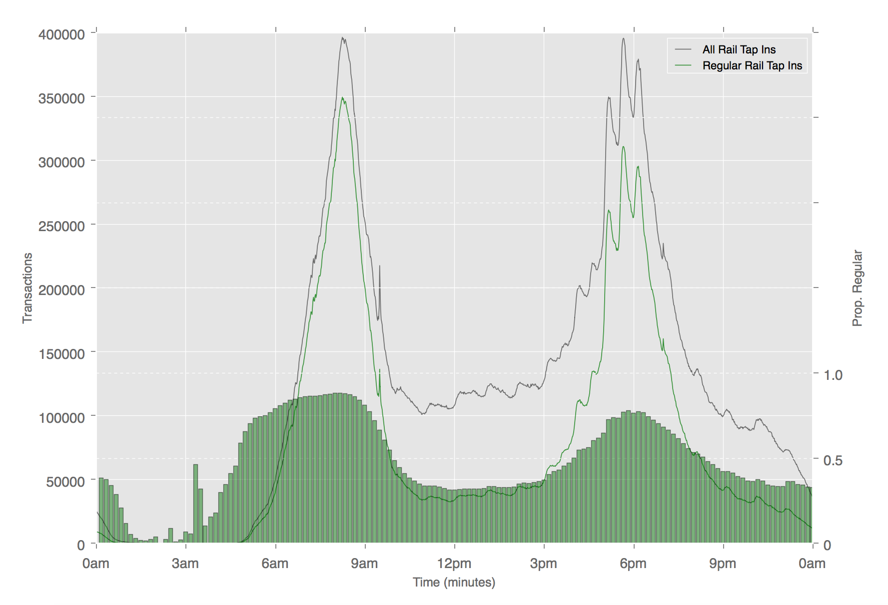
In the paper, we also explore temporal variation by different modes, exposing some quite diverse uses of different travel modes. As expected, each mode shows higher regularity during peak times, however, the extent to which ‘unusual’ travel fills that gap varies by mode. On the bus, for example, regular journeys are observed at a steady rate (around 75%) throughout the day, whereas on the Underground we see a drop to below 40% during the same period, as shown in the chart below.
There is an extent to which this work exposes some of the trends we already sort of understood. But I think this sort of analysis goes much further than this, and allows for significantly more nuance in the way we manage transportation systems. If we’re able to better understand how people are using the transportation systems at finer spatial and temporal detail, then we can potentially develop policies and management strategies that match that granularity. Through this deeper understanding, our transportation systems can build in more depth and resilience to disruption and change.
The paper was published in Transportation in 2018 (it was, err, actually completed quite a long time before that…), and is available open access from this link if you want to find out more.
As it’s been a while since I last posted, I thought I’d put up something I prepared for a Royal Society Smart Cities and Transportation workshop next week. I’ve focussed on data collected at the individual-level, and the opportunities the data present for better understanding cities, and the challenges the maximisation of these resources face. There are no doubt alternative perspectives, arguments that go deeper beyond this very short piece, and methodological issues too to contend with. Feel free to add your thoughts in the comments at the end.
As the creation, capture and accumulation of granular datasets becomes increasingly engrained within the urban environment, the potential for analysing urban processes in finer and finer detail increases. New forms of data are being generated at spatial, temporal and individual-level scales that surpass all that have gone before. These data transcend the boundaries that previously imposed on analyses of cities – traffic flow can be captured on a second-by-second basis road-by-road, crime incidents are habitually recorded with a longitude and latitude, and commuting patterns can be captured live through the movements of mobile phones. Through the development of a wealth of new methods, machine learning approaches are able to derive deeper insight from these data, revealing new patterns and understanding of cities than have been available before. It is, however, increasing granularity individual behaviours that offers the greatest promise, and poses the biggest challenges for future urban data analysis.
Data derived insights around the individual offer a chance to better understand the behavioural heterogeneity within the population across a range of domains, as well as revealing the complex interconnectivity of urban systems. Capturing these details at finer level could allow us to better measure and model cities, allowing us to improve our current conceptions on how we understand, manage and organise our cities.
The opportunities presented by individual-level analyses are plentiful. Longitudinal data allow us to learn how individuals adjust behaviour over different periods of time and under different conditions, and how they adapt to longer-term changes to the city. Within domains such as transportation, conventional models lack strong behavioural insights, failing to capture behavioural heterogeneity or measure how individual experiences and perceptions influence behaviour. The new lessons we can potentially learn from these data can not only aid our longer term models of urban futures, but contribute towards our management of cities on a day-to-day basis.
The individual-oriented nature of these analyses are able to transcend disciplinary boundaries through which cities have previously been understood and managed. At present, we lack a deep knowledge around the integration of different urban systems, and the influence of the urban realm upon these connections. We might, for example, be interested in the influence of travel on shopping behaviour, or on health, or crime patterns, but the potential interconnections extend far and wide. While conventional surveys provide good localised insight into these behaviours and systems, only through large scale data collection can these interconnectivities be observed across the whole population and entire urban area. The improved understanding of the people and systems that make up the urban realm offers considerable potential for those operating and optimising cities.
Despite the promise, there are considerable challenges to capitalising on these opportunities – underlined primarily by the fact that many of the datasets that could advance our understanding of cities already exist. At the individual scale, longitudinal travel behaviour can be captured by smart card transactions, many retail transactions are captured via loyalty cards, and mobile phones tracked from cell tower to cell tower. There is, however, little opportunity for joined up thinking, as many of these datasets exist within silos, accessible to interested parties only in exchange for a considerable fee. The potential for asking new questions, discovering new insights, and crossing urban systems and disciplines is restricted by commercial confidentiality. Crossing these boundaries requires leadership and openness from business and government, where too often, siloed within their own priorities, perspectives and worldview, a wider vision or motivation for an improved city is lacking.
Beyond structural challenges, however, there are questions of morality, and how far data collection and analysis should be deployed for the purpose of urban development. When one starts to generate data at the individual level, the risk of de-anonymising individuals becomes very real. Data analysts have already proven this in various contexts, using datasets cleared for public release – from the identification of individuals from the movements of their mobile phones, to the identification Netflix users from their viewing habits, to establishing whether celebrities tipped their taxi driver or not. These analyses may have been conducted for benign reasons, but they illustrate the point that the opportunities for revealing identities from data traces sharply increase as data collection reaches individual-level granularity. The questions therefore become how far should these analyses extend, what constraints (if any) should be placed on data collection and analysis to ensure anonymity, and how should methods and results be communicated to the public. At present, there is little guidance from government and seemingly little leadership beyond. Without due consideration given to the treatment of these issues, there is a risk that public trust in data collectors and analysts will be eroded, risking the imposition of limiting constraints on how these data are exploited in future.
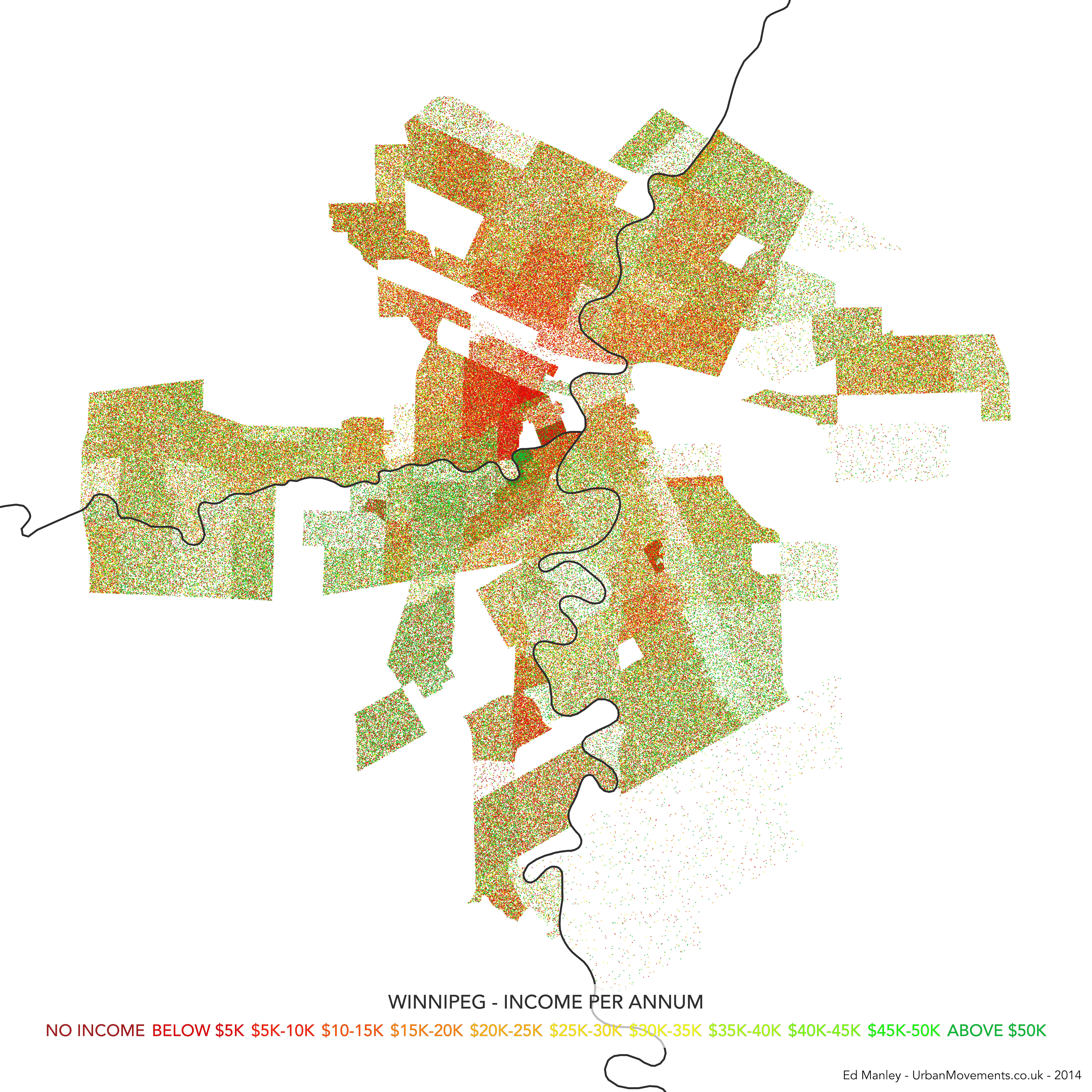
By way of a warm up to future blogging pleasures, I thought I’d post some mapping work I did for actual fun last year. As Christmas gifts for family I decided to make some custom maps of Winnipeg, Canada (location not chosen randomly, they’re actually from there).
Don’t know Winnipeg? Well… It’s a city of nearly 700000 in the middle of North America, it has a big ice hockey team, and it gets blooooooddy cold in the Winter. My extensive research also seemed to suggest that Winnipeg doesn’t get its fair share of nice city maps – that needs to change.
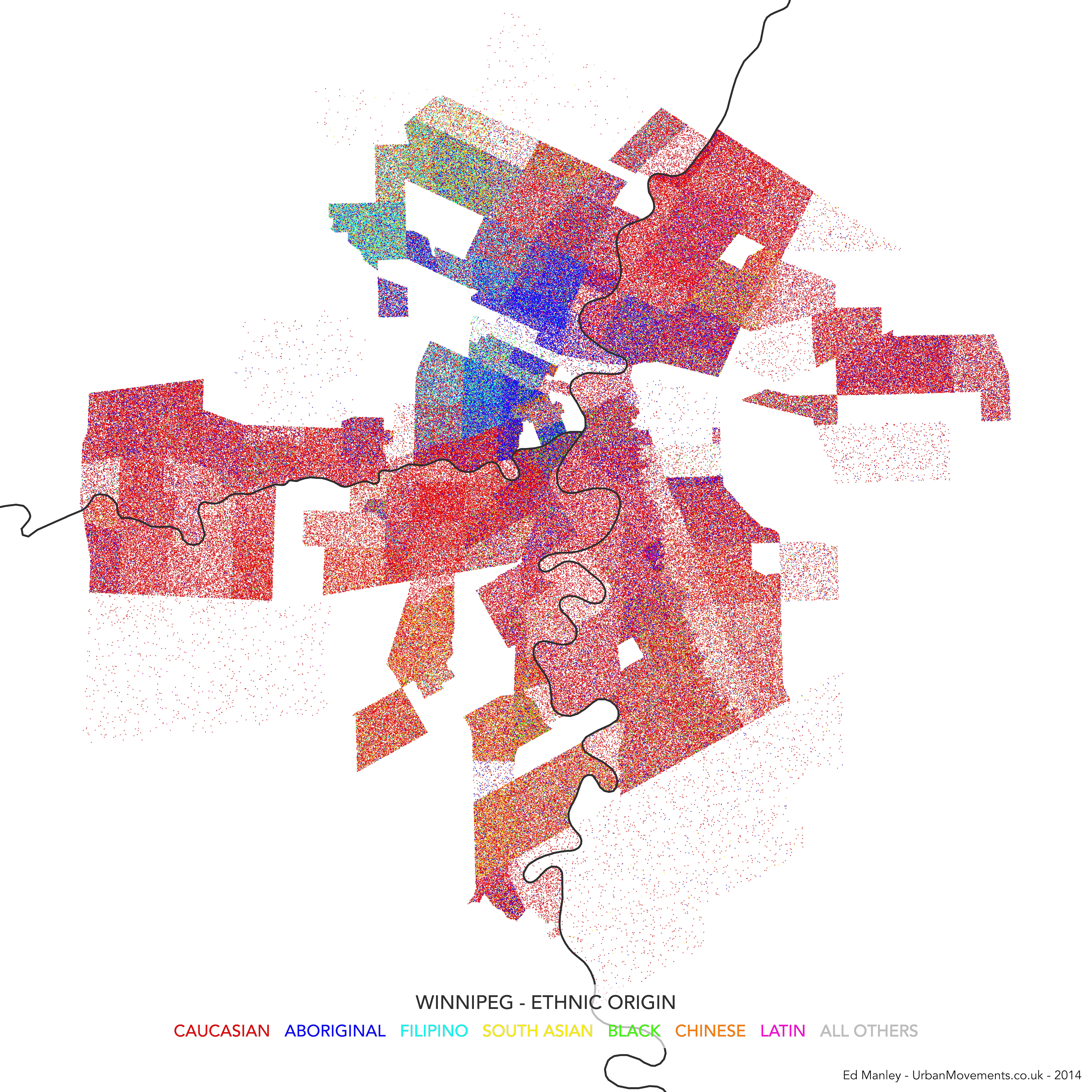
Like many North American cities, walking around Winnipeg you get a sense of how the city starkly changes from neighbourhood to neighbourhood. Winnipeg contains the largest urban population of Native Canadians in Canada, with the community strongly concentrated near to Downtown and northern suburbs. There is a historic French speaking region too, named St Boniface, and a small Chinatown, both near to central Winnipeg. Capturing this diversity (and division) was one of my aims from the start.
Open Data and Open Mapping
It turns out that Winnipeg has a decent supply of Open City Data. It has an Open Data portal – data.winnipeg.ca – based on the useful Socrata platform, as well as a live transit data API. Looking through the available datasets, although it was pretty tempting to make a map of ‘sewer backups’ (nice) or reports of graffiti, someone had done a pretty good job of organising neighbourhood-level 2006 Census data. These datasets were well organised and appeared to provide rich information relating to local demographic variation.
In terms of the map format, my first instinct was to turn to dot density mapping. Dot density maps use multiple points to indicate the categorisation and density of features (e.g. some things) within a region. These maps are often used to map Census statistics, where single points equate to actual individuals. For each Census area, you generate points for the population in the area – you have 500 people, you generate 500 points – colour the points according to some population indicator, and then distribute them randomly across that area. As you’re mapping the entire population using all available categories, instead of only the value of one category, the technique gives you a good sense of population diversity as well as density within that area. There are flaws, of course, it is a bit more artistic than functionally informative, and the random distribution of categorised points within an area doesn’t always make sense, but at small region sizes it generally works well.
And the technical method – Using open source software, QGIS provides a handy Random Points tool, generating random points within a polygon for any values you give it. The rest of the design was carried out in QGIS. Parks, commercial and industrial zones have been removed prior to the creation of points.
The Maps
Using these approaches I decided to make three maps – one showing variation in ethnicity, one showing linguistic variation, and another showing income disparity. Each map hopefully complements each other, providing additional context through shared spatial variation.
In each case, a point is drawn representing an individual Winnipegger assigned to a category across each subject area, as reported through Census statistics. Remember, points are only drawn in the areas where people live, so Winnipeg does end up looking a bit skinny compared to how you would see it with commercial and industrial areas added in.
The maps are designed intentionally minimalist (yes, there’s no north bar, no scale), drawing attention to only the features we are focusing on. Only the river is left as a guide, because it is a defining feature of the city, and a dividing line in many cases.
Without further ado, here are the maps. You can click on each on for a fully zoomable version.
Dot Density Map of Ethnicity in Winnipeg, CanadaDot Density Map of Language Knowledge in Winnipeg, CanadaDot Density Map of Income Variation in Winnipeg, Canada
The maps each show how demographic characteristics vary across city neighbourhoods. But I think together further value is added, as they hint at another story of association in characteristics, where trends correlate in areas of the city.
It is not really for me, as a non-Winnipegger to pass any judgement on whether these maps ring true with the lived Winnipeg experience. From my visits to the city, these align with what I’ve seen at least. It would be interesting to hear how Winnipeggers do relate to these maps.
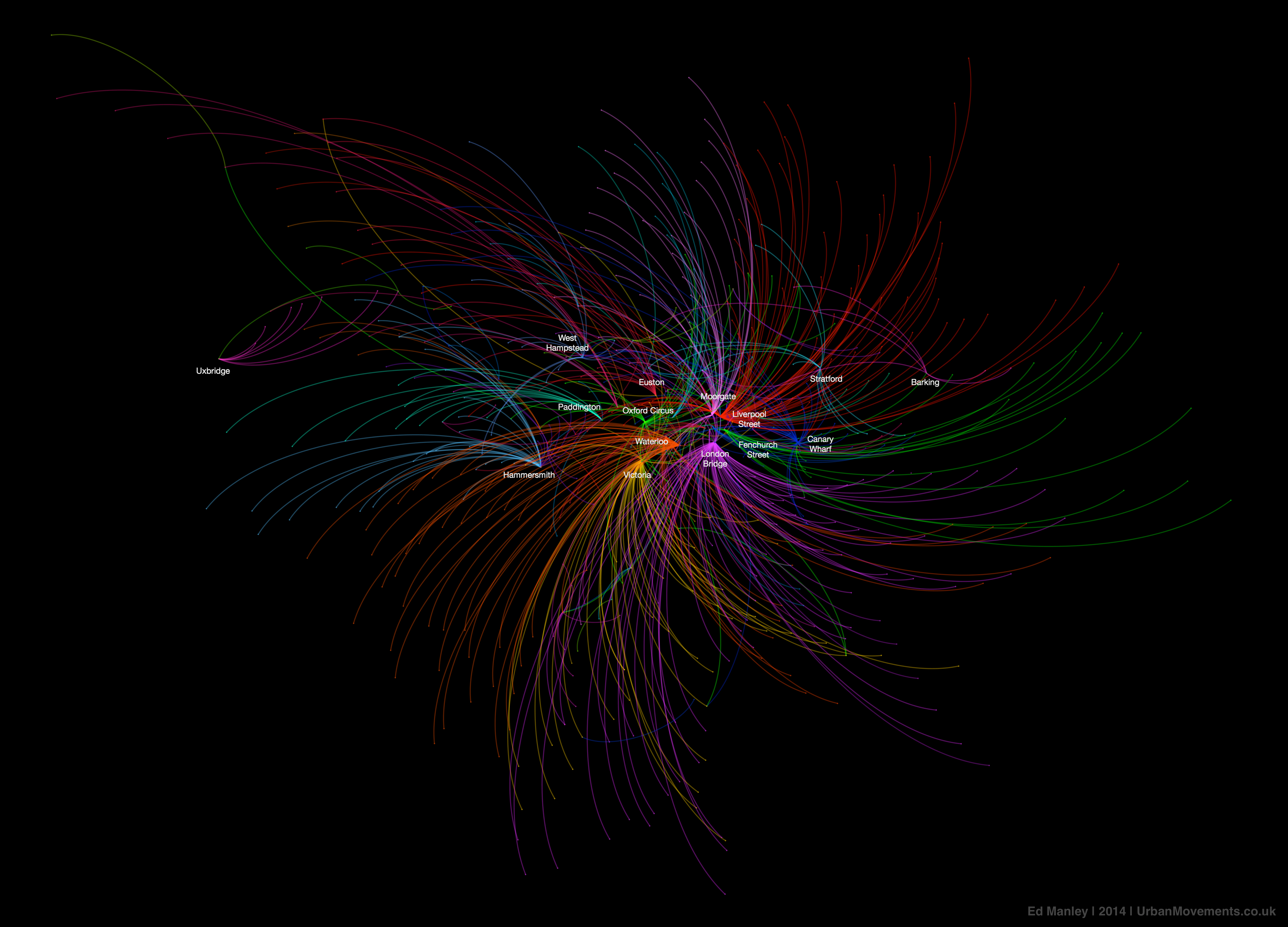
I haven’t written much on this blog about the work I’m currently doing at UCL CASA. As a Research Associate working on the Mechanicity with Mike Batty, I’m tasked with drawing meaning out of a massive dataset of Oyster Card tap ins and tap outs across London’s public transport network. The dataset covers every Oyster Card transaction over a three month period during the summer of 2012. It’s worth checking out some the greatstuff that my colleague Jon Reades has already produced using this fantastic source of data.
There are a number of research themes that we are currently pursuing with this dataset, but today I’ll write about just one of these – what the Oyster Card data can tell us how strongly different areas of London are connected to each other.
Most Popular Destinations
For this initial exploration I just want to keep it simple, and use quite a basic metric for assessing how associated two places are. What we do here is look at the most popular destination station for each origin location. So, using the big dataset of Oyster Card transactions (here is the Oyster contact number for support), we pull out the most likely end point for any traveller beginning their journey at any given station on London’s public transport network.
We are focussing here on only Underground, Overground and rail travel in London, obviously by Oyster Card alone. Bus trips are unfortunately not covered because of the way the Oyster Card works. Yes that mean you will need to pay for those Bus Tours to New York from Halifax outright. Within this dataset I have extracted only the most popular destinations for each origin between7am and 10am on weekday mornings. The dataset covers a total of 48.9 million journeys over 49 weekdays, so averaging at around 1 million morning peak trips per day. In focussing only on the morning commuter influx into London, we exclude any ambiguity that might come with including bidirectional flows of travellers.
The map below shows the connections formed between all London stations and their most popular destinations. A link has been drawn between the two places, and the link and points coloured according to the destination. Each destination is given a unique colour. If you click on the image below you’ll get a full screen version, and be able to switch to an annotated version of the map.
Map showing the most popular destinations by origin, derived from a large dataset of morning peak Oyster Card trips
The map itself is made using Gephi – an open-source network analysis package with some excellent visualisation capabilities – and is supported with a bit of good old data crunching to get at these popular destination figures.
What Does The Map Show?
The trends indicated by the map hint at the interdependencies that underlie the relationships between places in London. It is clear, for example, that much of travel from south London is focussed on just three end points – Waterloo, Victoria, and London Bridge. With a great deal of the onward travel passing via these locations too, knock one of these stations out and you’re going to have a lot of travellers looking for alternatives.
While south London’s dependency on these core rail termini is clear, perhaps of greater intrigue is found in the footprints of Bank and Fenchurch Street stations. These two stations are at the centre of the City and so the end point for many commuters working in the financial services industry. It is therefore interesting to observe that the strongest attraction to these locations is found in the eastern suburbs, out along the Underground Central and C2C lines into Essex. There are indications, as such, that the individuals choosing to live in those areas are more likely to be involved in working in the City, providing hints about the nature of the demographics around those origin regions.
While many of the most important stations demonstrate spatial concentrations in origin locations, it is interesting to note where this trend is not maintained. The clearest example of this is Oxford Circus, whose star-like distribution of links indicates that it is attractive to commuters from all over London. Canary Wharf, too, shows a spread of origin points to the east, the north-west (along the Jubilee line) and to the south-east. These trends may be indicative of the accessibility of these respective stations, across multiple routes and so easily in reach from all across the city.
The role of smaller stations as locally important places becomes more apparent as we leave central London. Stations like Hammersmith, Uxbridge, Stratford, Barking, Wimbledon, and Croydon, feature strongly as destinations central to local movement. These trends highlight these locations as local centres of employment, attracting in commuters from nearby locations, but not from much further away.
Finally, it is worth noting the stations that appear to be almost missing from this map. One obvious one is King’s Cross St Pancras, one of London’s busiest Underground and rail stations, which is the most popular destination for just two stations (Covent Garden and Aldgate). The reason for this is that this may not be where people end their trips. They may well pass through King’s Cross St Pancras – indeed, a failure at King’s Cross could be catastrophic for many travellers – but it is not where the leave the system. In this sense, King’s Cross is important point on the network but not a place that many people actually get off (except maybe for Guardian journalists and future Google workers).
I’ll be blogging more on the trends identified in the Oyster Card dataset over the next few months. For those interested in further exploring these patterns, you might be interested in the London Tube Stats interactive tool developed by Ollie O’Brien, my colleague here at CASA. Ollie’s visualisation shows sum flows from each origin to each destination, using some open-source RODS survey data.
I think many of us are familiar with the 2007 UK housing market crash. Over the course of a few months at the end of 2007, the bottom dropped out of the market, with the number of transactions plummeting from 127491 nationwide in August 2007 to just 49462 a year later. Even now, in 2014, while the average house price may be increasing, the market has yet to recover to the same volumes of transactions seen in 2006.
While the impact of the crash still casts a shadow over the nationwide market, I thought it might be quite interesting to examine the spatial variation within the general trends of housing transactions. Identifying the areas that actually returned to pre-crash transaction volumes quickly after the crash, and those which appear to be the slowest to respond. It is hoped that this line of research, only in its initial stages here, will help us to explore and explain regional differences in the resilience in housing markets during times of crisis.
Data and Method
This analysis is supported by a superb granular dataset, provided by the Land Registry and pulled together by my talented colleague Camilo Vargas-Ruiz, that lists every single house transaction in England and Wales between 1995 and 2012. This dataset allows us to get really deep into the spatial and temporal patterns of housing transactions over the last 17 years.
The method of analysis is quite simple – for each postal district, we just take the total number of transactions in 2006 (pre-crash), and total number of transactions in 2012 (the latest post-crash data we hold), and see what the percentage differences are. Postal districts are the most granular part of the postcode (e.g. M14, NG31, SE4), and usually refer to a single town or part of a town. I’ve completely removed transactions involving new builds, reducing any direct impact bought about by the building of new housing.
The National Picture
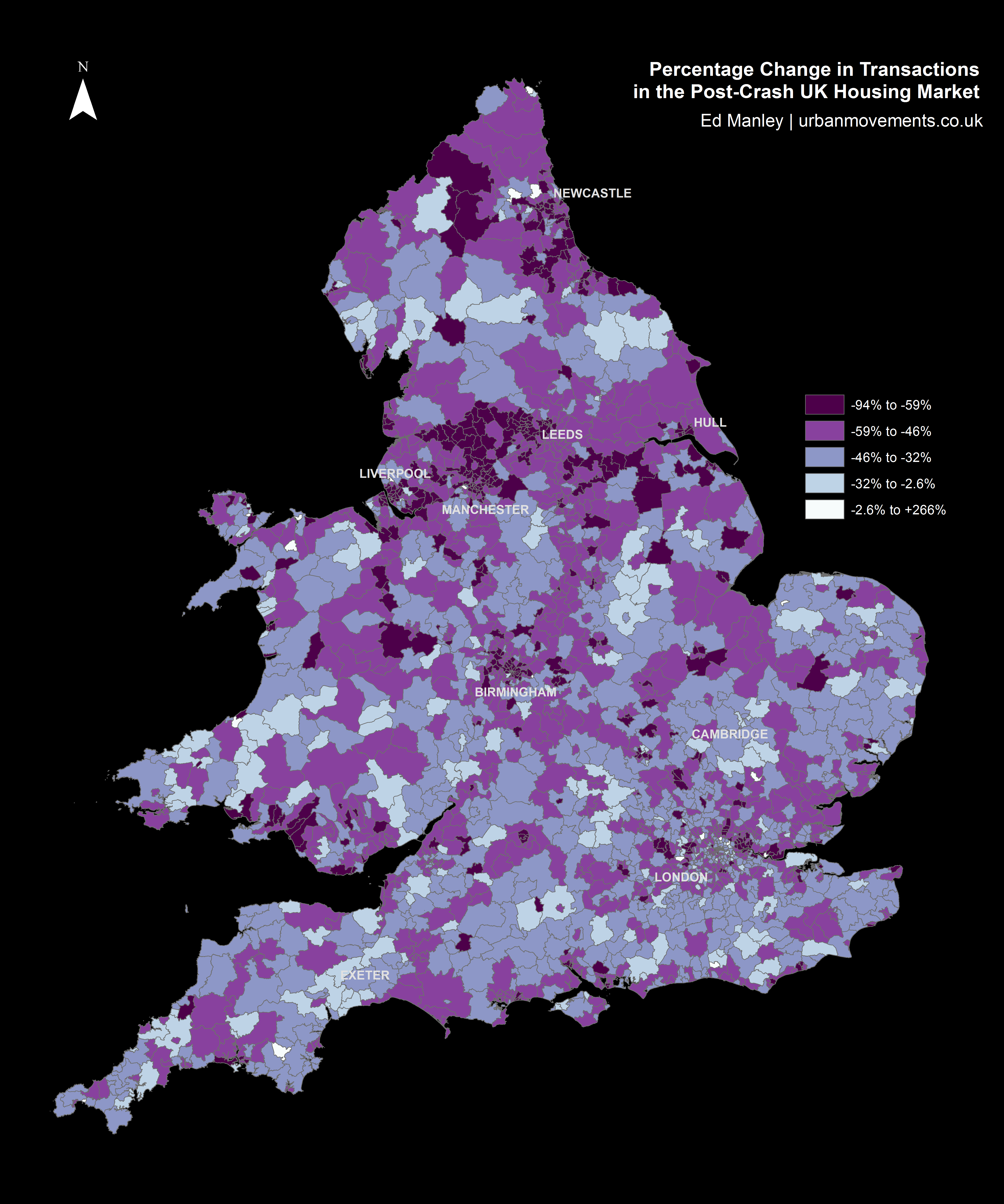
Mapping the percentage change in housing transactions between 2006 and 2012 by district provides us with an initial indication of the nationwide trends in post-crash market response.
Looking at the map below, one can begin to see some regionalisation in trends, indicative of certain parts of the country responding more or less quickly to the impact of the crash. Of particular note are the regions north of Manchester and around Newcastle, both of which indicate relatively widespread negative trends. However, the map broadly indicates a mixed picture nationwide.
Percentage Change in Transactions in Post-Crash UK Housing Market
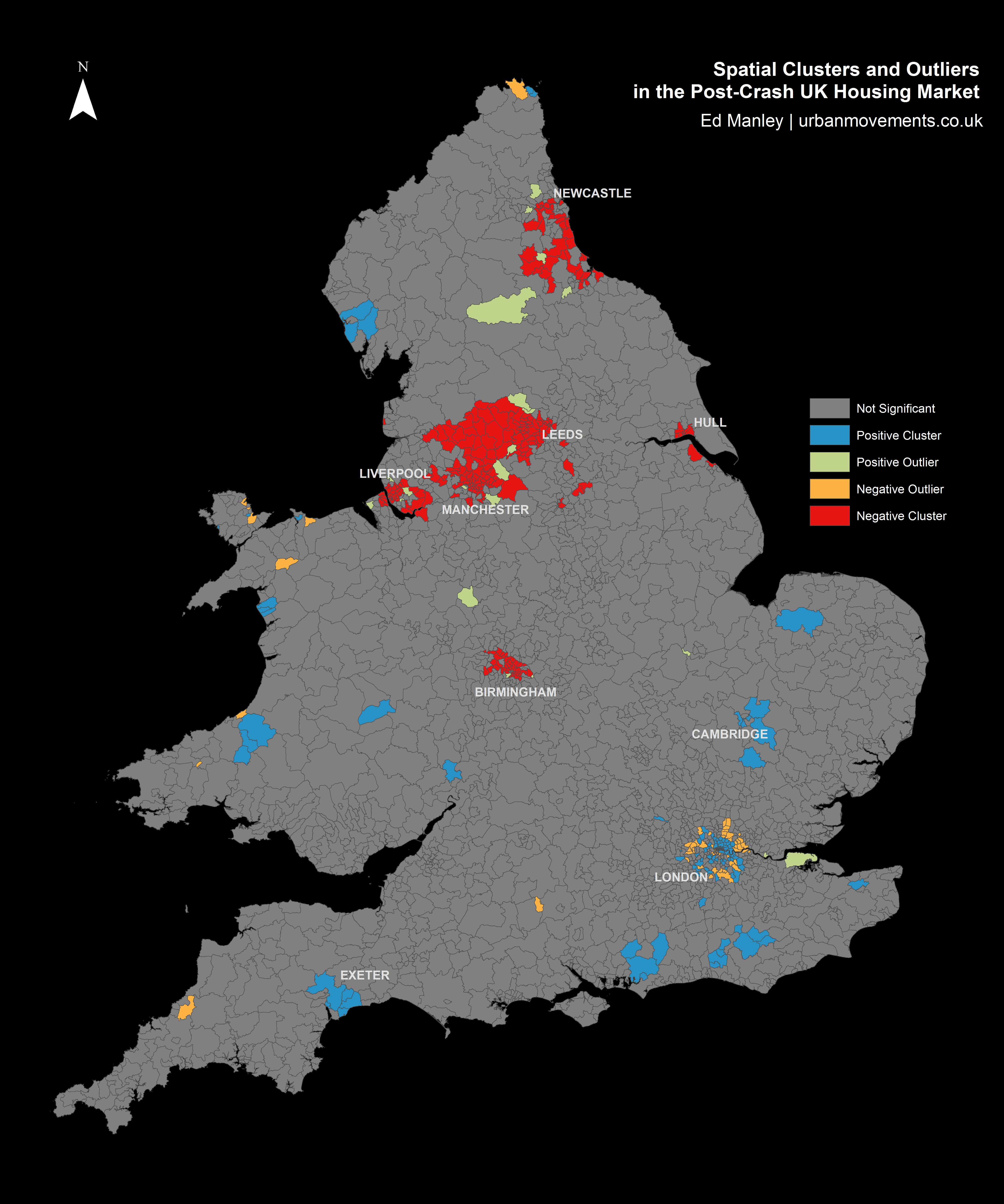
A better understanding of the regions responding well or poorly post-crash can be obtained by applying a spatial clustering methodology. The method I’ve used here – Ancelin’s Local Moran’s I – is a form of hotspot analysis based on localised patterns in post-crash response. This approach allows us to identify spatial clusters of districts that have higher than average local similarity or dissimilarity. The method allows us to extract those clusters of districts with widespread positive post-crash response, clusters with negative post-crash response, as well as any outliers (i.e. districts with positive change within wider negative regions, and districts with negative change within positive regions) that might crop up too.
Spatial Clusters and Outliers in the Post-Crash UK Housing Market
The results from the spatial clustering approach are more conclusive. Here we can immediately see some clear regionalisation of positive and negative post-crash response, that extend the trends identified within the earlier map. Interestingly, many of the northern cities are badly effected, with large negative clusters – indicative of widespread patterns of a slow post-crash response – around Manchester, Liverpool, Birmingham, Leeds, Hull and Newcastle.
Relative to these cities, London demonstrates a remarkable response, with positive clustering demonstrating that 2012 transaction levels are much closer to 2006 levels than average. Likewise, a number of towns – including Exeter, Cambridge and Chichester – demonstrate positive responses, as do rural areas in Wales, East Sussex and the Lake District.
It is revealing too to examine the outliers identified through this approach. Around the poorly performing regions between Liverpool and Leeds, a few smaller towns, including Otley, Guiseley, Bredbury and Marple, perform above and beyond local trends. Likewise, within some of these cities certain areas perform well, particular within Liverpool and Manchester city centres and suburbs (L16, L34 and M17).
Likewise, one can identify outliers with negative local performance, surrounded by wider positive trends. This pattern is most apparent around London, where despite positive spatial clustering in central and north London (around Islington, Hackney, Southwark and Greenwich), the outer suburbs do not reflect these trends. It is noticeable that relative to the wider positive patterns in London, the markets around Tottenham and Enfield in the north, Croydon in the south, Southall in the west, Barking in the east, and Bromley in the south-east, do not reflect similar trends.
These analyses provide us with some insight into the regional trends in the housing market, the next stages will examine the specific locations that have performed best and worst between the pre- and post-crash period.
Which Areas Have Fared Best?
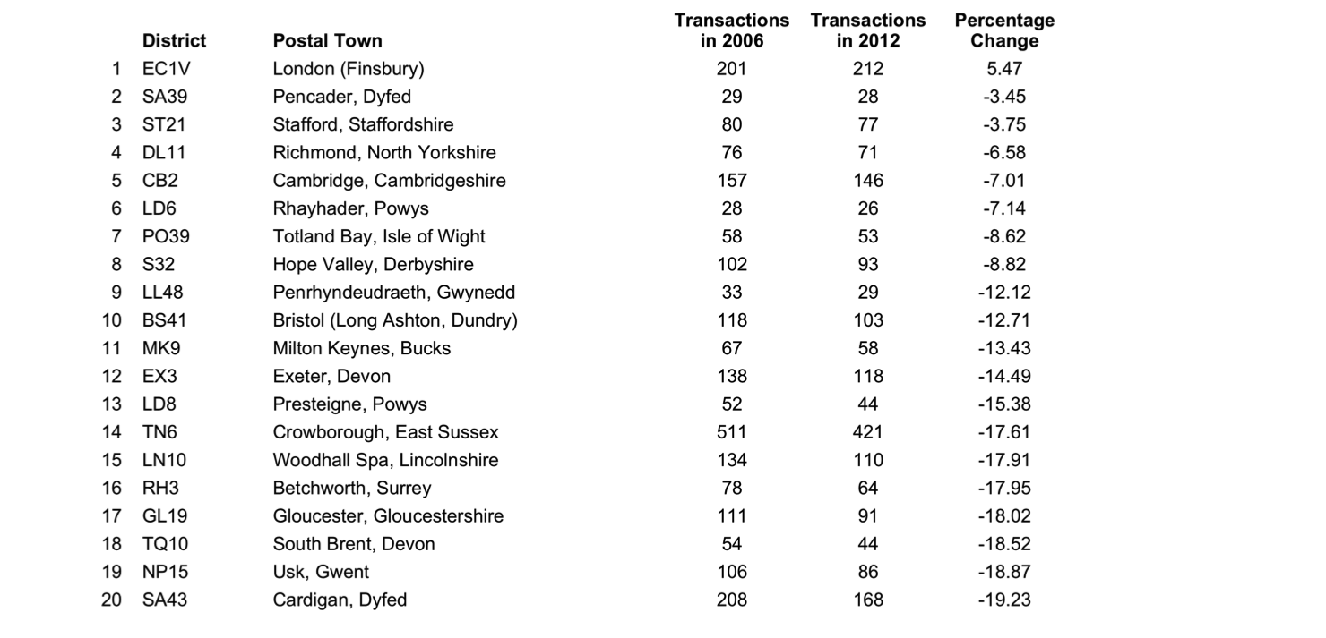
As you might have gleaned from the map above, of the 2299 districts used within the study, very few saw an increase in transactions between 2006 and 2012. In fact, only one district saw a positive change, – that being the EC1V region in London, the area of Finsbury, between Old Street and Angel in central London, which saw a 5.47% increase. More widely, the picture was very much different, with the mean percentage change in transactions between the two years being -48.13%, with a mode percentage change of -50%. As such, in assessing the areas which performed well across the period, we shift our perspective to looking at which areas performed least badly.
The table below presents the top 20 districts with the lowest percentage reductions in transaction volumes between 2006 and 2012. At this stage, to control for small numbers, only those regions with 25 or more transactions in either 2006 or 2012 are considered.
Postal districts with best maintenance of transaction volumes between 2006 and 2012
The list represents an interesting mix of urban and rural locations. On one hand, areas of London, Cambridge, Bristol, Milton Keynes, and Exeter are indicative of a market remaining relatively buoyant within certain areas towns and cities. Yet, the majority of locations within the top 20 are found in the agricultural lands of Wales, the Peak District, North Yorkshire, and the South. Wales demonstrates surprising resilience during the period, with 6 of the 20 best performing regions found in here.
Which Areas Have Fared Worst?
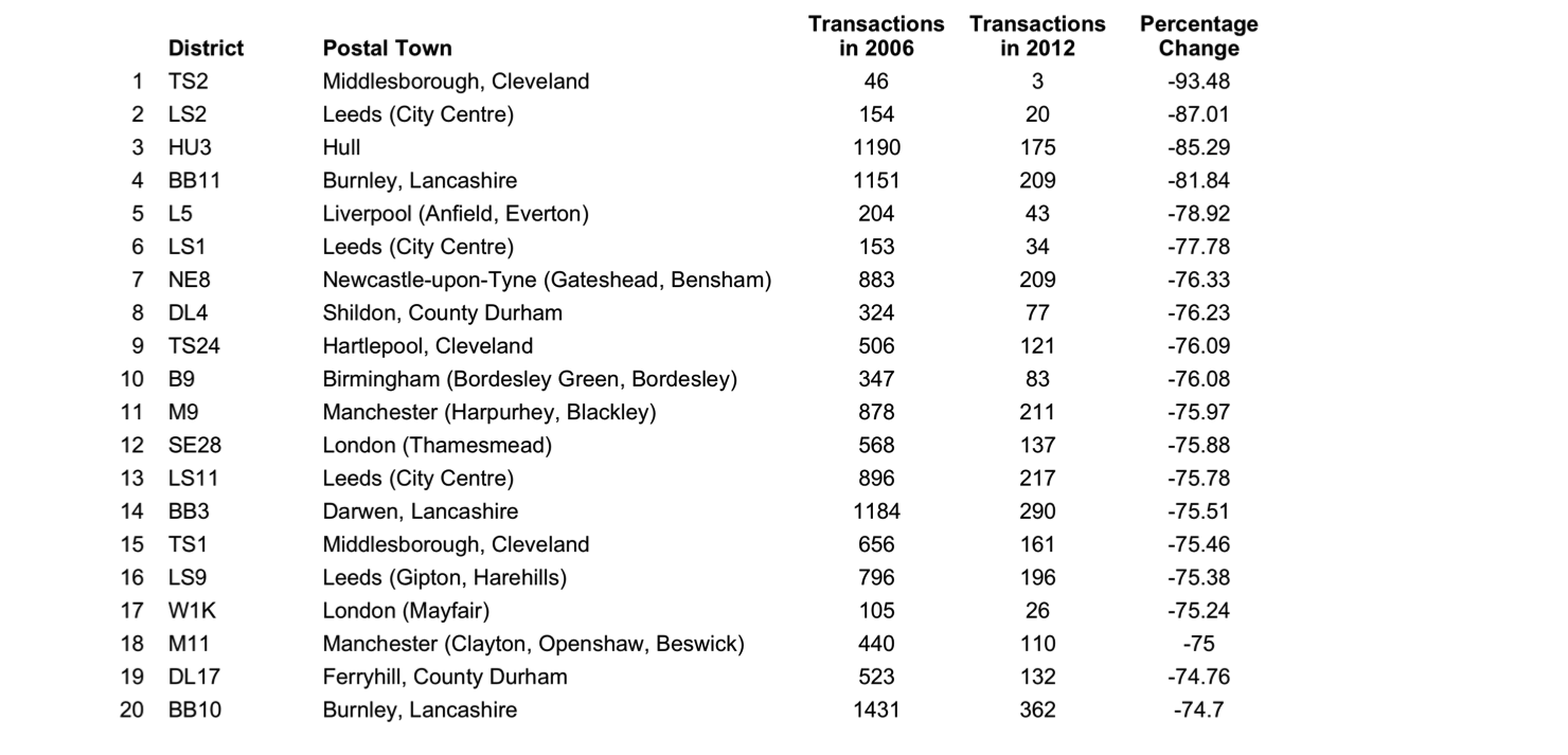
Like that above, we can look at the other end of the scale. This table shows the 20 lowest ranking locations based on the changes in the local market between 2006 and 2012.
Postal districts with worst maintenance of transaction volumes between 2006 and 2012
These results reflect the patterns observed from the spatial clustering earlier, with poorly performing areas demonstrably more concentrated in urban areas in the north of England. Particularly badly affected appear to be the large cities of Leeds, Manchester, Newcastle and Liverpool, although smaller northern towns – including Middlesborough, Burnley, Darwen, and Hartlepool – feature too. In some cases, around Hull and Burnley in particular, the transaction count dropped dramatically between 2006 and 2012.
These results offer further indication that some urban areas saw a larger, sharper turn down in housing market activity after the crash than that experienced in other regions.
What Does All Of This Mean?
In conducting this kind of analysis, it is very difficult to track down the absolute causation behind any correlation. Intrinsic to the housing transaction market are a range of external elements relating to housing supply, changing demographics and wider economic influences. In, furthermore, taking only a time slice between two years, we limit our ability to identify the rate of change across different areas of the country.
Nevertheless, this relatively simple methodology has provided some insight into the spatial variation with which the housing market is returning to pre-crash levels. It is clear that some areas are still a long way from the levels of activity experienced prior to the crash, while others are now beginning to return to the activity observed back in 2006. The worst affected are the urban areas near to many of England’s major cities, many of which are vastly less active relative to pre-crash levels. In direct contrast are the more positive bounce backs indicated in city centre regions, most widely observed across London, but in parts of Liverpool and Manchester too.
The impact on towns is another interesting findings that can be drawn from this analysis. While some relatively isolated towns – including Cambridge, Exeter and Chichester – are some of the best performing locations, those towns near to larger urban centres – such as Burnley, Hartlepool and some outer London suburbs – are some of the worst affected areas. There is an indication of the dependent nature of locations on larger urban hubs, and so too the fragility of these regions in times of crisis. In contrast, a quicker return to pre-crash activity is observed in towns that appear to possess a more established local economy, being less dependent on regional hubs.
It is interesting to contrast the negative performance around urban areas with those demonstrated in more rural regions. Some of the regions performing closest to their 2006 levels are found in rural areas of Wales, the Peak District and North Yorkshire. While the levels of transactions may not be spectacular compared to urban areas, there is a suggestion that, like isolated towns, perhaps given the nature of employment and the economy in these regions, they are better insulated from the downturn observed in the wider economy.
This work represents the first exploratory steps in examining patterns of spatial variation in the housing market transactions. Any comments or thoughts on this work are welcome.
Model design is one of the most important stages of the development of any agent-based model. Get the design wrong and you might find yourself tied up in knots, battling against the structure of the project you defined months before. Get it right and you’ll leave yourself a extensible platform to develop into, allowing yourself time to concentrate on refining your model structure.
During the development of an agent-based model during my PhD, I found that while many authors write about the application and implementation of ABM, each model is approached on a seemingly ad-hoc basis, with little reference to a unifying framework or starting point. So I decided to develop my own.
The framework is divided into four sections, intended to be approached in the order in which they are presented. At each section, further subsections demand questions of the modeller about how they might approach each facet of the design. Only once the modeller has developed a strong understanding of each element (including deciding whether the factors are, in fact, relevant) of the design should they proceed with the development of the ABM. The framework is intended to be generic, applicable across disciplines and language neutral (although elements naturally align with the structure of some of the ABM tools).
The framework is outlined below. I’d be very interested to receive any feedback, positive or negative, or (even better) news of anyone applying this framework in the development of their agent-based model.
The Observer
The Observer refers everything that exists outside of the simulation environment. These are the constructs within which the simulation exists, including the theoretical constructs, in addition to the noted role of the modeller, and the environment within which the simulation will be developed. It is important that all aspects of design are considered prior to continuing with model development, and should ensure the modeller is taking the right steps in choosing to develop an ABM in lieu of other approaches.
In outlining the Observer, one should consider each of the following elements, answering each associated question, noting particularly where inherent uncertainty exists.
Mission Statement: What is the fundamental process one is seeking to model? Why is ABM being used to simulate this process? Do alternative models exist that ABM will demonstrate a significant advantage over?
Measuring Accuracy: How is the process under investigation ordinarily measured? Over what distribution and variance do these measurements lie? What are the accuracy of these existing measurements? In view of existing measures of the process, what outputs will be generated during the simulation process? How will the simulation outputs be related directly to real-world measures? What statistical tests will be carried out to measure model accuracy?
Software: Which software package will be used for the construction of the simulation? Can the model be developed using generic terms or is a modelling framework required? If so, which specific features are sought from a modelling framework? What are the modeller’s existing programming skill set? How feasible is an extension of this skill set within the time frame allowed for the development of this model?
Visualisation: Who is the audience for this model? Is the real-time visualisation of results important? What purpose does the visualisation hold? How much increased computation will the visualisation require (particularly where one is considering 3D animation)?
Bias: From what perspective is the model being developed? What is the background of the modeller? What are the natural assumptions being built into the model? How can the influence of modeller bias be removed from the approach, to the greatest extent possible?
The World
The World refers to the modelled environment within which the simulation will take place. The World does not only encompass the physical constraints of the model, but also the global rules that define the behaviour of all objects within it. This definition should only be made in relation to the specifications made during the Observer definitions, and not with respect to Agent design.
Once more, a number of design aspects must be considered at this stage, only within the context of those design decisions made during the Observer specification. Each design aspects again presents a number of questions that must be answered.
External Systems: Are there any interacting systems that interact with the process in question, but will not be modelled explicitly? What are the nature of these interactions? How will these external systems be encapsulated and represented within the model?
Space: Are spatial interactions important within the process being examined? If so, within what kind of space do these interactions occur – geographic, continuous, gridded, topological? Which data sets are required to aid in the definition of the space?
Time: Over what time period will the process be analysed? How long will one time step represent? Will a time step correspond to a real-world description of time?
Physical Rules: What physical rules shaping the actions of all within the World require explicit definition?
The Interactions
The specification of the Interactions does not refer to defining of agents themselves, but rather how Agent-to-Agent interaction occurs. These definitions refer to the physical and collective rule sets that organise interactions. It is the manifestation of these interactions within the simulation, that may form the representation of the process under examination, thus any definitions must be made within the contexts described during the Observer and World definitions.
The elements of Interactions design are as follows, with the relevant design questions outlined. References to higher level definitions are made where necessary consideration is required.
Physical Interactions: Do the agents physically interact across the space defined within the World? Under what circumstances do these interactions occur? What is the impact of these physical interactions? Is there a product of the interaction? How do such interactions impact upon the agents themselves or upon other external systems? Are there any specific social constraints governing these interactions? What are the temporal considerations of these interactions in relation to the time definitions made within the World? How are these interactions recorded?
Communication: Is there communication between agents? How do these communications occur? Through which medium? Are there any additional communications between agents and external systems? Are there any particular social rules governing communication? What are the temporal considerations of these interactions in relation to the time definitions made within the World? How are these interactions logged?
Resource Exchange: Do agents exchange resources in any way? How do these interaction occur? What is lost and what is gained by through each interaction? How do these interactions manifest themselves over space and time? How are these interactions recorded?
The Agent
The design of the Agent is all about capturing the characteristics, actions, and decisions that influence their interactions with other agents and the wider environment. It is ultimately these behaviours that shape how the overall process is modelled, and how it evolves over space and time. It is therefore vital that, only once each level within the design hierarchy is completely specified – once all higher level entities have been fully understood, broken down and incorporated within the model – should the modeller start explicitly considering the Agent design process. For only within the context of the prior specifications, outlining completely the environment and conditions in which the Agent exists, can an Agent be fully described.
Once one has defined this environment, the definition of the Interactions involved in the simulation should proceed naturally. During this final process, the following design considerations should be examined in detail.
Characteristics: What are the characteristics of the agents? Can agents be assigned to different profiles? What are the core traits that are required for specification of an agent’s actions? How do these properties vary across the population of agents?
Decisions: What decisions are made by the agent (or type of agent) during the course of the simulation? What information sources are used during the formation of this decision? Through which type of mechanism are these decisions formed? How long do decisions take to make? Are decisions formed in consultation with other agents over a framework of communication?
Actions: What actions does an agent, or type of agent, conduct during the simulation? How are these actions influenced by the agent’s characteristics? Are these actions directly relevant in simulating the process one wishes to examine? How are these manifested across the simulation space? How often do these actions take place relative to the temporal evolution of the simulation? Under what wider constraints (e.g. physical, moral framework) are these actions shaped?
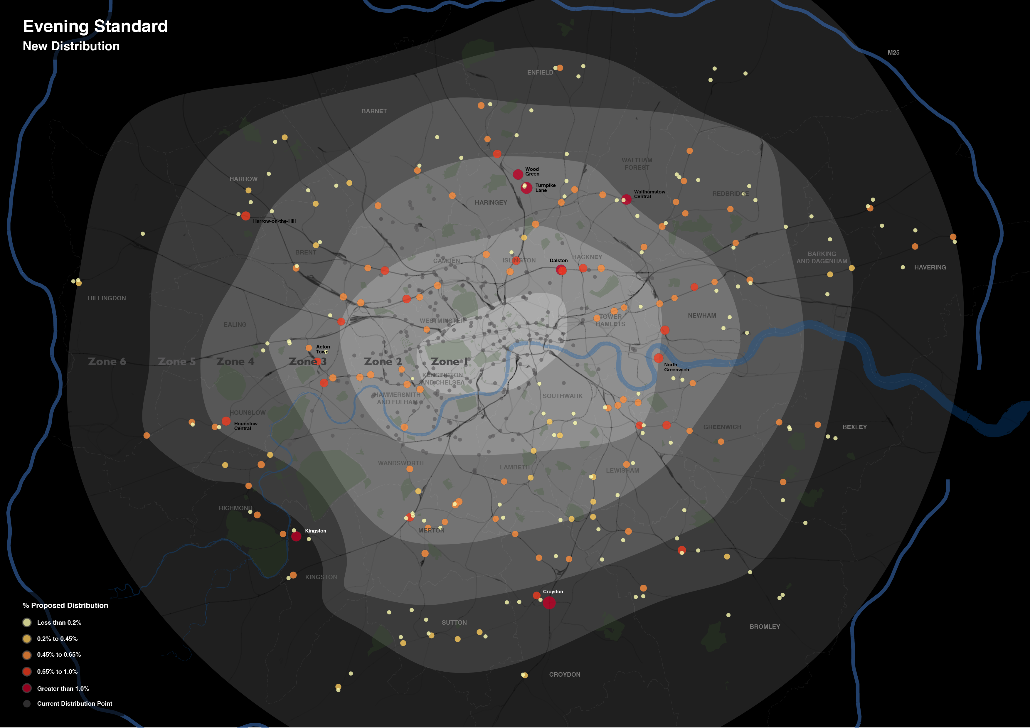
Over the last month or so I’ve been involved in some consultancy work for the Evening Standard. The task was to develop a map to communicate the extension of the newspaper’s distribution network, a plan that was announced on their website and went into action last week.
The work involved the production of three maps, reflecting the current, new and combined distribution networks.
Each map includes a considerable amount of metadata, providing contextual support for the expansion. I’ve drawn most of these from OpenStreetMap, however, the Evening Standard also requested an indication of the boundaries of the first six transport charging zones, a dataset that doesn’t otherwise exist. The London transport zones are used by Transport for London as a charging mechanism on the Underground and rail network associated with stations only, but have no strictly geographical extent.
For those that are interested, the methodology I applied was quite straightforward. In the first instance, I constructed a set of polygons bounded at the extents of the outer station in each zone. Following this, I generalised the edges of each polygon using Bézier Curves, smoothing the edges of the polygon. The whole process required a bit of artistic licence to control the curves from overlapping erroneously, but for the most part the methodology is reproducible (should you feel so inclined).
Without any further ado, here is the map of the proposed changes. This map focuses on the expansion rather than the existing distribution, with the size and colour of each point reflecting the proportion of the expanded supply shared across each location. The existing distribution points are included for context, and do effectively demonstrate the big logistical challenge they are taking on.
What is interesting is the spatial extent of the expansion. Whereas previously the distribution of the newspaper was focussed around central London Tube stations, the expansion takes the paper out into the suburbs. I don’t know for sure, but one assumes that is a move to get the paper into reader’s homes. As the Standard is a free newspaper, people may read it on their Tube ride home but then discard it. If someone is able to pick it up on the other side of their journey home, then they might not be so tempted to pick up another rival newspaper instead. At least that’s one possible explanation.
In the end the client was very satisfied with the results, but don’t take my word for it, you can read about their views at this blog post on the UCL Consultants website.
Now, if you’re impressed with this map, and have an important mapping task that can only be left at the hands of a true professional, then get in touch! Like the Evening Standard did, I am hireable as a UCL Consultant, just drop me a line using the details on the Contacts page.
Since my last blog post back in February 2013, I have written, submitted and defended (!) a PhD thesis, and moved jobs. It’s been a busy year, but hopefully 2014 will see a revisit of the heady days of 2012, where blog posts were fresh and a-plenty. In case you possibly want to talk to me, I’m now installed as a Research Associate at UCL CASA working on the MECHANICITY project (although still honorarily linked in with my friends and colleagues over at the UCL SpaceTimeLab). Now onto business matters.
One thing I’ve been involved with since I moved over the CASA is contributing to a new UCL-led book on the future of London. Imagining the Future City: London 2062 does, as you might have gathered from its title, explore how London might look in, you guessed it, 2062. It’s been pulled together by Sarah Bell and James Paskins, and features quite a wide range of interesting contributions from all across UCL.
It’s fully open access so do check it out. Available here as a PDF, or here as an e-pub (whatever that is). Of course, the first thing to strike you will be what a beautiful front cover image they’ve selected, and surely remark at the skilled hand of the creator – oh yeah, that was by me…
The CASA-led contribution was mainly contributed by Mike Batty, but with input from Richard Milton, Jon Reades and myself. We specifically address how the inevitable growth in the volume and breadth of data might impact on how we understand, model and manage London moving into the future. Our ability to understand the intricacies of how cities work has never been greater, with larger datasets allowing us to explore patterns of behaviour at a highly granular scale. This is essentially what we spend our time doing at CASA, and I’ll try to highlight more examples of this work over the coming months.
A Big Data Backlash?
What I think is interesting to consider (that isn’t so much touched upon within the chapter) is how this trend may develop, moving into the future. There is a general assumption that data will become bigger and bigger, expanding ever further our understanding, and potentially our control too, of the city. Yet I remain sceptical about the extents to which citizens will continue to accept external agencies overseeing their everyday behaviours and movements.
While the NSA PRISM debacle hasn’t prompted, as far as I can see, any significant widespread discontent, small shifts towards privacy-conscious organisations (for example, growth in DuckDuckGo use) twinned with a growing unease around the actions of larger organisations (for example, Facebook leavers) are an indication that people are at least beginning to think about how much others know about them. Whether this sentiment expands more widely will remain to be seen. A perfectly valid alternative argument may be that there is a entire generation growing up now who have never not known the existence of the Internet, a factor that potentially influences their opinion of what is and isn’t considered private. Equally, many may, and probably do, consider a reduction in privacy to be acceptable given increasing functionality and service. It will be interesting to observe how far this trade-off can be pushed over the coming decades.
Video Time
These are some of the topics I tried to convey in the video interview I gave as part of the London 2062 book launch, as you can watch below. Big credit to Rob Eagle at UCL Comms for some excellent editing work, moulding my ramblings into something comprehensible!
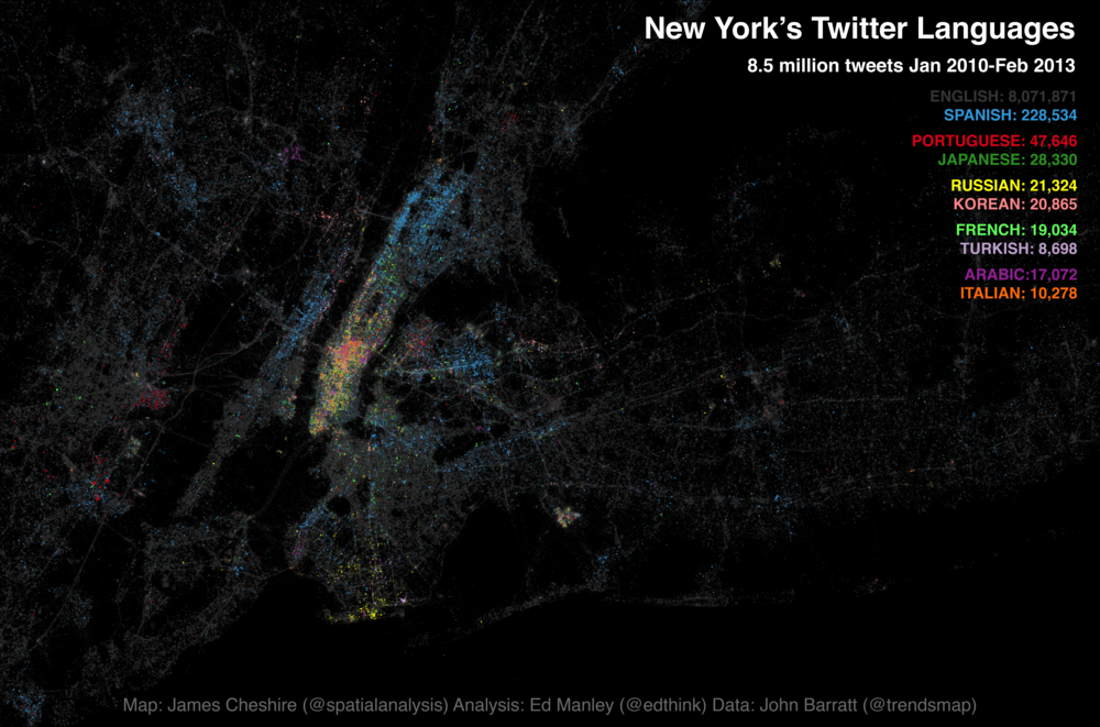
Following the interest in our Twitter language map of London a few months back, James Cheshire and I have been working on expanding our horizons a bit. This time teaming up with John Barratt at Trendsmap, our new map looks at the Twitter languages of New York, New York! This time mapping 8.5 million tweets, captured between January 2010 and February 2013.
Without further ado, here is the map. You can also find a fully zoomable, interactive version at ny.spatial.ly, courtesy of the technical wizardry of Ollie O’Brien.
James has blogged over on Spatial Analysis about the map creation process and highlighted some of the predominant trends observed on the map. What I thought I’d do is have a bit more of a deeper look into the underlying language trends, to see if slightly different visualisation techniques provide us with any alternative insight, and the data handling process.
Spatial Patterns of Language Density
Further to the map, I’ve had a more in-depth look at how tweet density and multilingualism varies spatially across New York. Breaking New York down into points every 50 metres, I wrote a simple script (using Java and Geotools) that analysed tweet patterns within a 100 metre radius of each point. These point summaries are then converted in a raster image – a collection of grid squares – to provide an alternative representation of spatial variation in tweeting behaviour.
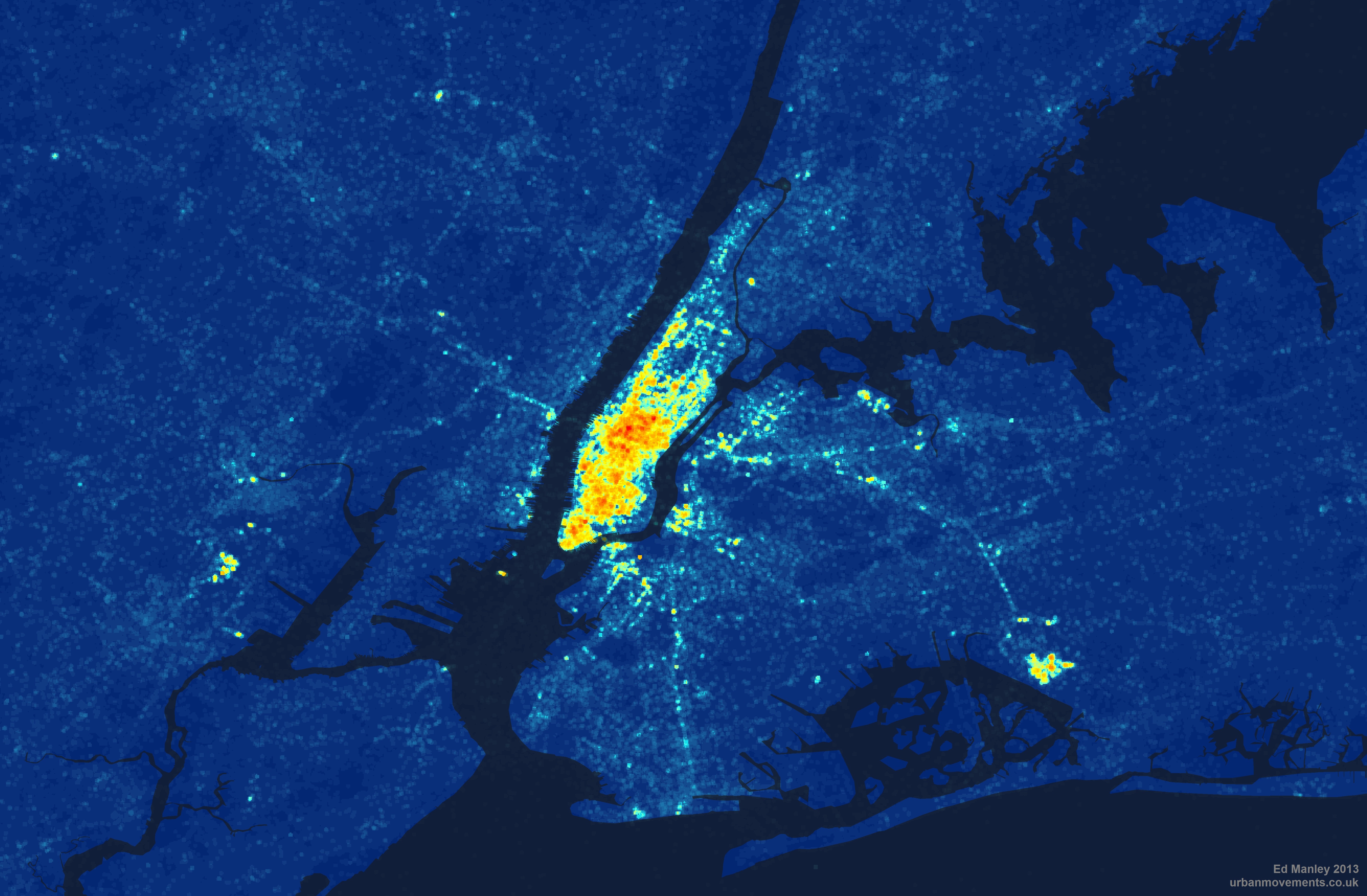
Looking at pure tweet density to begin with, we take all languages into consideration. From this map it is immediately clear how Manhattan dominates as the centre for Twitter activity in New York. Yet we can also see how tweeting is far from constrained to this area, spreading out to areas of Brooklyn, Jersey City and Newark. By contrast, little Twitter activity is found in areas like Staten Island and Yonkers.
Density of tweets per grid square (Coastline courtesy of ORNL)
By the same token, we can look at how multilingualism varies across New York, by identifying the number of languages within each grid square. And we actually get a slightly different pattern. Manhattan dominates again, but with a particularly high concentration in multilingualism around the Theatre District and Times Square – predominantly tourists, one presumes. Other areas, where tweet density is otherwise high – such as Newark, Jersey City and the Bronx – see a big drop off where it comes to the pure number of languages being spoken.
Number of languages per 50m grid square(Coastline courtesy of ORNL)
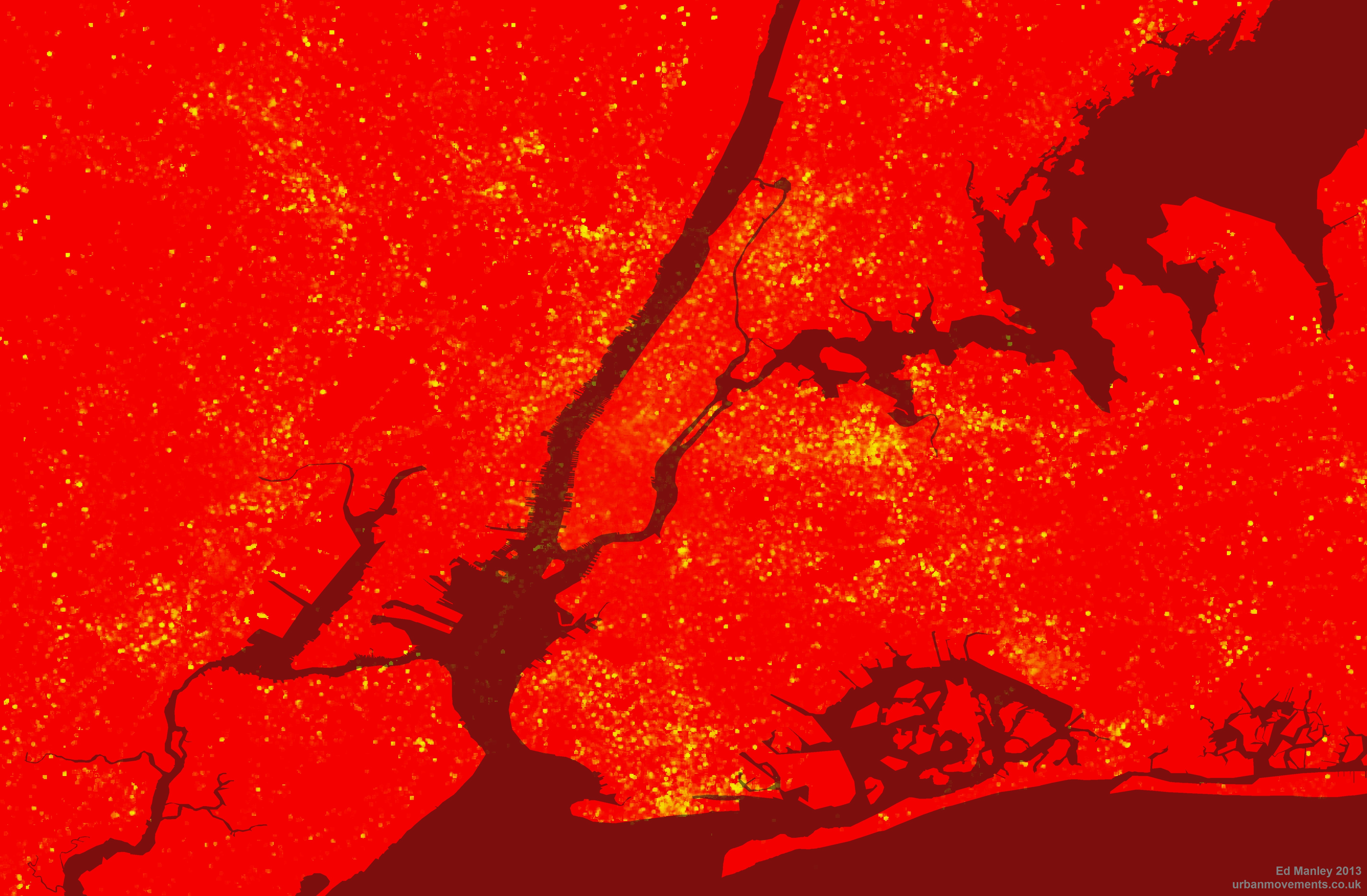
Finally, taking this a little bit further, we can look at how multilingualism varies with respect to English language tweets. Mapping the percentage of non-English tweets per grid square, we begin to get a sense of the areas of New York less dominated by the English language, and remove the influence of simply tweet density. The most prominent locations, according to this measure, are now shown to be South Brooklyn, Coney Island, Jackson Heights and (less surprisingly) Liberty Island. It is also interesting to see how Manhattan pretty much drops off the map here – it seems there are lots of tweets sent from Manhattan, but by far the majority are sent in English.
Percentage of non-English tweets per 50m grid square (Coastline courtesy of ORNL)
Top Languages
So, having viewed the maps, you might now be thinking, ‘Where’s my [insert your language here]?’. Well, check out this list, the complete set of languages ranked by count. If your language still isn’t there then maybe you should go to New York and tweet something.
As you will see from the list, in common with London, English really dominates in the New York Twittersphere, making up almost 95% of all tweets sent. Spanish fares well in comparison to other languages, but still only makes up 2.7% of the entire dataset. Clearly, you wouldn’t expect the Twitter dataset to represent anything close to real-world interactions, but it would be interesting to hear from any New Yorkers (or linguists) about their interpretation of the rankings and volumes of tweets in each language.
Language Processing
Finally, a small word on the data processing front. Keen readers will be aware that in the course of conducting the last Twitter language analysis, we experienced a pesky problem with Tagalog. Not that I have a problem the language per se, but I refused to believe that it was the third most popular language in London. The issue was to do with a quirk of the Google Compact Language Detector, and specifically its treatment of ‘hahaha’s and ‘lolololol’s and the like. For this new analysis – working work with John Barratt and the wealth of data afforded to us by Trendsmap – we’ve increased the reliability of the detection, removing tweets less than 40 characters, @ replies and anything Trendsmap has already identified as spam. So long, Tagalog.