Mapping the Evening Standard Distribution Network

Over the last month or so I’ve been involved in some consultancy work for the Evening Standard.  The task was to develop a map to communicate the extension of the newspaper’s distribution network, a plan that was announced on their website and went into action last week.

The work involved the production of three maps, reflecting the current, new and combined distribution networks.

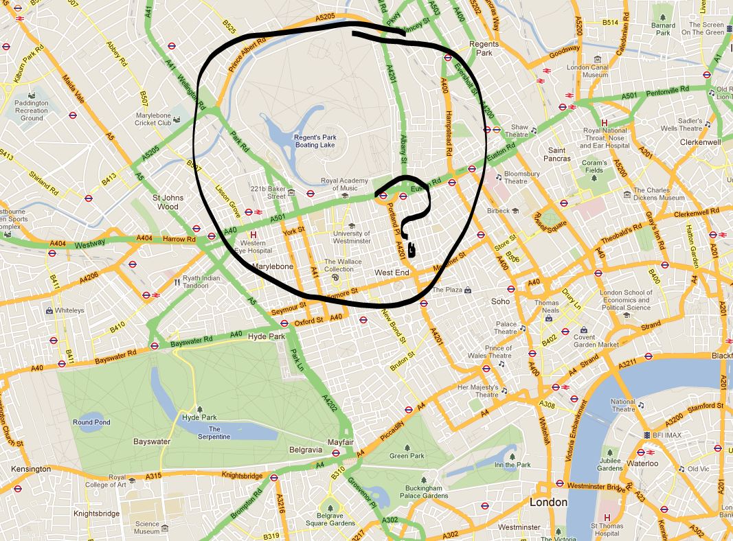
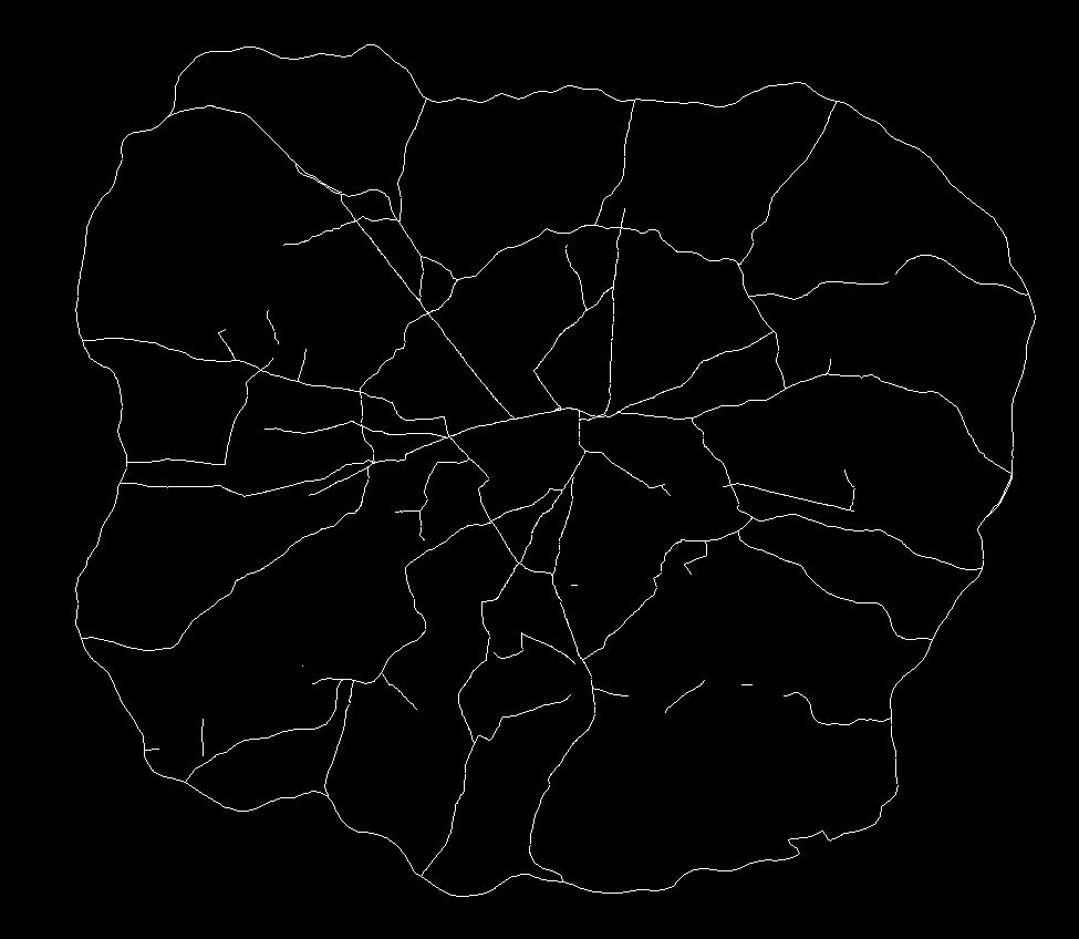
Each map includes a considerable amount of metadata, providing contextual support for the expansion.  I’ve drawn most of these from OpenStreetMap, however, the Evening Standard also requested an indication of the boundaries of the first six transport charging zones, a dataset that doesn’t otherwise exist. The London transport zones are used by Transport for London as a charging mechanism on the Underground and rail network associated with stations only, but have no strictly geographical extent.

For those that are interested, the methodology I applied was quite straightforward.  In the first instance, I constructed a set of polygons bounded at the extents of the outer station in each zone.  Following this, I generalised the edges of each polygon using Bézier Curves, smoothing the edges of the polygon.  The whole process required a bit of artistic licence to control the curves from overlapping erroneously, but for the most part the methodology is reproducible (should you feel so inclined).

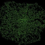
Without any further ado, here is the map of the proposed changes.  This map focuses on the expansion rather than the existing distribution, with the size and colour of each point reflecting the proportion of the expanded supply shared across each location. The existing distribution points are included for context, and do effectively demonstrate the big logistical challenge they are taking on.

esi_proposed_v4-01

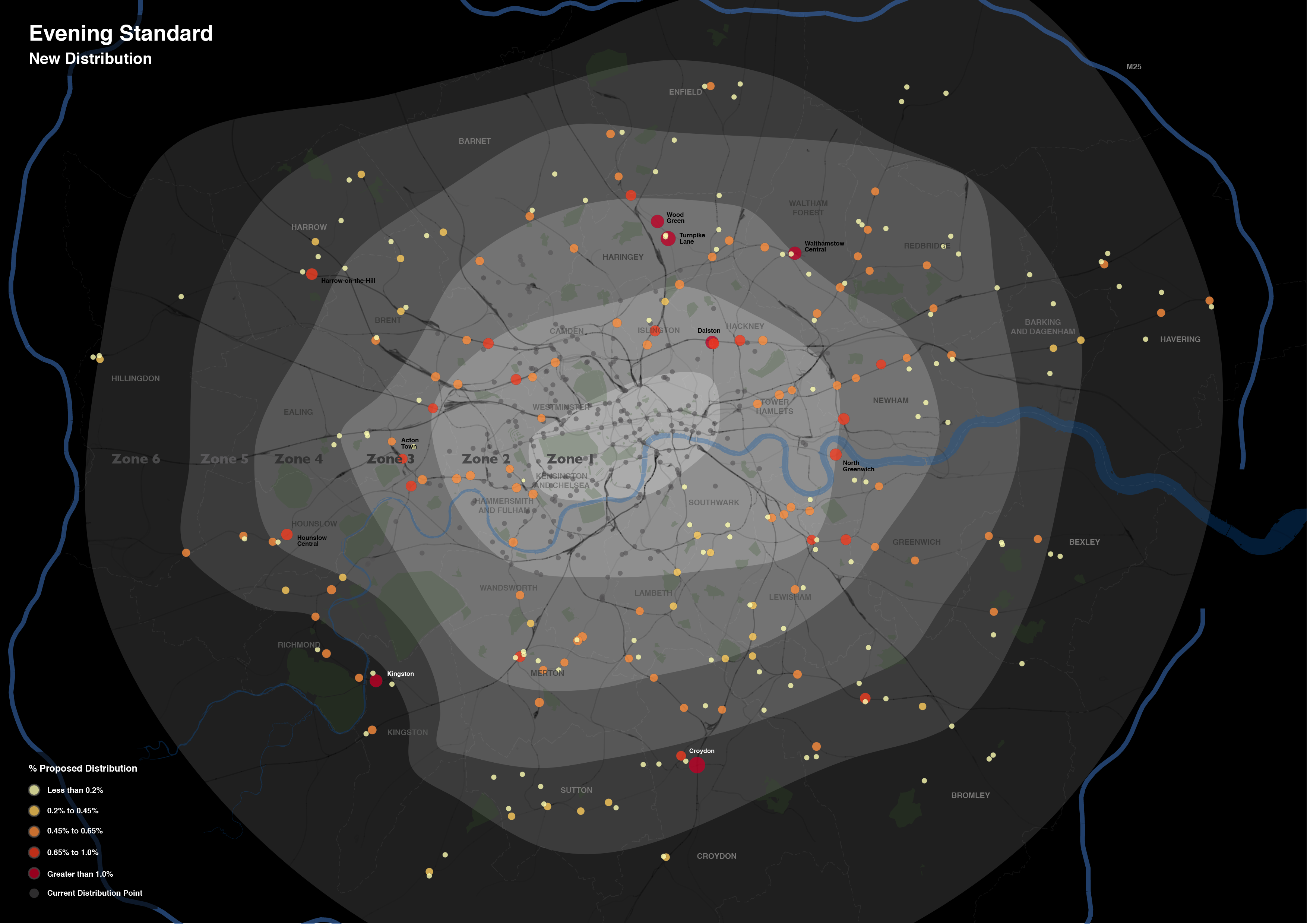
What is interesting is the spatial extent of the expansion.  Whereas previously the distribution of the newspaper was focussed around central London Tube stations, the expansion takes the paper out into the suburbs.  I don’t know for sure, but one assumes that is a move to get the paper into reader’s homes.  As the Standard is a free newspaper, people may read it on their Tube ride home but then discard it.  If someone is able to pick it up on the other side of their journey home, then they might not be so tempted to pick up another rival newspaper instead.  At least that’s one possible explanation.

In the end the client was very satisfied with the results, but don’t take my word for it, you can read about their views at this blog post on the UCL Consultants website.

Now, if you’re impressed with this map, and have an important mapping task that can only be left at the hands of a true professional, then get in touch!  Like the Evening Standard did, I am hireable as a UCL Consultant, just drop me a line using the details on the Contacts page.

Mapping Multiculturalism: ONS and the Sensitive Issue of Map Design

In case you hadn’t noticed, the ONS released their latest tranche of Census 2011 results today.  The data has received considerable fanfare in the media already, looking set to dominate political debate over the coming days.  One big story that appears to be arising from today’s release features the hot political potato of multiculturalism.

Before I start I’d like to emphasise that this blog post isn’t intended to comment on these results in any way, merely to point out clear examples of how, through the design of their the ONS have implicity directed the interpretation of these results.  In fact, it perhaps raises once again the important issue on how data and visualisation can be used to influence how results are perceived by the viewer.

ONS Interactive and Colour Selection

Along with this latest release, the ONS provided an interactive tool to enable the exploration of the results by category and in comparison to 2001 results, and these maps have been featured widely in the media coverage thus far.

Now, most people who have ever designed a map know that colour selection is vitally important.  The categories and colour scales you pick help to determine how a map is viewed and the message that is taken away.  I won’t go into detail here but more information and a nice tool for testing these principles out is available here. In effect, you build up a strategy for the presentation of your data.

With respect to this issue, the strategy taken by the ONS in this instance is somewhat peticular.  Take a look below at the ‘Percentage White’ ethnicity map by Unitary Authority, taken from the ONS website:

Mapping Multiculturalism: ONS and the Sensitive Issue of Map Design

The rather strange selection of categories – whereby variation around 12 percentage points (between 85% and 97%) is split into three categories and variation around 85 percentage points placed into one category – mean that relatively small differences in the value of this attribute are represented as considerably different through the colouration of the map.  This, to me, seems like a very strange approach.

To indicate this point more clearly, take a look at the map below of exactly the same data and same geographical boundaries.  All we have done here is use a standard symbology method, the Jenks Natural Break Optimisation method.  The results are quite different:

Mapping Multiculturalism: ONS and the Sensitive Issue of Map Design

In this map, through the categories selected using the Jenks algorithm, small variations between districts are absorbed and a truer sense of the variation is presented.  Similar results are found using other standard symbology approaches; some, such as Equal Interval categorisation shown below, indicate even lesser variation among the data:

Mapping Multiculturalism: ONS and the Sensitive Issue of Map Design

As I say, these are just standard methods and implemented in mainstream GIS software, nothing special and what would ordinarily be used in representation of such data.  For some reason the ONS have chosen to take an alternative direction.  And ‘Ethnicity’ isn’t by any means the only case of this, the same approach is employed in mapping ‘Born in the UK’ and ‘No Qualification’ data also.

Making Maps to Make your Point

I think what this demonstrates is a timely lesson in how maps can be used to influence how a viewer receives information.  Very few of the people looking at the ONS maps today will consult the map key before making their mind up about the results.  As a result, I feel, these people make take away an inaccurate understanding of what the underlying data actually represents.

I’m not sure what has lead the ONS to make the choices they have made with respect to their map design*.  They may well have a reason for selecting their colour categories in this way, but in emphasising small variations in data such as these they only go to helping to whip by political frenzy.


Update on 12-12-2012

* As you can read below, Robert Fry from the ONS got in touch about this issue.  It would appear that the motivation behind the map design is not as considered as I may have first suggested.  I have amended the blog post accordingly, although feel this still episode still provides an important lesson.


Space Syntax to GIS Integration: A Roadmap

Something I have been thinking about recently is the possibility of integration between GIS and space syntax.  The motivations are very clear.  Space syntax represents a compelling quantitative model of human behaviour and movement.  While the understanding of human systems is one of its most important areas of GIScience research (I may be slightly biased).  And with the ever increasing availability of movement data on a range of levels, the development of a model underlying this behaviour is ever more important.  So why can’t these two just get it on?

Representation

Well, the old argument has been that axial maps – the fundamental representation of space syntax – is simply not compatible with GIS.  Axial lines represent lines of sight, while GIS data segments are supposedly geographically accurate – at the level of network measures this difference is highly significant.  However, developments in space syntax – notably the development of Angular Segment Analysis by the brilliant Alasdair Turner, who very sadly died last week – mean that GIS integration is very much a possibility.

Turner’s approach was to measure the angular deviation between road segments on a GIS layer, assigning a score of zero for straight-ahead travel.  The greater the movement away from the straight line the higher the score, effectively yielding a new axial line.  Running angular betweenness (aka ‘choice’ in space syntax circles) calculations on the network yields some interesting results that I have discussed previously.  The story is clearly much more complex than this (and more can be read on this here).  But essentially this could be viewed as a new link between the traditional view of space syntax and GIScience.

ASA to the rescue?

However, some recent work I’ve been carrying out suggests that the picture is not so simple.  Specifically, it is not necessarily possible to run an Angular Segment Analysis on a raw GIS layer.  Taking the example of the OS ITN dataset – the most extensive representation of the UK road network – the presence of dual carriageways, roundabouts and other artefacts are contrary to what one would expect from an equivalent to the axial map.  And, indeed, betweeness measures on these networks do not inspire either, with strange variations across the datasets, notably across dual carriageways where big discrepancies can be found.

There are two key aspects at play here, I feel.  Firstly, ASA in it’s current form does not take account of traffic infrastructure and regulations.  Were it to perhaps handle routing information then the results may be more realistic, certainly in terms of the flow on dual carriageways and roundabouts.  Second, dual carriageways and roundabouts do not align with the fundamental idea behind the axial map.  Cognitively speaking, we do not think in terms of dual carriageways, rather simply the existence of a roadway at a given location.  In other words, why should dual carriageways be assessed independently since they were only simply engineered into two lanes?

Roadmap?

So, what can be the way forward here?  Well, I know that where ASA is used commercially, the underlying network model is initially simplified to remove dual carriageways and roundabouts.  But this seems awfully unscientific (well, maybe cartography isn’t particularly scientific either…).  My suggestion, and something I am currently pursuing, is usage of simpler, existing GIS datasets.  In this way, these models are already used widely and better validated than a subjective in-house alteration.  Yet, what about other models and datasets that require more extensive GIS data?  I suggest the development of tools that link together different GIS datasets, allowing an exchange of data yet not disrupting the validity of each approach.  We can even try to link the axial map back to a range of GIS layers, and truly gain an understanding about the strengths of these approaches.

This is something I’ll be working on over the next few months – so watch this space, or get in touch if you’re interested in this.

Google Maps: The ‘De-Parking’ of Regent’s Park

Spending a lot of time with code at the moment, and this doesn’t make for interesting blog posts…

However, I noticed something a while back that potential readers of this blog may have an explanation for.  In Google Maps ‘map view’, Regent’s Park is coloured grey.  Not green, as in Hyde Park or Hampstead Heath green, but grey as in plain old private housing grey.  And this never was previously the case, something has changed, Google has de-parked Regent’s Park.

Have a look here or I’ve taken a screen capture of the suspect area below (copyright Google, obvs):

Google Maps: The 'De-Parking' of Regent's Park

So what’s going on Google?  Why must you pay the beautiful Regent’s Park this disrespect?  Does it offer too much in the way of paved surfaces and tennis courts?  Surely it’s no worse than Hyde Park?

The Wikipedia article offers not much in the way of explanation, both being owned by the Queen (yes, the Queen, granted through ‘grace and favour’ for use by the public).  It is very much a park, too, according to the Ordinance Survey.  So what are the criteria that Google base their park definition on?  Or is this a glitch in the algorithm?  Answers on a postcard.  I’d be interested to hear of any ideas/conspiracy theories…


EDIT:  So I sent this post on to Ed Parsons from Google Maps via Twitter (@edparsons).  He replied saying that it seems to be an error and that he’ll get someone to look at it (full tweet here) – hurrah for Regent’s Park!

EDIT 2:  Regent’s Park isn’t alone it would seem.  According to one post of the Google message boards, there are other parks too, including Battersea and Victoria parks (credit to ‘Tom R London’.  I still wonder what sort of error would impact on only these few instances…

ArcGIS10: Spatial Indices

Handling large datasets in ArcGIS can be a truly painful process.  When you are up against a deadline, the seconds spent wasted waiting for ArcGIS to update its display or run a query can be excruciating.

That is until you discover spatial indices!  It is like a new world, where querying data is (almost) fun, and not an reason to go and make a cup of tea.  Plus it is incredibly simple.

To apply a spatial index, firstly find your troublesome dataset in Catalog.  Right-click and go to Properties.  Then the Indexes tab.  See Spatial Index in the bottom pane of this window and click Add.  This will take a few seconds but once in place it will significantly improve the speed of your redrawing and querying.

Having said all this, I’m not sure this will be new to many – but I found this very useful.  More information is available from ESRI themselves here.

Space Syntax and London’s ‘Main’ Roads

At the very broadest scope, Space Syntax can be said to investigate the relationship between movement and the configuration and connectivity of space.  In the past, while much favour has been found in the approach, critics have been distrustful of the axial line concept and of the representation of road segments as nodes in a network.  The construction of the network too, the process of drawing a network of longest lines of sight, has been seen to be unscientific.  Although I personally feel this to be a weak argument against Space Syntax in general, it’s acceptance into the wider research community may be hampered by this fact.

By way of a response to this argument, either intentionally or otherwise, there has been a movement towards segment-to-segment angularity (known as Angular Choice) as a predictor of movement.  The method is described by Turner in this paper, but in summary it is a calculation of betweenness on each network segment using the angular deviation between segments as the weight on which to calculate a shortest path.  The higher scoring segments, therefore, are those which are on a larger number of shortest angular paths passing over them.

One implication of this approach is that it a better fit for through-movement, that is an indicator of the routes we’re likely to use when moving from A to B.  This fits with what has been identified in other literature (particularly spatial cognition) where least angular change is identified as a driver of choice, notably in favour of pure metric distance.

So with a view to better understanding this relationship between the reality and angular choice, I wanted to compare the networks we find in the city and those indicated by this measure.  The first step was to draw out what traffic planners view as the most important roads on the network.  These are the roads identified in network as ‘Motorways’ and ‘A Roads’ (e.g. the ‘main’ roads), and as defined by the Department for Transport.  These were extracted and are as shown below:

The top 2% of these measures immediately draw out many of the most used and most well-known roads in London.  The M25 is prominent, as is the North Circular and various corridor roads into the city.  At 5% there is more definition of some of the other key roads, and by 10% we have a network that is quite similar to the map of ‘main’ roads in London.

By way of a statistically breakdown, the top 2% of values of the Choice measure predicts 76.3% of all ‘Motorway’ segments and 28.4% of all ‘A Roads’.  By 10%, these values have risen to 87.4% and 75.4% of all segments, respectively.  It is therefore clear that there is a correlation between this network measure and the definitions applied to the network.

I realise that this is a somewhat unrefined piece of work but I’d welcome any comments and am happy to share more on my method and results for those who are interested.