London 2012: Using Fear to Tame Transportation Demand

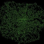
One of the biggest advantages, I feel, about studying urban transport phenomena in London is the simple ability to be able look out of the window and see what is actually going on.  This week, the Olympics and its (supposed) transportation chaos, came to London.

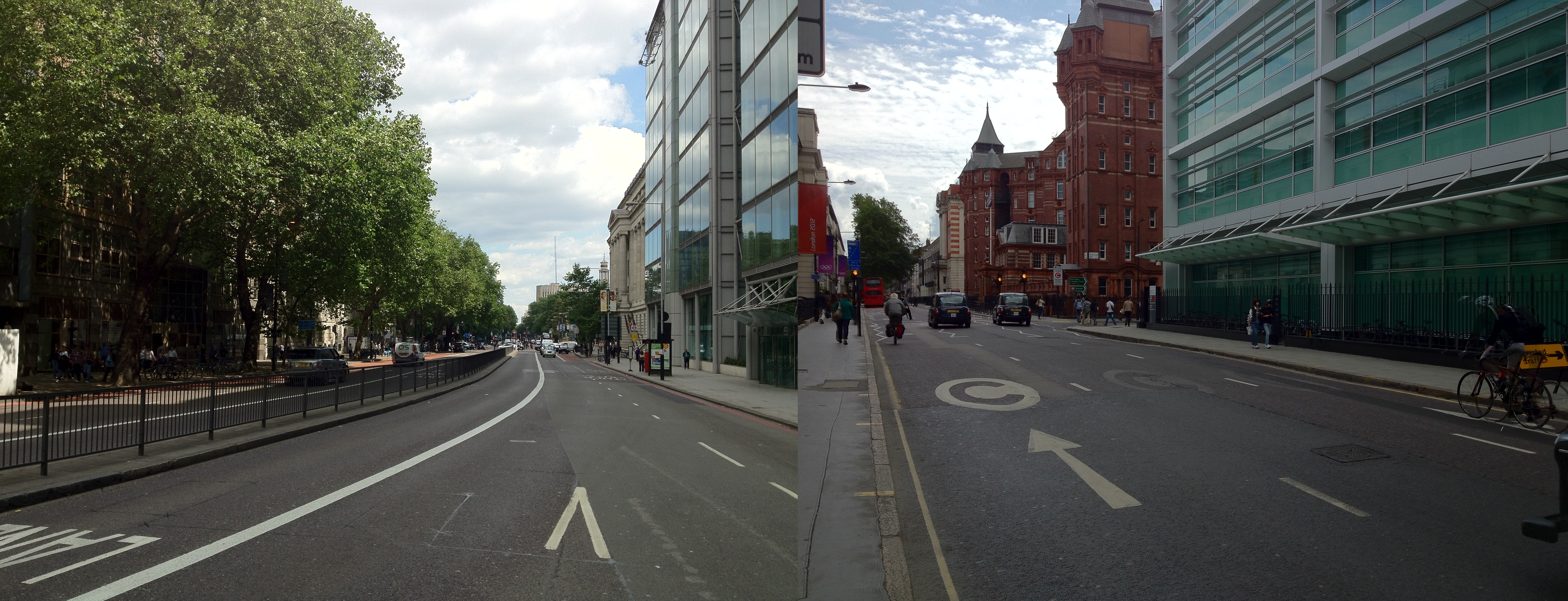
What has struck me early on, mainly since the introduction of the Games Lanes last week, is a big reduction in the number of vehicles on the road.  There have been reports of certain inevitable problems in various parts of the capital, but my experience has been a general reduction in demand on most roads (see a couple of photos I took below).  This sentiment has been shared by a number of my colleagues.  There has been no word yet from Transport for London as to whether the data is backing this up.

London 2012: Using Fear to Tame Transportation Demand

Second, the big public transport problems predicted at certain stations and at certain times, have no yet come to fruition.  Warnings were issued widely this morning about potential overcrowding at a number of stations, yet early reports suggest that this is far from the reality – the Guardian highlight a number of citizen reports of empty Tube seats and quiet stations this morning.

London 2012: Using Fear to Tame Transportation Demand

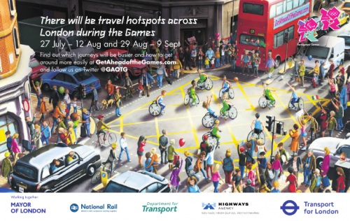
Typical fear-inducing GetAheadOfTheGames literature (copyright Transport for London 2012)

It appears that the strategy has worked.  In fact, one might even suggest that it has worked better than expected.  I would say that this is partly down to the impact of irrationality, specifically the impact of fear.  Individuals, scared of potentially having to wait considerable amounts of time at stations only to cram into packed Tube trains, or fearful of long queues on the roads, have changed their habitual plans en masse.

Social Phenomena

The effect has gone to demonstrate, at least to me, the impact that small changes in the behaviour of many individuals can have on the nature of the city.  As individuals, we make a choice, we carry out that action, and we are mostly unaware of the impact that decision has on shaping broader phenomena.  Yet, in observing the patterns these many individuals make, we can begin to see how individual and social attitudes impact on shaping transportation flows.

This relationship, specifically the impact that fear has had in the context of the Olympics, appears to have caught some analysts on the hop.  INRIX, a big transport data provider, predicted earlier in the year the ‘perfect traffic storm‘ in traffic demand during the first few days of the Games (reported in more detail here).  This patently failed to happen.  The models INRIX employed in making these predictions clearly failed to make consideration for the impact that fear would play in reducing traffic demand.  This approach is far from uncommon where transport demand modelling is concerned.

The Games have a long way to run yet, and we may well see a counter movement occur in time as people begin to realise that transportation isn’t as bad as first expected.  But I think the impact that fear has held on shaping, at least, the first few days of transportation flows makes for interesting viewing.

Navigating the City: Minimising Distance but NOT Minimal Distance

I’ve always had a problem with the pervasive assumption in transportation research that everyone takes the shortest metric distance path when travelling between A and B.  This idea doesn’t seem to have any solid foundations in research, and intuitively it doesn’t make much sense – how do you even know what the shortest distance path is anyway?

So a good deal of my research has looked into what people really do. I’m not going to reveal all here – journal papers are generally more important than blogs in assuring future employment – but I’ll share one interesting finding.

The data I have used relates to 700,000 taxi routes through London (you might remember I blogged about this dataset previously).  For each of these routes, between origin and destination, I have also calculated an optimum path, according to a range of metrics, one being distance.  Then, as far as this blog post goes, I have compared each route and calculated the percentage match between the real route and the optimum shortest distance journey.

Realistic?

So is the shortest distance path a decent representation of reality?  No.

On average, the shortest distance path is able to estimate only 39.8% of each route.  Pretty poor when you consider that it is often used solely in predicting the behaviour of many individuals.

Not only this, the data shows that the shortest distance path is followed in entirety only very rare occasions.  Only 5% of real journeys show a match with 90% of their equivalent shortest distance path, with this value only rising to 13% when that threshold is dropped to 75%.

Minimising Distance

So, do people have no consideration for distance when they route through the city?  Well, no, that isn’t quite the case.

The graph below shows a scatter plot of real distances against actual distances.  As you can see, the relationship and resulting R-square is pretty good.

DistanceVsOptimalAll.PNG.scaled1000

Note: Overly long routes (three times optimal distance) have been removed.

It appears that people therefore appear to minimise distance – or they at least do not at least go extremely far from the minimal – but do not generally take the optimal shortest distance path.

This is research I’m still pulling together, but I hope this post has interest to the wider community.  For anyone that is interested, do get in touch and I’ll let you know when the paper on this may be out.

The Diamond Jubilee in London: A Tweet Location Analysis

I’ve been collecting Twitter data for a little while now, and have managed to identify some interesting (if slightly frivolous) trends.  But, when considering the wider applications of such a dataset, one question that has continued to bug me is – Why do we tweet when we tweet?

I won’t attempt to answer that question here (yet), but one clear reason is when we want to communicate our involvement in an event or activity.  You can see it quite clearly in the data – gigs at the O2, football matches at the Emirates – all of these events show up as clusters of tweet points.  So, with the Diamond Jubilee celebrations occurring in London last weekend, I thought this would be a nice opportunity to demonstrate how these crowd patterns form and disappear over space and time.  The images below – I hope you will agree – are quite pretty, but I think the analysis presents some more interesting implications with regard to the use of this type of dataset and the nature of visualisation, aspects I’ll address at the end.


Tweeting the Diamond Jubilee

What I’ve done here is look at all tweets mentioning ‘Jubilee’ occurring in London on the 3rd and 4th June 2012.  As you good patriots will recall, these were the dates of the Thames flotilla and Jubilee concert outside Buckingham Palace.  For you more technically-minded people, I’ve taken the tweet point locations and applied a Kernel Density Estimation on them, to provide a sense of where the highest density of tweets were occurring on each day.

The colour scheme – in the colours of the flag, of course – shows the shift from high density areas of Jubilee-related tweets (in red) to areas where not many such tweets are detected (in blue).

Flotilla Day

On the day of the flotilla, you can clearly see a strong distribution of tweeting monarchists along the course of the flotilla on the River Thames.  It can be noted that this distribution is not spatially uniform, however, indicating perhaps the locations of the best, or most popular, viewing areas.  You can see other clusters around London too, which may indicate where other gatherings were taking place.

The Diamond Jubilee in London:  A Tweet Location Analysis

We can also look at this data in 3D too, allowing us to better explore where the absolute highest densities of tweets were occurring within those big clusters of red…

The Diamond Jubilee in London:  A Tweet Location Analysis

Interestingly, this map helps to better draw out where the exact hotspots lie. Revealing that the highest densities are at each the bridges along the route, with Vauxhall and London bridges seeing the greatest activity.

Concert Day

The day of the concert – taking place on the evening of the 4th June – indicates clearly a completely different pattern of behaviour.

The Diamond Jubilee in London:  A Tweet Location Analysis

Here the biggest activity is along the Mall and towards the Jubilee concert outside Buckingham Palace.  One can also identify big clusters of tweets in Hyde Park and around Soho, again with lots of other clusters dotted around the city.  Overall, there appears to be a lesser concentration of tweets than seen on the day of the flotilla, something that appears to follow that reported in the press.

Again, consulting the 3D representation of the data, shows us more exactly where the largest clusters of tweets are located…

The Diamond Jubilee in London:  A Tweet Location Analysis

This image again demonstrates the importance of an alternative perspective.  In this case, we can see that the most important cluster is found along the Mall at the concert itself, with the other activity highlighted in the 2D perspective seemingly of much lesser significance.


What does all this actually mean?

OK, OK, so you may be thinking at this point ‘Yes, very nice pictures and everything, but isn’t this all fairly obvious?’.  Well in some ways yes, we know from the television pictures that there were a lot of people along the Thames on the 3rd June watching the flotilla.  What we have a lesser grasp on is the exact volume and spatial distribution of these people, and how they moved throughout the day.

My feeling is that, although biased in many respects, this dataset provides us with a unique opportunity to measure the spatial distribution of crowds at events. It may well only be a proxy for activity, but rather than relying on a few, subjective viewpoints, we are able to get a better overall indication of the true patterns of crowds in space and time.  Such analysis may also help us to identify emerging, organic events, outside of our current viewpoint, that require our attention.

In regard to these images in particular, I hope that the Kernel Density approach has been of interest to some of you of a less geographic mindset.  They do quite effectively highlight the locations of tweet hotspots.  The differences between the 2D and 3D images do demonstrate, however, how the visualisation of data can become misleading.  What appear to be large events in one representation are much less significant when viewed from an alternative perspective.  This is a facet of data visualisation that we all should be conscious of.

As ever, your thoughts on anything I’ve presented here are very welcome.


Edit (11-06-12)

You can now find video animations of the 3D results here and here.


A Simple Idea for Making Route Directions More Human

For many, route planners are vital in finding your way around the city.  Type your destination into Google Maps or one of the many other websites or apps available, and you’ll be returned a list of directions from your location.  Simple, right?

Hmm well, let’s have a look at an example.  Taking two well known locations in London, we’ll have a look at the walking directions provided by Google Maps – Buckingham Palace to the Tate Modern – here we go.  Great George Street, fine, Bridge Street, ok, follow the A302, errr, something about the Millenium Bridge, and we’re there, maybe.

OK, if you’re a Londoner, how would you describe the route to someone?  I suspect it might go something like this…

Right, so from Buckingham Palace, head down towards Parliament, keep left of Parliament and go over the bridge.  At the end of the bridge, turn left, go past the Millenium Wheel, carry on along the river.  You’ll pass the National Theatre and the OXO Tower, then the Tate Modern is opposite St Pauls.

So why can’t Google Maps or anyone else include these instructions?  They have the data on the locations of these places.  They have the direction of movement of the individual, so can have an idea of what is in front of them…

“Yes, but what about obstacles stopping people from seeing these places?!”, I hear the perceptive reader ask.

Well, Google and Flickr hold ample amounts of georeferenced photography that would allow them to calculate viewsheds of these locations.  The locations and groupings of these photos show that St Pauls can not be seen from Parliament, for example, and indicate the places where these locations are viewed best.  Furthermore, the volume of photos provide an indication of the popularity or salience of the location, and could even be provided with directions so that even the least familiar tourist knows what to look for.

Considering the volumes of crowdsourced data they hold, I feel like Google are missing a pretty simple trick here.  So, come on, Google, why not improve this feature and make a walk through the city more interesting to everyone.

Mapping Taxi Routes in London

One major aspect of my research is spent looking into how people choose their routes around the city.  And to aid me in this, I managed to acquire a massive dataset of taxi GPS data from a private hire firm in London.  I’ve spent the last few months cleaning up the data, removing errors, deriving probable routes from the point data and extracting route properties.

It’s been a big job, but worth it.  I now have the route data of over 700,000 taxi journeys, from exact origin to destination, over the months of December, January and February 2010-11.  I’m now moving on to the actual analysis of this data, and am beginning to answer some of these questions concerning real-world route choice.  In the meantime, I thought I’d share one striking image that I extracted through this work.

The image below represents an aggregate of journeys on each segment of road on the London road network.  The higher levels of flow are illustrated in red, falling to orange, yellow, then white, with the lowest flow values shown in grey.

The most popular routes are along Euston Road, Park Lane and Embankment, which may be somewhat expected, but make for a stark constrast with respect to the flow of most traffic in London.  The connection with Canary Wharf comes out strongly, an indication of the company’s portfolio, though route choice here is interesting with selection of the The Highway more popular than Commercial Road.

Real insight will come with the full analysis of the route data, something that should be completed in January.  Until then, though, I’ll just leave you with this pretty something to look at.

Space Syntax to GIS Integration: A Roadmap

Something I have been thinking about recently is the possibility of integration between GIS and space syntax.  The motivations are very clear.  Space syntax represents a compelling quantitative model of human behaviour and movement.  While the understanding of human systems is one of its most important areas of GIScience research (I may be slightly biased).  And with the ever increasing availability of movement data on a range of levels, the development of a model underlying this behaviour is ever more important.  So why can’t these two just get it on?

Representation

Well, the old argument has been that axial maps – the fundamental representation of space syntax – is simply not compatible with GIS.  Axial lines represent lines of sight, while GIS data segments are supposedly geographically accurate – at the level of network measures this difference is highly significant.  However, developments in space syntax – notably the development of Angular Segment Analysis by the brilliant Alasdair Turner, who very sadly died last week – mean that GIS integration is very much a possibility.

Turner’s approach was to measure the angular deviation between road segments on a GIS layer, assigning a score of zero for straight-ahead travel.  The greater the movement away from the straight line the higher the score, effectively yielding a new axial line.  Running angular betweenness (aka ‘choice’ in space syntax circles) calculations on the network yields some interesting results that I have discussed previously.  The story is clearly much more complex than this (and more can be read on this here).  But essentially this could be viewed as a new link between the traditional view of space syntax and GIScience.

ASA to the rescue?

However, some recent work I’ve been carrying out suggests that the picture is not so simple.  Specifically, it is not necessarily possible to run an Angular Segment Analysis on a raw GIS layer.  Taking the example of the OS ITN dataset – the most extensive representation of the UK road network – the presence of dual carriageways, roundabouts and other artefacts are contrary to what one would expect from an equivalent to the axial map.  And, indeed, betweeness measures on these networks do not inspire either, with strange variations across the datasets, notably across dual carriageways where big discrepancies can be found.

There are two key aspects at play here, I feel.  Firstly, ASA in it’s current form does not take account of traffic infrastructure and regulations.  Were it to perhaps handle routing information then the results may be more realistic, certainly in terms of the flow on dual carriageways and roundabouts.  Second, dual carriageways and roundabouts do not align with the fundamental idea behind the axial map.  Cognitively speaking, we do not think in terms of dual carriageways, rather simply the existence of a roadway at a given location.  In other words, why should dual carriageways be assessed independently since they were only simply engineered into two lanes?

Roadmap?

So, what can be the way forward here?  Well, I know that where ASA is used commercially, the underlying network model is initially simplified to remove dual carriageways and roundabouts.  But this seems awfully unscientific (well, maybe cartography isn’t particularly scientific either…).  My suggestion, and something I am currently pursuing, is usage of simpler, existing GIS datasets.  In this way, these models are already used widely and better validated than a subjective in-house alteration.  Yet, what about other models and datasets that require more extensive GIS data?  I suggest the development of tools that link together different GIS datasets, allowing an exchange of data yet not disrupting the validity of each approach.  We can even try to link the axial map back to a range of GIS layers, and truly gain an understanding about the strengths of these approaches.

This is something I’ll be working on over the next few months – so watch this space, or get in touch if you’re interested in this.

Space Syntax and London’s ‘Main’ Roads

At the very broadest scope, Space Syntax can be said to investigate the relationship between movement and the configuration and connectivity of space.  In the past, while much favour has been found in the approach, critics have been distrustful of the axial line concept and of the representation of road segments as nodes in a network.  The construction of the network too, the process of drawing a network of longest lines of sight, has been seen to be unscientific.  Although I personally feel this to be a weak argument against Space Syntax in general, it’s acceptance into the wider research community may be hampered by this fact.

By way of a response to this argument, either intentionally or otherwise, there has been a movement towards segment-to-segment angularity (known as Angular Choice) as a predictor of movement.  The method is described by Turner in this paper, but in summary it is a calculation of betweenness on each network segment using the angular deviation between segments as the weight on which to calculate a shortest path.  The higher scoring segments, therefore, are those which are on a larger number of shortest angular paths passing over them.

One implication of this approach is that it a better fit for through-movement, that is an indicator of the routes we’re likely to use when moving from A to B.  This fits with what has been identified in other literature (particularly spatial cognition) where least angular change is identified as a driver of choice, notably in favour of pure metric distance.

So with a view to better understanding this relationship between the reality and angular choice, I wanted to compare the networks we find in the city and those indicated by this measure.  The first step was to draw out what traffic planners view as the most important roads on the network.  These are the roads identified in network as ‘Motorways’ and ‘A Roads’ (e.g. the ‘main’ roads), and as defined by the Department for Transport.  These were extracted and are as shown below:

The top 2% of these measures immediately draw out many of the most used and most well-known roads in London.  The M25 is prominent, as is the North Circular and various corridor roads into the city.  At 5% there is more definition of some of the other key roads, and by 10% we have a network that is quite similar to the map of ‘main’ roads in London.

By way of a statistically breakdown, the top 2% of values of the Choice measure predicts 76.3% of all ‘Motorway’ segments and 28.4% of all ‘A Roads’.  By 10%, these values have risen to 87.4% and 75.4% of all segments, respectively.  It is therefore clear that there is a correlation between this network measure and the definitions applied to the network.

I realise that this is a somewhat unrefined piece of work but I’d welcome any comments and am happy to share more on my method and results for those who are interested.

From Road Closure to Road Congestion

Much of my work attempts to recreate the macro from the micro.  That is the explanation of large-scale effects through the examination of small-scale behaviours.  I look at how these develop over space and time.

So, more specifically, I look at how road congestion forms in cities and how we, as travellers, all contribute towards it.

As part of my early work on this stuff, I developed a simulation looking at how traveller decisions impact on the flow of traffic in adverse situations.  This consisted of the development of an Agent-based Model (ABM) using the Java-based Repast Simphony framework.  After a fair bit of faffing with Repast (which, I should add, is great although has a considerable learning curve in comparison to some ABM software), I have a model that demonstrates the impact of road closures across a population of driving agents.

The video below shows how the population of individually-cognating agents move from an area of origins (in green) to an area of destinations (in red) through London.  All of the agents move through geographic space, specifically an area around UCL in Euston.  So, this first video shows the normal situation, the next video will show how that changes once we mess things up a bit. (By the way, the video takes a few seconds to get moving, just allowing me a few seconds of in-lecture explanation).

Although the model is relatively simple in traffic simulation terms (with no traffic lights and regulations etc), I think it does show where concentrations of traffic form.  Particularly through the Euston Road/Tottenham Court Road junction.  So, what would happen if we closed this junction?  This…

I think it’s interesting to see the redistribution in traffic around the network.  Knowing that this junction is closed, you get a lot more movement along other roads suggesting that traffic would be considerably slower in these areas.  Clearly, the exact where’s and when’s in this scenario are some way of what reality might show.  Not only do we not have the impact of road regulations, but each individual holds a perfect knowledge of the network, proceeds towards their target along the shortest path and has prior knowledge of the closure ahead.  These are three important aspects I address in other pieces of work that I’ll put up later.  I also realise a bit of flow data would be quite useful here, but considering the pure conjecture of this scenario I’m not sure it’ll add much!