There is no doubt about the importance of social media in organising and directing crowd behaviour. But there has been little discussion of how these models maintain certain social structures outside of periods of group activity.
As far as I can see, in the case of the London riots, young people are so intertwined with online social networking that they are never disconnected from the crowd. The ideas that seem ‘normal’ and ‘acceptable’ during the actual riots – vis a vis hatred of the police, the desire to burn down and loot property – are maintained through these online connections. When otherwise people may have had time to individually draw stock and reflect, there is always the online ‘crowd’ continuing to stoke the fire.
So, naturally then, people get together under the excitement that something might happen. And when inevitably something does kick off, everyone gets involved. What we then have is chaos and typical rioting behaviour.
‘The Madness of Crowds’ was a book written by Charles MacKay in 1841, describing the formation of crowd behaviours such as hysteria, economic bubbles and mass panic. MacKay was among the first to begin to describe widespread phenomena that exist beyond the realm of individual rationality, phenomena that only exist through the interaction of crowds. One particularly prescient quote may be as follows:
“Men, it has been well said, think in herds; it will be seen that they go mad in herds, while they only recover their senses slowly, and one by one.”
It appears to me that, in trying to understand and explain what has happened in London over the last few days, the press and politicians have forgotten this basic principle of crowd behaviour.
We all know that rioting and looting is a criminal activity (thanks for pointing that out Nick Clegg and Boris Johnson), but it is now taking place within an environment of acceptance and normality, an environment that has developed extremely quickly. Within these social networks, existing across the intertwined ‘real’ and online worlds, there persists an ongoing idea, for whatever reason, that this behaviour should be taking place. This is clearly dangerous and irrational, but it is an idea that remains. Instead of calming the situation, I suspect that the threat of heavy policing and criminal prosecution is inflammatory, riling the crowd and encouraging them to go to further lengths.
In trying to understand these situations, people look to establish the drivers of this behaviour – the shooting that prompted the anger, or Twitter being used a platform for communication. But this misses the point. Rioting doesn’t need a cause, it is an irrational herding behaviour, where new norms are established quickly.
The ending of this behaviour must come from the base up. Individuals – probably many of whom are normally decent and functioning members of society – must realise for themselves that what they are doing is wrong.
Unfortunately, this realisation, with the supporting infrastructure of online social networks maintaining this irrationality, may come later rather than sooner.
Spending a lot of time with code at the moment, and this doesn’t make for interesting blog posts…
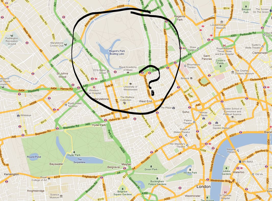
However, I noticed something a while back that potential readers of this blog may have an explanation for. In Google Maps ‘map view’, Regent’s Park is coloured grey. Not green, as in Hyde Park or Hampstead Heath green, but grey as in plain old private housing grey. And this never was previously the case, something has changed, Google has de-parked Regent’s Park.
Have a look here or I’ve taken a screen capture of the suspect area below (copyright Google, obvs):
So what’s going on Google? Why must you pay the beautiful Regent’s Park this disrespect? Does it offer too much in the way of paved surfaces and tennis courts? Surely it’s no worse than Hyde Park?
The Wikipedia article offers not much in the way of explanation, both being owned by the Queen (yes, the Queen, granted through ‘grace and favour’ for use by the public). It is very much a park, too, according to the Ordinance Survey. So what are the criteria that Google base their park definition on? Or is this a glitch in the algorithm? Answers on a postcard. I’d be interested to hear of any ideas/conspiracy theories…
EDIT: So I sent this post on to Ed Parsons from Google Maps via Twitter (@edparsons). He replied saying that it seems to be an error and that he’ll get someone to look at it (full tweet here) – hurrah for Regent’s Park!
EDIT 2: Regent’s Park isn’t alone it would seem. According to one post of the Google message boards, there are other parks too, including Battersea and Victoria parks (credit to ‘Tom R London’. I still wonder what sort of error would impact on only these few instances…
Handling large datasets in ArcGIS can be a truly painful process. When you are up against a deadline, the seconds spent wasted waiting for ArcGIS to update its display or run a query can be excruciating.
That is until you discover spatial indices! It is like a new world, where querying data is (almost) fun, and not an reason to go and make a cup of tea. Plus it is incredibly simple.
To apply a spatial index, firstly find your troublesome dataset in Catalog. Right-click and go to Properties. Then the Indexes tab. See Spatial Index in the bottom pane of this window and click Add. This will take a few seconds but once in place it will significantly improve the speed of your redrawing and querying.
Having said all this, I’m not sure this will be new to many – but I found this very useful. More information is available from ESRI themselves here.
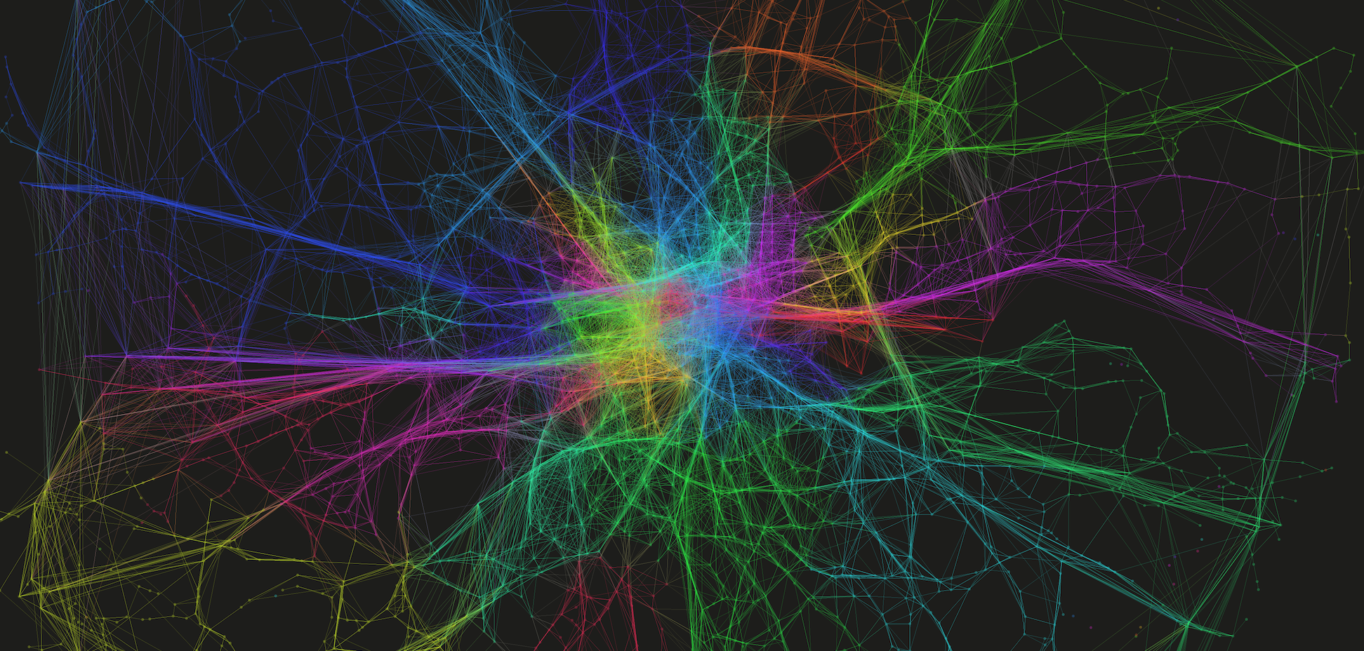
At the very broadest scope, Space Syntax can be said to investigate the relationship between movement and the configuration and connectivity of space. In the past, while much favour has been found in the approach, critics have been distrustful of the axial line concept and of the representation of road segments as nodes in a network. The construction of the network too, the process of drawing a network of longest lines of sight, has been seen to be unscientific. Although I personally feel this to be a weak argument against Space Syntax in general, it’s acceptance into the wider research community may be hampered by this fact.
By way of a response to this argument, either intentionally or otherwise, there has been a movement towards segment-to-segment angularity (known as Angular Choice) as a predictor of movement. The method is described by Turner in this paper, but in summary it is a calculation of betweenness on each network segment using the angular deviation between segments as the weight on which to calculate a shortest path. The higher scoring segments, therefore, are those which are on a larger number of shortest angular paths passing over them.
One implication of this approach is that it a better fit for through-movement, that is an indicator of the routes we’re likely to use when moving from A to B. This fits with what has been identified in other literature (particularly spatial cognition) where least angular change is identified as a driver of choice, notably in favour of pure metric distance.
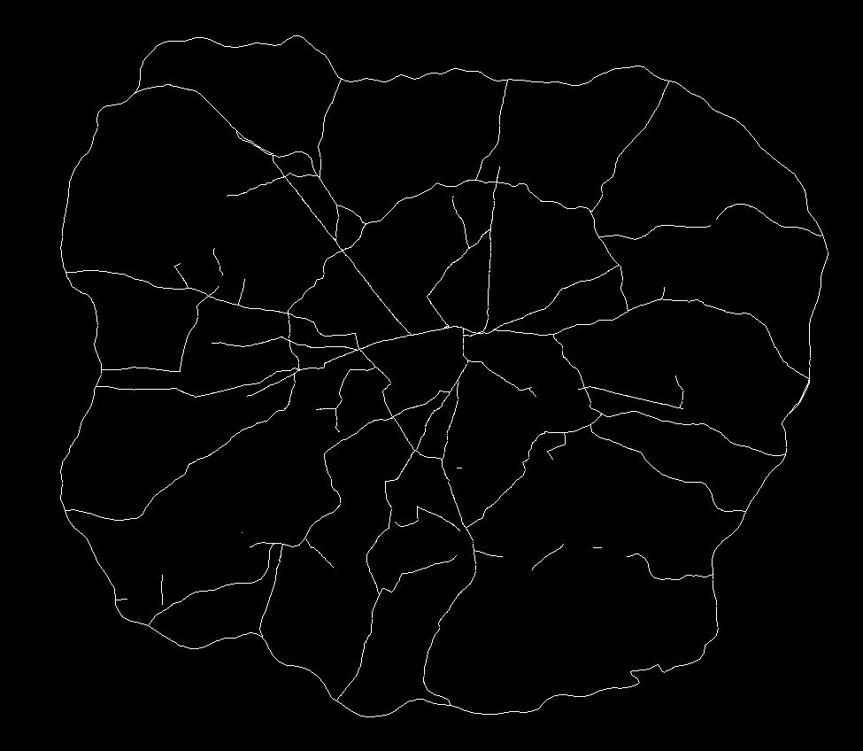
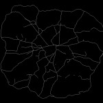
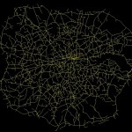
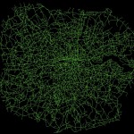
So with a view to better understanding this relationship between the reality and angular choice, I wanted to compare the networks we find in the city and those indicated by this measure. The first step was to draw out what traffic planners view as the most important roads on the network. These are the roads identified in network as ‘Motorways’ and ‘A Roads’ (e.g. the ‘main’ roads), and as defined by the Department for Transport. These were extracted and are as shown below:
Top 2%
Top 5%
Top 10%
Top 20%
Defined A Roads and Motorways
The top 2% of these measures immediately draw out many of the most used and most well-known roads in London. The M25 is prominent, as is the North Circular and various corridor roads into the city. At 5% there is more definition of some of the other key roads, and by 10% we have a network that is quite similar to the map of ‘main’ roads in London.
By way of a statistically breakdown, the top 2% of values of the Choice measure predicts 76.3% of all ‘Motorway’ segments and 28.4% of all ‘A Roads’. By 10%, these values have risen to 87.4% and 75.4% of all segments, respectively. It is therefore clear that there is a correlation between this network measure and the definitions applied to the network.
I realise that this is a somewhat unrefined piece of work but I’d welcome any comments and am happy to share more on my method and results for those who are interested.
Looks like the MIT City Form Research Group have developed a very useful toolkit for those interested in small-scale urban network analysis. Bit uncertain about how well it might run on larger urban networks, if I get around to testing it I’ll put the results on here.
Going through some old links I found this, UCL’s Hugo Spiers talking about taxi drivers’ brain activity during their movement around the city. Demonstrates the use of landmarks and salient features in movement around the city, as well as providing some quantitative evidence for route-choice patterns.
For those interested there a BBC article on this work here, and the full paper (for those with access) here.
Much of my work attempts to recreate the macro from the micro. That is the explanation of large-scale effects through the examination of small-scale behaviours. I look at how these develop over space and time.
So, more specifically, I look at how road congestion forms in cities and how we, as travellers, all contribute towards it.
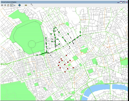
As part of my early work on this stuff, I developed a simulation looking at how traveller decisions impact on the flow of traffic in adverse situations. This consisted of the development of an Agent-based Model (ABM) using the Java-based Repast Simphony framework. After a fair bit of faffing with Repast (which, I should add, is great although has a considerable learning curve in comparison to some ABM software), I have a model that demonstrates the impact of road closures across a population of driving agents.
The video below shows how the population of individually-cognating agents move from an area of origins (in green) to an area of destinations (in red) through London. All of the agents move through geographic space, specifically an area around UCL in Euston. So, this first video shows the normal situation, the next video will show how that changes once we mess things up a bit. (By the way, the video takes a few seconds to get moving, just allowing me a few seconds of in-lecture explanation).
Although the model is relatively simple in traffic simulation terms (with no traffic lights and regulations etc), I think it does show where concentrations of traffic form. Particularly through the Euston Road/Tottenham Court Road junction. So, what would happen if we closed this junction? This…
I think it’s interesting to see the redistribution in traffic around the network. Knowing that this junction is closed, you get a lot more movement along other roads suggesting that traffic would be considerably slower in these areas. Clearly, the exact where’s and when’s in this scenario are some way of what reality might show. Not only do we not have the impact of road regulations, but each individual holds a perfect knowledge of the network, proceeds towards their target along the shortest path and has prior knowledge of the closure ahead. These are three important aspects I address in other pieces of work that I’ll put up later. I also realise a bit of flow data would be quite useful here, but considering the pure conjecture of this scenario I’m not sure it’ll add much!