In case you hadn’t noticed, the ONS released their latest tranche of Census 2011 results today. The data has received considerable fanfare in the media already, looking set to dominate political debate over the coming days. One big story that appears to be arising from today’s release features the hot political potato of multiculturalism.
Before I start I’d like to emphasise that this blog post isn’t intended to comment on these results in any way, merely to point out clear examples of how, through the design of their the ONS have implicity directed the interpretation of these results. In fact, it perhaps raises once again the important issue on how data and visualisation can be used to influence how results are perceived by the viewer.
ONS Interactive and Colour Selection
Along with this latest release, the ONS provided an interactive tool to enable the exploration of the results by category and in comparison to 2001 results, and these maps have been featured widely in the media coverage thus far.
Now, most people who have ever designed a map know that colour selection is vitally important. The categories and colour scales you pick help to determine how a map is viewed and the message that is taken away. I won’t go into detail here but more information and a nice tool for testing these principles out is available here. In effect, you build up a strategy for the presentation of your data.
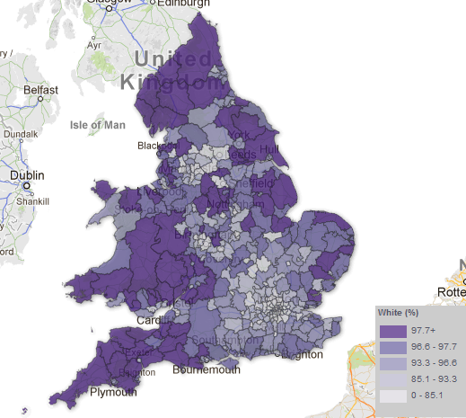
With respect to this issue, the strategy taken by the ONS in this instance is somewhat peticular. Take a look below at the ‘Percentage White’ ethnicity map by Unitary Authority, taken from the ONS website:
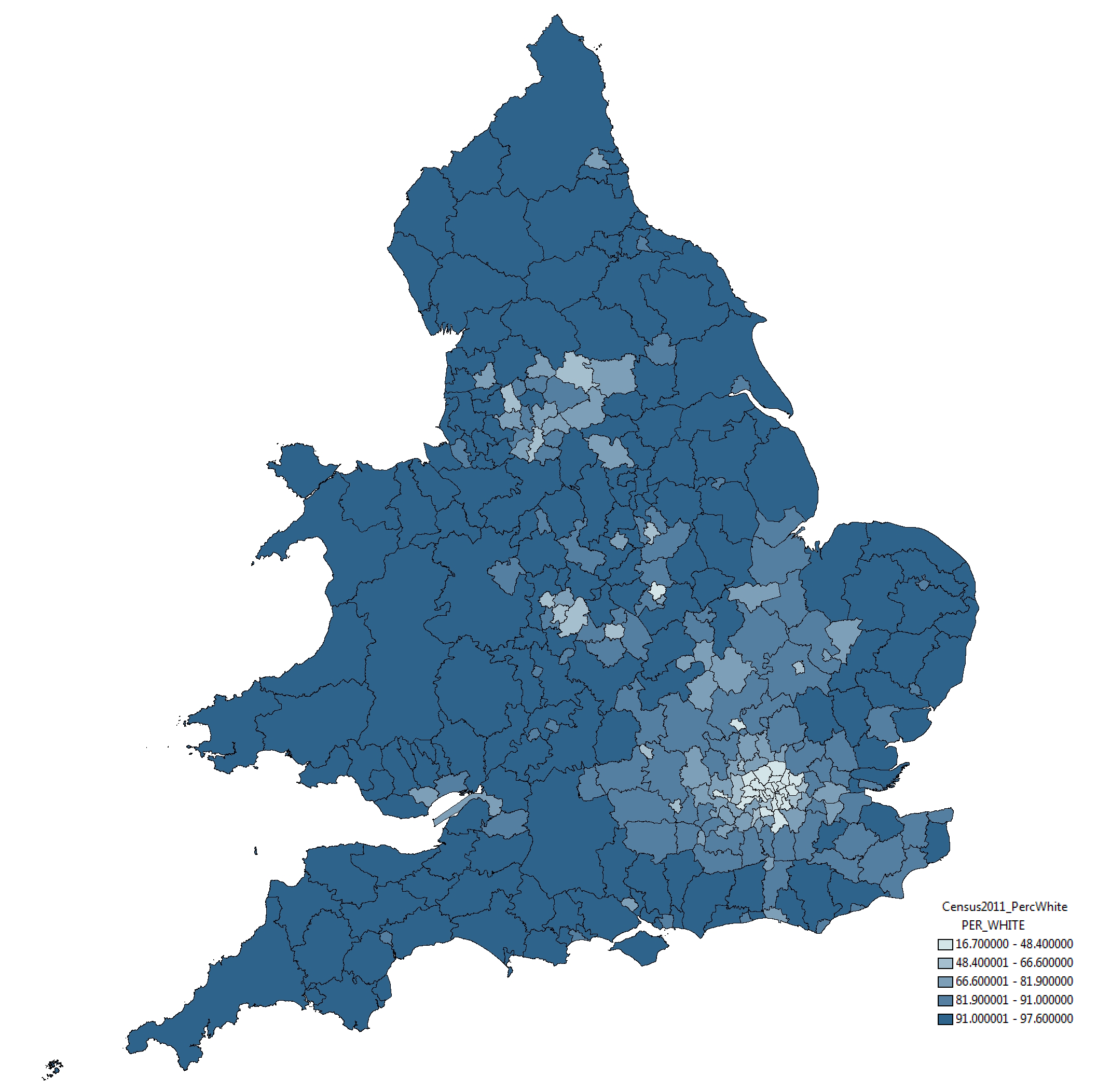
The rather strange selection of categories – whereby variation around 12 percentage points (between 85% and 97%) is split into three categories and variation around 85 percentage points placed into one category – mean that relatively small differences in the value of this attribute are represented as considerably different through the colouration of the map. This, to me, seems like a very strange approach.
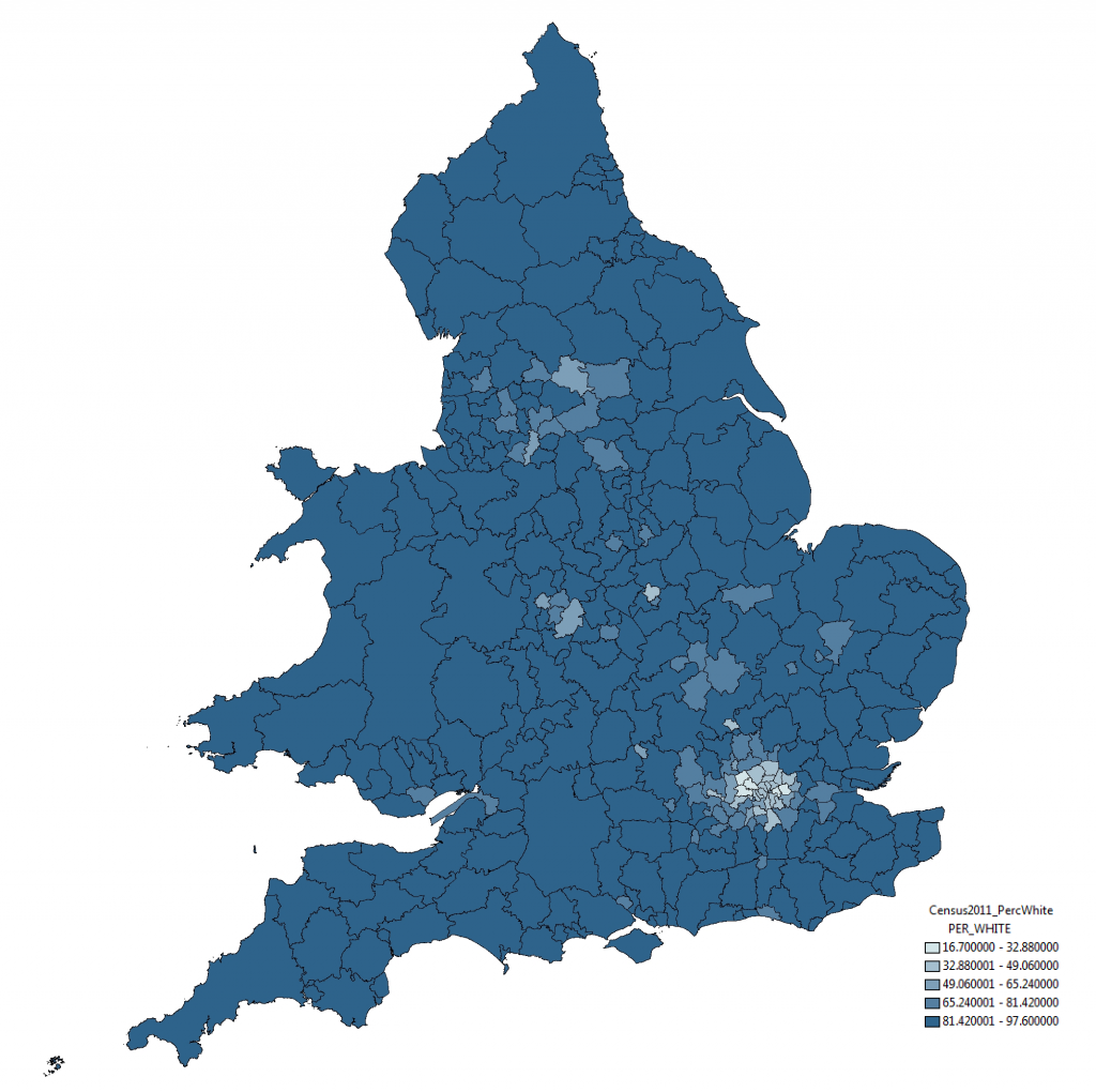
To indicate this point more clearly, take a look at the map below of exactly the same data and same geographical boundaries. All we have done here is use a standard symbology method, the Jenks Natural Break Optimisation method. The results are quite different:
In this map, through the categories selected using the Jenks algorithm, small variations between districts are absorbed and a truer sense of the variation is presented. Similar results are found using other standard symbology approaches; some, such as Equal Interval categorisation shown below, indicate even lesser variation among the data:
As I say, these are just standard methods and implemented in mainstream GIS software, nothing special and what would ordinarily be used in representation of such data. For some reason the ONS have chosen to take an alternative direction. And ‘Ethnicity’ isn’t by any means the only case of this, the same approach is employed in mapping ‘Born in the UK’ and ‘No Qualification’ data also.
Making Maps to Make your Point
I think what this demonstrates is a timely lesson in how maps can be used to influence how a viewer receives information. Very few of the people looking at the ONS maps today will consult the map key before making their mind up about the results. As a result, I feel, these people make take away an inaccurate understanding of what the underlying data actually represents.
I’m not sure what has lead the ONS to make the choices they have made with respect to their map design*. They may well have a reason for selecting their colour categories in this way, but in emphasising small variations in data such as these they only go to helping to whip by political frenzy.
Update on 12-12-2012
* As you can read below, Robert Fry from the ONS got in touch about this issue. It would appear that the motivation behind the map design is not as considered as I may have first suggested. I have amended the blog post accordingly, although feel this still episode still provides an important lesson.


