Dot Densifying a Canadian City

By way of a warm up to future blogging pleasures, I thought I’d post some mapping work I did for actual fun last year. As Christmas gifts for family I decided to make some custom maps of Winnipeg, Canada (location not chosen randomly, they’re actually from there).

Don’t know Winnipeg? Well… It’s a city of nearly 700000 in the middle of North America, it has a big ice hockey team, and it gets blooooooddy cold in the Winter. My extensive research also seemed to suggest that Winnipeg doesn’t get its fair share of nice city maps – that needs to change.

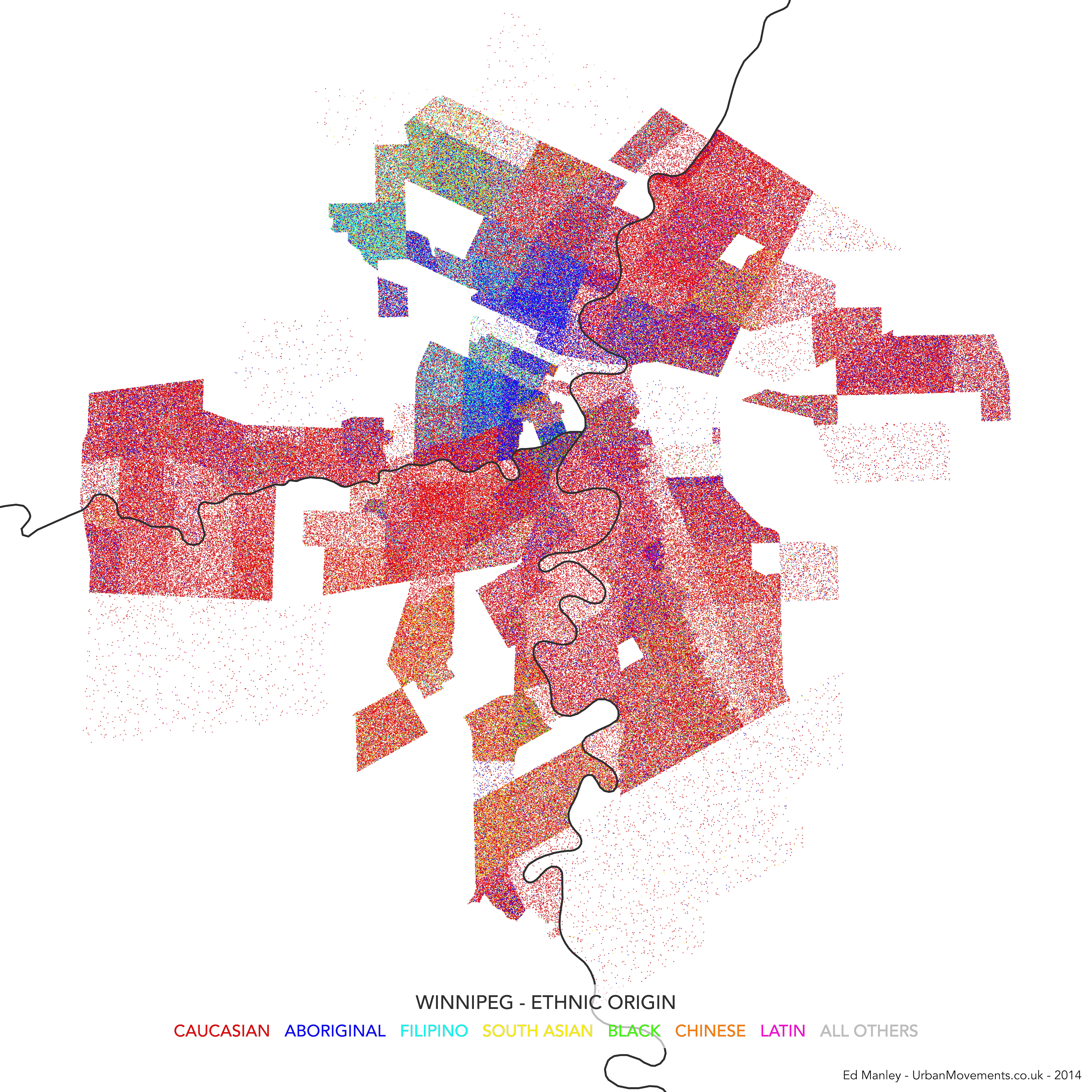
Like many North American cities, walking around Winnipeg you get a sense of how the city starkly changes from neighbourhood to neighbourhood. Winnipeg contains the largest urban population of Native Canadians in Canada, with the community strongly concentrated near to Downtown and northern suburbs. There is a historic French speaking region too, named St Boniface, and a small Chinatown, both near to central Winnipeg. Capturing this diversity (and division) was one of my aims from the start.

Open Data and Open Mapping

It turns out that Winnipeg has a decent supply of Open City Data. It has an Open Data portal – data.winnipeg.ca – based on the useful Socrata platform, as well as a live transit data API. Looking through the available datasets, although it was pretty tempting to make a map of ‘sewer backups’ (nice) or reports of graffiti, someone had done a pretty good job of organising neighbourhood-level 2006 Census data. These datasets were well organised and appeared to provide rich information relating to local demographic variation.

In terms of the map format, my first instinct was to turn to dot density mapping. Dot density maps use multiple points to indicate the categorisation and density of features (e.g. some things) within a region. These maps are often used to map Census statistics, where single points equate to actual individuals. For each Census area, you generate points for the population in the area – you have 500 people, you generate 500 points – colour the points according to some population indicator, and then distribute them randomly across that area. As you’re mapping the entire population using all available categories, instead of only the value of one category, the technique gives you a good sense of population diversity as well as density within that area. There are flaws, of course, it is a bit more artistic than functionally informative, and the random distribution of categorised points within an area doesn’t always make sense, but at small region sizes it generally works well.

And the technical method – Using open source software, QGIS provides a handy Random Points tool, generating random points within a polygon for any values you give it. The rest of the design was carried out in QGIS. Parks, commercial and industrial zones have been removed prior to the creation of points.

The Maps

Using these approaches I decided to make three maps – one showing variation in ethnicity, one showing linguistic variation, and another showing income disparity. Each map hopefully complements each other, providing additional context through shared spatial variation.

In each case, a point is drawn representing an individual Winnipegger assigned to a category across each subject area, as reported through Census statistics. Remember, points are only drawn in the areas where people live, so Winnipeg does end up looking a bit skinny compared to how you would see it with commercial and industrial areas added in.

The maps are designed intentionally minimalist (yes, there’s no north bar, no scale), drawing attention to only the features we are focusing on. Only the river is left as a guide, because it is a defining feature of the city, and a dividing line in many cases.

Without further ado, here are the maps. You can click on each on for a fully zoomable version.

Dot Density Map of Ethnicity in Winnipeg, Canada
Dot Density Map of Language Knowledge in Winnipeg, Canada
Dot Density Map of Income Variation in Winnipeg, Canada


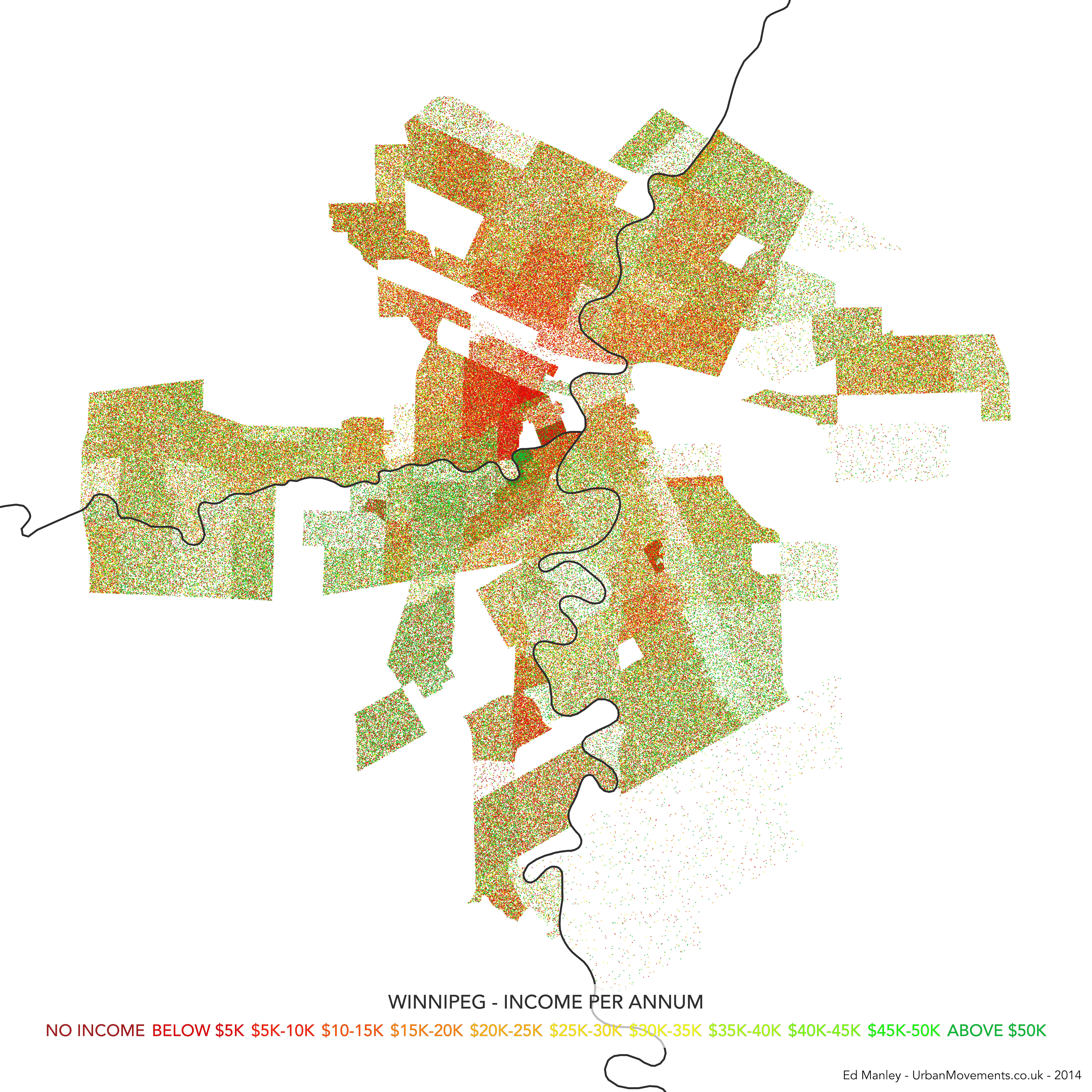
The maps each show how demographic characteristics vary across city neighbourhoods. But I think together further value is added, as they hint at another story of association in characteristics, where trends correlate in areas of the city.

It is not really for me, as a non-Winnipegger to pass any judgement on whether these maps ring true with the lived Winnipeg experience. From my visits to the city, these align with what I’ve seen at least. It would be interesting to hear how Winnipeggers do relate to these maps.


Identifying Communities in Traffic Flow

One recent bit of research I have been working on has been looking at the application of community detection algorithms to traffic flow in London.

The idea is that within the traffic system exist a number of sub-systems of highly interconnected roads.  To a certain extent, these sub-systems are engineered into the system.  Transport for London, for example, specifically manage and maintain 23 key routes into and around central London, known as ‘corridors’.  However, to what extent do further systems exist outside of these defined zones?

Community detection algorithms were developed to identify clusters within a network dataset.  These methods are most often applied to examples within the social network sphere, in the identification of cliques, where a cluster demonstrates high inter-connectivity, with lower connectivity with the rest of the network.  My thinking behind this bit of work was that we might be able to identify similar characteristics in traffic flow, where we can observed high coupling between clusters of nodes.

The map below visualises the modules (distinguished by colour) identified through the application of community detection methods to a topological representation of the road network.  Node connectivity is established using a dataset of 1.5 million private hire cab routes through London.

NodeModularity_GrLondon_3_1k_newcred

The resulting visualisation, apart from being quite pretty (thank Gephi for that), reveal some interesting trends.  To a certain extent, a number of expected patterns in traffic flow are prevalent, with some of the ‘corridors’ into central London, such as the M3, M4 and A2, clearly defined as distinct clusters.  Yet the image also shows how both the M25, the ring road around London, and the North Circular, usually considered as single entities, can be segmentalised into modules defined by their usage.

We also see further interesting patterns in central London too, where certain regions – specifically Knightsbridge, Soho, Shoreditch the City and Hyde Park – are clearly defined as distinct modules.  These would appear to be areas of high internal movement, and thus a clear product of cab usage patterns.

These results, while presented only in their initial stages, demonstrate how measures of network characteristics can help us to understand dynamic patterns of movement in the city.


Edit

Thanks to all for the interest in this work!

Just by way of follow up, the image below shows a zoom in on Central London, demonstrating more clearly some of the regions mentioned above.  I’ve annotated this version for people who may not be familiar with London.

CentralLondonModularity_02_annotated


London 2012: Using Fear to Tame Transportation Demand

One of the biggest advantages, I feel, about studying urban transport phenomena in London is the simple ability to be able look out of the window and see what is actually going on.  This week, the Olympics and its (supposed) transportation chaos, came to London.

What has struck me early on, mainly since the introduction of the Games Lanes last week, is a big reduction in the number of vehicles on the road.  There have been reports of certain inevitable problems in various parts of the capital, but my experience has been a general reduction in demand on most roads (see a couple of photos I took below).  This sentiment has been shared by a number of my colleagues.  There has been no word yet from Transport for London as to whether the data is backing this up.

London 2012: Using Fear to Tame Transportation Demand

Second, the big public transport problems predicted at certain stations and at certain times, have no yet come to fruition.  Warnings were issued widely this morning about potential overcrowding at a number of stations, yet early reports suggest that this is far from the reality – the Guardian highlight a number of citizen reports of empty Tube seats and quiet stations this morning.

London 2012: Using Fear to Tame Transportation Demand

Typical fear-inducing GetAheadOfTheGames literature (copyright Transport for London 2012)

It appears that the strategy has worked.  In fact, one might even suggest that it has worked better than expected.  I would say that this is partly down to the impact of irrationality, specifically the impact of fear.  Individuals, scared of potentially having to wait considerable amounts of time at stations only to cram into packed Tube trains, or fearful of long queues on the roads, have changed their habitual plans en masse.

Social Phenomena

The effect has gone to demonstrate, at least to me, the impact that small changes in the behaviour of many individuals can have on the nature of the city.  As individuals, we make a choice, we carry out that action, and we are mostly unaware of the impact that decision has on shaping broader phenomena.  Yet, in observing the patterns these many individuals make, we can begin to see how individual and social attitudes impact on shaping transportation flows.

This relationship, specifically the impact that fear has had in the context of the Olympics, appears to have caught some analysts on the hop.  INRIX, a big transport data provider, predicted earlier in the year the ‘perfect traffic storm‘ in traffic demand during the first few days of the Games (reported in more detail here).  This patently failed to happen.  The models INRIX employed in making these predictions clearly failed to make consideration for the impact that fear would play in reducing traffic demand.  This approach is far from uncommon where transport demand modelling is concerned.

The Games have a long way to run yet, and we may well see a counter movement occur in time as people begin to realise that transportation isn’t as bad as first expected.  But I think the impact that fear has held on shaping, at least, the first few days of transportation flows makes for interesting viewing.

1st International Conference on Urban Sustainability and Resilience

The 1st International Conference on Urban Sustainability and Resilience will be held at UCL between the 5th and 7th November 2012.  The Call for Abstracts is currently active, with the deadline for 500-word abstracts being the 4th July 2012.

Please see usar-conference-2012.org for more information.  The usual blurb follows below:


The continuing trend toward urbanisation has brought to the fore the linkages between human societies, the technological world which they have created and live in, and the natural environment. Understanding these linkages is crucial to the survival of our species. Recent events (hurricane Katrina, Fukushima disaster, UK flooding 2007) have shown what dire consequences can ensue when weak links are overlooked.

Engineers, policy makers, designers and planners are some of the key professions shaping the future of the urban world. The decisions they make today will often affect many generations to come. As such it is essential that their decision be backed by knowledge which is both scientifically sound and also fully aware of the human factors inherent in urban issues.

The first international conference in Urban Sustainability and Resilience will bring together world experts from across a wide range of engineering, science and social science disciplines with three main objectives:

  • Bring together a strong research community committed to address some of the most pressing issues that human societies have ever faced;
  • Take stock of the current state of knowledge in the field of urban sustainability and resilience
  • Put forward a coherent future research agenda in the field. 


The central themes of the conference will be:

  • Facets of urban resilience
  • Integrating and engineering sustainable and resilient urban systems
  • Feeding the city
  • Towards a low-carbon urban environment 


In addition the conference welcomes papers and posters appropriate to one or more of the following topics:

  • Eco-cities
  • Measuring resilience
  • Transport
  • Water
  • Security
  • ICT
  • Retrofitting
  • Adapting to Climate Change
  • Managing Ageing Infrastructure
  • Sustainability Indicators
  • Waste
  • Energy
  • Food
  • Material
  • Urban Visions

Cities of the Future: Towards Technical or Natural Optimisation?

Amanda Erickson put up a nice, simply visualisation of what life might be like in a future of driverless, automated cars. Check it out.

[vimeo http://vimeo.com/37751380]

Two things sprang to mind while watching this – first, how terrifying this might be for a passenger in one of these cars, and second, haven’t I seen this sort of thing somewhere else before?

Well, yes, I showed the following video in a lecture last month as demonstration of self-organisation.  To me, the patterns look similar – at the higher level you see chaos, but when you observe the actions of individual’s there is usually a rational stream of thought behind the actions they are taking – normally to get to their exit road.  Judge for yourself.

[youtube http://www.youtube.com/watch?v=mr5Gssaxl6g&version=3&hl=en_US]

I think the stark similarity seen between these two videos raise interesting questions about what we consider as progress in the urban realm.  Bare with me as I attempt to explain.

The driverless or automated car is often seen as the natural future of private transportation*, with one of its main benefits being the apparent offer of optimal organisation of traffic flows (e.g. no congestion).  And indeed when look at the first video, everything works and works well, perhaps even optimally.  But then you look at the second video, and you essentially have the same thing, created solely through the activity of individuals.

It is strange therefore that a fully optimised technical system is generally deemed necessary and superior.  When people are left to their own devices, to ‘sort it out between them’, people invariably do.  Traffic in Hanoi is not just the only example of this type of self-organisation – the Internet itself is a creation of human ingenuity.  Following Monderman’s ideas on Shared Space, perhaps all of these traffic regulations, signage and restrictions actually reduce our need to think about what we are doing.  They reduce and remove our ability or will to self-organise, and to the deficit of us all.

So why don’t ‘natural’ answers to technical problems receive a better press?  I suspect it is an issue of trust in the citizen.  That threat that one person may mess up, and mess it up for the rest of us.  Instead of facing the risk and accepting it as part of the solution, we surround ourselves with unnecessary and invasive mechanisms that carry out the task for us.  They may cost a lot of money and not be any better than our current solution, but they feel like progress.  It feels like things are getting better.  So, yes, perhaps automated cars are indeed a thing of the future.

As ever, very interested to hear your thoughts on this.

* I’ve personally never been so sure – mainly because of the safety element, and that fact that many people actually enjoy the process of driving…