Navigating the City: Minimising Distance but NOT Minimal Distance

I’ve always had a problem with the pervasive assumption in transportation research that everyone takes the shortest metric distance path when travelling between A and B.  This idea doesn’t seem to have any solid foundations in research, and intuitively it doesn’t make much sense – how do you even know what the shortest distance path is anyway?

So a good deal of my research has looked into what people really do. I’m not going to reveal all here – journal papers are generally more important than blogs in assuring future employment – but I’ll share one interesting finding.

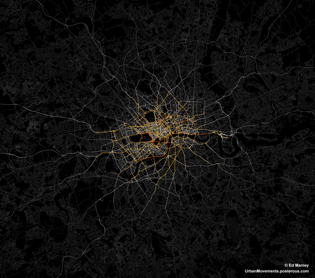
The data I have used relates to 700,000 taxi routes through London (you might remember I blogged about this dataset previously).  For each of these routes, between origin and destination, I have also calculated an optimum path, according to a range of metrics, one being distance.  Then, as far as this blog post goes, I have compared each route and calculated the percentage match between the real route and the optimum shortest distance journey.

Realistic?

So is the shortest distance path a decent representation of reality?  No.

On average, the shortest distance path is able to estimate only 39.8% of each route.  Pretty poor when you consider that it is often used solely in predicting the behaviour of many individuals.

Not only this, the data shows that the shortest distance path is followed in entirety only very rare occasions.  Only 5% of real journeys show a match with 90% of their equivalent shortest distance path, with this value only rising to 13% when that threshold is dropped to 75%.

Minimising Distance

So, do people have no consideration for distance when they route through the city?  Well, no, that isn’t quite the case.

The graph below shows a scatter plot of real distances against actual distances.  As you can see, the relationship and resulting R-square is pretty good.

DistanceVsOptimalAll.PNG.scaled1000

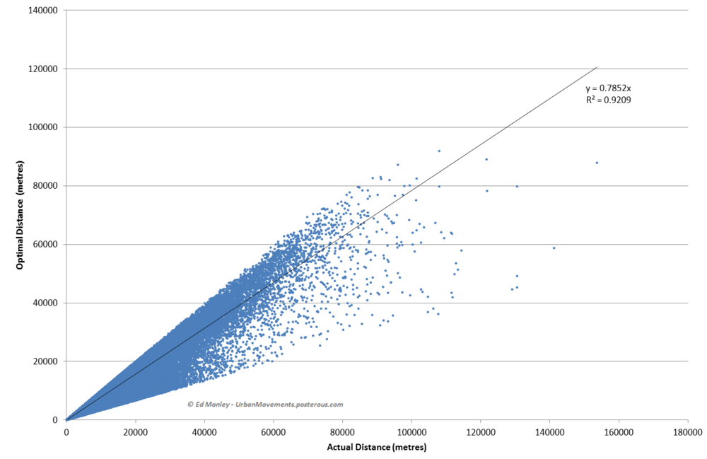
Note: Overly long routes (three times optimal distance) have been removed.

It appears that people therefore appear to minimise distance – or they at least do not at least go extremely far from the minimal – but do not generally take the optimal shortest distance path.

This is research I’m still pulling together, but I hope this post has interest to the wider community.  For anyone that is interested, do get in touch and I’ll let you know when the paper on this may be out.

Modelling Movement in the City: The Influence of Individuals

‘Modelling Movement in the City: The Influence of Individuals’ was the title of a talk I gave at the AGILE conference in Avignon, France last week.  For the conference I actually initially prepared a poster that never ended up seeing the light of day – except for now that is.

The poster presents some recent work I carried out through agent-based simulation, demonstrating how different behavioural models influence the formation of macroscopic patterns.  As you can see from the results, the impact of mere basic assumptions hold a significant impact upon the unfolding network picture.

[slideshare id=19430885&doc=agileposter-130421150321-phpapp02]

Probably now going to write this up as a journal paper, but hopefully putting the poster up here won’t mess with any copyright stuff – please let me know if it might!

Mapping Taxi Routes in London

One major aspect of my research is spent looking into how people choose their routes around the city.  And to aid me in this, I managed to acquire a massive dataset of taxi GPS data from a private hire firm in London.  I’ve spent the last few months cleaning up the data, removing errors, deriving probable routes from the point data and extracting route properties.

It’s been a big job, but worth it.  I now have the route data of over 700,000 taxi journeys, from exact origin to destination, over the months of December, January and February 2010-11.  I’m now moving on to the actual analysis of this data, and am beginning to answer some of these questions concerning real-world route choice.  In the meantime, I thought I’d share one striking image that I extracted through this work.

The image below represents an aggregate of journeys on each segment of road on the London road network.  The higher levels of flow are illustrated in red, falling to orange, yellow, then white, with the lowest flow values shown in grey.

The most popular routes are along Euston Road, Park Lane and Embankment, which may be somewhat expected, but make for a stark constrast with respect to the flow of most traffic in London.  The connection with Canary Wharf comes out strongly, an indication of the company’s portfolio, though route choice here is interesting with selection of the The Highway more popular than Commercial Road.

Real insight will come with the full analysis of the route data, something that should be completed in January.  Until then, though, I’ll just leave you with this pretty something to look at.