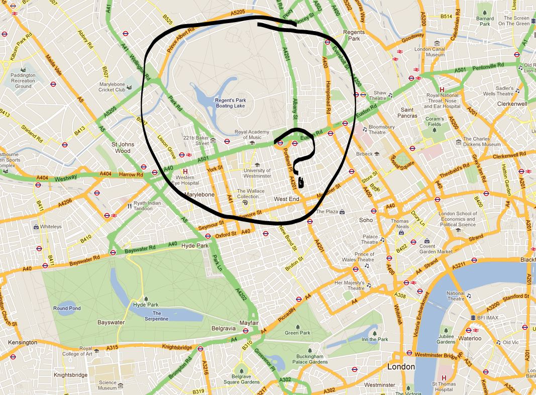
For many, route planners are vital in finding your way around the city. Type your destination into Google Maps or one of the many other websites or apps available, and you’ll be returned a list of directions from your location. Simple, right?
Hmm well, let’s have a look at an example. Taking two well known locations in London, we’ll have a look at the walking directions provided by Google Maps – Buckingham Palace to the Tate Modern – here we go. Great George Street, fine, Bridge Street, ok, follow the A302, errr, something about the Millenium Bridge, and we’re there, maybe.
OK, if you’re a Londoner, how would you describe the route to someone? I suspect it might go something like this…
Right, so from Buckingham Palace, head down towards Parliament, keep left of Parliament and go over the bridge. At the end of the bridge, turn left, go past the Millenium Wheel, carry on along the river. You’ll pass the National Theatre and the OXO Tower, then the Tate Modern is opposite St Pauls.
So why can’t Google Maps or anyone else include these instructions? They have the data on the locations of these places. They have the direction of movement of the individual, so can have an idea of what is in front of them…
“Yes, but what about obstacles stopping people from seeing these places?!”, I hear the perceptive reader ask.
Well, Google and Flickr hold ample amounts of georeferenced photography that would allow them to calculate viewsheds of these locations. The locations and groupings of these photos show that St Pauls can not be seen from Parliament, for example, and indicate the places where these locations are viewed best. Furthermore, the volume of photos provide an indication of the popularity or salience of the location, and could even be provided with directions so that even the least familiar tourist knows what to look for.
Considering the volumes of crowdsourced data they hold, I feel like Google are missing a pretty simple trick here. So, come on, Google, why not improve this feature and make a walk through the city more interesting to everyone.


