Identifying Communities in Traffic Flow

One recent bit of research I have been working on has been looking at the application of community detection algorithms to traffic flow in London.

The idea is that within the traffic system exist a number of sub-systems of highly interconnected roads.  To a certain extent, these sub-systems are engineered into the system.  Transport for London, for example, specifically manage and maintain 23 key routes into and around central London, known as ‘corridors’.  However, to what extent do further systems exist outside of these defined zones?

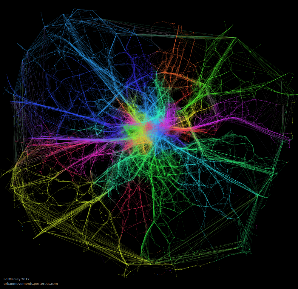
Community detection algorithms were developed to identify clusters within a network dataset.  These methods are most often applied to examples within the social network sphere, in the identification of cliques, where a cluster demonstrates high inter-connectivity, with lower connectivity with the rest of the network.  My thinking behind this bit of work was that we might be able to identify similar characteristics in traffic flow, where we can observed high coupling between clusters of nodes.

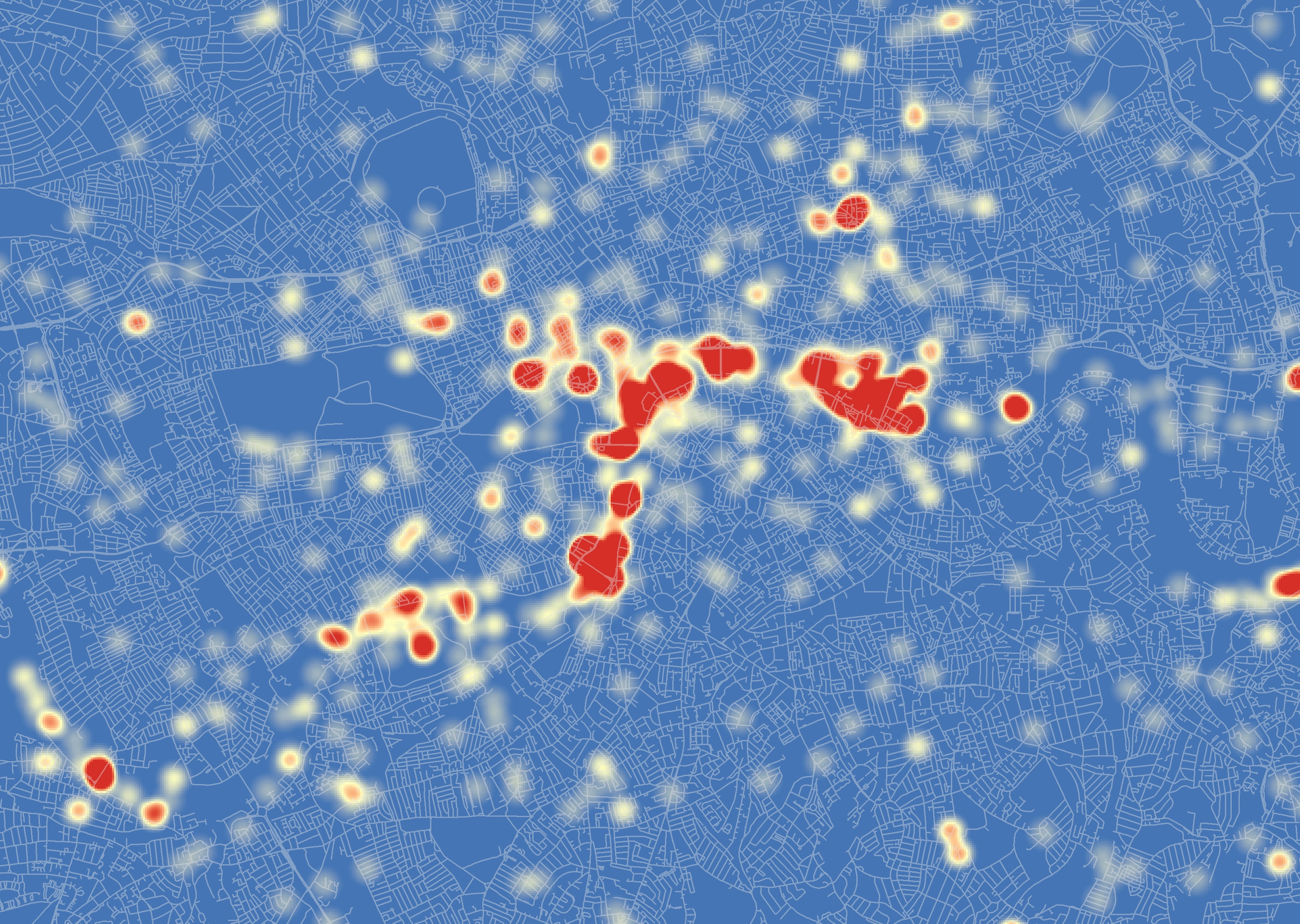
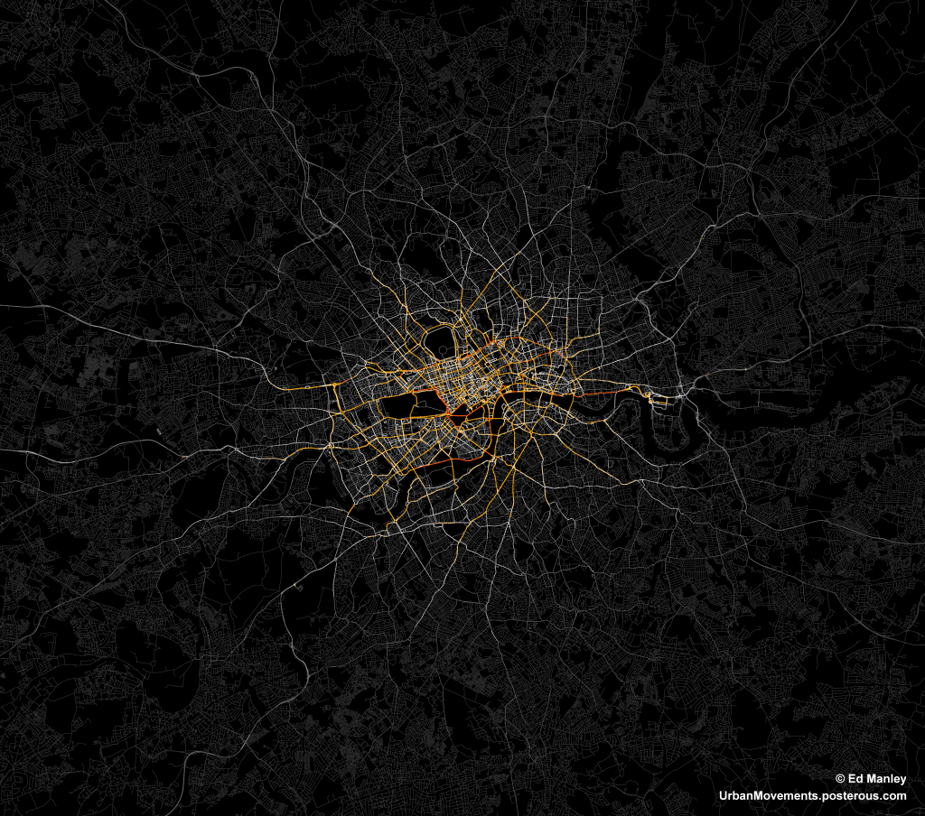
The map below visualises the modules (distinguished by colour) identified through the application of community detection methods to a topological representation of the road network.  Node connectivity is established using a dataset of 1.5 million private hire cab routes through London.

NodeModularity_GrLondon_3_1k_newcred

The resulting visualisation, apart from being quite pretty (thank Gephi for that), reveal some interesting trends.  To a certain extent, a number of expected patterns in traffic flow are prevalent, with some of the ‘corridors’ into central London, such as the M3, M4 and A2, clearly defined as distinct clusters.  Yet the image also shows how both the M25, the ring road around London, and the North Circular, usually considered as single entities, can be segmentalised into modules defined by their usage.

We also see further interesting patterns in central London too, where certain regions – specifically Knightsbridge, Soho, Shoreditch the City and Hyde Park – are clearly defined as distinct modules.  These would appear to be areas of high internal movement, and thus a clear product of cab usage patterns.

These results, while presented only in their initial stages, demonstrate how measures of network characteristics can help us to understand dynamic patterns of movement in the city.


Edit

Thanks to all for the interest in this work!

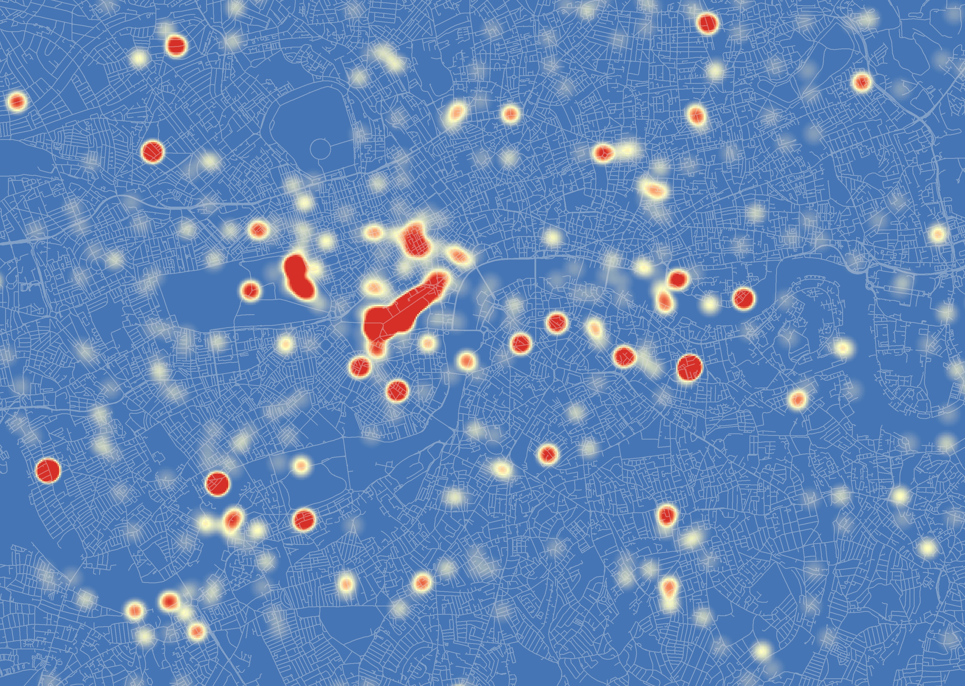
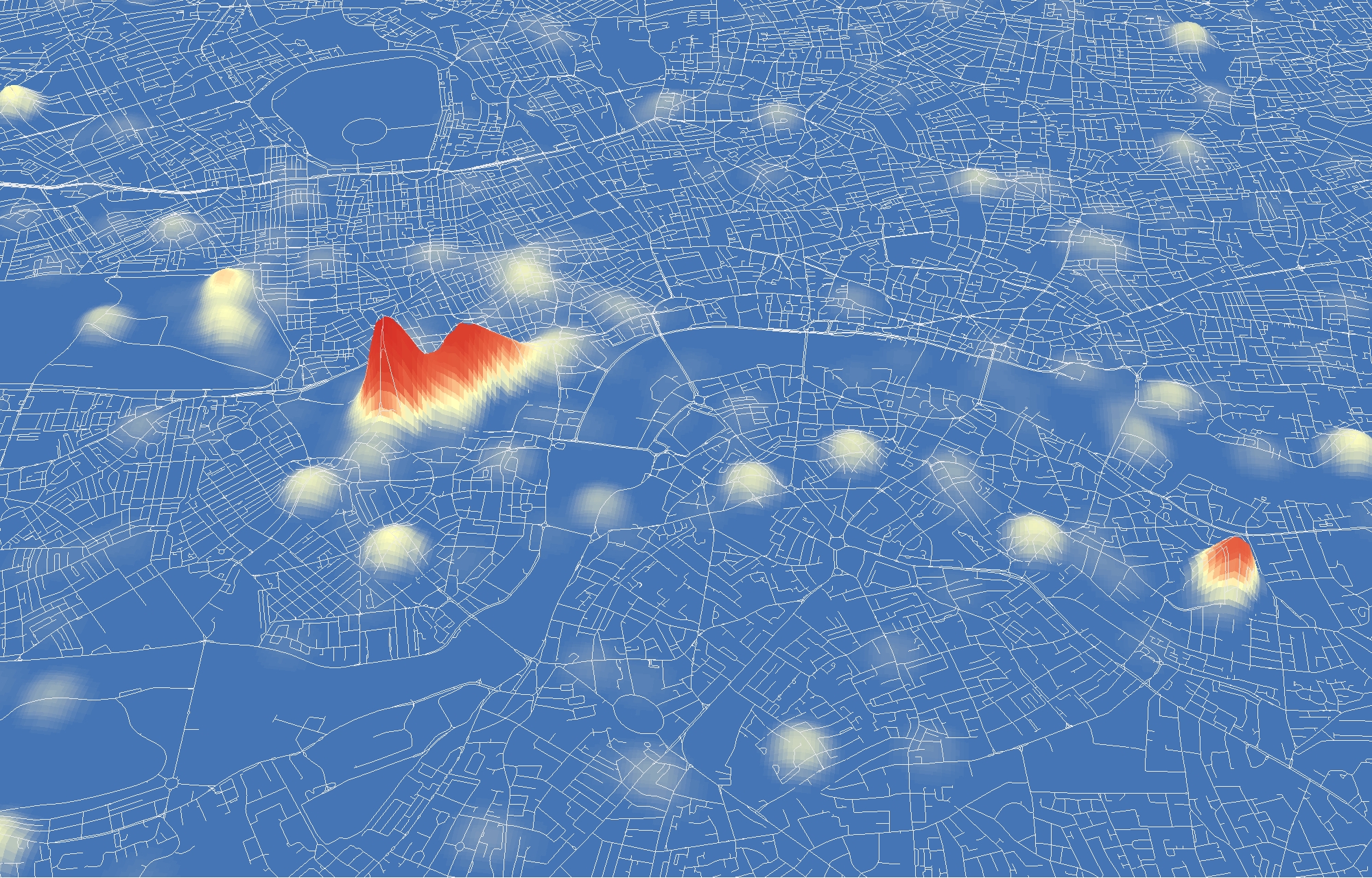
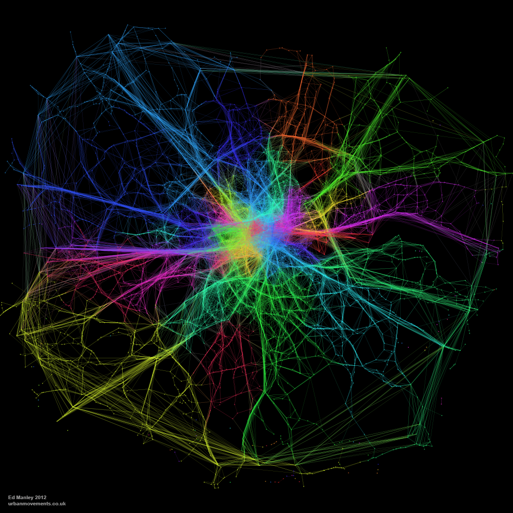
Just by way of follow up, the image below shows a zoom in on Central London, demonstrating more clearly some of the regions mentioned above.  I’ve annotated this version for people who may not be familiar with London.

CentralLondonModularity_02_annotated


Detecting Languages in London’s Twittersphere

Over the last couple of weeks, and as a bit of a distraction from finishing off my PhD, I’ve been working with James Cheshire looking at the use of different languages within my aforementioned dataset of London tweets.

I’ve been handling the data generation side, and the method really is quite simple.  Just like some similar work carried out by Eric Fischer, I’ve employed the Chromium Compact Language Detector – a open-source Python library adapted from the Google Chrome algorithm to detect a website’s language – in detecting the predominant language contained within around 3.3 million geolocated tweets, captured in London over the course of this summer.

James has mapped up the data – shown below, or in zoomable form here – and he more fully describes some of the interesting trends that may be observed over on his blog.

Detecting Languages in London's Twittersphere

With respect to the detection process, the CLD tool appears to work pretty well.  In total, 66 languages were detected among the complete dataset (including a bit of Basque, Haitian Creole and Swahili, surprisingly enough), and on the whole these classifications appear to be correct.  In cases where the tool is not completely confident in what is it reading – usually due to the brevity or colloquiality of a tweet – classification is marked as unknown or unreliable, and in these cases we end up losing around 1.4 million of additional tweets.

One issue with this approach that I did note was the surprising popularity of Tagalog, a language of the Philippines, which initially was identified as the 7th most tweeted language.  On further investigation, I found that many of these classifications included just uses of English terms such as ‘hahahahaha’, ‘ahhhhhhh’ and ‘lololololol’.  I don’t know much about Tagalog but it sounds like a fun language.  Nevertheless, Tagalog was excluded from our analysis.

I won’t dwell too much on discussing the results, only that Twitter appears to reveal itself here to be the severely skewed dataset we all always really knew it was.  In total, 92.5% of tweets are detected as English, far above existing estimations (60%) of English speakers in London.  While languages you’d expect to score highly – such as Bengali and Somali – barely feature at all.  Either people only tweet in English, or usage of Twitter varies significantly among language groups in London.  There is a great deal you can say about bias within the Twitter dataset, but I think I’ll save that for another day.

For the time being, enjoy the map.


London 2012: Using Fear to Tame Transportation Demand

One of the biggest advantages, I feel, about studying urban transport phenomena in London is the simple ability to be able look out of the window and see what is actually going on.  This week, the Olympics and its (supposed) transportation chaos, came to London.

What has struck me early on, mainly since the introduction of the Games Lanes last week, is a big reduction in the number of vehicles on the road.  There have been reports of certain inevitable problems in various parts of the capital, but my experience has been a general reduction in demand on most roads (see a couple of photos I took below).  This sentiment has been shared by a number of my colleagues.  There has been no word yet from Transport for London as to whether the data is backing this up.

London 2012: Using Fear to Tame Transportation Demand

Second, the big public transport problems predicted at certain stations and at certain times, have no yet come to fruition.  Warnings were issued widely this morning about potential overcrowding at a number of stations, yet early reports suggest that this is far from the reality – the Guardian highlight a number of citizen reports of empty Tube seats and quiet stations this morning.

London 2012: Using Fear to Tame Transportation Demand

Typical fear-inducing GetAheadOfTheGames literature (copyright Transport for London 2012)

It appears that the strategy has worked.  In fact, one might even suggest that it has worked better than expected.  I would say that this is partly down to the impact of irrationality, specifically the impact of fear.  Individuals, scared of potentially having to wait considerable amounts of time at stations only to cram into packed Tube trains, or fearful of long queues on the roads, have changed their habitual plans en masse.

Social Phenomena

The effect has gone to demonstrate, at least to me, the impact that small changes in the behaviour of many individuals can have on the nature of the city.  As individuals, we make a choice, we carry out that action, and we are mostly unaware of the impact that decision has on shaping broader phenomena.  Yet, in observing the patterns these many individuals make, we can begin to see how individual and social attitudes impact on shaping transportation flows.

This relationship, specifically the impact that fear has had in the context of the Olympics, appears to have caught some analysts on the hop.  INRIX, a big transport data provider, predicted earlier in the year the ‘perfect traffic storm‘ in traffic demand during the first few days of the Games (reported in more detail here).  This patently failed to happen.  The models INRIX employed in making these predictions clearly failed to make consideration for the impact that fear would play in reducing traffic demand.  This approach is far from uncommon where transport demand modelling is concerned.

The Games have a long way to run yet, and we may well see a counter movement occur in time as people begin to realise that transportation isn’t as bad as first expected.  But I think the impact that fear has held on shaping, at least, the first few days of transportation flows makes for interesting viewing.

The Diamond Jubilee in London: A Tweet Location Analysis

I’ve been collecting Twitter data for a little while now, and have managed to identify some interesting (if slightly frivolous) trends.  But, when considering the wider applications of such a dataset, one question that has continued to bug me is – Why do we tweet when we tweet?

I won’t attempt to answer that question here (yet), but one clear reason is when we want to communicate our involvement in an event or activity.  You can see it quite clearly in the data – gigs at the O2, football matches at the Emirates – all of these events show up as clusters of tweet points.  So, with the Diamond Jubilee celebrations occurring in London last weekend, I thought this would be a nice opportunity to demonstrate how these crowd patterns form and disappear over space and time.  The images below – I hope you will agree – are quite pretty, but I think the analysis presents some more interesting implications with regard to the use of this type of dataset and the nature of visualisation, aspects I’ll address at the end.


Tweeting the Diamond Jubilee

What I’ve done here is look at all tweets mentioning ‘Jubilee’ occurring in London on the 3rd and 4th June 2012.  As you good patriots will recall, these were the dates of the Thames flotilla and Jubilee concert outside Buckingham Palace.  For you more technically-minded people, I’ve taken the tweet point locations and applied a Kernel Density Estimation on them, to provide a sense of where the highest density of tweets were occurring on each day.

The colour scheme – in the colours of the flag, of course – shows the shift from high density areas of Jubilee-related tweets (in red) to areas where not many such tweets are detected (in blue).

Flotilla Day

On the day of the flotilla, you can clearly see a strong distribution of tweeting monarchists along the course of the flotilla on the River Thames.  It can be noted that this distribution is not spatially uniform, however, indicating perhaps the locations of the best, or most popular, viewing areas.  You can see other clusters around London too, which may indicate where other gatherings were taking place.

The Diamond Jubilee in London:  A Tweet Location Analysis

We can also look at this data in 3D too, allowing us to better explore where the absolute highest densities of tweets were occurring within those big clusters of red…

The Diamond Jubilee in London:  A Tweet Location Analysis

Interestingly, this map helps to better draw out where the exact hotspots lie. Revealing that the highest densities are at each the bridges along the route, with Vauxhall and London bridges seeing the greatest activity.

Concert Day

The day of the concert – taking place on the evening of the 4th June – indicates clearly a completely different pattern of behaviour.

The Diamond Jubilee in London:  A Tweet Location Analysis

Here the biggest activity is along the Mall and towards the Jubilee concert outside Buckingham Palace.  One can also identify big clusters of tweets in Hyde Park and around Soho, again with lots of other clusters dotted around the city.  Overall, there appears to be a lesser concentration of tweets than seen on the day of the flotilla, something that appears to follow that reported in the press.

Again, consulting the 3D representation of the data, shows us more exactly where the largest clusters of tweets are located…

The Diamond Jubilee in London:  A Tweet Location Analysis

This image again demonstrates the importance of an alternative perspective.  In this case, we can see that the most important cluster is found along the Mall at the concert itself, with the other activity highlighted in the 2D perspective seemingly of much lesser significance.


What does all this actually mean?

OK, OK, so you may be thinking at this point ‘Yes, very nice pictures and everything, but isn’t this all fairly obvious?’.  Well in some ways yes, we know from the television pictures that there were a lot of people along the Thames on the 3rd June watching the flotilla.  What we have a lesser grasp on is the exact volume and spatial distribution of these people, and how they moved throughout the day.

My feeling is that, although biased in many respects, this dataset provides us with a unique opportunity to measure the spatial distribution of crowds at events. It may well only be a proxy for activity, but rather than relying on a few, subjective viewpoints, we are able to get a better overall indication of the true patterns of crowds in space and time.  Such analysis may also help us to identify emerging, organic events, outside of our current viewpoint, that require our attention.

In regard to these images in particular, I hope that the Kernel Density approach has been of interest to some of you of a less geographic mindset.  They do quite effectively highlight the locations of tweet hotspots.  The differences between the 2D and 3D images do demonstrate, however, how the visualisation of data can become misleading.  What appear to be large events in one representation are much less significant when viewed from an alternative perspective.  This is a facet of data visualisation that we all should be conscious of.

As ever, your thoughts on anything I’ve presented here are very welcome.


Edit (11-06-12)

You can now find video animations of the 3D results here and here.


Modelling Movement in the City: The Influence of Individuals

‘Modelling Movement in the City: The Influence of Individuals’ was the title of a talk I gave at the AGILE conference in Avignon, France last week.  For the conference I actually initially prepared a poster that never ended up seeing the light of day – except for now that is.

The poster presents some recent work I carried out through agent-based simulation, demonstrating how different behavioural models influence the formation of macroscopic patterns.  As you can see from the results, the impact of mere basic assumptions hold a significant impact upon the unfolding network picture.

[slideshare id=19430885&doc=agileposter-130421150321-phpapp02]

Probably now going to write this up as a journal paper, but hopefully putting the poster up here won’t mess with any copyright stuff – please let me know if it might!

Mapped: London’s ‘Rudest’ Boroughs

A couple of weeks ago, I put up a post detailing how swearing on Twitter increases during the course of the average day.  It seemed people get more angry and sweary outside of work time, rather than during.

To delve a little deeper in this topic, I’ve now had a look at where Twitter gets angry.  For each of London’s 33 boroughs I have carried out the same analysis – this time for a month’s worth of tweets – looking at the percentage of tweets containing swear words in each borough.  The results follow some interesting trends… LondonsRudestBoroughs.PNG.scaled1000

At least in the Twittersphere, inner London appears to be the veritable paradise of civility relative to the bile-filled tweet streams emanating from outer London.  The biggest offenders appear to be located to the east of city, with east London fairing considerably worse.  Yet the leafy boroughs of Barnet, Sutton and Bromley perform badly too.

Right, so let’s first look at what doesn’t seem to be going on here.  First off, the influence of this idea that people mostly swear from the comfort of their own sofa does not seem to hold very true.  There does not seem to be a very strong relationship between swearing density and residential locations.  If there were then you’d see higher scores in the likes of Haringey, Richmond, Hammersmith and Fulham and Newham. Nor does swearing follow any sort of deprivation index, again Haringey is relatively poor compared to the likes of Sutton, Bromley and Barnet, which fair much worse.

So what is going on?

In my opinion, what I think we are seeing is a reflection of demographic and cultural trends across these boroughs.  Taking demography in the first instance, according to the 2009 figures on nationality demographics at the borough level, those London boroughs with the highest percentages of British-born citizens are Havering, Bexley, Bromley and Sutton, respectively*.   It would make sense that the higher the percentage of British-born citizens in an area – on average those probably more likely to use an English swear word in a tweet – the greater the number of swearing tweets there are likely to be.  True, but I don’t think this tells the whole story.

Looking beyond these four boroughs, Kingston and Richmond also report high percentages of British citizens living within their boundaries – yet we don’t see similar volumes of sweary tweets coming from these boroughs.  How can this be so?  Make of this what you will, but beyond the demographic variation, the data appears to highlight a cultural variation across London in attitudes towards swearing in tweets.  Simply put, the data seems to suggest that the good residents of eastern and southern boroughs of outer London are generally more inclined to throw a swear word into a tweet than their counterparts over to the western side of London.

As I say, this is just my theory – there is a whole lot more you could do to this data to gain a better understanding of the trends observed here (unfortunately I don’t have the time to do so!).  I’d be very interested to hear any alternative ideas about what might be going on though.

Overall, I hope these analyses begin to give you an insight into the extent to which Twitter data (and other data sources like it) can be used to reveal and explain social, spatial and temporal trends.

* Newham, Westminster and Kensington and Chelsea score highest for non-British born residents


When does Twitter get angry?

I’ve been spending a bit of time with Twitter data of late – perhaps not a healthy activity – but it is amazing what a rich data source of social and spatial behaviour it is.

Someone asked to me today whether it was possible to identify when and where Twitter gets angry.  Well, here is my answer to the first part – the when.

The graph below shows the variation, across the day, in the prevalence of swearing in the ‘Twittersphere’.  The data used represents tweets during two weeks in March 2012 covering London only – so maybe this is just when London gets angry…

In the graph we have the percentage of all tweets containing ALL types of swearing in blue, in red we have the prevalence of the f-word (by far the most common swear word), then finally the percent appearance of the s-word is shown in green.  Time is along the bottom.

When does Twitter get angry?

Putting the slightly frivolous nature of this work aside for a second, the data does demonstrate some interesting trends.  There is a clear upward trend in ‘anger’ as the day goes on, reaching a peak at around 10pm.  But why is this?  Why do we swear more in the evening, when we should be relaxed and enjoying our precious free time?  Are we (we being Twitter users only, of course) swearing at the TV?  Arguing with our friends over Twitter?  Or are enough of us getting drunk and losing our inhibitions?

We also see a smaller peak at around 5pm – now this is more easily explained.  The ‘thank f**k work is over’ tweet one might surmise.  An even smaller peak at around 9am suggests the opposite effect.

But I think this simple analysis gives us some insight into the way we use social media throughout the day.  During the day we think about work.  We tweet and communicate about work.  Yet in the evening, Twitter becomes a different place.  We let our guard down, and once we’re outside of the constraints of work, perhaps we begin to use Twitter in a different way.  Places like Twitter allow us the space to exclaim and let off our true feelings, whatever they may be, that might otherwise be constrained in other environments.

Twitter gets a lot of stick for its high volume of frivolous content – probably with good reason – but at a higher level some subtle but interesting social trends can start to be observed.

London Driver Survey

As part of building a fuller understanding of the way people move around the city by car, I’ve developed a survey to start delving into some of the lesser understood issues.

The survey looks at the extent of use of GPS and similar devices, behaviour around congested areas of the network and usage of traffic information.  The results will contribute towards the building of a better model of driver behaviour.

You can find the survey here – http://goo.gl/UDrFI

Please pass it on to all of the motorists in London that you know!

A Simple Idea for Making Route Directions More Human

For many, route planners are vital in finding your way around the city.  Type your destination into Google Maps or one of the many other websites or apps available, and you’ll be returned a list of directions from your location.  Simple, right?

Hmm well, let’s have a look at an example.  Taking two well known locations in London, we’ll have a look at the walking directions provided by Google Maps – Buckingham Palace to the Tate Modern – here we go.  Great George Street, fine, Bridge Street, ok, follow the A302, errr, something about the Millenium Bridge, and we’re there, maybe.

OK, if you’re a Londoner, how would you describe the route to someone?  I suspect it might go something like this…

Right, so from Buckingham Palace, head down towards Parliament, keep left of Parliament and go over the bridge.  At the end of the bridge, turn left, go past the Millenium Wheel, carry on along the river.  You’ll pass the National Theatre and the OXO Tower, then the Tate Modern is opposite St Pauls.

So why can’t Google Maps or anyone else include these instructions?  They have the data on the locations of these places.  They have the direction of movement of the individual, so can have an idea of what is in front of them…

“Yes, but what about obstacles stopping people from seeing these places?!”, I hear the perceptive reader ask.

Well, Google and Flickr hold ample amounts of georeferenced photography that would allow them to calculate viewsheds of these locations.  The locations and groupings of these photos show that St Pauls can not be seen from Parliament, for example, and indicate the places where these locations are viewed best.  Furthermore, the volume of photos provide an indication of the popularity or salience of the location, and could even be provided with directions so that even the least familiar tourist knows what to look for.

Considering the volumes of crowdsourced data they hold, I feel like Google are missing a pretty simple trick here.  So, come on, Google, why not improve this feature and make a walk through the city more interesting to everyone.

Mapping Taxi Routes in London

One major aspect of my research is spent looking into how people choose their routes around the city.  And to aid me in this, I managed to acquire a massive dataset of taxi GPS data from a private hire firm in London.  I’ve spent the last few months cleaning up the data, removing errors, deriving probable routes from the point data and extracting route properties.

It’s been a big job, but worth it.  I now have the route data of over 700,000 taxi journeys, from exact origin to destination, over the months of December, January and February 2010-11.  I’m now moving on to the actual analysis of this data, and am beginning to answer some of these questions concerning real-world route choice.  In the meantime, I thought I’d share one striking image that I extracted through this work.

The image below represents an aggregate of journeys on each segment of road on the London road network.  The higher levels of flow are illustrated in red, falling to orange, yellow, then white, with the lowest flow values shown in grey.

The most popular routes are along Euston Road, Park Lane and Embankment, which may be somewhat expected, but make for a stark constrast with respect to the flow of most traffic in London.  The connection with Canary Wharf comes out strongly, an indication of the company’s portfolio, though route choice here is interesting with selection of the The Highway more popular than Commercial Road.

Real insight will come with the full analysis of the route data, something that should be completed in January.  Until then, though, I’ll just leave you with this pretty something to look at.