Cities of the Future: Towards Technical or Natural Optimisation?

Amanda Erickson put up a nice, simply visualisation of what life might be like in a future of driverless, automated cars. Check it out.

[vimeo http://vimeo.com/37751380]

Two things sprang to mind while watching this – first, how terrifying this might be for a passenger in one of these cars, and second, haven’t I seen this sort of thing somewhere else before?

Well, yes, I showed the following video in a lecture last month as demonstration of self-organisation.  To me, the patterns look similar – at the higher level you see chaos, but when you observe the actions of individual’s there is usually a rational stream of thought behind the actions they are taking – normally to get to their exit road.  Judge for yourself.

[youtube http://www.youtube.com/watch?v=mr5Gssaxl6g&version=3&hl=en_US]

I think the stark similarity seen between these two videos raise interesting questions about what we consider as progress in the urban realm.  Bare with me as I attempt to explain.

The driverless or automated car is often seen as the natural future of private transportation*, with one of its main benefits being the apparent offer of optimal organisation of traffic flows (e.g. no congestion).  And indeed when look at the first video, everything works and works well, perhaps even optimally.  But then you look at the second video, and you essentially have the same thing, created solely through the activity of individuals.

It is strange therefore that a fully optimised technical system is generally deemed necessary and superior.  When people are left to their own devices, to ‘sort it out between them’, people invariably do.  Traffic in Hanoi is not just the only example of this type of self-organisation – the Internet itself is a creation of human ingenuity.  Following Monderman’s ideas on Shared Space, perhaps all of these traffic regulations, signage and restrictions actually reduce our need to think about what we are doing.  They reduce and remove our ability or will to self-organise, and to the deficit of us all.

So why don’t ‘natural’ answers to technical problems receive a better press?  I suspect it is an issue of trust in the citizen.  That threat that one person may mess up, and mess it up for the rest of us.  Instead of facing the risk and accepting it as part of the solution, we surround ourselves with unnecessary and invasive mechanisms that carry out the task for us.  They may cost a lot of money and not be any better than our current solution, but they feel like progress.  It feels like things are getting better.  So, yes, perhaps automated cars are indeed a thing of the future.

As ever, very interested to hear your thoughts on this.

* I’ve personally never been so sure – mainly because of the safety element, and that fact that many people actually enjoy the process of driving…
 

When does Twitter get angry?

I’ve been spending a bit of time with Twitter data of late – perhaps not a healthy activity – but it is amazing what a rich data source of social and spatial behaviour it is.

Someone asked to me today whether it was possible to identify when and where Twitter gets angry.  Well, here is my answer to the first part – the when.

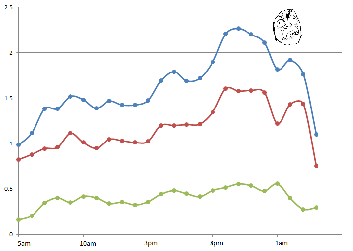
The graph below shows the variation, across the day, in the prevalence of swearing in the ‘Twittersphere’.  The data used represents tweets during two weeks in March 2012 covering London only – so maybe this is just when London gets angry…

In the graph we have the percentage of all tweets containing ALL types of swearing in blue, in red we have the prevalence of the f-word (by far the most common swear word), then finally the percent appearance of the s-word is shown in green.  Time is along the bottom.

When does Twitter get angry?

Putting the slightly frivolous nature of this work aside for a second, the data does demonstrate some interesting trends.  There is a clear upward trend in ‘anger’ as the day goes on, reaching a peak at around 10pm.  But why is this?  Why do we swear more in the evening, when we should be relaxed and enjoying our precious free time?  Are we (we being Twitter users only, of course) swearing at the TV?  Arguing with our friends over Twitter?  Or are enough of us getting drunk and losing our inhibitions?

We also see a smaller peak at around 5pm – now this is more easily explained.  The ‘thank f**k work is over’ tweet one might surmise.  An even smaller peak at around 9am suggests the opposite effect.

But I think this simple analysis gives us some insight into the way we use social media throughout the day.  During the day we think about work.  We tweet and communicate about work.  Yet in the evening, Twitter becomes a different place.  We let our guard down, and once we’re outside of the constraints of work, perhaps we begin to use Twitter in a different way.  Places like Twitter allow us the space to exclaim and let off our true feelings, whatever they may be, that might otherwise be constrained in other environments.

Twitter gets a lot of stick for its high volume of frivolous content – probably with good reason – but at a higher level some subtle but interesting social trends can start to be observed.

London Driver Survey

As part of building a fuller understanding of the way people move around the city by car, I’ve developed a survey to start delving into some of the lesser understood issues.

The survey looks at the extent of use of GPS and similar devices, behaviour around congested areas of the network and usage of traffic information.  The results will contribute towards the building of a better model of driver behaviour.

You can find the survey here – http://goo.gl/UDrFI

Please pass it on to all of the motorists in London that you know!

My Lecture on Agent-based Modelling

I’ve just completed a lecture at the UCL Energy Institute on agent-based modelling and thought, hey – maybe some of my blog readership would be interested in this!

Please find the PDF below – it should be quite straightforward, although without the whizz-bang of the demonstrations and videos.  You can find the simulations I describe in the Model Library within NetLogo.

Enjoy, and please let me know if you have any questions.

[slideshare id=19270232&doc=abmtalk-130420065548-phpapp01]

LongLatMe: Location-embedded SMS

So, let’s say you want to meet up with your friends.  You text – “Where are you?”.  “We’re at the Bar Bar on 59th Street”, they reply.  Now you need to look the place up, and navigate your way there.

Instead, why can’t your friend just send you a location object within the SMS, encoding their current coordinates.  The ability to locate exists, all that needs to be developed is a generic method for integration with all current mapping applications, allowing you to easily route your way to their location.

Does this exist?  And, if it doesn’t, then why not?  I’d be amazed if Google haven’t thought to implement this with Android.

Edit: This exists (well, of course it does!) though with not as good a name.  You can find out about ‘GeoSMS’ at this wikipedia page…

Agent-based Modelling + Traffic Flow Modelling = Large-Scale Urban Simulation

At the upcoming AAG conference in New York, I’ll be presenting a recent prototype that links agent-based simulation with current traffic flow models.

The basic premise is that any cognitive decision associated with movement around cities should be modelled at the level of the individual.  However, it is not always necessary that all movement be represented individually.  Doing so potentially wastes limited computational power, especially important where modelling many complex agents.

Instead, my new simulation utilises traffic flow modelling to constrain the movement of individual agents.  Individuals choose where they move individually, but physical movement itself is modelled collectively.  The higher the traffic flow on a single route, the slower each agent on that route will travel.  This approach is more efficient and allows a much larger scale of complex agent-based simulation.

I’ll provide more detail at AAG next Sunday, but the basic result is as above.

The simulation demonstrates traffic flows across central London.  There are 30000 agents of varying behavioural characteristics moving around this space.  Their movement decisions impact on the state of the network.

[vimeo https://vimeo.com/36979205]

KEY:  The redder colours represent high traffic saturation aka queues and congestion, the blues and greens represent quiet or free flowing traffic conditions.


A Simple Idea for Making Route Directions More Human

For many, route planners are vital in finding your way around the city.  Type your destination into Google Maps or one of the many other websites or apps available, and you’ll be returned a list of directions from your location.  Simple, right?

Hmm well, let’s have a look at an example.  Taking two well known locations in London, we’ll have a look at the walking directions provided by Google Maps – Buckingham Palace to the Tate Modern – here we go.  Great George Street, fine, Bridge Street, ok, follow the A302, errr, something about the Millenium Bridge, and we’re there, maybe.

OK, if you’re a Londoner, how would you describe the route to someone?  I suspect it might go something like this…

Right, so from Buckingham Palace, head down towards Parliament, keep left of Parliament and go over the bridge.  At the end of the bridge, turn left, go past the Millenium Wheel, carry on along the river.  You’ll pass the National Theatre and the OXO Tower, then the Tate Modern is opposite St Pauls.

So why can’t Google Maps or anyone else include these instructions?  They have the data on the locations of these places.  They have the direction of movement of the individual, so can have an idea of what is in front of them…

“Yes, but what about obstacles stopping people from seeing these places?!”, I hear the perceptive reader ask.

Well, Google and Flickr hold ample amounts of georeferenced photography that would allow them to calculate viewsheds of these locations.  The locations and groupings of these photos show that St Pauls can not be seen from Parliament, for example, and indicate the places where these locations are viewed best.  Furthermore, the volume of photos provide an indication of the popularity or salience of the location, and could even be provided with directions so that even the least familiar tourist knows what to look for.

Considering the volumes of crowdsourced data they hold, I feel like Google are missing a pretty simple trick here.  So, come on, Google, why not improve this feature and make a walk through the city more interesting to everyone.

Mapping Taxi Routes in London

One major aspect of my research is spent looking into how people choose their routes around the city.  And to aid me in this, I managed to acquire a massive dataset of taxi GPS data from a private hire firm in London.  I’ve spent the last few months cleaning up the data, removing errors, deriving probable routes from the point data and extracting route properties.

It’s been a big job, but worth it.  I now have the route data of over 700,000 taxi journeys, from exact origin to destination, over the months of December, January and February 2010-11.  I’m now moving on to the actual analysis of this data, and am beginning to answer some of these questions concerning real-world route choice.  In the meantime, I thought I’d share one striking image that I extracted through this work.

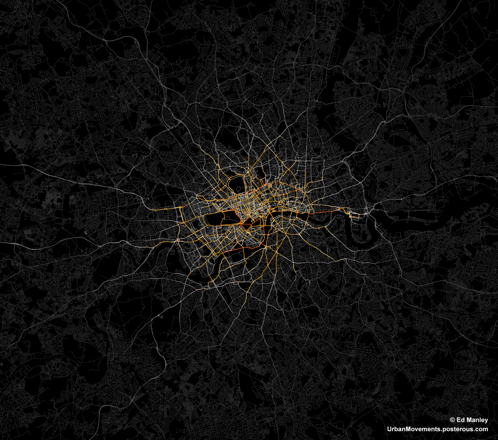
The image below represents an aggregate of journeys on each segment of road on the London road network.  The higher levels of flow are illustrated in red, falling to orange, yellow, then white, with the lowest flow values shown in grey.

The most popular routes are along Euston Road, Park Lane and Embankment, which may be somewhat expected, but make for a stark constrast with respect to the flow of most traffic in London.  The connection with Canary Wharf comes out strongly, an indication of the company’s portfolio, though route choice here is interesting with selection of the The Highway more popular than Commercial Road.

Real insight will come with the full analysis of the route data, something that should be completed in January.  Until then, though, I’ll just leave you with this pretty something to look at.

Space Syntax to GIS Integration: A Roadmap

Something I have been thinking about recently is the possibility of integration between GIS and space syntax.  The motivations are very clear.  Space syntax represents a compelling quantitative model of human behaviour and movement.  While the understanding of human systems is one of its most important areas of GIScience research (I may be slightly biased).  And with the ever increasing availability of movement data on a range of levels, the development of a model underlying this behaviour is ever more important.  So why can’t these two just get it on?

Representation

Well, the old argument has been that axial maps – the fundamental representation of space syntax – is simply not compatible with GIS.  Axial lines represent lines of sight, while GIS data segments are supposedly geographically accurate – at the level of network measures this difference is highly significant.  However, developments in space syntax – notably the development of Angular Segment Analysis by the brilliant Alasdair Turner, who very sadly died last week – mean that GIS integration is very much a possibility.

Turner’s approach was to measure the angular deviation between road segments on a GIS layer, assigning a score of zero for straight-ahead travel.  The greater the movement away from the straight line the higher the score, effectively yielding a new axial line.  Running angular betweenness (aka ‘choice’ in space syntax circles) calculations on the network yields some interesting results that I have discussed previously.  The story is clearly much more complex than this (and more can be read on this here).  But essentially this could be viewed as a new link between the traditional view of space syntax and GIScience.

ASA to the rescue?

However, some recent work I’ve been carrying out suggests that the picture is not so simple.  Specifically, it is not necessarily possible to run an Angular Segment Analysis on a raw GIS layer.  Taking the example of the OS ITN dataset – the most extensive representation of the UK road network – the presence of dual carriageways, roundabouts and other artefacts are contrary to what one would expect from an equivalent to the axial map.  And, indeed, betweeness measures on these networks do not inspire either, with strange variations across the datasets, notably across dual carriageways where big discrepancies can be found.

There are two key aspects at play here, I feel.  Firstly, ASA in it’s current form does not take account of traffic infrastructure and regulations.  Were it to perhaps handle routing information then the results may be more realistic, certainly in terms of the flow on dual carriageways and roundabouts.  Second, dual carriageways and roundabouts do not align with the fundamental idea behind the axial map.  Cognitively speaking, we do not think in terms of dual carriageways, rather simply the existence of a roadway at a given location.  In other words, why should dual carriageways be assessed independently since they were only simply engineered into two lanes?

Roadmap?

So, what can be the way forward here?  Well, I know that where ASA is used commercially, the underlying network model is initially simplified to remove dual carriageways and roundabouts.  But this seems awfully unscientific (well, maybe cartography isn’t particularly scientific either…).  My suggestion, and something I am currently pursuing, is usage of simpler, existing GIS datasets.  In this way, these models are already used widely and better validated than a subjective in-house alteration.  Yet, what about other models and datasets that require more extensive GIS data?  I suggest the development of tools that link together different GIS datasets, allowing an exchange of data yet not disrupting the validity of each approach.  We can even try to link the axial map back to a range of GIS layers, and truly gain an understanding about the strengths of these approaches.

This is something I’ll be working on over the next few months – so watch this space, or get in touch if you’re interested in this.

Rioting, it ain’t so simple…

The last week of trouble on the streets of British towns provides an interesting ‘field study’ of collective behaviour.  While the media and politicians seek to simplify the argument, understanding is only reached by examining the full complexity of the situation.  In seeking to remain as objective as possible, I’ll try to identify some diversity within these groups – starting with the ‘Rioters’:

The Destructors:  These are those intent on destruction.  Simply put, those who break the windows and light the fires.  They are highly influential on those around them, perhaps due to infectious bravado and dynamism.  They are likely to be within or supported by a close group of friends (e.g. gang structure) that encourages and respects this behaviour.  They may be motivated by an underlying resentment for (and perhaps a lack of fear of) the police or their community in general, although this may not be the focus of their actions.

The Followers:  These are those people bought onto the streets by sheer interest of what it happening in their neighbourhood.  On seeing the behaviour of those mentioned above (perhaps viewed as fun, or exciting), twinned with a lack of police intervention, they will join in also, although without the same vigour pursued by The Destructors.  They are likely to be more fearful of police action.

The Opportunists:  These are those who did not get involved with the wanton destruction, rather they were attracted by the potential of looted items.  They are united by a desire for material gain.  This may be twinned with an underlying sentiment that they have not received as much in the way of these items as they perceive to be ‘fair’.  This means that members of this group may be from any part of society, any person who feels that they deserve more. (Possible example: Laura Johnson)

The Observers:  They were those just watching and not getting involved.  Don’t underestimate the influence of hundreds of observers to make a riot look larger or more dangerous than it is.

In essence, it is too simple, too cack-handed to regard the ‘Rioters’ from one viewpoint.  Within the population of people out on the streets during those nights is a great deal of diversity.  This is important as it raises different questions as to how we deal with the underlying problems.  For example, why were these ‘Opportunists’ (as I’ve have coined them) drawn out onto the streets?  What can we do within our society, our society of superficiality and the culture of success attached to material wealth, to stop these people from acting this way again?

Furthermore, it is important the fully grasp the numbers of people we are talking about when it comes to addressing the scale of the issue.  This is hard to get a grasp on, and while the news reports can provide some sense of this, they are only drawn to the worst examples of behaviour.  However, I believe that, contrary to much opinion, there were only a small number of these so-called Destructors.  Rather, the behaviour of these people (within gangs) was highly influential on those around them.  Their own behaviour, and the resulting lack of action against them, encouraged the behaviour of those in other groups.

So when we did begin to see a crackdown by police, and arrests of hundreds of people, the rioting almost ceased straight away.  This would support the idea of a far greater number of ‘Followers’, those keen to be involved in the ‘fun’ but not those who will start it – in some respects, those afflicted by the ‘Madness of Crowds’ (see former blog post).  The Destructors, perhaps depleted in numbers and without the potential cover offered by the presence of many ‘Followers’, ‘Opportunists’ and ‘Observers’, simply stay at home.

The riots were a truly terrible event, but in seeking to understand what has happened we need to get a grasp of the full complexity of behaviour within the rioting populace.  We are not talking about ‘feral youth’ or ‘people gone wild’, the situation is more nuanced and requires a careful form of analysis and politics that, I fear, it won’t receive.

At some point this week I will try to apply the same analysis to the actions of the wider population during this period.