Analysing Languages in the New York Twittersphere

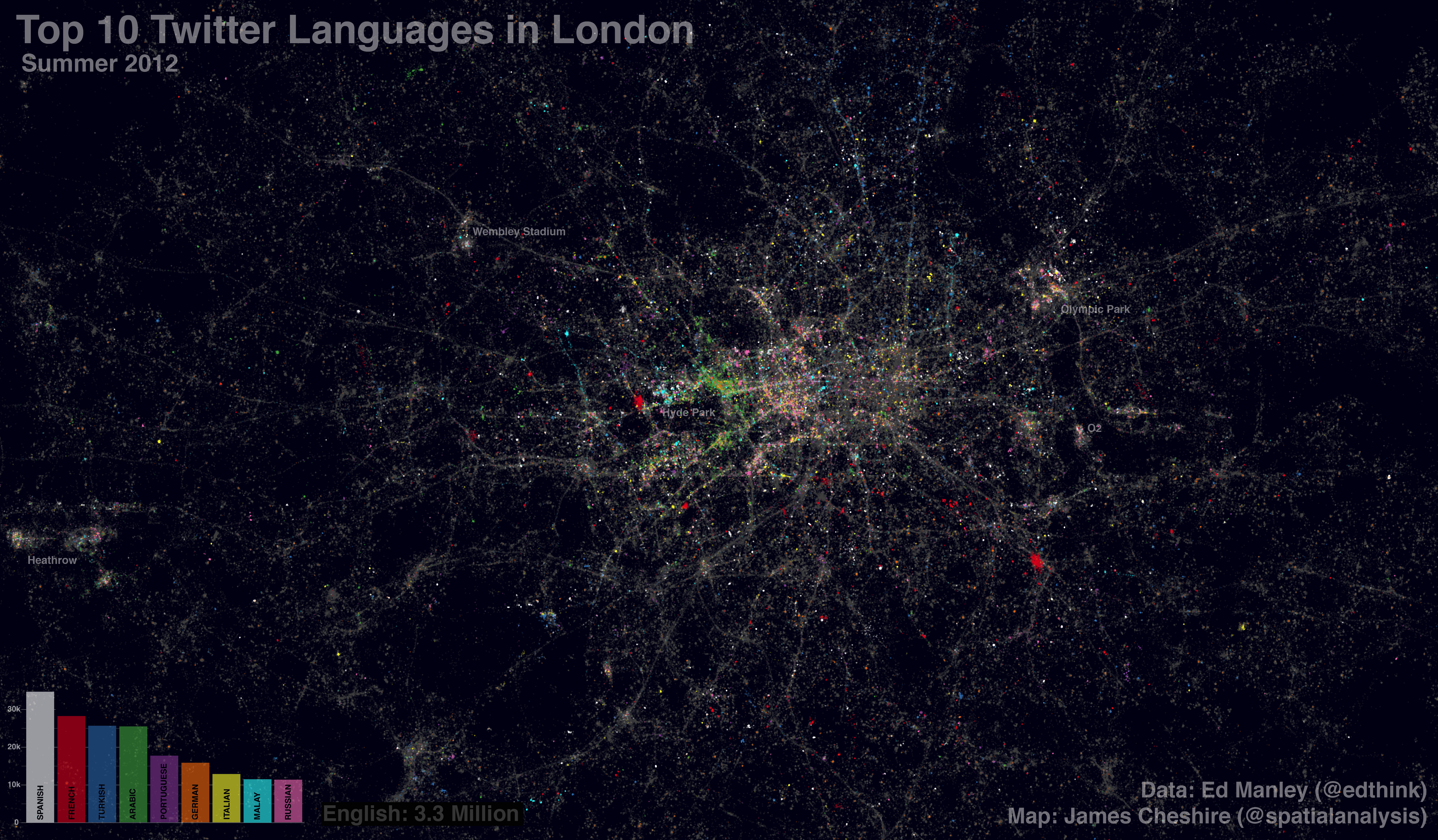
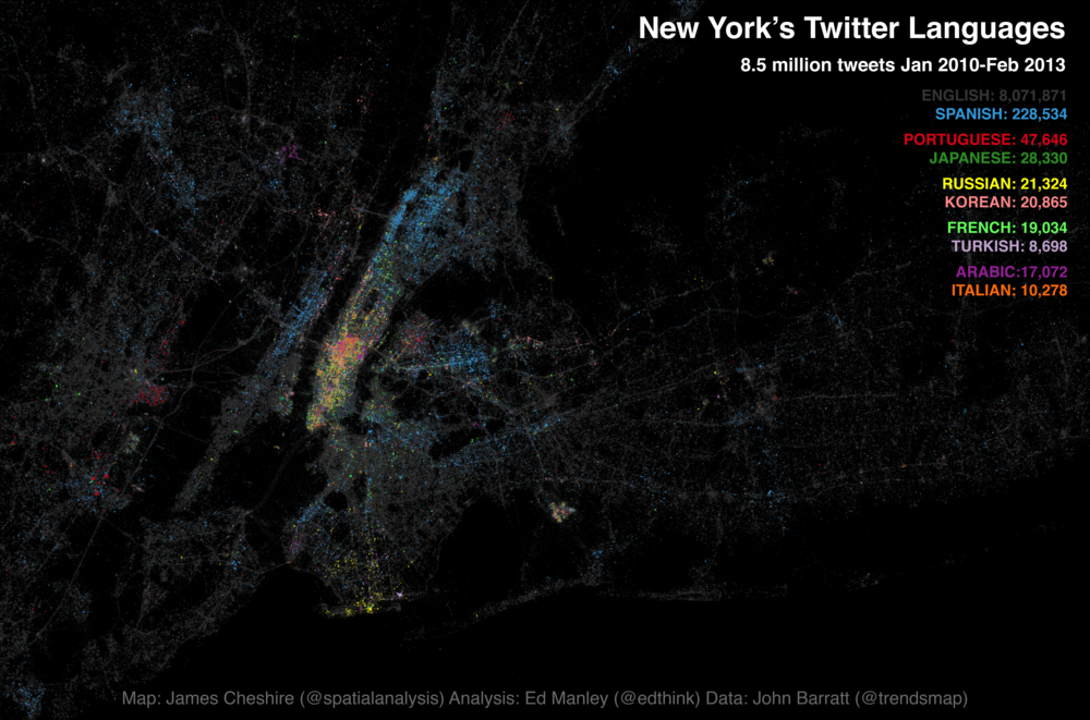
Following the interest in our Twitter language map of London a few months back, James Cheshire and I have been working on expanding our horizons a bit.  This time teaming up with John Barratt at Trendsmap, our new map looks at the Twitter languages of New York, New York!  This time mapping 8.5 million tweets, captured between January 2010 and February 2013.

Without further ado, here is the map. You can also find a fully zoomable, interactive version at ny.spatial.ly, courtesy of the technical wizardry of Ollie O’Brien.

twitter_NY_final_print.png.scaled1000

James has blogged over on Spatial Analysis about the map creation process and highlighted some of the predominant trends observed on the map.  What I thought I’d do is have a bit more of a deeper look into the underlying language trends, to see if slightly different visualisation techniques provide us with any alternative insight, and the data handling process.

Spatial Patterns of Language Density

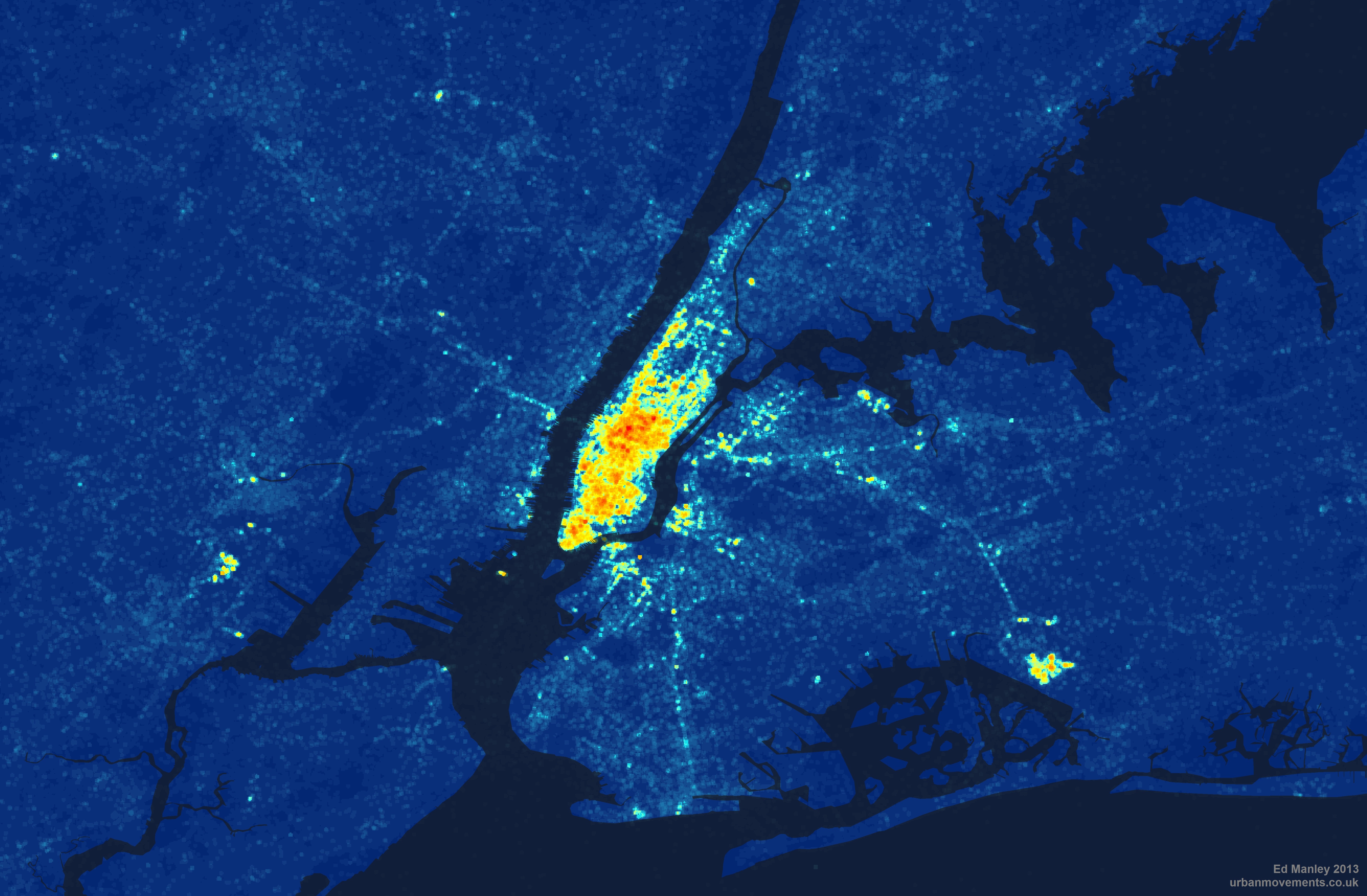
Further to the map, I’ve had a more in-depth look at how tweet density and multilingualism varies spatially across New York.  Breaking New York down into points every 50 metres, I wrote a simple script (using Java and Geotools) that analysed tweet patterns within a 100 metre radius of each point.  These point summaries are then converted in a raster image – a collection of grid squares – to provide an alternative representation of spatial variation in tweeting behaviour.

Looking at pure tweet density to begin with, we take all languages into consideration.  From this map it is immediately clear how Manhattan dominates as the centre for Twitter activity in New York.  Yet we can also see how tweeting is far from constrained to this area, spreading out to areas of Brooklyn, Jersey City and Newark.  By contrast, little Twitter activity is found in areas like Staten Island and Yonkers.

Analysing Languages in the New York Twittersphere

Density of tweets per grid square (Coastline courtesy of ORNL)

By the same token, we can look at how multilingualism varies across New York, by identifying the number of languages within each grid square.  And we actually get a slightly different pattern.  Manhattan dominates again, but with a particularly high concentration in multilingualism around the Theatre District and Times Square – predominantly tourists, one presumes.  Other areas, where tweet density is otherwise high – such as Newark, Jersey City and the Bronx – see a big drop off where it comes to the pure number of languages being spoken.

Analysing Languages in the New York Twittersphere

Number of languages per 50m grid square (Coastline courtesy of ORNL)

Finally, taking this a little bit further, we can look at how multilingualism varies with respect to English language tweets.  Mapping the percentage of non-English tweets per grid square, we begin to get a sense of the areas of New York less dominated by the English language, and remove the influence of simply tweet density.  The most prominent locations, according to this measure, are now shown to be South Brooklyn, Coney Island, Jackson Heights and (less surprisingly) Liberty Island.  It is also interesting to see how Manhattan pretty much drops off the map here – it seems there are lots of tweets sent from Manhattan, but by far the majority are sent in English.

Analysing Languages in the New York Twittersphere

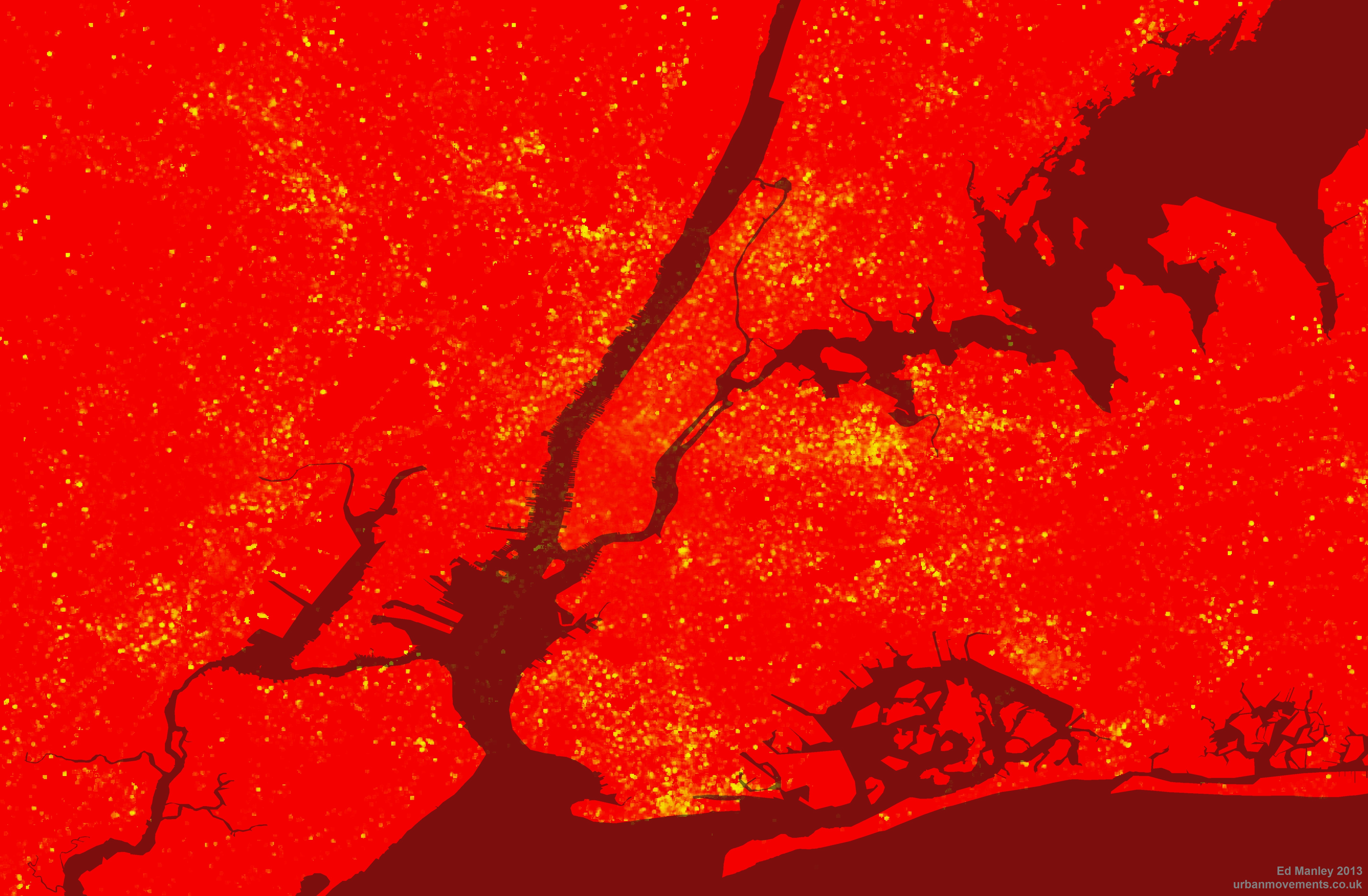
Percentage of non-English tweets per 50m grid square (Coastline courtesy of ORNL)

 Top Languages

So, having viewed the maps, you might now be thinking, ‘Where’s my [insert your language here]?’.  Well, check out this list, the complete set of languages ranked by count.  If your language still isn’t there then maybe you should go to New York and tweet something.

As you will see from the list, in common with London, English really dominates in the New York Twittersphere, making up almost 95% of all tweets sent.  Spanish fares well in comparison to other languages, but still only makes up 2.7% of the entire dataset.  Clearly, you wouldn’t expect the Twitter dataset to represent anything close to real-world interactions, but it would be interesting to hear from any New Yorkers (or linguists) about their interpretation of the rankings and volumes of tweets in each language.

Language Processing

Finally, a small word on the data processing front.  Keen readers will be aware that in the course of conducting the last Twitter language analysis, we experienced a pesky problem with Tagalog.  Not that I have a problem the language per se, but I refused to believe that it was the third most popular language in London.  The issue was to do with a quirk of the Google Compact Language Detector, and specifically its treatment of ‘hahaha’s and ‘lolololol’s and the like.  For this new analysis – working work with John Barratt and the wealth of data afforded to us by Trendsmap – we’ve increased the reliability of the detection, removing tweets less than 40 characters, @ replies and anything Trendsmap has already identified as spam.  So long, Tagalog.


Languages in the London Twittersphere: The Complete List

Further to my last post and various requests, I’ve published the complete list of languages detected within the whole collection of geolocated tweets in London.

The list contains the full counts ranked for each language (excluding Tagalog), as well as the count of detections classed as ‘Unknown’ – probably due to the tweet being too short, or too colloquial, for the detector to work out what language is being written.

You can find that full list here.

Detecting Languages in London’s Twittersphere

Over the last couple of weeks, and as a bit of a distraction from finishing off my PhD, I’ve been working with James Cheshire looking at the use of different languages within my aforementioned dataset of London tweets.

I’ve been handling the data generation side, and the method really is quite simple.  Just like some similar work carried out by Eric Fischer, I’ve employed the Chromium Compact Language Detector – a open-source Python library adapted from the Google Chrome algorithm to detect a website’s language – in detecting the predominant language contained within around 3.3 million geolocated tweets, captured in London over the course of this summer.

James has mapped up the data – shown below, or in zoomable form here – and he more fully describes some of the interesting trends that may be observed over on his blog.

Detecting Languages in London's Twittersphere

With respect to the detection process, the CLD tool appears to work pretty well.  In total, 66 languages were detected among the complete dataset (including a bit of Basque, Haitian Creole and Swahili, surprisingly enough), and on the whole these classifications appear to be correct.  In cases where the tool is not completely confident in what is it reading – usually due to the brevity or colloquiality of a tweet – classification is marked as unknown or unreliable, and in these cases we end up losing around 1.4 million of additional tweets.

One issue with this approach that I did note was the surprising popularity of Tagalog, a language of the Philippines, which initially was identified as the 7th most tweeted language.  On further investigation, I found that many of these classifications included just uses of English terms such as ‘hahahahaha’, ‘ahhhhhhh’ and ‘lololololol’.  I don’t know much about Tagalog but it sounds like a fun language.  Nevertheless, Tagalog was excluded from our analysis.

I won’t dwell too much on discussing the results, only that Twitter appears to reveal itself here to be the severely skewed dataset we all always really knew it was.  In total, 92.5% of tweets are detected as English, far above existing estimations (60%) of English speakers in London.  While languages you’d expect to score highly – such as Bengali and Somali – barely feature at all.  Either people only tweet in English, or usage of Twitter varies significantly among language groups in London.  There is a great deal you can say about bias within the Twitter dataset, but I think I’ll save that for another day.

For the time being, enjoy the map.


Mapped: London’s ‘Rudest’ Boroughs

A couple of weeks ago, I put up a post detailing how swearing on Twitter increases during the course of the average day.  It seemed people get more angry and sweary outside of work time, rather than during.

To delve a little deeper in this topic, I’ve now had a look at where Twitter gets angry.  For each of London’s 33 boroughs I have carried out the same analysis – this time for a month’s worth of tweets – looking at the percentage of tweets containing swear words in each borough.  The results follow some interesting trends… LondonsRudestBoroughs.PNG.scaled1000

At least in the Twittersphere, inner London appears to be the veritable paradise of civility relative to the bile-filled tweet streams emanating from outer London.  The biggest offenders appear to be located to the east of city, with east London fairing considerably worse.  Yet the leafy boroughs of Barnet, Sutton and Bromley perform badly too.

Right, so let’s first look at what doesn’t seem to be going on here.  First off, the influence of this idea that people mostly swear from the comfort of their own sofa does not seem to hold very true.  There does not seem to be a very strong relationship between swearing density and residential locations.  If there were then you’d see higher scores in the likes of Haringey, Richmond, Hammersmith and Fulham and Newham. Nor does swearing follow any sort of deprivation index, again Haringey is relatively poor compared to the likes of Sutton, Bromley and Barnet, which fair much worse.

So what is going on?

In my opinion, what I think we are seeing is a reflection of demographic and cultural trends across these boroughs.  Taking demography in the first instance, according to the 2009 figures on nationality demographics at the borough level, those London boroughs with the highest percentages of British-born citizens are Havering, Bexley, Bromley and Sutton, respectively*.   It would make sense that the higher the percentage of British-born citizens in an area – on average those probably more likely to use an English swear word in a tweet – the greater the number of swearing tweets there are likely to be.  True, but I don’t think this tells the whole story.

Looking beyond these four boroughs, Kingston and Richmond also report high percentages of British citizens living within their boundaries – yet we don’t see similar volumes of sweary tweets coming from these boroughs.  How can this be so?  Make of this what you will, but beyond the demographic variation, the data appears to highlight a cultural variation across London in attitudes towards swearing in tweets.  Simply put, the data seems to suggest that the good residents of eastern and southern boroughs of outer London are generally more inclined to throw a swear word into a tweet than their counterparts over to the western side of London.

As I say, this is just my theory – there is a whole lot more you could do to this data to gain a better understanding of the trends observed here (unfortunately I don’t have the time to do so!).  I’d be very interested to hear any alternative ideas about what might be going on though.

Overall, I hope these analyses begin to give you an insight into the extent to which Twitter data (and other data sources like it) can be used to reveal and explain social, spatial and temporal trends.

* Newham, Westminster and Kensington and Chelsea score highest for non-British born residents


When does Twitter get angry?

I’ve been spending a bit of time with Twitter data of late – perhaps not a healthy activity – but it is amazing what a rich data source of social and spatial behaviour it is.

Someone asked to me today whether it was possible to identify when and where Twitter gets angry.  Well, here is my answer to the first part – the when.

The graph below shows the variation, across the day, in the prevalence of swearing in the ‘Twittersphere’.  The data used represents tweets during two weeks in March 2012 covering London only – so maybe this is just when London gets angry…

In the graph we have the percentage of all tweets containing ALL types of swearing in blue, in red we have the prevalence of the f-word (by far the most common swear word), then finally the percent appearance of the s-word is shown in green.  Time is along the bottom.

When does Twitter get angry?

Putting the slightly frivolous nature of this work aside for a second, the data does demonstrate some interesting trends.  There is a clear upward trend in ‘anger’ as the day goes on, reaching a peak at around 10pm.  But why is this?  Why do we swear more in the evening, when we should be relaxed and enjoying our precious free time?  Are we (we being Twitter users only, of course) swearing at the TV?  Arguing with our friends over Twitter?  Or are enough of us getting drunk and losing our inhibitions?

We also see a smaller peak at around 5pm – now this is more easily explained.  The ‘thank f**k work is over’ tweet one might surmise.  An even smaller peak at around 9am suggests the opposite effect.

But I think this simple analysis gives us some insight into the way we use social media throughout the day.  During the day we think about work.  We tweet and communicate about work.  Yet in the evening, Twitter becomes a different place.  We let our guard down, and once we’re outside of the constraints of work, perhaps we begin to use Twitter in a different way.  Places like Twitter allow us the space to exclaim and let off our true feelings, whatever they may be, that might otherwise be constrained in other environments.

Twitter gets a lot of stick for its high volume of frivolous content – probably with good reason – but at a higher level some subtle but interesting social trends can start to be observed.