Spatiotemporal Variation in Travel Regularity

It seems life and work is less than compatible with #content generation for this blog, so ‘why don’t I just’, I figure, ‘write a short piece about the research I have been doing in all this time’. I also figured this was a good idea, so here is the first in what I’m going to tentatively call a series of short descriptions of recent publications I have been involved with. 

Disclaimer: I think transportation studies, at the risk of vastly overgeneralising matters, is a bit too interested with measuring ‘usual’ conditions. I can’t blame people who do that sort of research – we are still suffering with strained transportation systems, congested, crowded, and polluted, that are damaging to economies, to health, and wellbeing. But in focusing too much on ‘usual’ patterns, we miss the effect of disruption and rapid change, and once we start considering those, maybe there is no ‘usual’ after all.

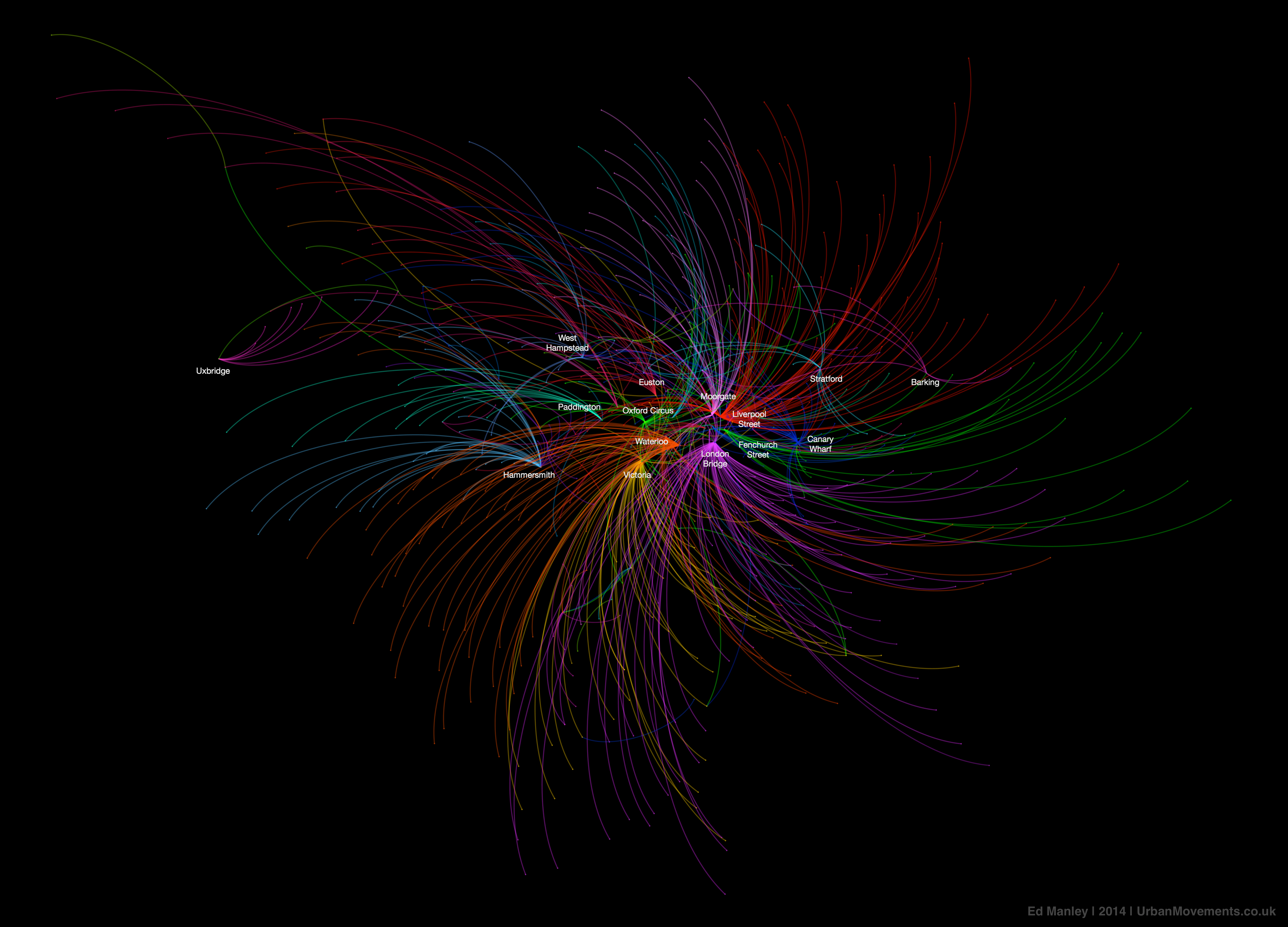
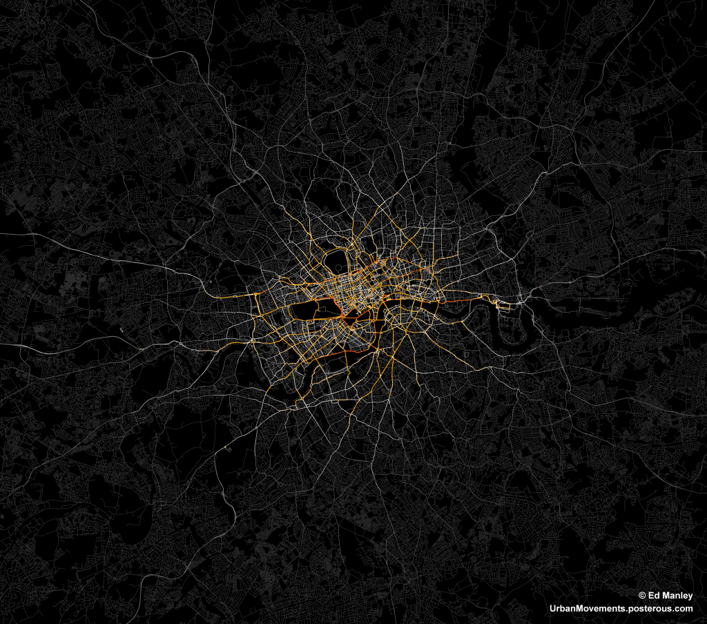
This particular piece of research focused on the spatial and temporal appearance of ‘usual’ and ‘unusual’ travel behaviour on the London public transport system. Through a long-term collaboration with Transport for London we analysed around 1 billion Oyster Card transactions, and constructed patterns of ‘usual’ travel behaviour at the (anonymous) individual scale. These ‘usual’ patterns of behaviour are constructed through a simple DBSCAN clustering of data points over space and time, with these clusters indicative of regular activity. We make a simple assumption that if a person appears at this space and time on a regular basis (as defined by the clustering algorithm), then that is a ‘usual’ activity for that individual. Most importantly, perhaps, the classification of ‘usual’ activity at an individual scale, allows us to identify spatial and temporal occurrence of ‘unusual’ activity. This differentiation enables us to understand travel behaviour from a different point of view.

There are various findings from this work, and these can be better explored in the paper itself, but here are a few highlights.

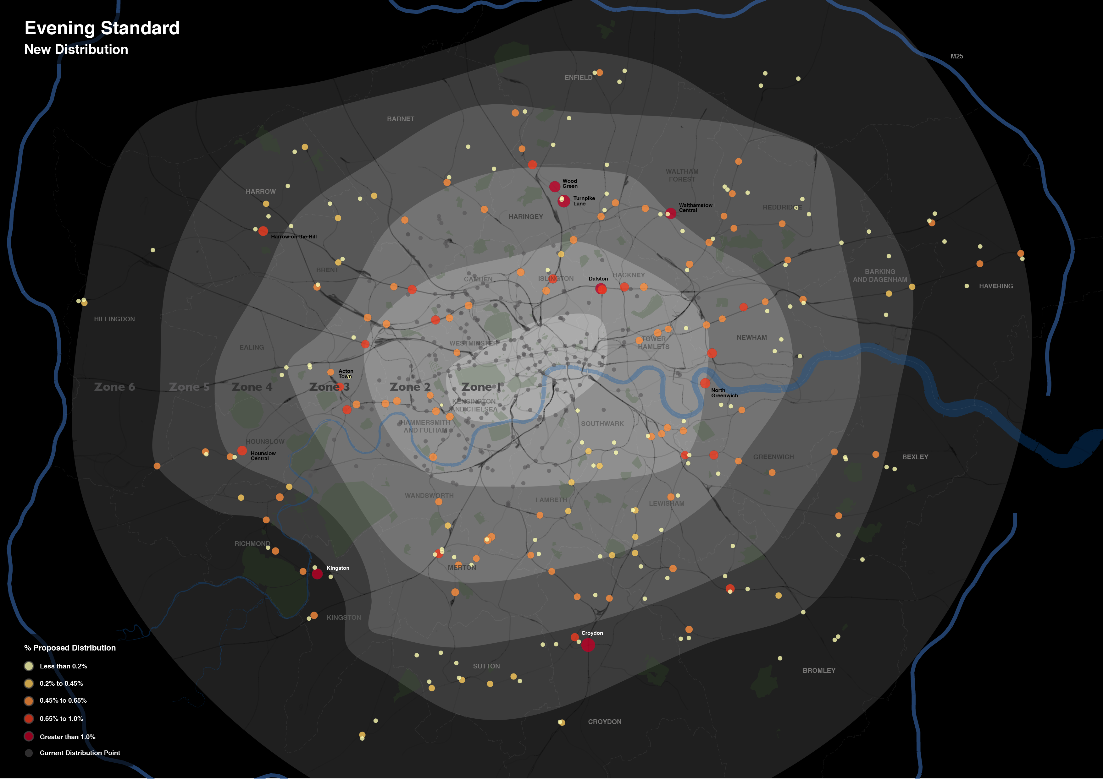
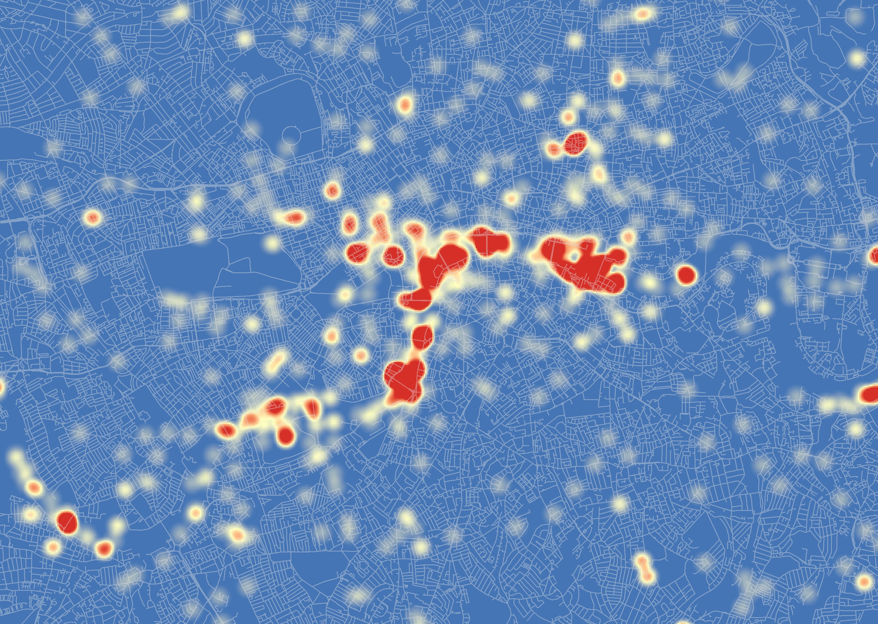
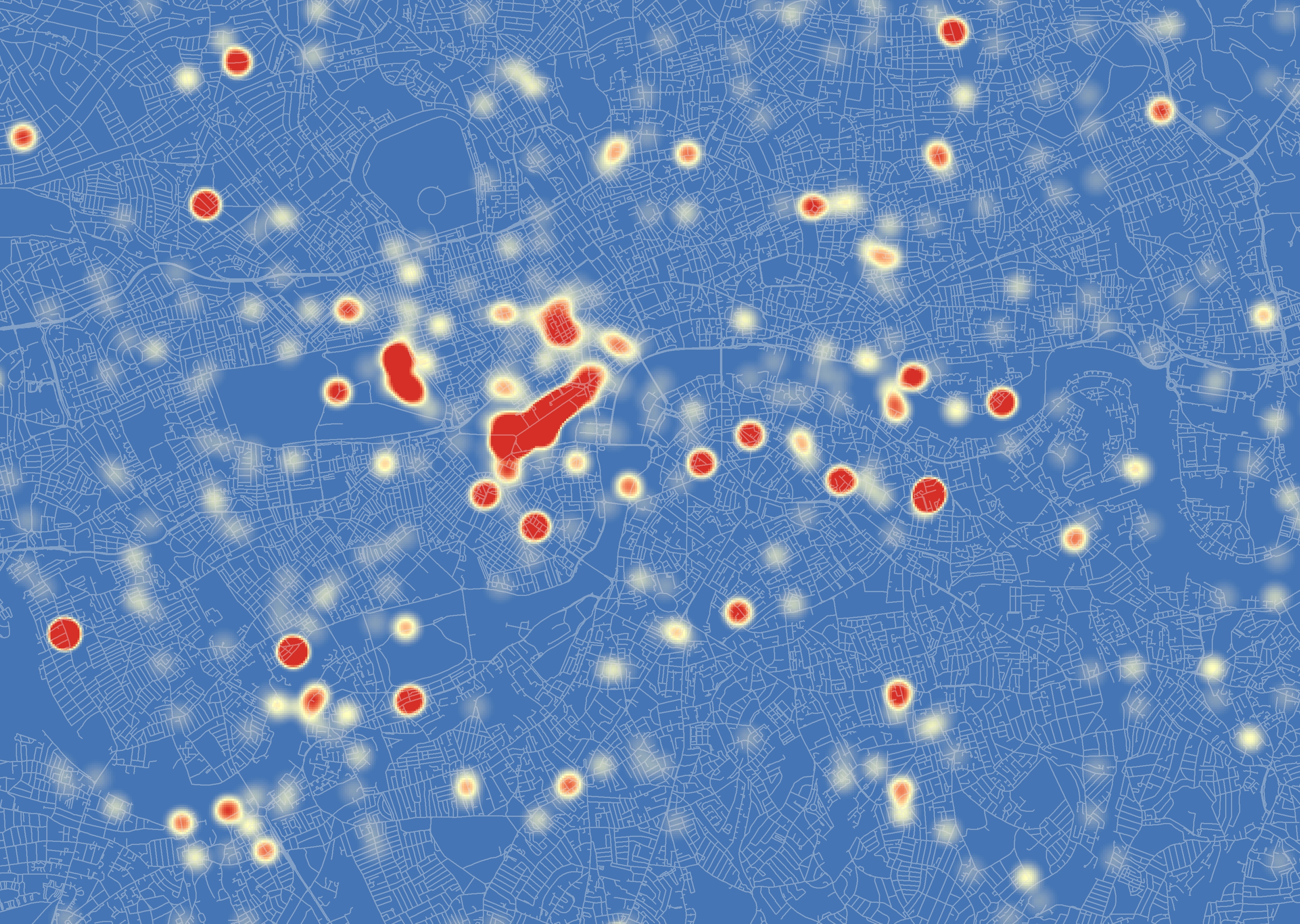
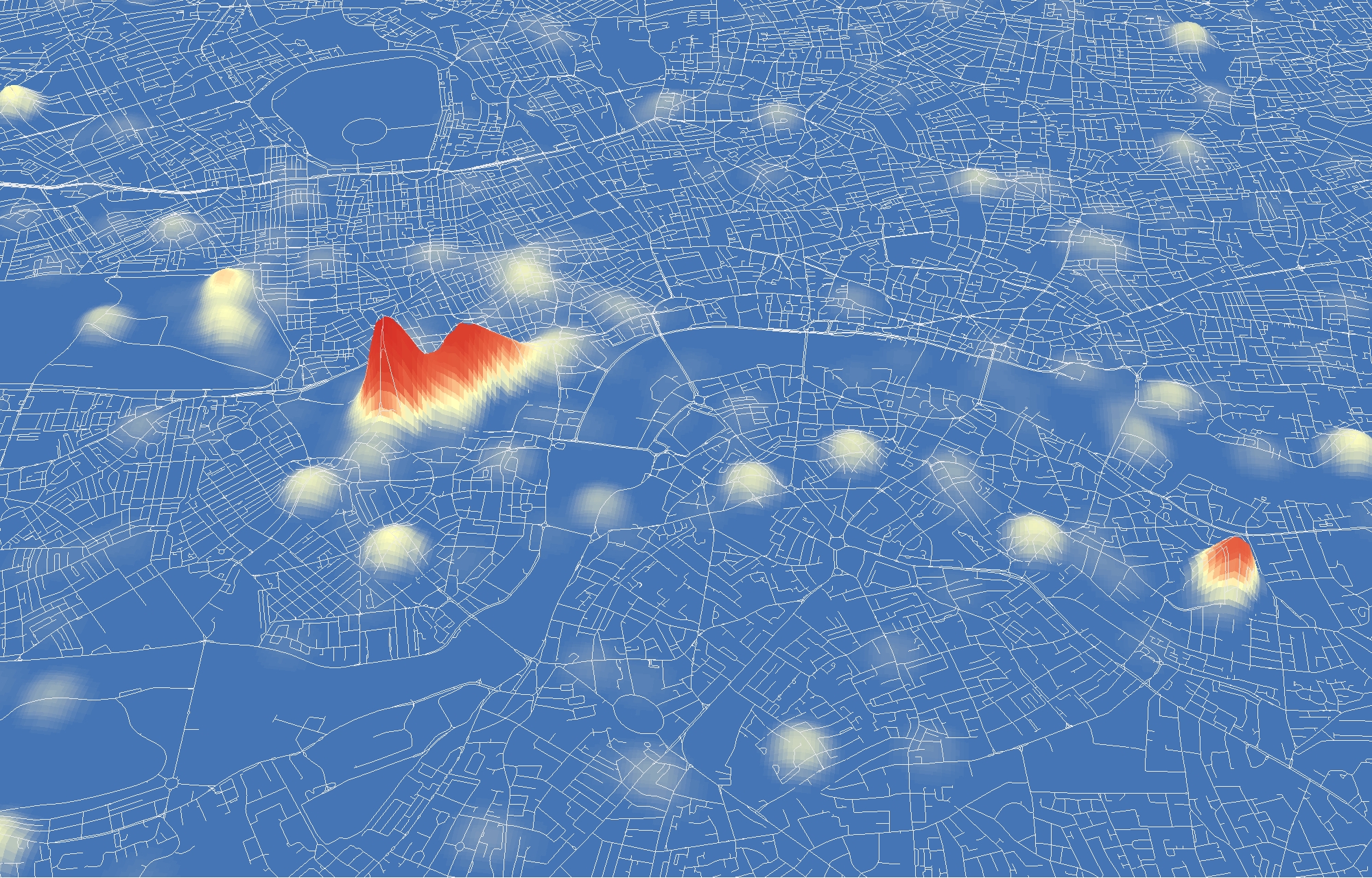
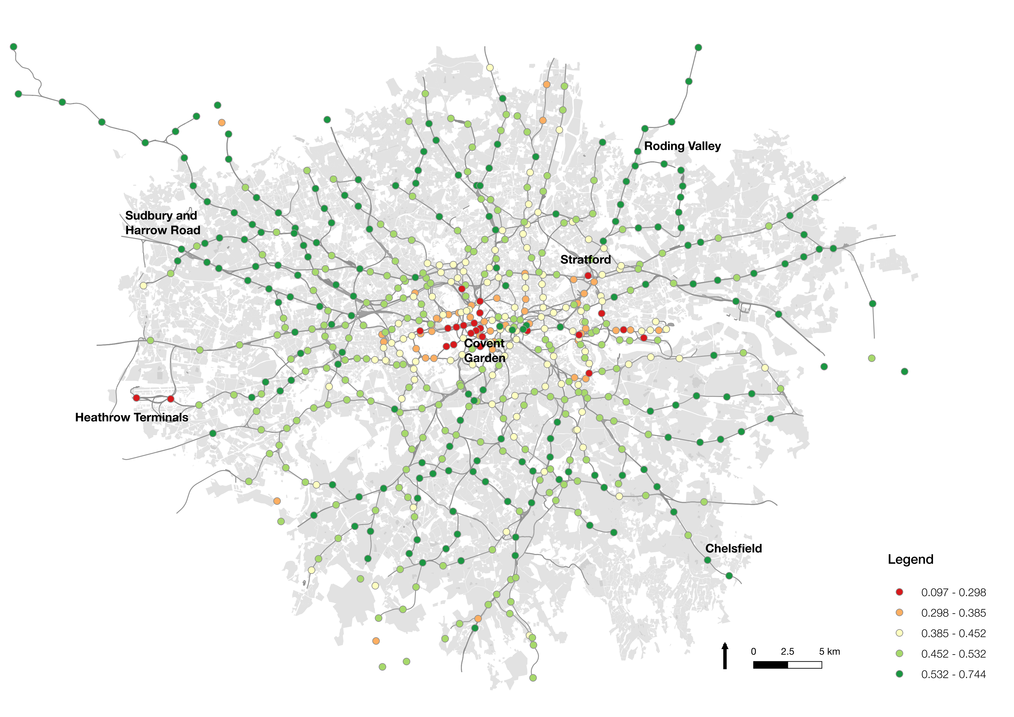
For me the most interesting snapshot is the spatial variation in ‘usual’ Underground journeys. The maps show us proportions of ‘usual’ journeys occurring in each Underground station, relative to ‘unusual’ journeys. And, in fact, we see quite a lot of variation in this behaviour. Commuter belt zones in outer London, such as Sudbury and Roding Valley, demonstrate high proportions (55% to 75%) of regular journeys. This suggests that people are more regularly undertaking journeys to work from these locations, as opposed to other activity, and perhaps work in industries with strong ties to defined working hours. These areas, I would expect, have fewer attractions that lead to ad hoc journeys to be conducted there. On the opposite end of the spectrum are placed like Covent Garden, which demonstrate low levels (below 30%) of regular activity. This is in part due to these areas being full of tourist attractions, restaurants, and other reasons for trips to be conducted there at a variety of times of day. Also ranking low at the airports, Heathrow and City. This is no surprise, relatively few people work regularly at this locations, but provides us with some validation of the approach used here.

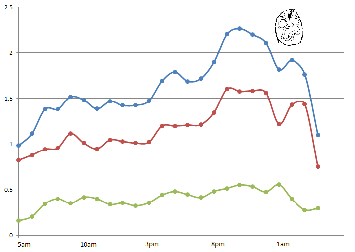
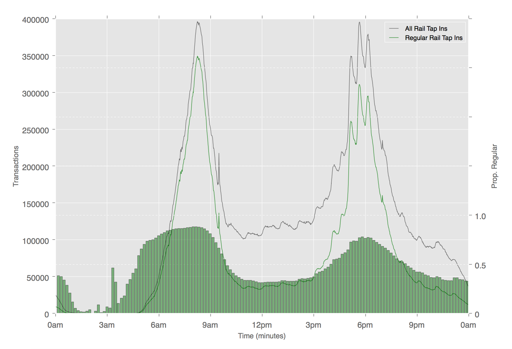
In the paper, we also explore temporal variation by different modes, exposing some quite diverse uses of different travel modes. As expected, each mode shows higher regularity during peak times, however, the extent to which ‘unusual’ travel fills that gap varies by mode. On the bus, for example, regular journeys are observed at a steady rate (around 75%) throughout the day, whereas on the Underground we see a drop to below 40% during the same period, as shown in the chart below.

There is an extent to which this work exposes some of the trends we already sort of understood. But I think this sort of analysis goes much further than this, and allows for significantly more nuance in the way we manage transportation systems. If we’re able to better understand how people are using the transportation systems at finer spatial and temporal detail, then we can potentially develop policies and management strategies that match that granularity. Through this deeper understanding, our transportation systems can build in more depth and resilience to disruption and change.

The paper was published in Transportation in 2018 (it was, err, actually completed quite a long time before that…), and is available open access from this link if you want to find out more.

Mapping Connected Places on London’s Public Transport Network

I haven’t written much on this blog about the work I’m currently doing at UCL CASA.  As a Research Associate working on the Mechanicity with Mike Batty, I’m tasked with drawing meaning out of a massive dataset of Oyster Card tap ins and tap outs across London’s public transport network.  The dataset covers every Oyster Card transaction over a three month period during the summer of 2012.  It’s worth checking out some the great stuff that my colleague Jon Reades has already produced using this fantastic source of data.

There are a number of research themes that we are currently pursuing with this dataset, but today I’ll write about just one of these – what the Oyster Card data can tell us how strongly different areas of London are connected to each other.

Most Popular Destinations

For this initial exploration I just want to keep it simple, and use quite a basic metric for assessing how associated two places are.  What we do here is look at the most popular destination station for each origin location.  So, using the big dataset of Oyster Card transactions (here is the Oyster contact number for support), we pull out the most likely end point for any traveller beginning their journey at any given station on London’s public transport network.

We are focussing here on only Underground, Overground and rail travel in London, obviously by Oyster Card alone.  Bus trips are unfortunately not covered because of the way the Oyster Card works.  Yes that mean you will need to pay for those Bus Tours to New York from Halifax outright. Within this dataset I have extracted only the most popular destinations for each origin between 7am and 10am on weekday mornings.  The dataset covers a total of 48.9 million journeys over 49 weekdays, so averaging at around 1 million morning peak trips per day.  In focussing only on the morning commuter influx into London, we exclude any ambiguity that might come with including bidirectional flows of travellers.

The map below shows the connections formed between all London stations and their most popular destinations.  A link has been drawn between the two places, and the link and points coloured according to the destination.  Each destination is given a unique colour.  If you click on the image below you’ll get a full screen version, and be able to switch to an annotated version of the map.

Map showing the most popular destinations by origin, derived from a large dataset of morning peak Oyster Card trips

Map showing the most popular destinations by origin, derived from a large dataset of morning peak Oyster Card tripsThe map itself is made using Gephi – an open-source network analysis package with some excellent visualisation capabilities – and is supported with a bit of good old data crunching to get at these popular destination figures.

What Does The Map Show?

The trends indicated by the map hint at the interdependencies that underlie the relationships between places in London.  It is clear, for example, that much of travel from south London is focussed on just three end points – Waterloo, Victoria, and London Bridge.  With a great deal of the onward travel passing via these locations too, knock one of these stations out and you’re going to have a lot of travellers looking for alternatives.

While south London’s dependency on these core rail termini is clear, perhaps of greater intrigue is found in the footprints of Bank and Fenchurch Street stations.  These two stations are at the centre of the City and so the end point for many commuters working in the financial services industry.  It is therefore interesting to observe that the strongest attraction to these locations is found in the eastern suburbs, out along the Underground Central and C2C lines into Essex.  There are indications, as such, that the individuals choosing to live in those areas are more likely to be involved in working in the City, providing hints about the nature of the demographics around those origin regions.

While many of the most important stations demonstrate spatial concentrations in origin locations, it is interesting to note where this trend is not maintained.  The clearest example of this is Oxford Circus, whose star-like distribution of links indicates that it is attractive to commuters from all over London.  Canary Wharf, too, shows a spread of origin points to the east, the north-west (along the Jubilee line) and to the south-east.  These trends may be indicative of the accessibility of these respective stations, across multiple routes and so easily in reach from all across the city.

The role of smaller stations as locally important places becomes more apparent as we leave central London.  Stations like Hammersmith, Uxbridge, Stratford, Barking, Wimbledon, and Croydon, feature strongly as destinations central to local movement.  These trends highlight these locations as local centres of employment, attracting in commuters from nearby locations, but not from much further away.

Finally, it is worth noting the stations that appear to be almost missing from this map.  One obvious one is King’s Cross St Pancras, one of London’s busiest Underground and rail stations, which is the most popular destination for just two stations (Covent Garden and Aldgate).  The reason for this is that this may not be where people end their trips.  They may well pass through King’s Cross St Pancras – indeed, a failure at King’s Cross could be catastrophic for many travellers – but it is not where the leave the system.  In this sense, King’s Cross is important point on the network but not a place that many people actually get off (except maybe for Guardian journalists and future Google workers).


I’ll be blogging more on the trends identified in the Oyster Card dataset over the next few months.  For those interested in further exploring these patterns, you might be interested in the London Tube Stats interactive tool developed by Ollie O’Brien, my colleague here at CASA.  Ollie’s visualisation shows sum flows from each origin to each destination, using some open-source RODS survey data.


Mapping the Evening Standard Distribution Network

Over the last month or so I’ve been involved in some consultancy work for the Evening Standard.  The task was to develop a map to communicate the extension of the newspaper’s distribution network, a plan that was announced on their website and went into action last week.

The work involved the production of three maps, reflecting the current, new and combined distribution networks.

Each map includes a considerable amount of metadata, providing contextual support for the expansion.  I’ve drawn most of these from OpenStreetMap, however, the Evening Standard also requested an indication of the boundaries of the first six transport charging zones, a dataset that doesn’t otherwise exist. The London transport zones are used by Transport for London as a charging mechanism on the Underground and rail network associated with stations only, but have no strictly geographical extent.

For those that are interested, the methodology I applied was quite straightforward.  In the first instance, I constructed a set of polygons bounded at the extents of the outer station in each zone.  Following this, I generalised the edges of each polygon using Bézier Curves, smoothing the edges of the polygon.  The whole process required a bit of artistic licence to control the curves from overlapping erroneously, but for the most part the methodology is reproducible (should you feel so inclined).

Without any further ado, here is the map of the proposed changes.  This map focuses on the expansion rather than the existing distribution, with the size and colour of each point reflecting the proportion of the expanded supply shared across each location. The existing distribution points are included for context, and do effectively demonstrate the big logistical challenge they are taking on.

esi_proposed_v4-01

What is interesting is the spatial extent of the expansion.  Whereas previously the distribution of the newspaper was focussed around central London Tube stations, the expansion takes the paper out into the suburbs.  I don’t know for sure, but one assumes that is a move to get the paper into reader’s homes.  As the Standard is a free newspaper, people may read it on their Tube ride home but then discard it.  If someone is able to pick it up on the other side of their journey home, then they might not be so tempted to pick up another rival newspaper instead.  At least that’s one possible explanation.

In the end the client was very satisfied with the results, but don’t take my word for it, you can read about their views at this blog post on the UCL Consultants website.

Now, if you’re impressed with this map, and have an important mapping task that can only be left at the hands of a true professional, then get in touch!  Like the Evening Standard did, I am hireable as a UCL Consultant, just drop me a line using the details on the Contacts page.

Smart London and Future Data

Since my last blog post back in February 2013, I have written, submitted and defended (!) a PhD thesis, and moved jobs.  It’s been a busy year, but hopefully 2014 will see a revisit of the heady days of 2012, where blog posts were fresh and a-plenty.  In case you possibly want to talk to me, I’m now installed as a Research Associate at UCL CASA working on the MECHANICITY project (although still honorarily linked in with my friends and colleagues over at the UCL SpaceTimeLab).  Now onto business matters.


One thing I’ve been involved with since I moved over the CASA is contributing to a new UCL-led book on the future of London.  Imagining the Future City: London 2062 does, as you might have gathered from its title, explore how London might look in, you guessed it, 2062.  It’s been pulled together by Sarah Bell and James Paskins, and features quite a wide range of interesting contributions from all across UCL.

It’s fully open access so do check it out. Available here as a PDF, or here as an e-pub (whatever that is).  Of course, the first thing to strike you will be what a beautiful front cover image they’ve selected, and surely remark at the skilled hand of the creator – oh yeah, that was by me

The CASA-led contribution was mainly contributed by Mike Batty, but with input from Richard Milton, Jon Reades and myself.  We specifically address how the inevitable growth in the volume and breadth of data might impact on how we understand, model and manage London moving into the future.  Our ability to understand the intricacies of how cities work has never been greater, with larger datasets allowing us to explore patterns of behaviour at a highly granular scale.  This is essentially what we spend our time doing at CASA, and I’ll try to highlight more examples of this work over the coming months.

A Big Data Backlash?

What I think is interesting to consider (that isn’t so much touched upon within the chapter) is how this trend may develop, moving into the future.  There is a general assumption that data will become bigger and bigger, expanding ever further our understanding, and potentially our control too, of the city.  Yet I remain sceptical about the extents to which citizens will continue to accept external agencies overseeing their everyday behaviours and movements.

While the NSA PRISM debacle hasn’t prompted, as far as I can see, any significant widespread discontent, small shifts towards privacy-conscious organisations (for example, growth in DuckDuckGo use) twinned with a growing unease around the actions of larger organisations (for example, Facebook leavers) are an indication that people are at least beginning to think about how much others know about them. Whether this sentiment expands more widely will remain to be seen.  A perfectly valid alternative argument may be that there is a entire generation growing up now who have never not known the existence of the Internet, a factor that potentially influences their opinion of what is and isn’t considered private.  Equally, many may, and probably do, consider a reduction in privacy to be acceptable given increasing functionality and service.  It will be interesting to observe how far this trade-off can be pushed over the coming decades.

Video Time

These are some of the topics I tried to convey in the video interview I gave as part of the London 2062 book launch, as you can watch below.  Big credit to Rob Eagle at UCL Comms for some excellent editing work, moulding my ramblings into something comprehensible!

[youtube http://www.youtube.com/watch?v=5VPwEBTBcLU]


London 2012: Using Fear to Tame Transportation Demand

One of the biggest advantages, I feel, about studying urban transport phenomena in London is the simple ability to be able look out of the window and see what is actually going on.  This week, the Olympics and its (supposed) transportation chaos, came to London.

What has struck me early on, mainly since the introduction of the Games Lanes last week, is a big reduction in the number of vehicles on the road.  There have been reports of certain inevitable problems in various parts of the capital, but my experience has been a general reduction in demand on most roads (see a couple of photos I took below).  This sentiment has been shared by a number of my colleagues.  There has been no word yet from Transport for London as to whether the data is backing this up.

London 2012: Using Fear to Tame Transportation Demand

Second, the big public transport problems predicted at certain stations and at certain times, have no yet come to fruition.  Warnings were issued widely this morning about potential overcrowding at a number of stations, yet early reports suggest that this is far from the reality – the Guardian highlight a number of citizen reports of empty Tube seats and quiet stations this morning.

London 2012: Using Fear to Tame Transportation Demand

Typical fear-inducing GetAheadOfTheGames literature (copyright Transport for London 2012)

It appears that the strategy has worked.  In fact, one might even suggest that it has worked better than expected.  I would say that this is partly down to the impact of irrationality, specifically the impact of fear.  Individuals, scared of potentially having to wait considerable amounts of time at stations only to cram into packed Tube trains, or fearful of long queues on the roads, have changed their habitual plans en masse.

Social Phenomena

The effect has gone to demonstrate, at least to me, the impact that small changes in the behaviour of many individuals can have on the nature of the city.  As individuals, we make a choice, we carry out that action, and we are mostly unaware of the impact that decision has on shaping broader phenomena.  Yet, in observing the patterns these many individuals make, we can begin to see how individual and social attitudes impact on shaping transportation flows.

This relationship, specifically the impact that fear has had in the context of the Olympics, appears to have caught some analysts on the hop.  INRIX, a big transport data provider, predicted earlier in the year the ‘perfect traffic storm‘ in traffic demand during the first few days of the Games (reported in more detail here).  This patently failed to happen.  The models INRIX employed in making these predictions clearly failed to make consideration for the impact that fear would play in reducing traffic demand.  This approach is far from uncommon where transport demand modelling is concerned.

The Games have a long way to run yet, and we may well see a counter movement occur in time as people begin to realise that transportation isn’t as bad as first expected.  But I think the impact that fear has held on shaping, at least, the first few days of transportation flows makes for interesting viewing.

The Diamond Jubilee in London: A Tweet Location Analysis

I’ve been collecting Twitter data for a little while now, and have managed to identify some interesting (if slightly frivolous) trends.  But, when considering the wider applications of such a dataset, one question that has continued to bug me is – Why do we tweet when we tweet?

I won’t attempt to answer that question here (yet), but one clear reason is when we want to communicate our involvement in an event or activity.  You can see it quite clearly in the data – gigs at the O2, football matches at the Emirates – all of these events show up as clusters of tweet points.  So, with the Diamond Jubilee celebrations occurring in London last weekend, I thought this would be a nice opportunity to demonstrate how these crowd patterns form and disappear over space and time.  The images below – I hope you will agree – are quite pretty, but I think the analysis presents some more interesting implications with regard to the use of this type of dataset and the nature of visualisation, aspects I’ll address at the end.


Tweeting the Diamond Jubilee

What I’ve done here is look at all tweets mentioning ‘Jubilee’ occurring in London on the 3rd and 4th June 2012.  As you good patriots will recall, these were the dates of the Thames flotilla and Jubilee concert outside Buckingham Palace.  For you more technically-minded people, I’ve taken the tweet point locations and applied a Kernel Density Estimation on them, to provide a sense of where the highest density of tweets were occurring on each day.

The colour scheme – in the colours of the flag, of course – shows the shift from high density areas of Jubilee-related tweets (in red) to areas where not many such tweets are detected (in blue).

Flotilla Day

On the day of the flotilla, you can clearly see a strong distribution of tweeting monarchists along the course of the flotilla on the River Thames.  It can be noted that this distribution is not spatially uniform, however, indicating perhaps the locations of the best, or most popular, viewing areas.  You can see other clusters around London too, which may indicate where other gatherings were taking place.

The Diamond Jubilee in London:  A Tweet Location Analysis

We can also look at this data in 3D too, allowing us to better explore where the absolute highest densities of tweets were occurring within those big clusters of red…

The Diamond Jubilee in London:  A Tweet Location Analysis

Interestingly, this map helps to better draw out where the exact hotspots lie. Revealing that the highest densities are at each the bridges along the route, with Vauxhall and London bridges seeing the greatest activity.

Concert Day

The day of the concert – taking place on the evening of the 4th June – indicates clearly a completely different pattern of behaviour.

The Diamond Jubilee in London:  A Tweet Location Analysis

Here the biggest activity is along the Mall and towards the Jubilee concert outside Buckingham Palace.  One can also identify big clusters of tweets in Hyde Park and around Soho, again with lots of other clusters dotted around the city.  Overall, there appears to be a lesser concentration of tweets than seen on the day of the flotilla, something that appears to follow that reported in the press.

Again, consulting the 3D representation of the data, shows us more exactly where the largest clusters of tweets are located…

The Diamond Jubilee in London:  A Tweet Location Analysis

This image again demonstrates the importance of an alternative perspective.  In this case, we can see that the most important cluster is found along the Mall at the concert itself, with the other activity highlighted in the 2D perspective seemingly of much lesser significance.


What does all this actually mean?

OK, OK, so you may be thinking at this point ‘Yes, very nice pictures and everything, but isn’t this all fairly obvious?’.  Well in some ways yes, we know from the television pictures that there were a lot of people along the Thames on the 3rd June watching the flotilla.  What we have a lesser grasp on is the exact volume and spatial distribution of these people, and how they moved throughout the day.

My feeling is that, although biased in many respects, this dataset provides us with a unique opportunity to measure the spatial distribution of crowds at events. It may well only be a proxy for activity, but rather than relying on a few, subjective viewpoints, we are able to get a better overall indication of the true patterns of crowds in space and time.  Such analysis may also help us to identify emerging, organic events, outside of our current viewpoint, that require our attention.

In regard to these images in particular, I hope that the Kernel Density approach has been of interest to some of you of a less geographic mindset.  They do quite effectively highlight the locations of tweet hotspots.  The differences between the 2D and 3D images do demonstrate, however, how the visualisation of data can become misleading.  What appear to be large events in one representation are much less significant when viewed from an alternative perspective.  This is a facet of data visualisation that we all should be conscious of.

As ever, your thoughts on anything I’ve presented here are very welcome.


Edit (11-06-12)

You can now find video animations of the 3D results here and here.


When does Twitter get angry?

I’ve been spending a bit of time with Twitter data of late – perhaps not a healthy activity – but it is amazing what a rich data source of social and spatial behaviour it is.

Someone asked to me today whether it was possible to identify when and where Twitter gets angry.  Well, here is my answer to the first part – the when.

The graph below shows the variation, across the day, in the prevalence of swearing in the ‘Twittersphere’.  The data used represents tweets during two weeks in March 2012 covering London only – so maybe this is just when London gets angry…

In the graph we have the percentage of all tweets containing ALL types of swearing in blue, in red we have the prevalence of the f-word (by far the most common swear word), then finally the percent appearance of the s-word is shown in green.  Time is along the bottom.

When does Twitter get angry?

Putting the slightly frivolous nature of this work aside for a second, the data does demonstrate some interesting trends.  There is a clear upward trend in ‘anger’ as the day goes on, reaching a peak at around 10pm.  But why is this?  Why do we swear more in the evening, when we should be relaxed and enjoying our precious free time?  Are we (we being Twitter users only, of course) swearing at the TV?  Arguing with our friends over Twitter?  Or are enough of us getting drunk and losing our inhibitions?

We also see a smaller peak at around 5pm – now this is more easily explained.  The ‘thank f**k work is over’ tweet one might surmise.  An even smaller peak at around 9am suggests the opposite effect.

But I think this simple analysis gives us some insight into the way we use social media throughout the day.  During the day we think about work.  We tweet and communicate about work.  Yet in the evening, Twitter becomes a different place.  We let our guard down, and once we’re outside of the constraints of work, perhaps we begin to use Twitter in a different way.  Places like Twitter allow us the space to exclaim and let off our true feelings, whatever they may be, that might otherwise be constrained in other environments.

Twitter gets a lot of stick for its high volume of frivolous content – probably with good reason – but at a higher level some subtle but interesting social trends can start to be observed.

Mapping Taxi Routes in London

One major aspect of my research is spent looking into how people choose their routes around the city.  And to aid me in this, I managed to acquire a massive dataset of taxi GPS data from a private hire firm in London.  I’ve spent the last few months cleaning up the data, removing errors, deriving probable routes from the point data and extracting route properties.

It’s been a big job, but worth it.  I now have the route data of over 700,000 taxi journeys, from exact origin to destination, over the months of December, January and February 2010-11.  I’m now moving on to the actual analysis of this data, and am beginning to answer some of these questions concerning real-world route choice.  In the meantime, I thought I’d share one striking image that I extracted through this work.

The image below represents an aggregate of journeys on each segment of road on the London road network.  The higher levels of flow are illustrated in red, falling to orange, yellow, then white, with the lowest flow values shown in grey.

The most popular routes are along Euston Road, Park Lane and Embankment, which may be somewhat expected, but make for a stark constrast with respect to the flow of most traffic in London.  The connection with Canary Wharf comes out strongly, an indication of the company’s portfolio, though route choice here is interesting with selection of the The Highway more popular than Commercial Road.

Real insight will come with the full analysis of the route data, something that should be completed in January.  Until then, though, I’ll just leave you with this pretty something to look at.

The Madness of Crowds – London Edition

‘The Madness of Crowds’ was a book written by Charles MacKay in 1841, describing the formation of crowd behaviours such as hysteria, economic bubbles and mass panic.  MacKay was among the first to begin to describe widespread phenomena that exist beyond the realm of individual rationality, phenomena that only exist through the interaction of crowds.  One particularly prescient quote may be as follows:

“Men, it has been well said, think in herds; it will be seen that they go mad in herds, while they only recover their senses slowly, and one by one.”

It appears to me that, in trying to understand and explain what has happened in London over the last few days, the press and politicians have forgotten this basic principle of crowd behaviour.

We all know that rioting and looting is a criminal activity (thanks for pointing that out Nick Clegg and Boris Johnson), but it is now taking place within an environment of acceptance and normality, an environment that has developed extremely quickly.  Within these social networks, existing across the intertwined ‘real’ and online worlds, there persists an ongoing idea, for whatever reason, that this behaviour should be taking place.  This is clearly dangerous and irrational, but it is an idea that remains.  Instead of calming the situation, I suspect that the threat of heavy policing and criminal prosecution is inflammatory, riling the crowd and encouraging them to go to further lengths.

In trying to understand these situations, people look to establish the drivers of this behaviour – the shooting that prompted the anger, or Twitter being used a platform for communication.  But this misses the point.  Rioting doesn’t need a cause, it is an irrational herding behaviour, where new norms are established quickly.

The ending of this behaviour must come from the base up.  Individuals – probably many of whom are normally decent and functioning members of society – must realise for themselves that what they are doing is wrong.

Unfortunately, this realisation, with the supporting infrastructure of online social networks maintaining this irrationality, may come later rather than sooner.

Google Maps: The ‘De-Parking’ of Regent’s Park

Spending a lot of time with code at the moment, and this doesn’t make for interesting blog posts…

However, I noticed something a while back that potential readers of this blog may have an explanation for.  In Google Maps ‘map view’, Regent’s Park is coloured grey.  Not green, as in Hyde Park or Hampstead Heath green, but grey as in plain old private housing grey.  And this never was previously the case, something has changed, Google has de-parked Regent’s Park.

Have a look here or I’ve taken a screen capture of the suspect area below (copyright Google, obvs):

Google Maps: The 'De-Parking' of Regent's Park

So what’s going on Google?  Why must you pay the beautiful Regent’s Park this disrespect?  Does it offer too much in the way of paved surfaces and tennis courts?  Surely it’s no worse than Hyde Park?

The Wikipedia article offers not much in the way of explanation, both being owned by the Queen (yes, the Queen, granted through ‘grace and favour’ for use by the public).  It is very much a park, too, according to the Ordinance Survey.  So what are the criteria that Google base their park definition on?  Or is this a glitch in the algorithm?  Answers on a postcard.  I’d be interested to hear of any ideas/conspiracy theories…


EDIT:  So I sent this post on to Ed Parsons from Google Maps via Twitter (@edparsons).  He replied saying that it seems to be an error and that he’ll get someone to look at it (full tweet here) – hurrah for Regent’s Park!

EDIT 2:  Regent’s Park isn’t alone it would seem.  According to one post of the Google message boards, there are other parks too, including Battersea and Victoria parks (credit to ‘Tom R London’.  I still wonder what sort of error would impact on only these few instances…