Understanding Cities through Individual-Level Data – Opportunities and Challenges

As it’s been a while since I last posted, I thought I’d put up something I prepared for a Royal Society Smart Cities and Transportation workshop next week. I’ve focussed on data collected at the individual-level, and the opportunities the data present for better understanding cities, and the challenges the maximisation of these resources face. There are no doubt alternative perspectives, arguments that go deeper beyond this very short piece, and methodological issues too to contend with. Feel free to add your thoughts in the comments at the end.


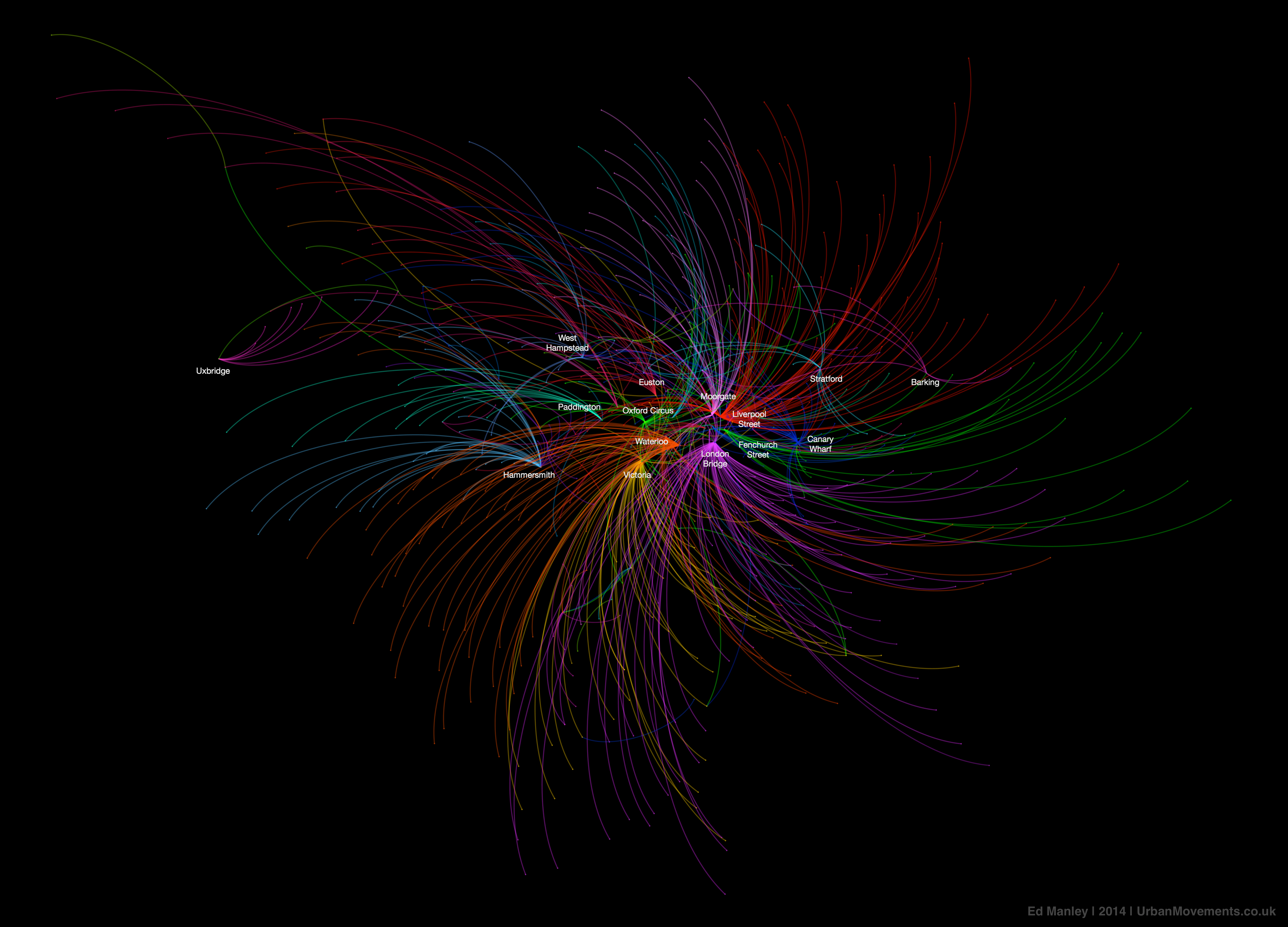
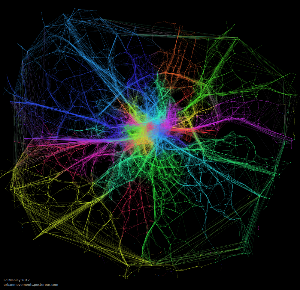
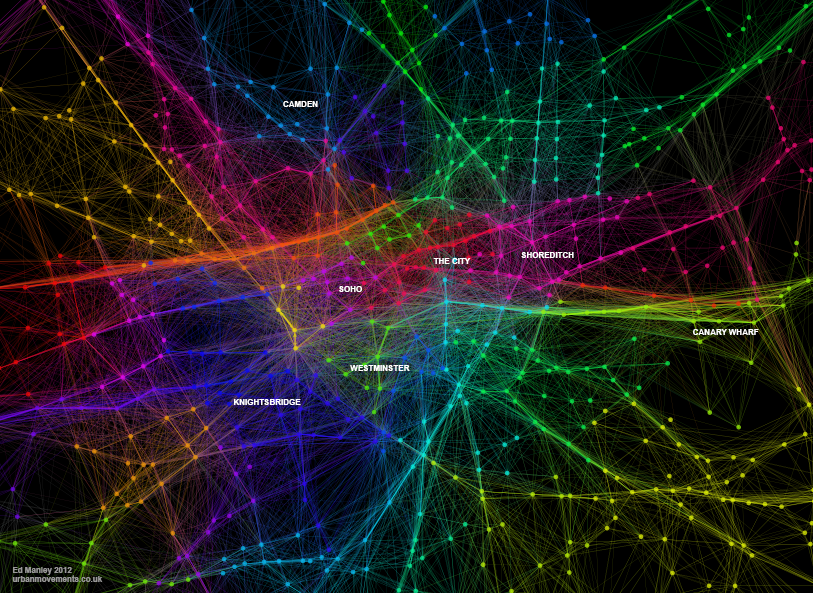
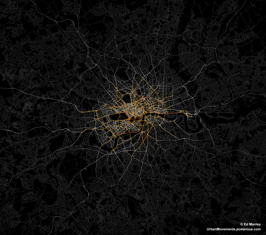
As the creation, capture and accumulation of granular datasets becomes increasingly engrained within the urban environment, the potential for analysing urban processes in finer and finer detail increases. New forms of data are being generated at spatial, temporal and individual-level scales that surpass all that have gone before. These data transcend the boundaries that previously imposed on analyses of cities – traffic flow can be captured on a second-by-second basis road-by-road, crime incidents are habitually recorded with a longitude and latitude, and commuting patterns can be captured live through the movements of mobile phones. Through the development of a wealth of new methods, machine learning approaches are able to derive deeper insight from these data, revealing new patterns and understanding of cities than have been available before. It is, however, increasing granularity individual behaviours that offers the greatest promise, and poses the biggest challenges for future urban data analysis.

Data derived insights around the individual offer a chance to better understand the behavioural heterogeneity within the population across a range of domains, as well as revealing the complex interconnectivity of urban systems. Capturing these details at finer level could allow us to better measure and model cities, allowing us to improve our current conceptions on how we understand, manage and organise our cities.

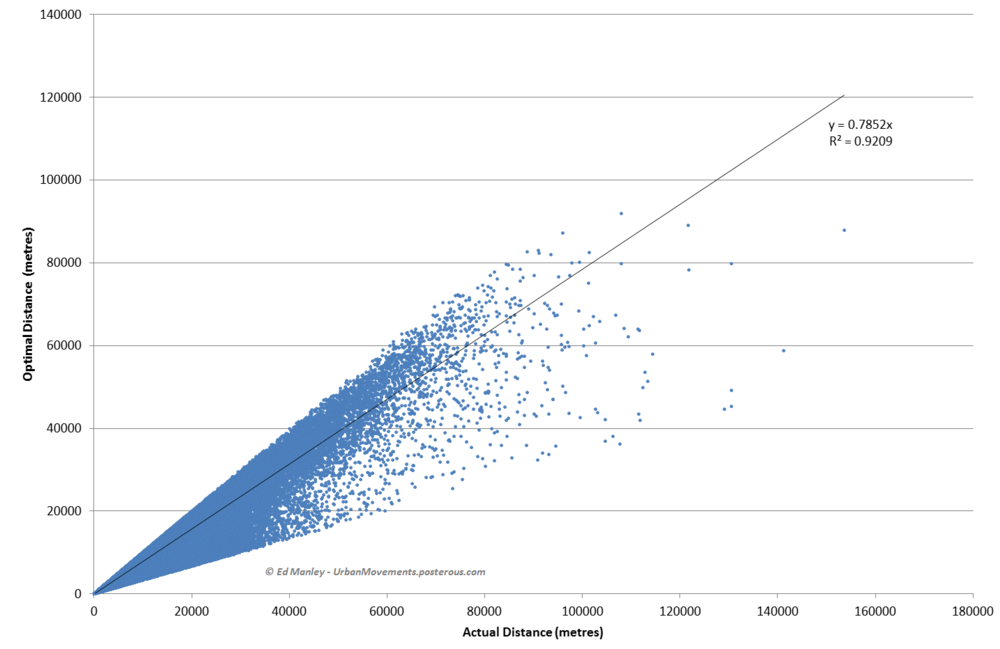
The opportunities presented by individual-level analyses are plentiful. Longitudinal data allow us to learn how individuals adjust behaviour over different periods of time and under different conditions, and how they adapt to longer-term changes to the city. Within domains such as transportation, conventional models lack strong behavioural insights, failing to capture behavioural heterogeneity or measure how individual experiences and perceptions influence behaviour. The new lessons we can potentially learn from these data can not only aid our longer term models of urban futures, but contribute towards our management of cities on a day-to-day basis.

The individual-oriented nature of these analyses are able to transcend disciplinary boundaries through which cities have previously been understood and managed. At present, we lack a deep knowledge around the integration of different urban systems, and the influence of the urban realm upon these connections. We might, for example, be interested in the influence of travel on shopping behaviour, or on health, or crime patterns, but the potential interconnections extend far and wide. While conventional surveys provide good localised insight into these behaviours and systems, only through large scale data collection can these interconnectivities be observed across the whole population and entire urban area. The improved understanding of the people and systems that make up the urban realm offers considerable potential for those operating and optimising cities.

Despite the promise, there are considerable challenges to capitalising on these opportunities – underlined primarily by the fact that many of the datasets that could advance our understanding of cities already exist. At the individual scale, longitudinal travel behaviour can be captured by smart card transactions, many retail transactions are captured via loyalty cards, and mobile phones tracked from cell tower to cell tower. There is, however, little opportunity for joined up thinking, as many of these datasets exist within silos, accessible to interested parties only in exchange for a considerable fee. The potential for asking new questions, discovering new insights, and crossing urban systems and disciplines is restricted by commercial confidentiality. Crossing these boundaries requires leadership and openness from business and government, where too often, siloed within their own priorities, perspectives and worldview, a wider vision or motivation for an improved city is lacking.

Beyond structural challenges, however, there are questions of morality, and how far data collection and analysis should be deployed for the purpose of urban development. When one starts to generate data at the individual level, the risk of de-anonymising individuals becomes very real. Data analysts have already proven this in various contexts, using datasets cleared for public release – from the identification of individuals from the movements of their mobile phones, to the identification Netflix users from their viewing habits, to establishing whether celebrities tipped their taxi driver or not. These analyses may have been conducted for benign reasons, but they illustrate the point that the opportunities for revealing identities from data traces sharply increase as data collection reaches individual-level granularity. The questions therefore become how far should these analyses extend, what constraints (if any) should be placed on data collection and analysis to ensure anonymity, and how should methods and results be communicated to the public. At present, there is little guidance from government and seemingly little leadership beyond. Without due consideration given to the treatment of these issues, there is a risk that public trust in data collectors and analysts will be eroded, risking the imposition of limiting constraints on how these data are exploited in future.

Mapping Connected Places on London’s Public Transport Network

I haven’t written much on this blog about the work I’m currently doing at UCL CASA.  As a Research Associate working on the Mechanicity with Mike Batty, I’m tasked with drawing meaning out of a massive dataset of Oyster Card tap ins and tap outs across London’s public transport network.  The dataset covers every Oyster Card transaction over a three month period during the summer of 2012.  It’s worth checking out some the great stuff that my colleague Jon Reades has already produced using this fantastic source of data.

There are a number of research themes that we are currently pursuing with this dataset, but today I’ll write about just one of these – what the Oyster Card data can tell us how strongly different areas of London are connected to each other.

Most Popular Destinations

For this initial exploration I just want to keep it simple, and use quite a basic metric for assessing how associated two places are.  What we do here is look at the most popular destination station for each origin location.  So, using the big dataset of Oyster Card transactions (here is the Oyster contact number for support), we pull out the most likely end point for any traveller beginning their journey at any given station on London’s public transport network.

We are focussing here on only Underground, Overground and rail travel in London, obviously by Oyster Card alone.  Bus trips are unfortunately not covered because of the way the Oyster Card works.  Yes that mean you will need to pay for those Bus Tours to New York from Halifax outright. Within this dataset I have extracted only the most popular destinations for each origin between 7am and 10am on weekday mornings.  The dataset covers a total of 48.9 million journeys over 49 weekdays, so averaging at around 1 million morning peak trips per day.  In focussing only on the morning commuter influx into London, we exclude any ambiguity that might come with including bidirectional flows of travellers.

The map below shows the connections formed between all London stations and their most popular destinations.  A link has been drawn between the two places, and the link and points coloured according to the destination.  Each destination is given a unique colour.  If you click on the image below you’ll get a full screen version, and be able to switch to an annotated version of the map.

Map showing the most popular destinations by origin, derived from a large dataset of morning peak Oyster Card trips

Map showing the most popular destinations by origin, derived from a large dataset of morning peak Oyster Card tripsThe map itself is made using Gephi – an open-source network analysis package with some excellent visualisation capabilities – and is supported with a bit of good old data crunching to get at these popular destination figures.

What Does The Map Show?

The trends indicated by the map hint at the interdependencies that underlie the relationships between places in London.  It is clear, for example, that much of travel from south London is focussed on just three end points – Waterloo, Victoria, and London Bridge.  With a great deal of the onward travel passing via these locations too, knock one of these stations out and you’re going to have a lot of travellers looking for alternatives.

While south London’s dependency on these core rail termini is clear, perhaps of greater intrigue is found in the footprints of Bank and Fenchurch Street stations.  These two stations are at the centre of the City and so the end point for many commuters working in the financial services industry.  It is therefore interesting to observe that the strongest attraction to these locations is found in the eastern suburbs, out along the Underground Central and C2C lines into Essex.  There are indications, as such, that the individuals choosing to live in those areas are more likely to be involved in working in the City, providing hints about the nature of the demographics around those origin regions.

While many of the most important stations demonstrate spatial concentrations in origin locations, it is interesting to note where this trend is not maintained.  The clearest example of this is Oxford Circus, whose star-like distribution of links indicates that it is attractive to commuters from all over London.  Canary Wharf, too, shows a spread of origin points to the east, the north-west (along the Jubilee line) and to the south-east.  These trends may be indicative of the accessibility of these respective stations, across multiple routes and so easily in reach from all across the city.

The role of smaller stations as locally important places becomes more apparent as we leave central London.  Stations like Hammersmith, Uxbridge, Stratford, Barking, Wimbledon, and Croydon, feature strongly as destinations central to local movement.  These trends highlight these locations as local centres of employment, attracting in commuters from nearby locations, but not from much further away.

Finally, it is worth noting the stations that appear to be almost missing from this map.  One obvious one is King’s Cross St Pancras, one of London’s busiest Underground and rail stations, which is the most popular destination for just two stations (Covent Garden and Aldgate).  The reason for this is that this may not be where people end their trips.  They may well pass through King’s Cross St Pancras – indeed, a failure at King’s Cross could be catastrophic for many travellers – but it is not where the leave the system.  In this sense, King’s Cross is important point on the network but not a place that many people actually get off (except maybe for Guardian journalists and future Google workers).


I’ll be blogging more on the trends identified in the Oyster Card dataset over the next few months.  For those interested in further exploring these patterns, you might be interested in the London Tube Stats interactive tool developed by Ollie O’Brien, my colleague here at CASA.  Ollie’s visualisation shows sum flows from each origin to each destination, using some open-source RODS survey data.


Smart London and Future Data

Since my last blog post back in February 2013, I have written, submitted and defended (!) a PhD thesis, and moved jobs.  It’s been a busy year, but hopefully 2014 will see a revisit of the heady days of 2012, where blog posts were fresh and a-plenty.  In case you possibly want to talk to me, I’m now installed as a Research Associate at UCL CASA working on the MECHANICITY project (although still honorarily linked in with my friends and colleagues over at the UCL SpaceTimeLab).  Now onto business matters.


One thing I’ve been involved with since I moved over the CASA is contributing to a new UCL-led book on the future of London.  Imagining the Future City: London 2062 does, as you might have gathered from its title, explore how London might look in, you guessed it, 2062.  It’s been pulled together by Sarah Bell and James Paskins, and features quite a wide range of interesting contributions from all across UCL.

It’s fully open access so do check it out. Available here as a PDF, or here as an e-pub (whatever that is).  Of course, the first thing to strike you will be what a beautiful front cover image they’ve selected, and surely remark at the skilled hand of the creator – oh yeah, that was by me

The CASA-led contribution was mainly contributed by Mike Batty, but with input from Richard Milton, Jon Reades and myself.  We specifically address how the inevitable growth in the volume and breadth of data might impact on how we understand, model and manage London moving into the future.  Our ability to understand the intricacies of how cities work has never been greater, with larger datasets allowing us to explore patterns of behaviour at a highly granular scale.  This is essentially what we spend our time doing at CASA, and I’ll try to highlight more examples of this work over the coming months.

A Big Data Backlash?

What I think is interesting to consider (that isn’t so much touched upon within the chapter) is how this trend may develop, moving into the future.  There is a general assumption that data will become bigger and bigger, expanding ever further our understanding, and potentially our control too, of the city.  Yet I remain sceptical about the extents to which citizens will continue to accept external agencies overseeing their everyday behaviours and movements.

While the NSA PRISM debacle hasn’t prompted, as far as I can see, any significant widespread discontent, small shifts towards privacy-conscious organisations (for example, growth in DuckDuckGo use) twinned with a growing unease around the actions of larger organisations (for example, Facebook leavers) are an indication that people are at least beginning to think about how much others know about them. Whether this sentiment expands more widely will remain to be seen.  A perfectly valid alternative argument may be that there is a entire generation growing up now who have never not known the existence of the Internet, a factor that potentially influences their opinion of what is and isn’t considered private.  Equally, many may, and probably do, consider a reduction in privacy to be acceptable given increasing functionality and service.  It will be interesting to observe how far this trade-off can be pushed over the coming decades.

Video Time

These are some of the topics I tried to convey in the video interview I gave as part of the London 2062 book launch, as you can watch below.  Big credit to Rob Eagle at UCL Comms for some excellent editing work, moulding my ramblings into something comprehensible!

[youtube http://www.youtube.com/watch?v=5VPwEBTBcLU]


Identifying Communities in Traffic Flow

One recent bit of research I have been working on has been looking at the application of community detection algorithms to traffic flow in London.

The idea is that within the traffic system exist a number of sub-systems of highly interconnected roads.  To a certain extent, these sub-systems are engineered into the system.  Transport for London, for example, specifically manage and maintain 23 key routes into and around central London, known as ‘corridors’.  However, to what extent do further systems exist outside of these defined zones?

Community detection algorithms were developed to identify clusters within a network dataset.  These methods are most often applied to examples within the social network sphere, in the identification of cliques, where a cluster demonstrates high inter-connectivity, with lower connectivity with the rest of the network.  My thinking behind this bit of work was that we might be able to identify similar characteristics in traffic flow, where we can observed high coupling between clusters of nodes.

The map below visualises the modules (distinguished by colour) identified through the application of community detection methods to a topological representation of the road network.  Node connectivity is established using a dataset of 1.5 million private hire cab routes through London.

NodeModularity_GrLondon_3_1k_newcred

The resulting visualisation, apart from being quite pretty (thank Gephi for that), reveal some interesting trends.  To a certain extent, a number of expected patterns in traffic flow are prevalent, with some of the ‘corridors’ into central London, such as the M3, M4 and A2, clearly defined as distinct clusters.  Yet the image also shows how both the M25, the ring road around London, and the North Circular, usually considered as single entities, can be segmentalised into modules defined by their usage.

We also see further interesting patterns in central London too, where certain regions – specifically Knightsbridge, Soho, Shoreditch the City and Hyde Park – are clearly defined as distinct modules.  These would appear to be areas of high internal movement, and thus a clear product of cab usage patterns.

These results, while presented only in their initial stages, demonstrate how measures of network characteristics can help us to understand dynamic patterns of movement in the city.


Edit

Thanks to all for the interest in this work!

Just by way of follow up, the image below shows a zoom in on Central London, demonstrating more clearly some of the regions mentioned above.  I’ve annotated this version for people who may not be familiar with London.

CentralLondonModularity_02_annotated


London 2012: Using Fear to Tame Transportation Demand

One of the biggest advantages, I feel, about studying urban transport phenomena in London is the simple ability to be able look out of the window and see what is actually going on.  This week, the Olympics and its (supposed) transportation chaos, came to London.

What has struck me early on, mainly since the introduction of the Games Lanes last week, is a big reduction in the number of vehicles on the road.  There have been reports of certain inevitable problems in various parts of the capital, but my experience has been a general reduction in demand on most roads (see a couple of photos I took below).  This sentiment has been shared by a number of my colleagues.  There has been no word yet from Transport for London as to whether the data is backing this up.

London 2012: Using Fear to Tame Transportation Demand

Second, the big public transport problems predicted at certain stations and at certain times, have no yet come to fruition.  Warnings were issued widely this morning about potential overcrowding at a number of stations, yet early reports suggest that this is far from the reality – the Guardian highlight a number of citizen reports of empty Tube seats and quiet stations this morning.

London 2012: Using Fear to Tame Transportation Demand

Typical fear-inducing GetAheadOfTheGames literature (copyright Transport for London 2012)

It appears that the strategy has worked.  In fact, one might even suggest that it has worked better than expected.  I would say that this is partly down to the impact of irrationality, specifically the impact of fear.  Individuals, scared of potentially having to wait considerable amounts of time at stations only to cram into packed Tube trains, or fearful of long queues on the roads, have changed their habitual plans en masse.

Social Phenomena

The effect has gone to demonstrate, at least to me, the impact that small changes in the behaviour of many individuals can have on the nature of the city.  As individuals, we make a choice, we carry out that action, and we are mostly unaware of the impact that decision has on shaping broader phenomena.  Yet, in observing the patterns these many individuals make, we can begin to see how individual and social attitudes impact on shaping transportation flows.

This relationship, specifically the impact that fear has had in the context of the Olympics, appears to have caught some analysts on the hop.  INRIX, a big transport data provider, predicted earlier in the year the ‘perfect traffic storm‘ in traffic demand during the first few days of the Games (reported in more detail here).  This patently failed to happen.  The models INRIX employed in making these predictions clearly failed to make consideration for the impact that fear would play in reducing traffic demand.  This approach is far from uncommon where transport demand modelling is concerned.

The Games have a long way to run yet, and we may well see a counter movement occur in time as people begin to realise that transportation isn’t as bad as first expected.  But I think the impact that fear has held on shaping, at least, the first few days of transportation flows makes for interesting viewing.

Navigating the City: Minimising Distance but NOT Minimal Distance

I’ve always had a problem with the pervasive assumption in transportation research that everyone takes the shortest metric distance path when travelling between A and B.  This idea doesn’t seem to have any solid foundations in research, and intuitively it doesn’t make much sense – how do you even know what the shortest distance path is anyway?

So a good deal of my research has looked into what people really do. I’m not going to reveal all here – journal papers are generally more important than blogs in assuring future employment – but I’ll share one interesting finding.

The data I have used relates to 700,000 taxi routes through London (you might remember I blogged about this dataset previously).  For each of these routes, between origin and destination, I have also calculated an optimum path, according to a range of metrics, one being distance.  Then, as far as this blog post goes, I have compared each route and calculated the percentage match between the real route and the optimum shortest distance journey.

Realistic?

So is the shortest distance path a decent representation of reality?  No.

On average, the shortest distance path is able to estimate only 39.8% of each route.  Pretty poor when you consider that it is often used solely in predicting the behaviour of many individuals.

Not only this, the data shows that the shortest distance path is followed in entirety only very rare occasions.  Only 5% of real journeys show a match with 90% of their equivalent shortest distance path, with this value only rising to 13% when that threshold is dropped to 75%.

Minimising Distance

So, do people have no consideration for distance when they route through the city?  Well, no, that isn’t quite the case.

The graph below shows a scatter plot of real distances against actual distances.  As you can see, the relationship and resulting R-square is pretty good.

DistanceVsOptimalAll.PNG.scaled1000

Note: Overly long routes (three times optimal distance) have been removed.

It appears that people therefore appear to minimise distance – or they at least do not at least go extremely far from the minimal – but do not generally take the optimal shortest distance path.

This is research I’m still pulling together, but I hope this post has interest to the wider community.  For anyone that is interested, do get in touch and I’ll let you know when the paper on this may be out.

1st International Conference on Urban Sustainability and Resilience

The 1st International Conference on Urban Sustainability and Resilience will be held at UCL between the 5th and 7th November 2012.  The Call for Abstracts is currently active, with the deadline for 500-word abstracts being the 4th July 2012.

Please see usar-conference-2012.org for more information.  The usual blurb follows below:


The continuing trend toward urbanisation has brought to the fore the linkages between human societies, the technological world which they have created and live in, and the natural environment. Understanding these linkages is crucial to the survival of our species. Recent events (hurricane Katrina, Fukushima disaster, UK flooding 2007) have shown what dire consequences can ensue when weak links are overlooked.

Engineers, policy makers, designers and planners are some of the key professions shaping the future of the urban world. The decisions they make today will often affect many generations to come. As such it is essential that their decision be backed by knowledge which is both scientifically sound and also fully aware of the human factors inherent in urban issues.

The first international conference in Urban Sustainability and Resilience will bring together world experts from across a wide range of engineering, science and social science disciplines with three main objectives:

  • Bring together a strong research community committed to address some of the most pressing issues that human societies have ever faced;
  • Take stock of the current state of knowledge in the field of urban sustainability and resilience
  • Put forward a coherent future research agenda in the field. 


The central themes of the conference will be:

  • Facets of urban resilience
  • Integrating and engineering sustainable and resilient urban systems
  • Feeding the city
  • Towards a low-carbon urban environment 


In addition the conference welcomes papers and posters appropriate to one or more of the following topics:

  • Eco-cities
  • Measuring resilience
  • Transport
  • Water
  • Security
  • ICT
  • Retrofitting
  • Adapting to Climate Change
  • Managing Ageing Infrastructure
  • Sustainability Indicators
  • Waste
  • Energy
  • Food
  • Material
  • Urban Visions

Cities of the Future: Towards Technical or Natural Optimisation?

Amanda Erickson put up a nice, simply visualisation of what life might be like in a future of driverless, automated cars. Check it out.

[vimeo http://vimeo.com/37751380]

Two things sprang to mind while watching this – first, how terrifying this might be for a passenger in one of these cars, and second, haven’t I seen this sort of thing somewhere else before?

Well, yes, I showed the following video in a lecture last month as demonstration of self-organisation.  To me, the patterns look similar – at the higher level you see chaos, but when you observe the actions of individual’s there is usually a rational stream of thought behind the actions they are taking – normally to get to their exit road.  Judge for yourself.

[youtube http://www.youtube.com/watch?v=mr5Gssaxl6g&version=3&hl=en_US]

I think the stark similarity seen between these two videos raise interesting questions about what we consider as progress in the urban realm.  Bare with me as I attempt to explain.

The driverless or automated car is often seen as the natural future of private transportation*, with one of its main benefits being the apparent offer of optimal organisation of traffic flows (e.g. no congestion).  And indeed when look at the first video, everything works and works well, perhaps even optimally.  But then you look at the second video, and you essentially have the same thing, created solely through the activity of individuals.

It is strange therefore that a fully optimised technical system is generally deemed necessary and superior.  When people are left to their own devices, to ‘sort it out between them’, people invariably do.  Traffic in Hanoi is not just the only example of this type of self-organisation – the Internet itself is a creation of human ingenuity.  Following Monderman’s ideas on Shared Space, perhaps all of these traffic regulations, signage and restrictions actually reduce our need to think about what we are doing.  They reduce and remove our ability or will to self-organise, and to the deficit of us all.

So why don’t ‘natural’ answers to technical problems receive a better press?  I suspect it is an issue of trust in the citizen.  That threat that one person may mess up, and mess it up for the rest of us.  Instead of facing the risk and accepting it as part of the solution, we surround ourselves with unnecessary and invasive mechanisms that carry out the task for us.  They may cost a lot of money and not be any better than our current solution, but they feel like progress.  It feels like things are getting better.  So, yes, perhaps automated cars are indeed a thing of the future.

As ever, very interested to hear your thoughts on this.

* I’ve personally never been so sure – mainly because of the safety element, and that fact that many people actually enjoy the process of driving…


Agent-based Modelling + Traffic Flow Modelling = Large-Scale Urban Simulation

At the upcoming AAG conference in New York, I’ll be presenting a recent prototype that links agent-based simulation with current traffic flow models.

The basic premise is that any cognitive decision associated with movement around cities should be modelled at the level of the individual.  However, it is not always necessary that all movement be represented individually.  Doing so potentially wastes limited computational power, especially important where modelling many complex agents.

Instead, my new simulation utilises traffic flow modelling to constrain the movement of individual agents.  Individuals choose where they move individually, but physical movement itself is modelled collectively.  The higher the traffic flow on a single route, the slower each agent on that route will travel.  This approach is more efficient and allows a much larger scale of complex agent-based simulation.

I’ll provide more detail at AAG next Sunday, but the basic result is as above.

The simulation demonstrates traffic flows across central London.  There are 30000 agents of varying behavioural characteristics moving around this space.  Their movement decisions impact on the state of the network.

[vimeo https://vimeo.com/36979205]

KEY:  The redder colours represent high traffic saturation aka queues and congestion, the blues and greens represent quiet or free flowing traffic conditions.