

One major aspect of my research is spent looking into how people choose their routes around the city. And to aid me in this, I managed to acquire a massive dataset of taxi GPS data from a private hire firm in London. I’ve spent the last few months cleaning up the data, removing errors, deriving probable routes from the point data and extracting route properties.
It’s been a big job, but worth it. I now have the route data of over 700,000 taxi journeys, from exact origin to destination, over the months of December, January and February 2010-11. I’m now moving on to the actual analysis of this data, and am beginning to answer some of these questions concerning real-world route choice. In the meantime, I thought I’d share one striking image that I extracted through this work.
The image below represents an aggregate of journeys on each segment of road on the London road network. The higher levels of flow are illustrated in red, falling to orange, yellow, then white, with the lowest flow values shown in grey.
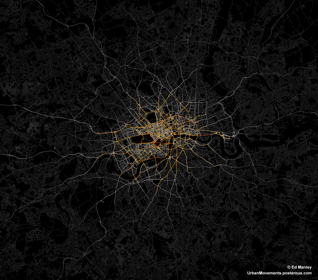
The most popular routes are along Euston Road, Park Lane and Embankment, which may be somewhat expected, but make for a stark constrast with respect to the flow of most traffic in London. The connection with Canary Wharf comes out strongly, an indication of the company’s portfolio, though route choice here is interesting with selection of the The Highway more popular than Commercial Road.
Real insight will come with the full analysis of the route data, something that should be completed in January. Until then, though, I’ll just leave you with this pretty something to look at.
do you think this same technique can be applied to public transit, improving existing routes, building new ones. etc?
@Noah My work mostly focuses on how people choose routes, which is a vastly simpler process than how people choose the method by which they travel. Public transport provision needs better modelling and planning, but the underlying driving factors around choice vary widely amongst the population. I’d like to think that data could inform us as to how to better improve public transport provision, but it is not simple.
Apologies if i’ve overlooked it – but I don’t see any provision for road-works
Hey Ed, very interesting. When do you have your full analysis?Thanks
Hi Catharina – I should have some more detailed results soon. Carrying out discrete choice and computational learning analysis on the data at present. I’ll put the results up on here when I have something concrete. Ed
Hi EdJust wanted your thoughts on this. Your images really strike me as being quite organic. I wandered if you thought there might be any merit in analysis of cell biology or circulatory systems. In that they may contained transferable eccentricity’s to real world transit systems?
Hey Ed! Your work looks amazing and I would be very much interested in learning more about your project and the visualisation techniques you use. I am a student of Civil and Environmental Engineering at Imperial College London and am working towards a thesis which aims at designing eVTOL networks for cities. The OD data you are using as well could be very interesting for me in estimating demand for air-taxi services. Would you be willing to share it?
House there gonna be lightning
Don’t